

The first half of the project is over in a flash. So fast!
Everyone took Shimohama's comments seriously and is now moving on to the next step.
We will start an article introducing each of these wonderful members one by one.
This time, our advisor, Hashizume, will be sharing his thoughts.
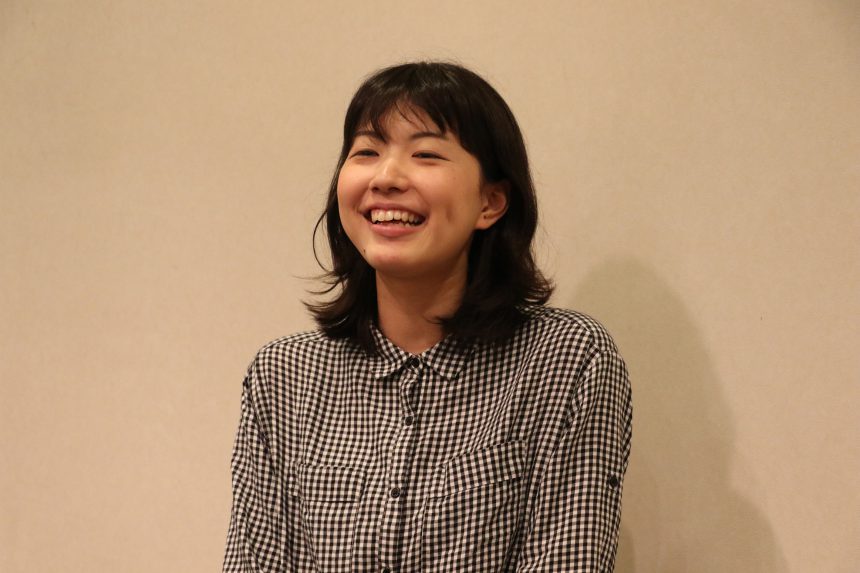
This time, Takeshita Yuki
Tama Art University, Faculty of Fine Arts, Graphic Design Department, 3rd year
My favorite typeface is "Round Antique"
Mr. Takeshita,
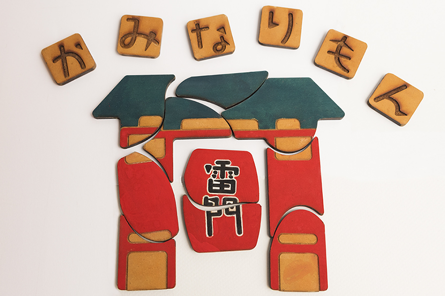
Tokyo × Typography
They created a product (toy) based on the theme:
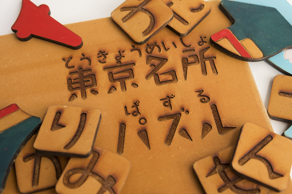
Concept and typeface selection
Based on the concept of "Let's be able to introduce the good things about Tokyo," Takeshita created a puzzle to give children an opportunity to learn about Tokyo's famous places.
The font isTakarismI want to use it!
This time, Takeshita said that from the moment he downloaded the font from the MORISAWA PASSPORT Academic Edition, he had wanted to use "Takarhythm!" However, in regular assignments, it's difficult to use a typeface, and he couldn't combine them well, so he was waiting for an opportunity. Then, when this assignment came up, he thought, "This time!!!"
He wondered, "What kind of piece of work should I create to make the most of these characters?" and came up with the idea of creating a puzzle for children.
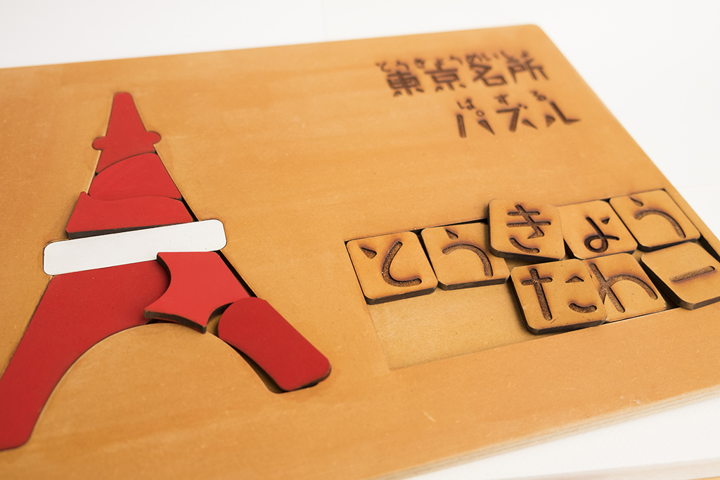
"Takarhythm" has a unique appealing form that is different from basic typefaces. I thought that by making it a three-dimensional object and expressing the letters with indentations and protrusions, the form would be more impressive, and by making it into a toy for children, I could make use of the fun that comes from the rhythmic structure and fleshiness! That's how it came to be in its current form.
He created this film with a deep understanding of the appeal of Takarism.
Your font sensitivity is now fully turned on!
Takeshita said that this assignment gave him the opportunity to think more than usual about how to harmonize his own taste with the taste of the typeface itself and express it naturally. He commented, "I think it's important to examine typeface as one of the elements to this extent even in my everyday work!", showing his growth.
from now on
Takeshita-san is not a product specialist, so this assignment involved a lot of trial and error.
Because it is a toy for children, we were aiming for a smooth and rounded texture from the material that would make people want to touch it repeatedly, but there were many setbacks in the process, such as the cut-out shape being harder than expected, or the surface of the wood becoming fuzzy after painting.
That's what they say.
Review sessionTakeshita then received some advice from Shimohama Rintaro: "It will look even better if you adjust the layout!"
Once they are able to use the school's workshop, they would like to brush up on their work by considering the relationship between the illustration puzzles and the letter puzzles.
He also wants to increase the variety! Like Skytree...
(Please make it)
In the second half of the year, he will be working on the free magazine team. We look forward to seeing more of Takeshita's work in the future!