


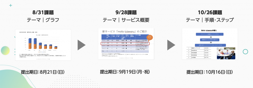
As a program to improve your presentation skills, we have been running a school program since July, with guest Keiichiro Takahashi. This time, we will report on the "First School Session: Direct Instruction from a Presentation Professional! Designing Effective Presentation Materials Using Universal Design Fonts," held on Wednesday, August 31st.
Held on Wednesday, July 27thSeminar ReportPlease also see:
If you would like to watch the archived video from the seminar, you can do so below.
*Registration is required to watch videos.
*In addition to watching the archived videos, you can also download the work materials.
*Due to equipment problems on the day, there will be some parts where the moderator's voice will be difficult to hear.
Seminar Report

guestLecturer |Keiichiro Takahashi(Takahashi Keiichiro)
With 100,000 subscribers,The Presentation UniversityHe runs the website "PowerPoint Consulting." He provides comprehensive consulting services related to presentations, from creating presentation content and document design to communication techniques. His latest book, "The World's Easiest PowerPoint Tips for Business Use: Just Look at Them" (Takarajimasha), is now on sale.
Solve your worries about creating presentation materials
In this school, participants were asked to submit common slide data as an assignment and edit the presentation materials with the aim of making them easier to understand.
From the many applications received, Takahashi will select some and provide advice in the comments, and at the end, Takahashi will edit the assignment data and share a model.
We interviewed participants who were participating to improve their document creation skills about the difficulties they faced when creating documents. As a result, many felt that their challenges included "conveying information succinctly," "selecting and discarding information," "organizing information," and "how to concisely summarize the information they want to communicate in a visual format." We received feedback that these concerns were being resolved through the assignments and advice, and the survey results showed that those with 90% felt that their challenges had been resolved.
Participant comments
I learned a lot from the participants' works and Professor Takahashi's comments on them. He gave specific details about what was good about each piece and how to improve it further, which made it easy to understand.
I learned the importance of keeping tables and graphs simple and clear. In the future, I would like to limit myself to using four colors and be more careful about fonts and emphasis.
The examples were easy to imagine and made it easy to understand the content.
Regarding the relationship between graphs and comments, we learned that "duplication is subtraction" and "deficiency is addition."
You'll want some font variation. Practice makes perfect!
Picking up issues and giving advice
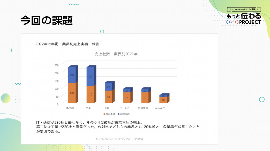
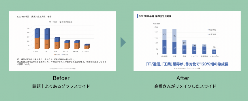
Subject Theme | Graph
The graph function allows you to choose between two-dimensional and three-dimensional graphs, but the assignment this time is to create a three-dimensional graph.
Just because it's cool is a no-no
Many of the questions from those who submitted assignments were about graph representation.
I wondered if it was necessary to have a three-dimensional graph.
I felt that a lot of people use 3D graphs a lot, so I decided to make this a topic. It's fine if the 3D graph has meaning, but avoid 3D graphs that just look cool!
Takahashi-san gave us some advice and also gave us a lecture on how to change the graph during the demonstration. It's true that 2D is much cleaner to the eye!
Up to four colors
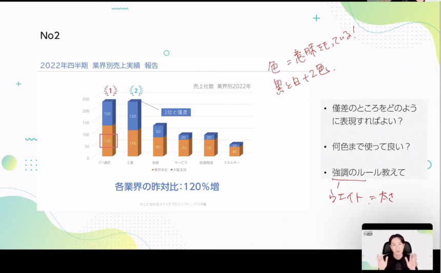
This is related to the "organizing information" that was also mentioned in the participants' concerns, but Takahashi said, "Not only text, but color is also information," and advised us that if we are to organize information, we need to organize color as well.
Also, the key to presentation materials is to limit the number of colors to four. Incidentally, the four colors are broken down into two colors for the background and two for the text, so limiting the number to two effectively results in a clean slide.
Many people may think that's all they can use, but I'd like to add that it's not a limited number of colors, as you can express many different colors by changing the brightness of one color.
The strength of the information can be adjusted by changing the "weight"
When asked if there are any rules for how to emphasize the information he found, Takahashi replied, "The key is font size and thickness (weight)!"
If you want to emphasize text, you can make the slide more distinct by increasing the font size and weight.
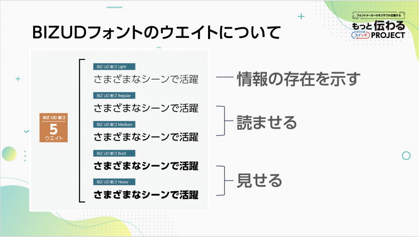
"BIZ UD Shin Go," which Takahashi often uses, has five weights, so when there is multiple pieces of information, the trick is to be able to quickly recognize the strength of the weights by the thickness of the weights.
Please refer to the diagram above for weights and information purposes.
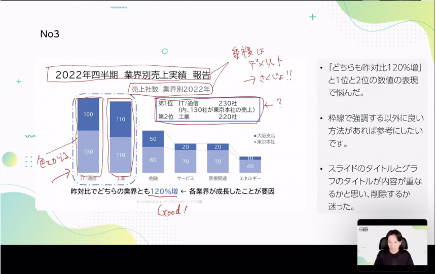
Remove duplicate information!
It's common to want to edit information to make it stand out.
Participants who were unsure how to express small differences in numbers received advice on how to handle information.
If the graph shows that the difference is small, there's no need to add any additional information! Also, duplicate information not only makes the slide difficult to read, but also makes it meaningless, so if you find any duplicates, delete them.
Takahashi demonstrates the remake
Based on the comments on the selected tasks, Takahashi himself remade the task data at the end.
From the viewers:It was great to see Takahashi Sensei demonstrate right in front of me and see my progress improving!" We also received comments such as, "This is very informative," and the demonstration covered all the advice given to those who submitted their work.
Demonstration content
- Change a 3D graph to a 2D graph
- Bulk change fonts
- Remove duplicates
- Emphasis (font size and weight)
- Change color
- Final tweaks
School Announcements
Next school service overview (table)
In the second school, we prepared a slide outlining our services, based on the theme of a typical table layout used in presentation slides.
For all three sessions, we have prepared slides in the genres that you will most likely be dealing with! By completing the assignments and taking the course, you will be able to further improve your presentation slide creation skills, so please give it a try!
The school is open to both first-time attendees and those who have attended seminars.Applications will be available.
*The application period has now ended, so please see the report and archive. If you have the same concerns, please take a look.
Direct advice from a presentation professional! How to design presentation materials that "get the message"Report List
If you want to use UD fonts, which Takahashi recommended in the seminar, easily in Office applications,We recommend MORISAWA BIZ+. For details,Here
Also,As a company, local government, organization, or school organizationIf you are considering using UD fonts, please feel free to ask us any questions below.
Takahashi's YouTube channel, "The Presentation University," shares presentation know-how. If you're looking to improve your presentation skills, be sure to check it out.