
In this series, font manufacturer Morisawa will be giving lectures on the basics of fonts. This time, they will be explaining the two basic types of fonts: Gothic and Mincho.
What kind of fonts do you use when creating something?
When it comes to font types, the first thing that comes to mind for many people is "Gothic font","Mincho font" Both are used in many design works.
However, when you start using fonts, you will find that you want a more cute, pop, or uniquely designed font (so-calledDesign typeface) Don't you feel like using it?
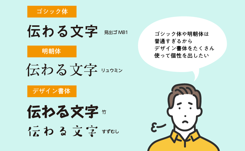
For font beginner designs,Using too many design typefaces makes the fonts stand outTo avoid this, it is important to first master the use of Gothic and Mincho fonts before moving on to design fonts. This will make it easier to create a well-balanced design overall.
There are the following benefits to mastering Gothic and Mincho fonts:
- A simple and cohesive design
- It can highlight the parts where design fonts are used.
Before we explain these two in detail, let's take a quick look at what typefaces Mincho and Gothic are.
1. What are Gothic and Mincho fonts like?
Gothic font
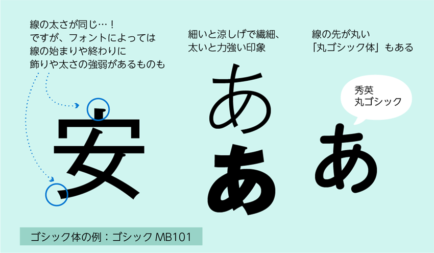
Line thickness is uniformIt is a Gothic font. It has a more frank impression than Mincho font. The impression changes greatly depending on the weight (thickness): thin is delicate, thick is powerful and impactful. It has been used in various scenes since ancient times, but because it is a typeface with few decorations and a simple design, the letters tend to be crushed these days.Great for presentation materials tooIt has been done.
Rounded Gothic font with rounded letter tipsIt can also add a softer impression when you feel that regular Gothic fonts are too stiff.
Shape characteristics
- Line thickness is uniform
- Depending on the weight, various impressions can be created, such as delicacy or strength.
- There are also rounded Gothic fonts with rounded line ends.
Mincho font
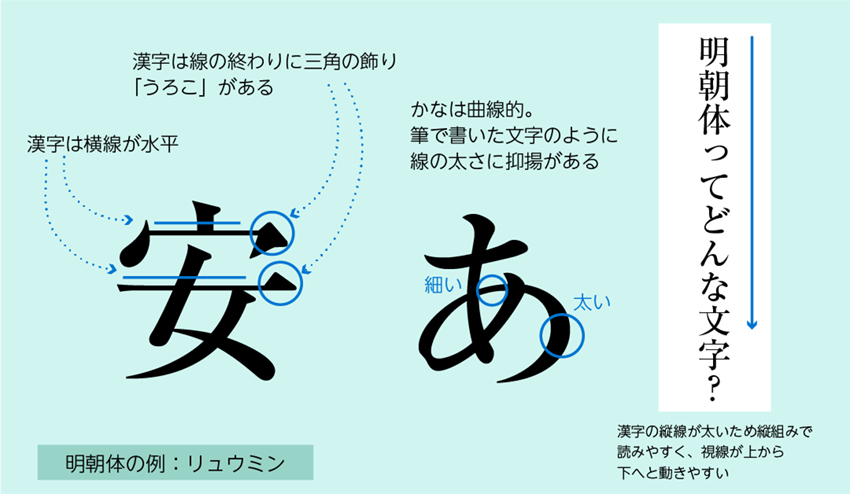
Elegant and formal impressionThis is a Mincho typeface. It is useful when you want to create a luxurious and formal impression. With thick vertical lines and thin horizontal lines, it is a typeface that makes it easy to create a vertical flow of the eye, making vertical text easy to read. For this reason, it is often used for the main text of vertically typeset books and magazines.
Shape characteristics
- Kanji characters have straight horizontal lines, while hiragana characters have curved lines that look like they were written with a brush.
- Kanji characters have triangular scales at the end of the lines
- Kanji characters have thick vertical lines and thin horizontal lines, making them easy to read in vertical text.
Both Gothic and Mincho are standard typefaces commonly used in design.
In the next section, we will explain the benefits of mastering Gothic and Mincho fonts.
2. The benefits of using Gothic and Mincho fonts
Advantage 1. Simple and cohesive design
Gothic and Mincho fonts are standard typefaces that blend in with the viewer's eyes and don't add unnecessary noise. They allow the reader to focus on the content. Designer typefaces have unique shapes that make them too individual, making it difficult to create cohesion on the page, and readers' attention is drawn to the appearance rather than the content.
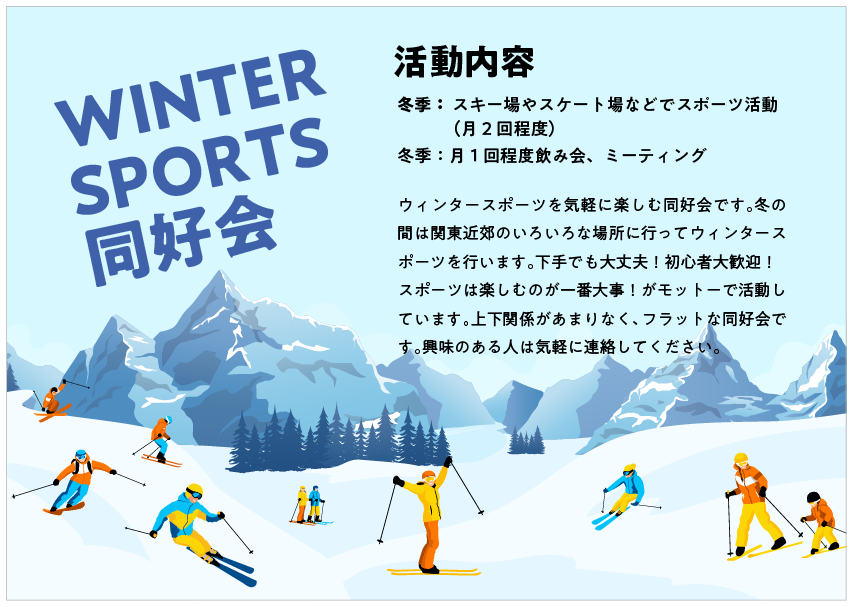
Example 1: Flyer example
When using only design fonts

- Each piece of information is important, so I tried using fonts with designs that make each piece stand out, but the overall impression is that it lacks cohesion and lacks focus.
- The font design is very decorative, making long sentences a little difficult to read.
When compiled in Gothic font
- It's neat and tidy now and no longer looks clumsy!
- The text design is simpler and easier to read, so I think it's easier to convey information!
Example 2: Invitation example
When using only design fonts
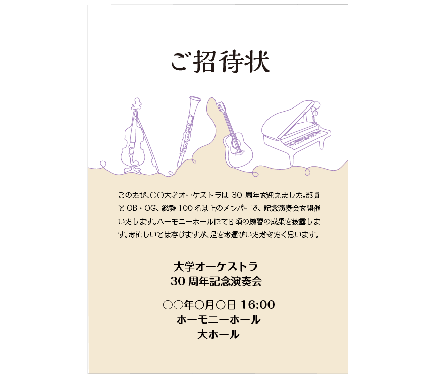
- Because it's an orchestra concert, I wanted to create a luxurious feel with the illustrations and colors I chose, but for some reason it doesn't feel luxurious.
- The font is cluttered, creating an unsophisticated and cluttered look.
When compiled in Mincho font
- Using Mincho font gives it a luxurious feel!
- By using one font for everything, the overall look is cohesive and calm, creating a sophisticated atmosphere!
Rather than using a lot of design fonts, it may be easier to create a neat and tidy look by using Gothic or Mincho fonts. If you feel like it's a little plain or you want to make more impact, try changing the weight and font size as shown in the article below to decorate the page.

Advantage 2. It can highlight the parts using design typefaces.
So, when designing, is it better to use only Gothic and Mincho fonts and not use design fonts? Of course not! By using Gothic and Mincho fonts in combination, you can create a focal point within a cohesive design. This is the second benefit: "It can highlight the parts where design fonts are used."
In the previous example, we have incorporated some design fonts.
Flyer example

- The design font is only used for the headings "WINTER SPORTS Club" and "Activities," so the page doesn't look cluttered and the design font stands out nicely!
- Long sentences are written in Gothic font, making them easy to read!
Invitation example
- I thought that using only Mincho font would be a little too stiff for the image I was aiming for, but by using a design font for the title "Invitation," I was able to create a luxurious yet slightly casual feel!
- Since the base is Mincho font, we were able to maintain the luxurious atmosphere!
3. Summary
There are the following benefits to mastering Gothic and Mincho fonts:
- A simple and cohesive design
- It can highlight the parts where design fonts are used.
When there are many fonts available, we tend to use typefaces with interesting designs.First, master Gothic and Mincho fonts and reduce the number of fonts you use.Doing so is often a shortcut to creating a beautiful design.
If you can master the use of Gothic and Mincho fonts, the day when you can become a design master may be just around the corner!
Follow the Morisawa FONT SWITCH PROJECT on social media to turn on everyone's font sensibilities and have even more fun with fonts!
All fonts are available! The student font product "MORISAWA PASSPORT Academic Edition"Here
UD fonts for business use available from 330 yen per monthHere