

In this series, font manufacturer Morisawa will be giving lectures on the basics of fonts. This time, they will be explaining the elements that determine font design.
In the previous article,Gothic and Mincho fonts" was explained.
Now you know the difference between Gothic and Mincho fonts perfectly!
Even if you think that way, have you ever been in a situation where you tried to line up fonts and found yourself confused about which one to choose?

There are many different types of Gothic and Mincho fonts. How do you choose the font that best suits your work?
In such cases, you can use the font details such as "elementLet's take a look at "

Maybe the ends of the lines were rounded, which made it look less powerful...!

Here are some benefits of knowing the characteristics of elements:
- You will be able to choose fonts that are more suited to your work.
- The impression of the font can be divided into two categories: old style and new style.
First, let's look at elements.
1. What are elements?
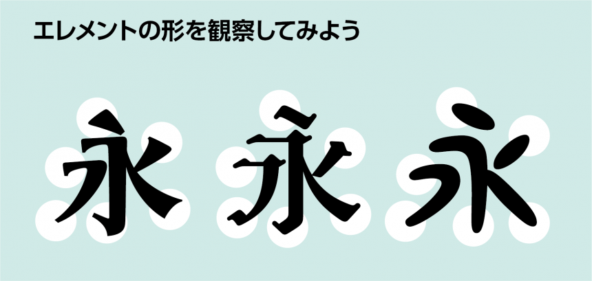
Common to all fontsDesign of each part such as "stop", "flick", and "stroke"That is "element"It is called.
The impression a font gives to the viewer is that if the ends of the lines are rounded it is soft, and if the ends of the lines are decorated it is gorgeous.The shape of the elements makes a big impressionis.
Also, even if it is the same Gothic or Mincho font,Old Style","New Style" can be divided into two categories.
You can determine which style a font is by looking at its elements.
2. Distinguishing between old style and new style
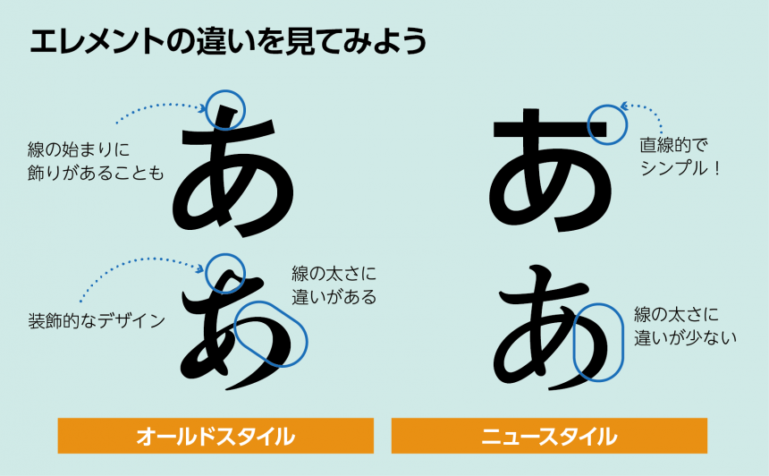
Old Style
Like letters written with a brushThere is a change in thickness,Decorative and intricate elementsFonts with this are likely to be old-style.Elegant and classic lookRecommended when you want to have
New Style
LineThe thickness did not change much,Simple elementsFonts with this feature are likely to be new styles.A clean and modern lookRecommended when you want to have
Example 1: Presentation slide "Ecosystem survey of Lake Morisawa"
Example of an old-style font

It's not bad, but the decorative lettering elements can be a bit noisy.
Is it too emotional? A more modern and solid feel would be better.
Examples of new style fonts

It feels more organized than before!
I feel like being able to state it so clearly in a font with simple elements has even increased the credibility of the survey!
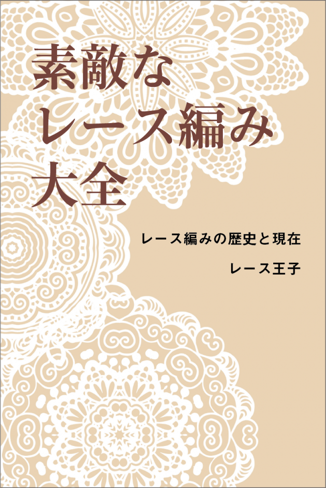
Example 2: Title of a critical fanzine: "The Encyclopedia of Beautiful Lace Knitting"
Examples of new style fonts
It's easy to read as a title, but as a critique of lace knitting it may be a bit bland.
I want a more elegant atmosphere.
Example of an old-style font
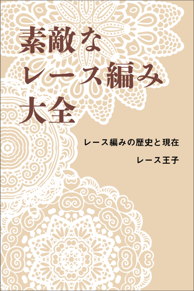
The elements are vibrant and dynamic, and it looks even better than before!
The cover is sure to appeal to people who like a classic and elegant atmosphere!
3. Summary
Observing elements when choosing a font has the following benefits:
- You will be able to choose fonts that are more suited to your work.
- The impression of the font can be divided into two categories: old style and new style.
If you're having trouble finding the perfect font to convey the image you want to convey, consider the characteristics of the element!
Follow the Morisawa FONT SWITCH PROJECT on social media to turn on everyone's font sensibilities and have even more fun with fonts!
All fonts are available! The student font product "MORISAWA PASSPORT Academic Edition"Here
UD fonts for business use available from 330 yen per monthHere