

In this series, font manufacturer Morisawa will be giving lectures on the basics of fonts. This time, they will be explaining the "framework, depth, and center of gravity."
In the previous article, we explained about "characters."
We found that the size of the characters can change the "pressure" they give to the viewer.
This time, we will use the "Skeleton, chest, center of gravity"We will explain about this.
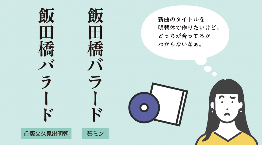
Have you ever decided that you want to use a Mincho font, but had trouble figuring out which Mincho font to choose that would suit your work?
In such cases, knowing how to think about a font's "skeleton, depth, and center of gravity" can have the following benefits.
1. Identify the differences between similar fonts
2. You will be able to choose a font that matches your image.
First, let's explain the terms "skeleton," "bosom," and "center of gravity."
1. What are skeleton, chest, and center of gravity?
skeleton
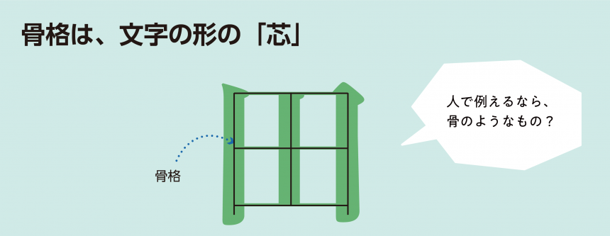
The "skeleton" isThe "core" of the character strokeis.
If we were to compare it to the human body, it would be similar to bones. For example, even if you go on a diet and the amount of muscle or fat changes, the original shape of your bones remains the same, so your height and leg length do not change. To understand your body type, it is important to first know what shape your bones are.
Similarly, when learning about a typeface, it is important to observe what kind of skeleton it has, because the balance of the skeleton determines the balance of the entire typeface.
Specifically, the following will be explained:The width of the "pocket" and the height of the "center of gravity"will be decided.
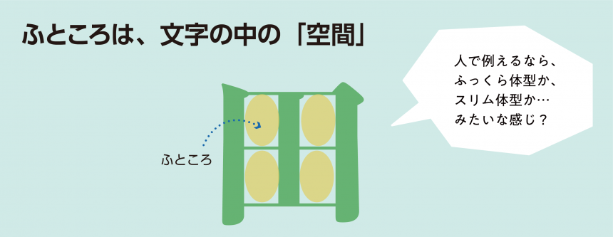
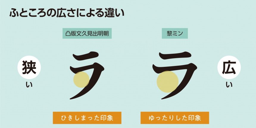
"Fukutokoro" meansThe inner space formed between each stroke of a characterHe says:
If we were to compare it to the human body, a font with a wide opening would be like a plump body, while a font with a narrow opening would be like a slim body.Choosing a font with a wide opening gives a relaxed impression, while choosing a font with a narrow opening gives a tight impression.is given to those who see it.
center of gravity
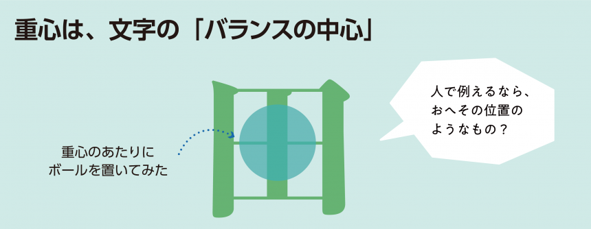
The "center of gravity" isThe center of balance of the charactersRepresents:
If we compare it to the human body, it would be like whether the belly button is high or low.
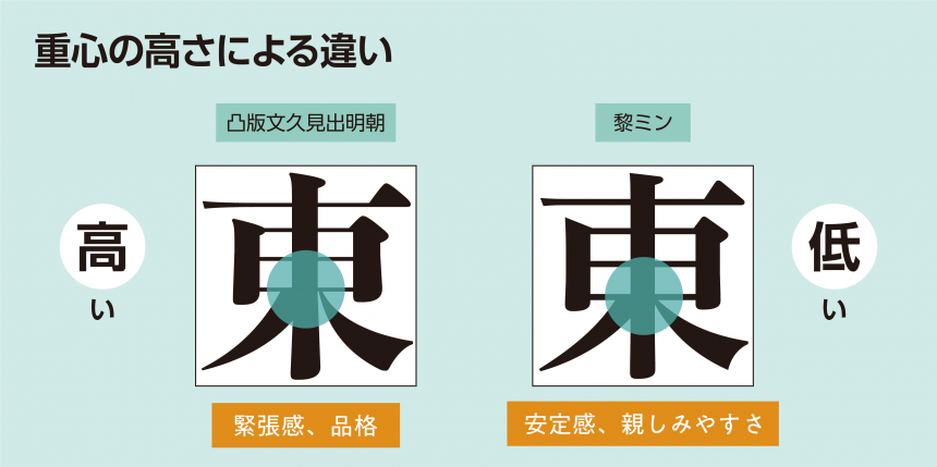
If the center of gravity is high, it gives off a sense of tension and dignity.andIf it's low, it gives a sense of stability and familiarity.It gives you a sense of...
2. Identify the differences between similar fonts
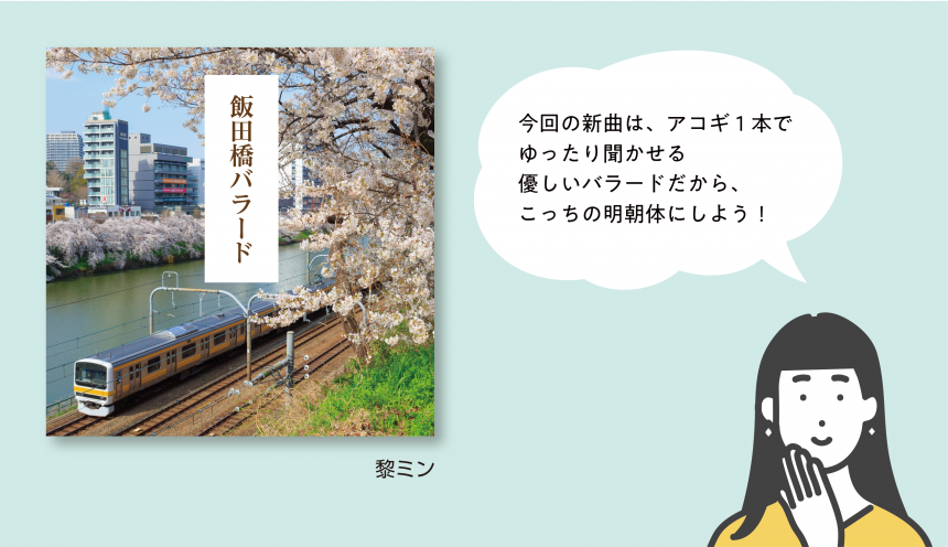
Now that we understand the skeleton, depth, and center of gravity, let's think again about which typeface suits the title of our new song.
Although the designs may appear similar at first glance, you can see that the pocket width and center of gravity height are different.
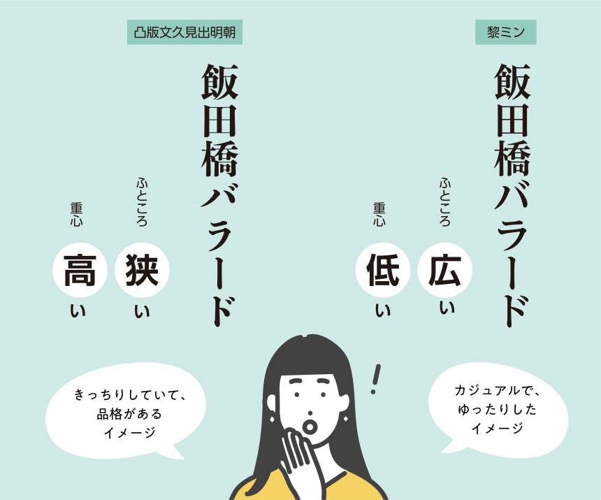
When it comes to text on a CD jacket, it's a good idea to choose a font that conveys what kind of song it is.
For casual songs that can be listened to at a leisurely pace, a font with a wide opening and low center of gravity is recommended.
For precise and elegant pieces, a typeface with a narrow pocket and a high center of gravity is recommended.
Knowing the key points to consider when selecting a typeface can help you make a choice.
3. You will be able to choose a font that matches your image.
Based on the explanation above, let's focus on the frame, depth, and center of gravity to choose a font that best suits the image you want to convey to the viewer.
A sign for a cooking class that encourages casual participation
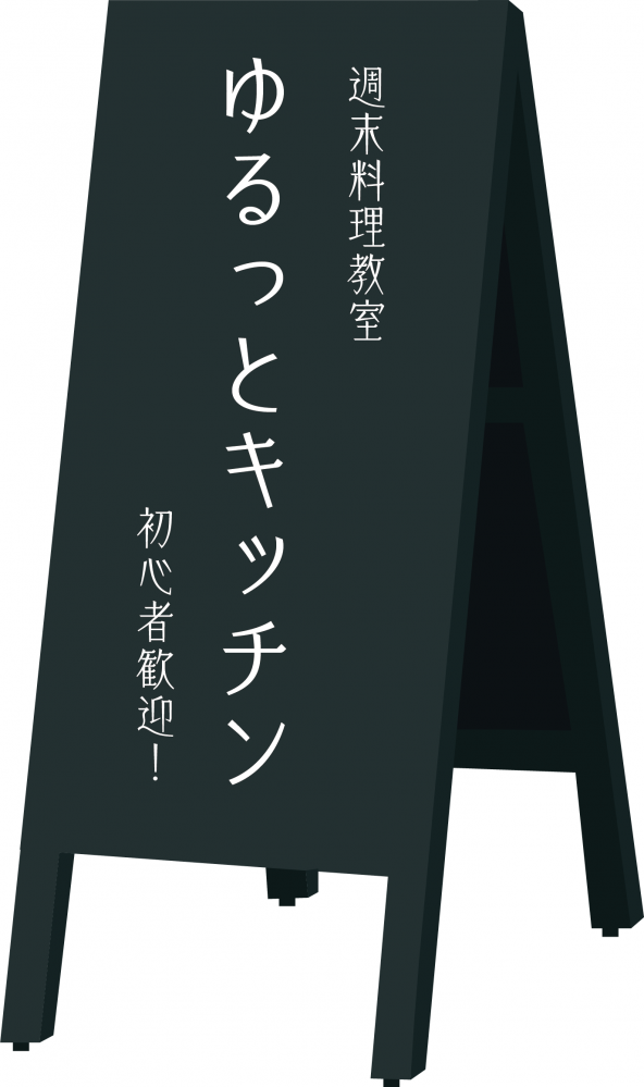
It's slim and stylish, but if I had chosen a font with a high center of gravity, it might have come across as tense. It might have seemed a little intimidating.
Even though we used the same thin font, choosing a typeface with a low center of gravity created a casual, easy-to-participate atmosphere!
New Year's cards to send to your teacher
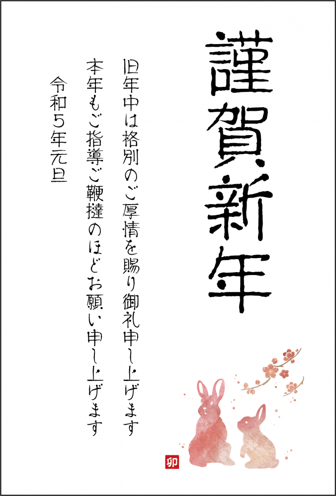
Since it's a New Year's card, I chose a calligraphy-like font, but it doesn't seem very formal.
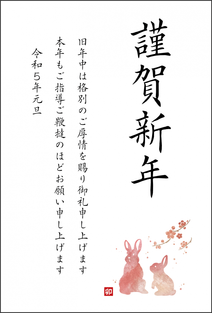
By choosing a font with a high center of gravity and a narrow center, it gives a neat feel!
3. Summary
Understanding the "skeleton, depth, and center of gravity" that determine the balance of a character has the following benefits:
1. Identify the differences between similar fonts
2. You will be able to choose a font that matches your image.
Choosing a typeface becomes even more fun when you understand the key points of a typeface, such as the structure of the skeleton, the height of the center of gravity, and the width of the font!
Follow the Morisawa FONT SWITCH PROJECT on social media to turn on everyone's font sensibilities and have even more fun with fonts!
All fonts are available! The student font product "MORISAWA PASSPORT Academic Edition"Here
UD fonts for business use available from 330 yen per monthHere