
MORISAWA BIZ+ offers a lineup of UD fonts (Universal Design Fonts) at reasonable prices for users of business applications such as Office products. (For details of the service, please seeHere)
This time, we will explain the features and how to use condensed typefaces, which are useful for arranging text compactly!
Solves the problem of not being able to communicate clearly
Presentation slides are limited in size by the amount of paper space available for each slide.
- I want to keep the lines as short as possible when laying out the layout!
- There are some parts of the table where the text is so long that it takes up two lines, so I want to align it to one line!
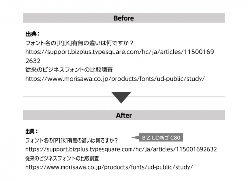
- I want to list sources without taking up space!
In such cases, I tend to do the following:
- Reduce the font size
- Close the space between characters
- Apply elongated effect to text
However, doing these things makes the text harder to read and reduces readability.
So how can you maintain readability?
In fact, by changing the font, you can fit the text while still keeping it easy to read.
That"Condensed typeface"is.
What is a "condensed typeface"?
Condensed typefaces are typefaces that are designed to be narrow in width.
When a typical typeface is transformed to narrow its width, the character design collapses and becomes difficult to read. However, condensed typefaces are designed to be displayed in a narrower width without sacrificing visibility or readability, and the line thickness and balance are adjusted to make them easy to read.
The condensed font "BIZ UD Shingo C80","BIZ UD Shingo C60" is a typeface based on the design of "BIZ UDP Shin Go," and is designed with a width of 80% and 60% of the width of the characters in "BIZ UDP Shin Go," assuming the character width of "BIZ UDP Shin Go" is 100%.
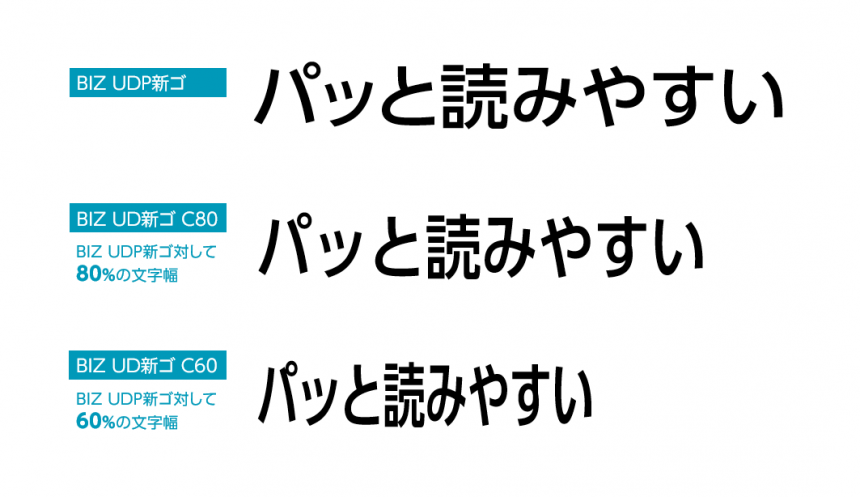
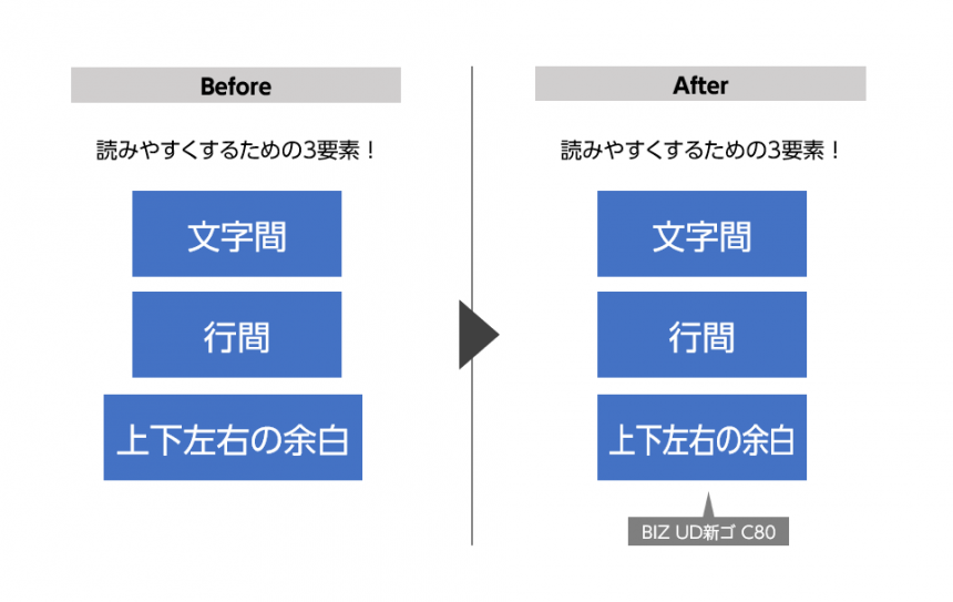
Condensed typefaces allow for a more compact layout of characters due to their narrow width, while still maintaining readability.
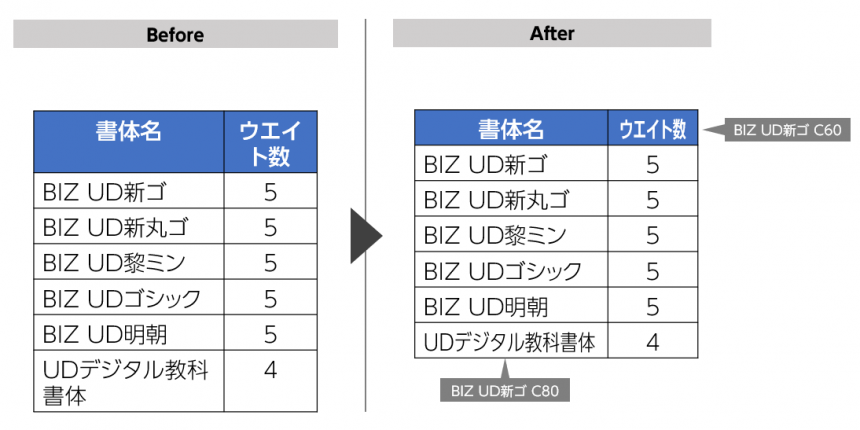
In the table below, using a condensed typeface reduces two rows to one. The cells are all the same height, making the table look neater.
When should you use condensed typefaces?
It also comes in handy in other situations like this.
- I want to put text inside a shape, but the size of the shapes is not uniform in places where there are a lot of characters.
- When the source URL, which is supplementary information, is long and takes up space and stands out in an unpleasant way
What did you think?
There are various features in Office apps, but sometimes the problem can be solved simply by changing the font.
Learn the tips for creating easy-to-read documents and create materials that others will want to read!
The product page for the business UD font, MORISAWA BIZ+, isHere
You can download free fonts or purchase paid fonts.Free Membership RegistrationClick the button below!
To make better use of MORISAWA BIZ+
Including the condensed fonts introduced above MORISAWA BIZ+ In order to help you use it more effectively in business situations, Morisawa offers training in document creation. Designing Materials that Communicate Program We have the following available.
▼On the following page,Costs, implementation process, and participant feedback You can see detailed information such as:

If you would like to know more about the "Communicative" Document Design Program, or if your organization is considering introducing and using UD fonts, please feel free to ask us any questions below.