
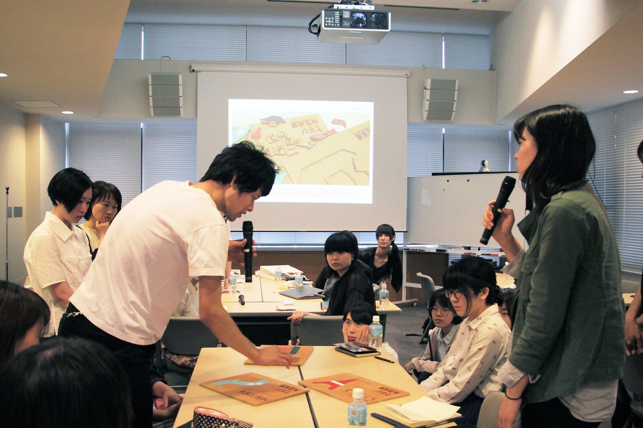

We report on the third meeting of the Moripass Club, the second term, held in June! This time, it was time for the final presentation of the assignment. How did the club members tackle the assignment and font of "expressing Tokyo with fonts" and complete their work?
3D, video, books. A variety of works completed
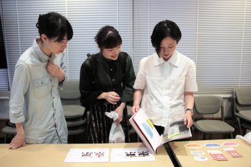
 MayInterim presentation of assignmentsIt's been three weeks since then. During this time, the club members have repeatedly made adjustments to their plans, sometimes consulting with guest Shimohama via LINE, to complete the piece.
Participants brought in works in a variety of forms, including posters, photo books, guidebooks, and other booklets, three-dimensional objects, motion graphics, and promotional materials involving the whole of Tokyo.
 After listening to the members' presentations, Shimohama gave the following overall review along with comments on each individual.
"Text is a tool for communication. Usually, the main focus of a work is the 'content' that is communicated through the text. But this time, the 'text' also plays a central role. I think it was a fairly advanced assignment. I usually choose neutral fonts, so even I would have a hard time deciding on a piece that focuses on fonts..."
Another important point to consider when selecting a font is whether it is suitable for composing text or whether it is strong enough to be used as a logo."
AlsoAdvisor Hashizume-sanThere were also comments from:
"I'm glad that you chose fonts with various perspectives. I hope you will use this as reference for the future. For example, by making good use of kana typefaces, you can sometimes better express the concept of your work.
Please take advantage of Shimohama's advice and try to further refine your work in the future."
How did you guys choose your fonts?
We plan to introduce the completed works on our blog in the future. In this article, we focus on how the club members chose the fonts to use in their works. We spoke to two of them.
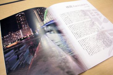
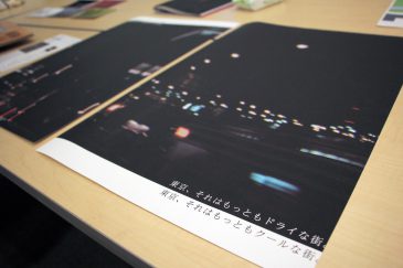 Naohara-san sees "dry Tokyo" as a "cool city." He created a poster. Under a photo of the Shuto Expressway,ReiminThis is a work in which copies are placed.
"In the past seminars held by the committee, we have learned that typefaces were created based on the needs of the time.elementorpocketThere was talk that the two are different. There was also talk that Reimin was created relatively recently. I used that as a hint when I chose it.
Reimin = new and sophisticated image. However, I thought that the Ming style would soften the coldness and elevate it to "dry = cool."
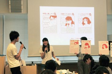
 Yoshida-kun personified fonts to represent the people living in various parts of Tokyo. He selected seven different fonts to match the unique characteristics of each city.
"For couples looking at the night view at Kachidoki,Haruhi Gakuen"Haruhi Gakuen is a typeface that exudes individuality and freedom. The name 'Gakuen' (school) also evokes a feeling of youth. But school can also be a restrictive place. Even so, it's wonderful to see people who maintain their individuality. I felt that same charm in this typeface."
Launch! What did you learn from the assignment?
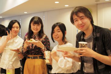 After the presentation, there will be a celebration with drinks and snacks!
They learned more about each other's work and shared their impressions of working with fonts over the four weeks they spent creating the assignment.
By the way, we have heard the following comments from members.
"Not just the 'image' of the font,
I also chose the font with an eye to the "density of black" when lined up." (Shiba)
"The truth is, I'm not very good at using design typefaces. But by using a font that I wouldn't normally choose, I realized that to improve my expressiveness, I really need to know a variety of fonts!" (laughs)" (Inaba)
 Shimohama and the advisors also participated in the after-party, which provided an opportunity for members to ask questions they hadn't had a chance to ask in the committee meetings and receive more detailed feedback.
This marks the end of the first half of the Moripass Club, where members tackled individual tasks. From the next meeting onwards, new tasks will begin: "Event Production" and "Free Paper Production." The members will split into two teams and work on these tasks.
What aspects of the fonts made the club members, who had been exposed to them, think, "I want to share this with my fellow art students!" and "I want to know more!" From next time onwards, we will be sharing information behind the scenes of their creations.
Writer: Umezawa