Tama Art University, Graphic Design Department
Professor Hiroshi Abe
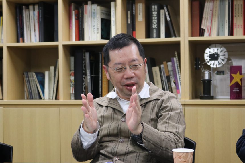
Professor Tadashi Morisaki
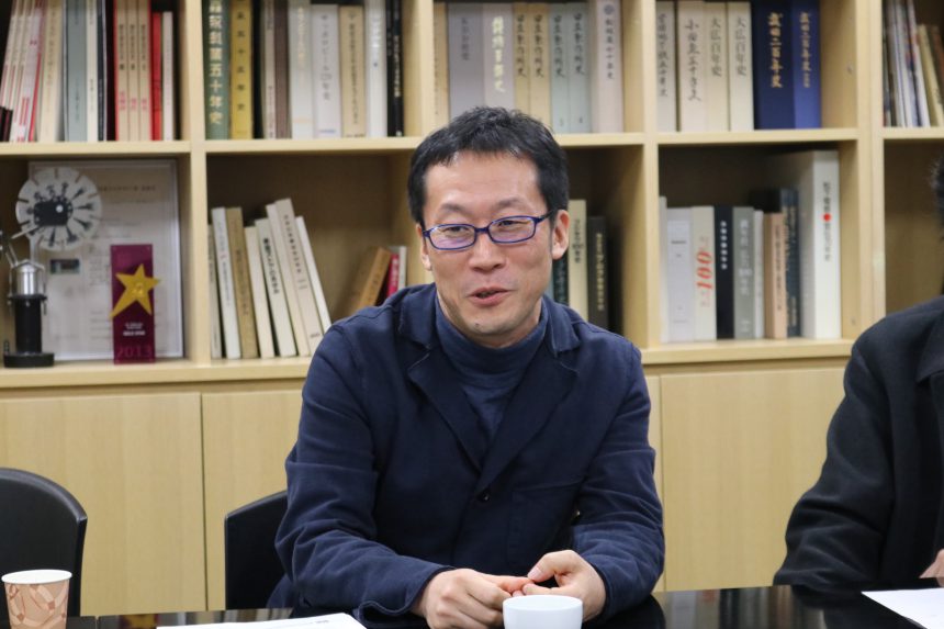
Professor Naoyuki Takeshita
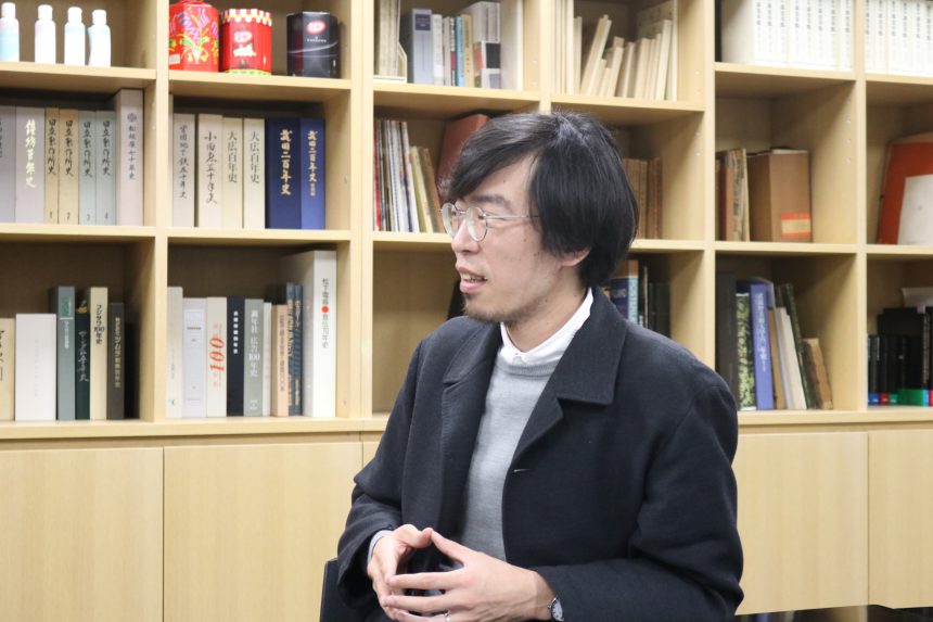
Professor Ichiro Saga
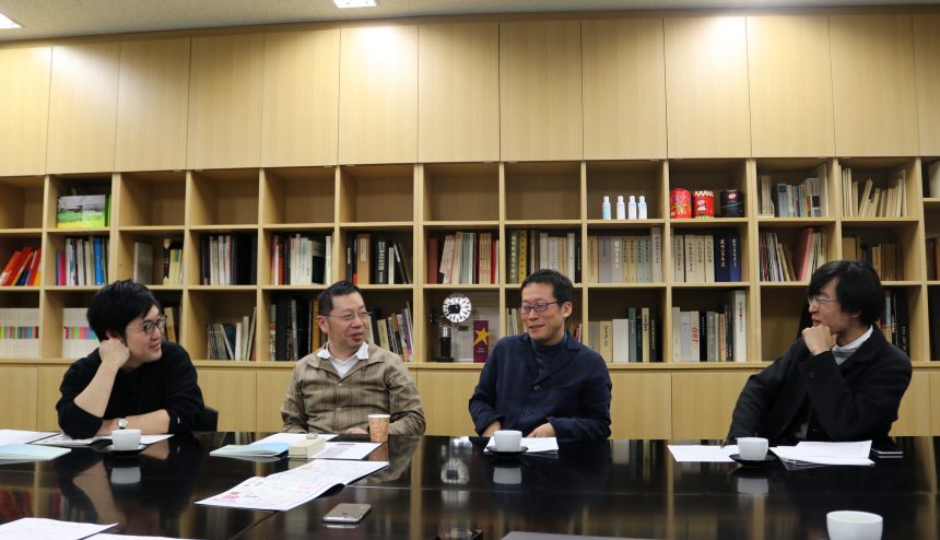
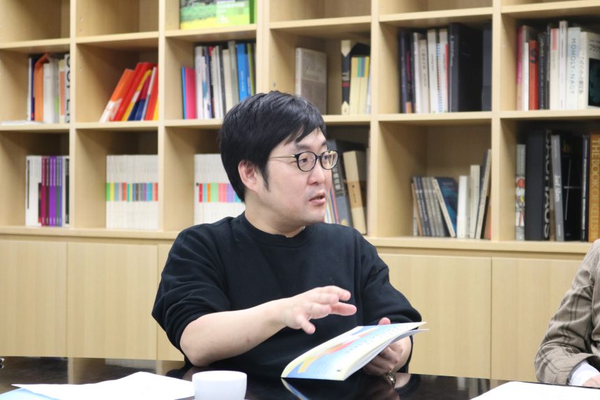
At the Department of Graphic Design at Tama Art University1,2(From left in the photo) Professor Abe Hirofumi, Professor Morisaki Tadashi, Professor Takeshita Naoyuki, and Professor Saga Ichiro are in charge of the basic typography classes for first-year students.
Today, this4We spoke to a number of teachers.
Q. The moment when the font's sensitivity was turned on
Professor Saga
It started when I joined the graduate school of Joshibi University of Art and Design, and began learning about the history of Japanese type and typography from Professor Mori Kei.
In 2004, Joshibi University of Art and Design held a typography symposium and exhibition, and I was involved in the setup as a graduate student under Professor Mori. That experience was crucial.
Professor Takeshita
I first became interested in fonts when I heard about the job of "typeface design" in a typography class during my student days. The teacher who taught me in the class would demonstrate by drawing a line on a white piece of paper without looking at anything, and would write kanji characters in Ming style without a draft.
Even before that, I had been interested in letters and loved writing with hard pens. When I was in junior high school, I would imitate others and write in round letters from "a" to "n." That's why I think I came to Tama Art University to do this job.
Professor Abe
I don't have any particularly good episodes (laughs).
When I was a university student, I learned about the works of Swiss designers Emil Ruder and Josef Müller-Brockmann from the 1960s in "Typography Today," edited by Helmut Schmidt, and it was there that I first became aware of the typefaces they used. I was particularly struck by how a slight difference in the sans serif typeface could change the impression of a work so much.
Professor Morisaki
MacWhen I started using Morisawa, I first had the medium gothic font.BBBand Ryumin's2There was a typeface. At the time, I was working without being familiar with computers, so sometimes the letters would accidentally become larger. When I saw that, I thought it was interesting that the shape of the letters would become like this when they became larger.
When phototypesetting, it takes money and effort, so it's not easy to make the letters bigger or smaller. I never typed in large letters or checked them on a monitor. That's when I first became aware of the shape of a typeface.
Q. What is your favorite Morisawa font and why?
Professor Morisaki
My favorite Morisawa typeface isGothicMB101,RyuminL-KOis.
At firstMacin2I couldn't accept it because we were only allowed to use certain fonts, and it wasn't an era when we could use them freely like we do now. With phototypesetting, there were many more fonts to choose from. However, the number gradually increased, and I looked forward to the release of MB101 B, H, and U, which are thick Gothic fonts. It's still one of my favorite fonts.MacIt's great that it's now available.
Professor Saga
Toppan Bunkyu style andMedium GothicThis is BBB.
I like the softness of the Toppan Bunkyu font, and I think the kanji is great.
Medium GothicBBBI like the balance between hiragana and katakana, which looks slender when put together.1character1The letters aren't particularly pretty, but when you line them up they look beautiful, which is a mystery to me. (laughs)
It makes an impression on me when I see it in magazines. I guess it's something that was imprinted on me when I was in middle and high school and looked at magazines the most.
Professor Abe
I often useRyuminandSmall Gothicis.
I actually like Chu Gothic BBB because I still can't get the hang of it. It's a difficult typeface, with a unique character that's characterized by its irregularity.
Professor Takeshita
I can't choose. I like all fonts that I haven't created.
It's not that I'm running away, but I'm a little embarrassed about the typeface I created. (laughs)
When I see it being used after a few years, I think to myself that I would fix it a little more if I were to do it now. When I see what other people have made, I learn how to write it in a certain way.I feel that Morisawa's typefaces are of higher quality since they went digital. The typefaces from the phototypesetting era still had a handwritten base, and although they had character, they felt disorganized, whereas recent typefaces are apparently produced through many processes and the eyes of many people, so although it depends on the typeface, the newer typefaces are refined and nice.
Q. What do you think of the students at this school?
Professor Saga
"Honest, serious, and cheerful" - perhaps that's it?
this3For me, this is linked to the location of the campus. There are no tall buildings and the view is great. That's the impression I get.
Professor Takeshita
There is more individuality here than at other universities, art colleges, or art universities. The reason is that there are so many students, so you can't survive unless you show how you're different from others. It's not that anyone says, "Be unique," but in the process of creating a work, you have to face yourself whether you like it or not, so I think there are many opportunities to think about individuality.
Professor Morisaki
There are times when they are confident and times when they are not. I am sometimes surprised and think, "Why can't they be so confident at times, when they are so talented?" Overall, I feel that there are many very earnest and well-behaved students.
Professor Abe
In terms of typeface creation, I'm amazed at how much they can create despite being students. I'm sure that many Tama Art University students know their own areas of expertise. They might say, "I'll spend a lot of time on this," or "I'll skip this class." I feel that because there are so many students, they find their path at an early stage, knowing where they want to live.
Q. The moment the switch turns "OFF"
Professor Abe
When I read a book in the bath, it's hot, so when I read in the bath, I prefer a font that doesn't have any quirks.
Professor Morisaki
I think about work all day long. My ideas come to me especially when I'm soaking in the bathtub. It's a habit I've had since I was little, so I always take a bath in the morning.
OFFIt's when I travel that I completely switch off from thinking about work. The same is true when I'm on the train or traveling. But other than that, I'm always thinking about work, every day.
Professor Takeshita
Maybe when I'm sleeping. But sometimes it appears in my dreams. It's an occupational hazard.
When I watched a movie, I noticed that the subtitles were written in Maru Gothic font.……(laughs)
I can't imagine a world without writing. There's no escape.
Professor Saga
I like to laugh and do things I love. I like being by the ocean, fishing, driving, playing basketball, etc.
Q: What would you like to challenge yourself with in the future? What are you interested in?
Professor Abe
In Europe, it seems like there are an increasing number of graphic designers who are also typeface designers. They use the typefaces they have created in their own designs. Then, these become typeface samples, and some people buy the typefaces.
I don't know what will happen in Japan, but personally I'm interested in people who can do both typefaces and design.
Professor Morisaki
Recently, even on government websites,WebI'm interested to hear that fonts are starting to be used.WebIn my work, I thought that if the words didn't change, I could just use images,WebThere are some problems that can be solved by using fonts, so I feel that it is an effective method.
One thing I'd like to challenge myself with is working with a typeface that's outside my range. I'm usually limited to using a set typeface and can't use unexpected ones, so in a way I'm envious when I see designers using typefaces that make me go "Huh?" For example, if it's a book aimed at young people, Suzumushi is popular among them, so even though I don't usually use it, I'd like to try using it. I don't want to decide on a specific typeface from the start, but rather try out various things and choose one that feels right.
Professor Takeshita
My goal is to bring the typeface I'm currently working on to the world.
This wasn't the case in the past, but now that people know who created a typeface, I sometimes feel a bit of a sense of responsibility, a kind of pressure, because I'm involved in the typeface.
Now that we can zoom in and out freely on a computer and look closely at every detail of a typeface, it feels like I'm walking around completely naked. There are so many free fonts available, and when I think about that, I want to put more effort into creating quality fonts and put them out into the world.
Professor Saga
I want to do work that I can do over a long period of time.
I would like to learn about the history of design and the history of letters, and how to connect the three fields of "art, design, and craft," which are currently separate.Art creates new things in the world, and design directs the new things that art creates. When design directs, it eventually connects with the economy, and by connecting with the economy, a new culture is born. As this continues, another turning point comes, and the economy is removed from design, leaving behind something like a handmade texture as craft. I think this has been repeated over and over. It's fine to think about everything separately, but if you do that, you'll only be able to think within existing frameworks, so I want to think about it comprehensively.
I hope that one day I will be able to hold an exhibition like the one I experienced in 2004.