

2month18We will be sharing the stories of the teachers who cooperated with the pre-interviews for the event "Design Work from the Perspective of Typefaces" held on the 1st.5We will be introducing these over several episodes! There will also be stories that we were not able to cover within the limited time of the event! For those who attended the event on the day, and those who unfortunately were unable to attend this time, please be sure to check it out.
The first guest is Professor Hagiwara from Kobe Design University, where I, Shinoda from the Kansai Moripass Club, belong.
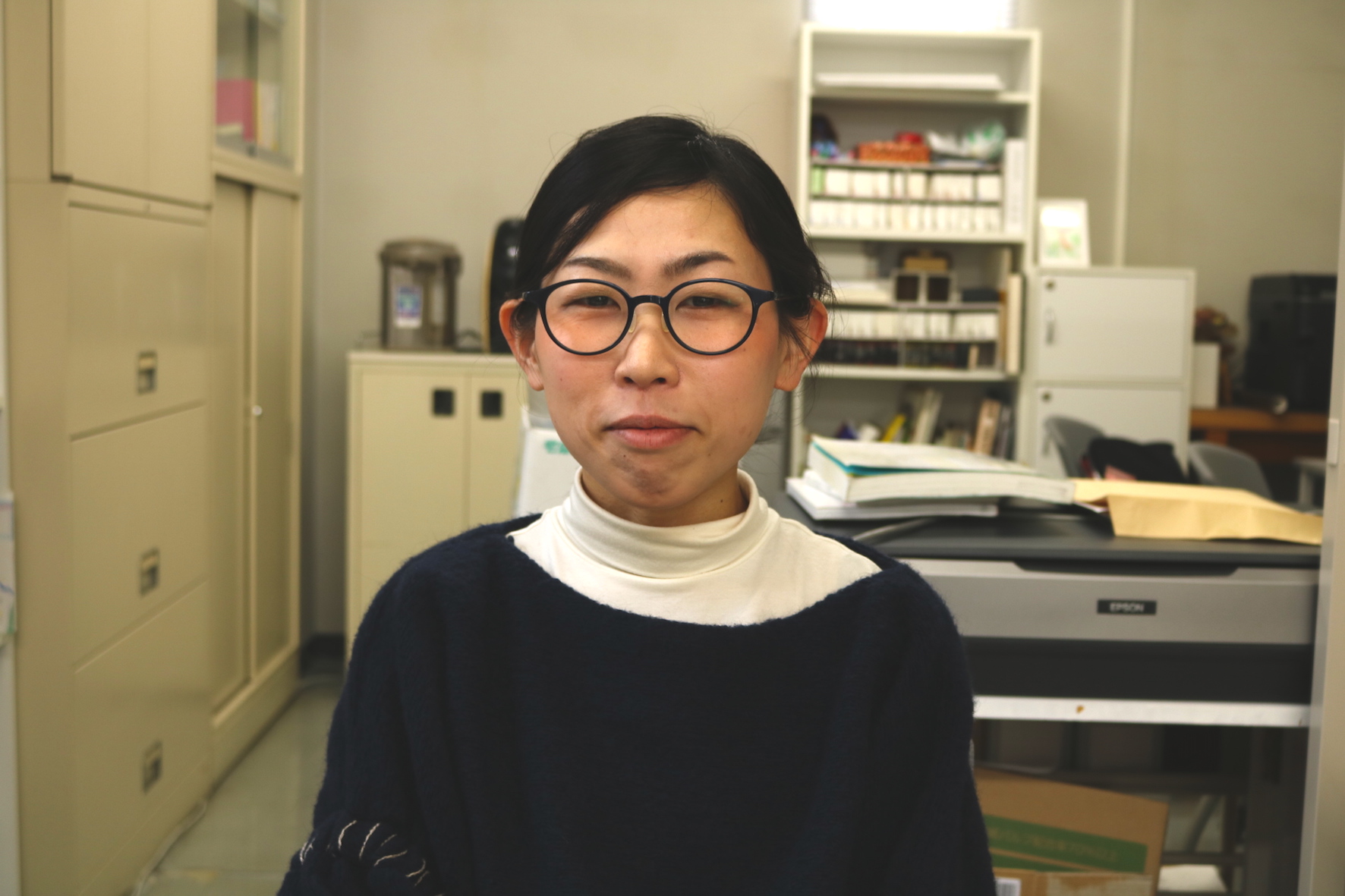
Kobe Design University
Professor Komaki Hagiwara
Q.What kind of work or production do you do?
The biggest part of my job is working as a university professor. I'm also attending graduate school, so I'm also teaching an editorial design course while I'm studying. I mainly teach practical classes aimed at mastering application, as well as book design. Most of my work involves designing for Kobe Design University, where I work, and I'm involved in creating public relations materials such as open campus flyers, T-shirts, and clear files. Other than that, I do a lot of work in Kobe. Recently, I created a flyer for the Kobe Film Archive's film festival. The majority of my work involves things other than books.
Q.What is the role of typefaces in your work?
It's difficult to position it.
When I receive a job, I sometimes have a vague idea of the font, but I don't design with only the typeface in mind. It's a little removed from the text, but it finally emerges from meeting the client, what they value, the atmosphere and texture when I visit the site, gathering various information, and accumulating experience. I can't make a decision in an instant. I don't just create physical objects, so I think it's the same when choosing paper, not just when choosing text.
Q. What was the moment when your font senses were turned on?
I feel the importance of fonts when I see something that is "not so good" rather than when I see something that is "good."
Also, when I read a book or in my daily life, I'm concerned about things like the spacing between characters, the spacing between lines, and the font of the text I see. I sometimes feel like it would be a big problem if I didn't handle it consciously. When I create my own work, I think back to that, so rather than turning it on, it feels more like it's just kept warm, like it's always warm rather than boiling. I think that as someone who uses fonts, I have to be constantly conscious of it.
Q.What is your favorite font?
I feel that this typeface has come up with something different from anything that has come before. I am looking forward to seeing how it will be used in the future.
I actually used it for work. It's digital but has an analog look that's interesting, and it blends in surprisingly well with the paper, making it easy to use. It's based on Shueitai, so I think it maintains its beauty. It has ink pools, but somehow it gives off a flat impression, and I can sense the atmosphere of modern Japanese design.