
Morisawa Inc. has participated in the "OAC Student Advertising Creative Awards 2023" and set the theme as "Morisawa'sUD FONT markWe provided advertising to help more people become aware of ``.''
We would like to introduce the works that have been awarded the Morisawa Award!
The "UD FONT Mark" is a mark that can be used on deliverables that use UD (Universal Design) fonts. I have seen it used on product packaging and educational publications.
This mark lets the recipient know that the product was made with universal design in mind. However, if the mark itself is not known, the message will not be conveyed.
We have set this challenge in the hopes that you will lend us your support in spreading the word about the mark!
Video Category Grand Prix
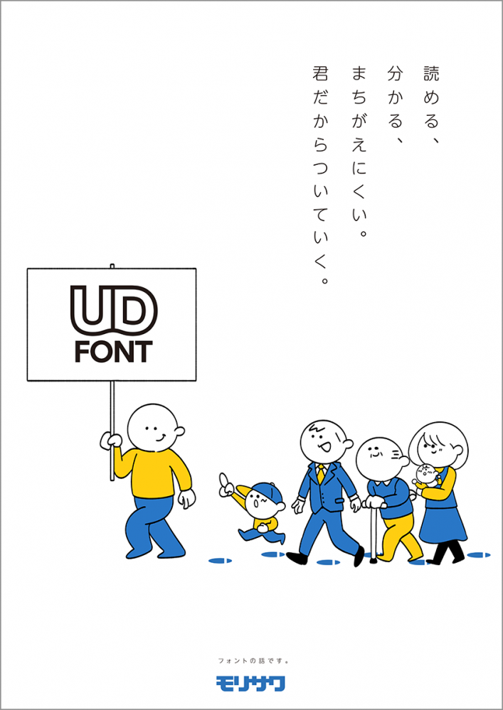
Tokai University's Kimura Kosho and Kobayashi Mayuko: "Fonts that show consideration for people"
It's a very atmospheric film.
Episodes such as class changes and episodes where it's difficult to "quickly skim" the story were very realistic and I was able to empathize with the characters.
The first half is from the perspective of someone who has difficulty reading and writing, and the second half expands from there to the perspective of "wanting to convey information in an easy-to-understand way," which is hopeful and wonderful.
Thank you to Kimura-san and Kobayashi-san for your submissions!
Next, we will introduce the winning works in the graphics category.
Graphics Category Grand Prix
Yu Inoue, Japan Designer Academy, "That's why I'm following you."
The design is simple and easy to understand, and the viewer's eyes are naturally drawn to the "UD FONT mark" that is the subject of the design.
I chose this design because I thought it would be loved by anyone, regardless of demographic, and it suited the theme of the work, which is related to universal design.
The illustrations are also charming!
Mr. Inoue gave us some comments about the work.
Q: Please tell us what you are particular about in your work.
We created the logo with the intention of making it clear at a glance that it is a font mark that is easy to read for people of all ages and genders. We also paid particular attention to creating an illustration with a friendly touch that anyone can relate to.
Q: Please tell us what you came up with when it came to the text.
The catchphrase "I'll follow you because it's you" was chosen to express the sense of security that comes from the readability of the UD font. We also added punctuation marks at each line break in the copy to add emphasis.
Thank you, Inoue-san!
Graphics Category Runner-up
Tokuki Homma of Niigata Design College: "Even letters can be this universal."
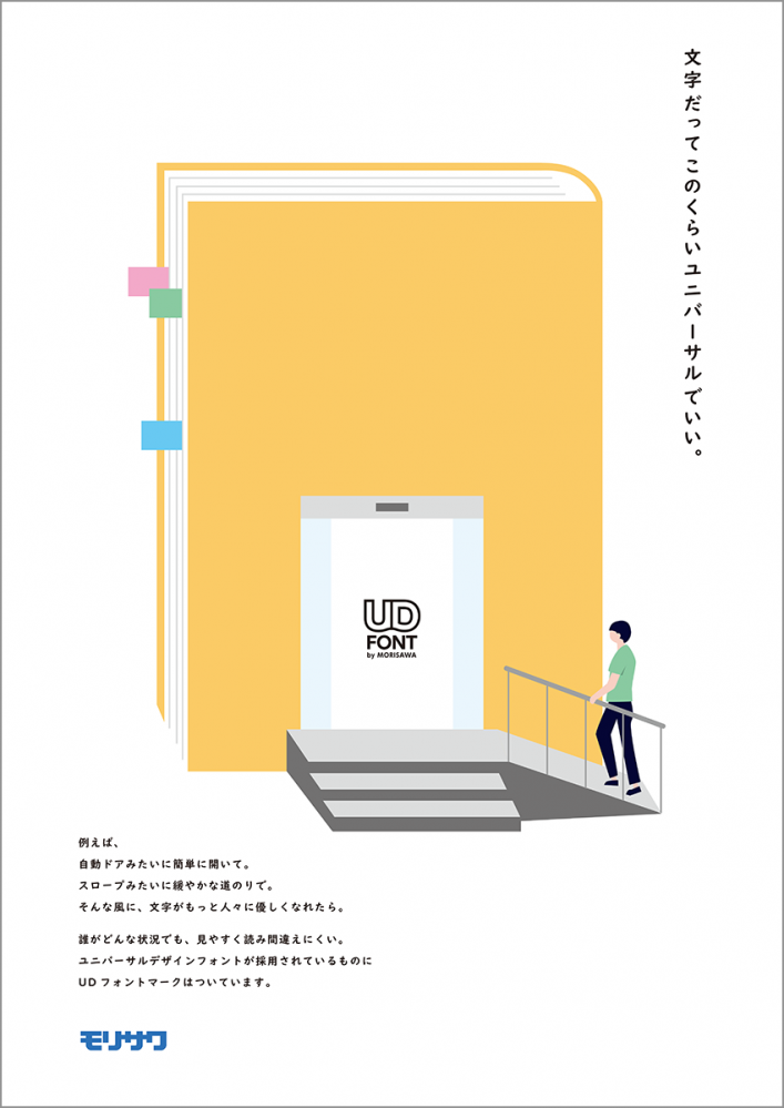
The copy clearly explains UD fonts, which are still not widely understood.
At first glance, the visuals may make you wonder, "What is this?", but once you read the copy and then look at it, you'll see that it's well thought out, and once you understand the meaning, you'll enjoy it twice as much.
Mr. Homma commented on the work.
Q: Please tell us what you are particular about in your work.
We carefully considered how to best convey the purpose and thoughts behind this mark.
We also considered the flow of the image when creating it, using a large, eye-catching color in the center, encouraging people to think by looking at the illustration, and then read the copy to learn more.
Q: What did you do to improve the copy?
First of all, how many people recognize type as design? I thought that perhaps people would remember more the words "Even type can be made into universal design" than explaining what kind of font it was, so I created the main copy with that in mind.
Furthermore, because this alone is too vague, we thought it would be necessary to create a "common image" that many people could relate to. For this reason, we started the sentence with "For example..." and gave examples of automatic doors and ramps, so that readers would associate the idea with the sentence and become interested.
Furthermore, I tried to create a gentle atmosphere by speaking in a staccato style.
Thank you, Homma-san!
"Kind Proof" by Ikue Takamura, Anabuki Business College
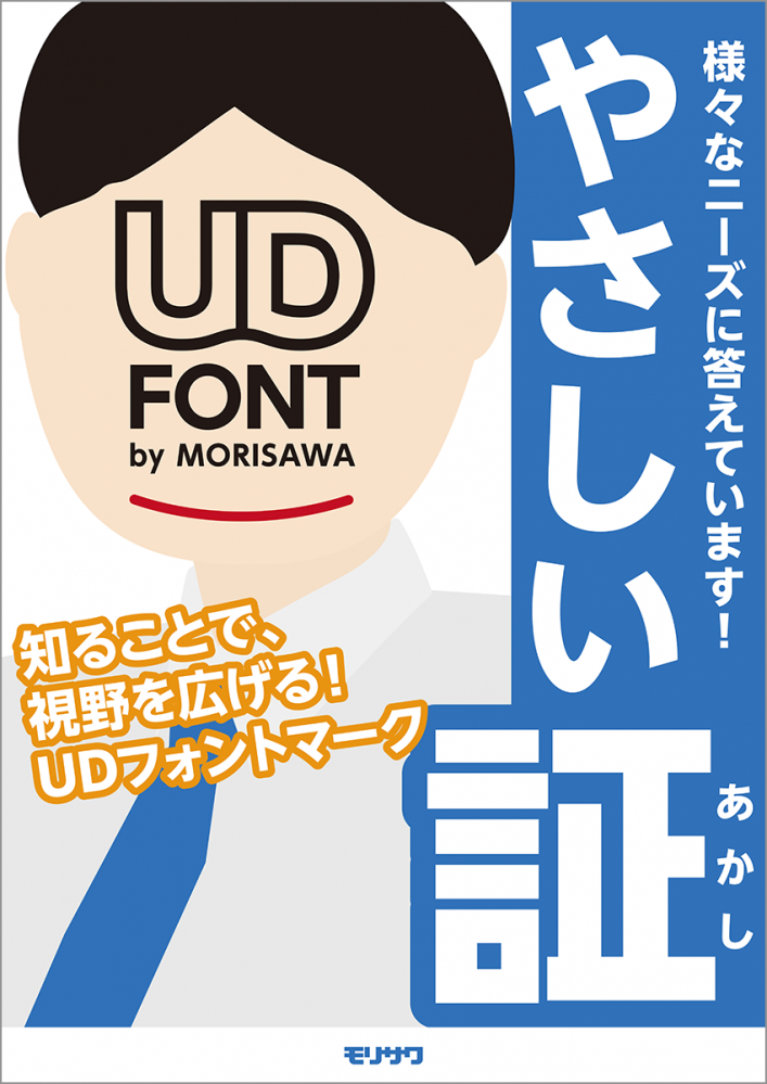
There were many works that used the UD FONT mark as a face, but this one was unique in that it was made to look like an election poster. It cleverly explains the information using the candidate's name and slogan. The name "Yasashii Sho" (Gentle Proof) is easy to understand and has a strong impact!
Takamura-san gave us a comment about the work.
Q: Please tell us what you are particular about in your work.
In order to make many people aware of the UD font mark, we thought it was important to draw attention to the poster.
So, we created an election-style poster layout that conveys the message, "I'm running for your font choice!", and designed it to be interesting for people who see it.
Q: Please tell us what you came up with when it came to the text.
We wanted to include a catchy slogan that would convey the meaning of the UD font mark.
To sum it up in one word, I thought it was a mark that embodied kindness, so I used the words "Kindness Proof" in large letters.
Thank you, Takamura-san!
The works that won the awards were selected from the Japan Advertising Production Association (OAC)siteYou can check it out here.
Thank you to all the participants!
[Notice] Click here for the font pack for students that can be used for four years↓
