
MOZ is a typography magazine produced over the course of a year by students majoring in design at the Graduate School of Fine Arts at Tokyo University of the Arts. Over the next three issues, we will be introducing the contents and latest information on the magazine.
This time, we will introduce the commemorative first issue.
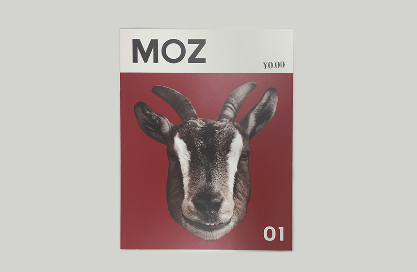
The first issue was published in 2012. The theme was the classic typography theme, "SWISS."
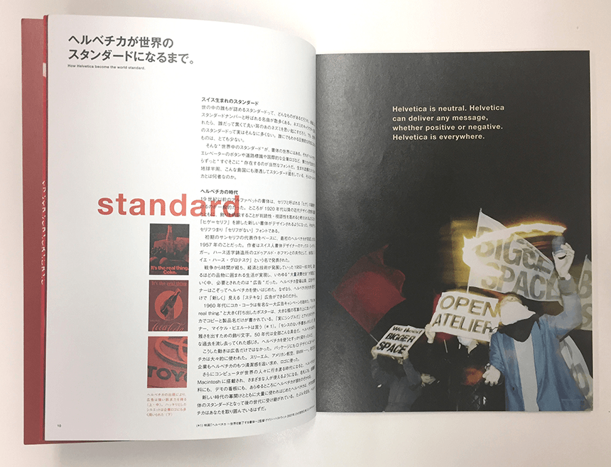
The inaugural issue's special feature focuses on Swiss Typo, with the theme "Why does the world choose Helvetica?" Other content includes a conversation between graphic designer Yoshiaki Irobe and architect Go Hasegawa, as well as interviews with design unit so+ba, Tomohiro Okazaki, and Emi Gordon. The quality is so good you wouldn't believe it's a free paper, and it was so popular that it sold out as soon as it was put up.
You can read the first issue of MOZ for free in electronic format on BCCKS. And if you want to keep it, they will print it for you (for a fee).
https://bccks.jp/bcck/111321/info
*Some content has not yet been distributed. The layout has been edited to match BCCKS.
If you'd like to read it, please check it out. Next time we'll be introducing issue 2. Look forward to it!
(Moripass Club Advisor Hashizume)