Morisawa Inc. has participated in the "OAC Student Advertising Creative Awards 2024" was sponsored by the project. The theme of the project was "Advertisement that makes many students want to use Morisawa's new font products for students".
Morisawa Fonts is a professional font product with over 2,000 fonts available at a special price for students.Morisawa Fonts Standard Plan for Students" We were asked to promote a new service called "Morizawa Fonts." Applicants were provided with limited-edition Morisawa Fonts and asked to create their own fonts.
We will introduce the works that won the Morisawa Award, as well as comments from the Grand Prix winners in the Video and Graphics categories!
The students appealed to us from various angles about the appeal they felt about the service, such as the freedom to choose fonts and price, and we had a lot of fun selecting the winners. There were many attractive works in both the visual and video categories, and the number of winning works was the largest ever.
Graphics Category Grand Prix
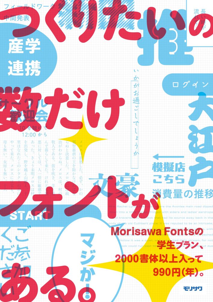
Anabuki Business College, Yoshiko Himeji
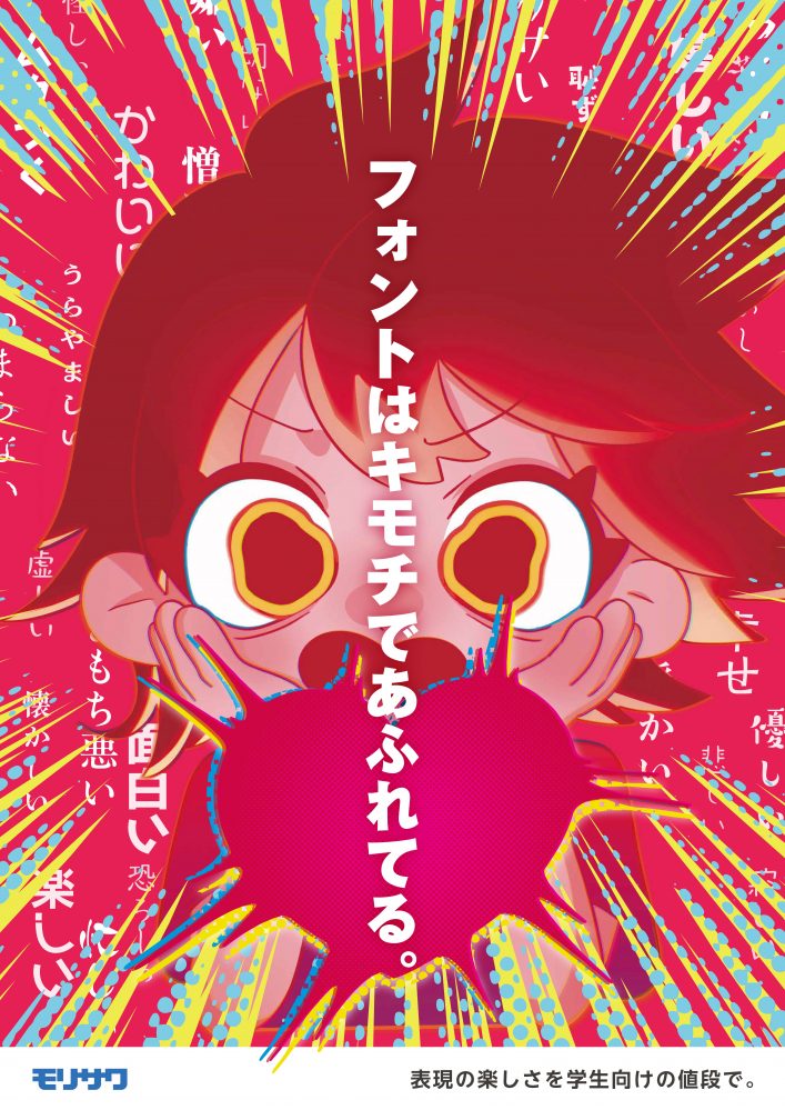
We asked them to use a variety of fonts to express the feelings we wanted to convey, such as "cute" and "fun," through powerful illustrations and copy.
The visuals convey the "joy of expression," and the graphics are both highly polished and convey a powerful message, so we have selected this entry as the Grand Prix winner.
We interviewed Himeji about his winning work.
Q: What are the highlights of the work?
Character facial expressionsis.
Illustration is my hobby, so I wanted to use that to participate and give it a try.
Emotions change in various ways, but I tried my best to make the expressions appear to capture anger, joy, surprise, and so on all at the same time.
Q: What do you think is the most appealing aspect of using Morisawa Fonts?
When creating this piece, I found it easy to quickly find a font that would correspond to the "emotion" of the background.
Video Category Grand Prix
Sophia University, Miki Fujiwara
The video, which was full of various creative ideas, conveyed the students' earnest desire to "communicate their feelings to more people" and "move the hearts of others."
We were attracted to the message that the wide variety of fonts conveys to students as they struggle with creative endeavors, and so we selected this work as the grand prize winner.
We interviewed Fujiwara about his winning work.
Q: What are the highlights of the work?
The characters' growthThis was made as a highlight.
The target audience for this advertisement was students who are taking on various challenges, such as business.
My "challenge" was job hunting. I wanted to convey that even though I struggled during the process, I cooperated with many people, persevered even when it was tough, and continued to challenge myself, so I created a story that started with a scene of failure, then worked with friends, made a presentation, and then decided to try again.
At the end of the video, a message appears saying "Let's challenge the world" with the buildings of Shinjuku in the background, and I think the highlight is seeing the growth of the main character, who struggles but ultimately decides he wants to take on more challenges.
Q: What do you think is the most appealing aspect of using Morisawa Fonts?
This was my first time using Morisawa fonts. It was also my first time downloading fonts or creating an account, so at first I wondered how to do it, but after looking at the website, I was grateful to see how easy it was to use.
On the Morisawa Fonts websiteA system that allows you to test fontsSo it was easy to choose.
This font is also used for signs, so you can get a feel for the font at a glance.Usage exampleIt had a lot of fonts, which I thought was great for me since I'm not used to fonts.
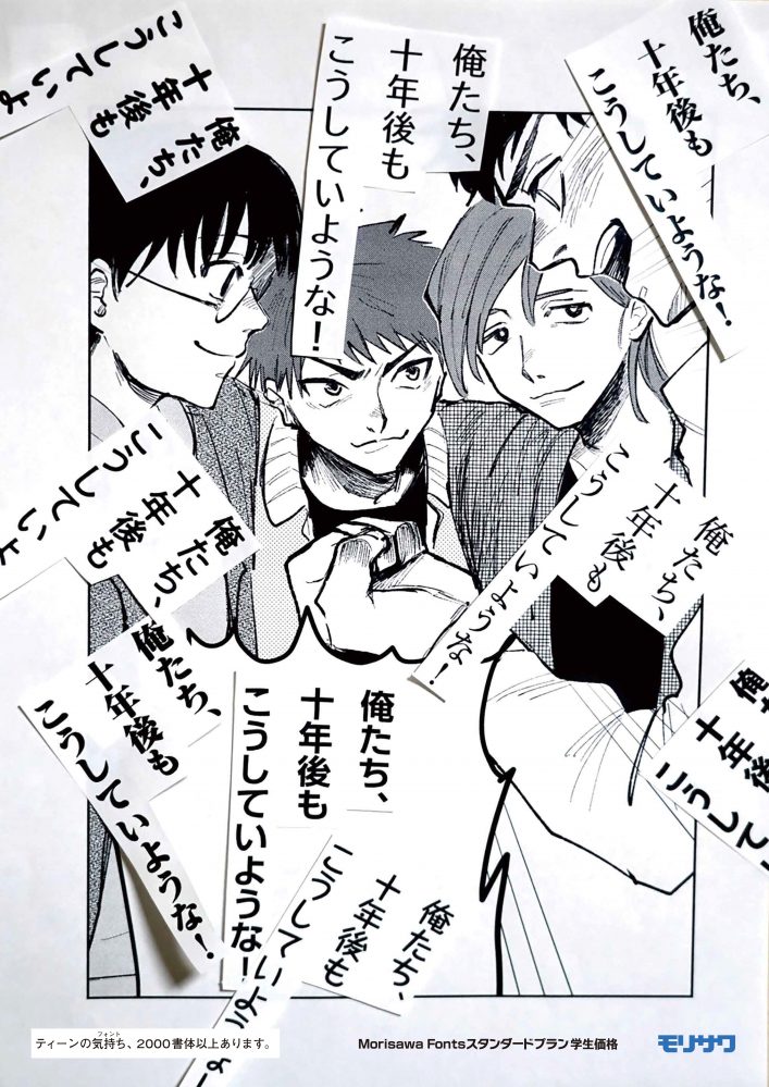
Graphics Category Runner-up
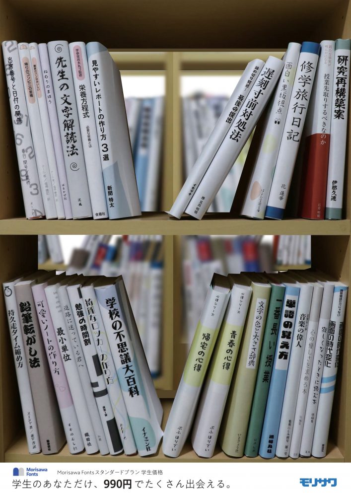
Tama Art University, Inui Hiyori
I was delighted to see that the fonts were used in practical ways to respond to the various things that arise in student life, such as school festivals, research presentations, reports, club activities, and activities related to one's favorite idols.
Morisawa wanted to emphasize how fonts can add color to the diverse creative endeavors of students, and the realistic expressions that made fonts feel familiar were wonderful.
Honoka Hisamitsu, Japan Designer Academy
In addition to the idea of using fonts to represent books, the titles, such as "How to Deal with Lateness" and "Encyclopedia of School Mysteries," are intriguing to students and make them want to read them. The font selection was also a good choice that reflected the style of the book.
Video Category Runner-up
Tokyo University of Technology, Mr. Nakamura Nichinan and Mr. Taniyama Tomoyuki
I was impressed by how the appeal of the service was summarized in a cute fairy tale-style animation: "For 990 yen, you can create a variety of voices for a year." I also enjoyed seeing the many font variations available for the Little Mermaid's singing voice.
Ms. Haruka Morioka, Kagawa Prefectural Zentsuji First High School
The single kanji character and the silhouette of a dancer created a simple yet captivating image. The dance and the font matched well, and the use of carefully selected fonts created a sophisticated piece, making for a convincing video.
Graphics Category Honorable Mention
Aika Ando, Japan Designer Academy
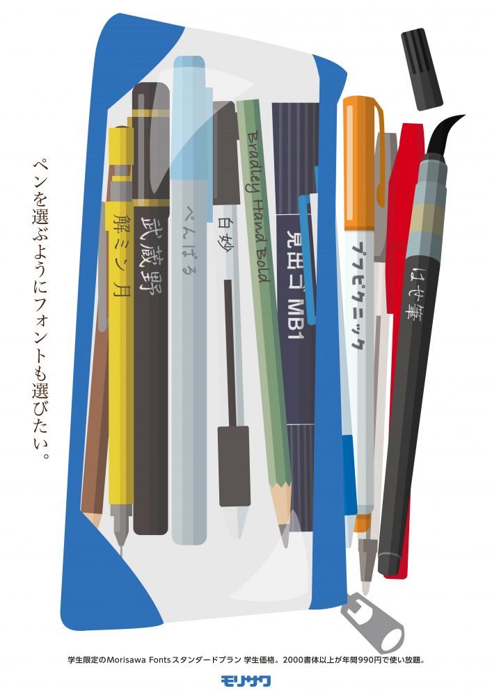
It was great to see how fonts can be viewed as "familiar tools like stationery" and how the wide variety of fonts available can broaden the scope of expression. The font selection also matched the characteristics of stationery.
Haruna Domon, Japan Designer Academy
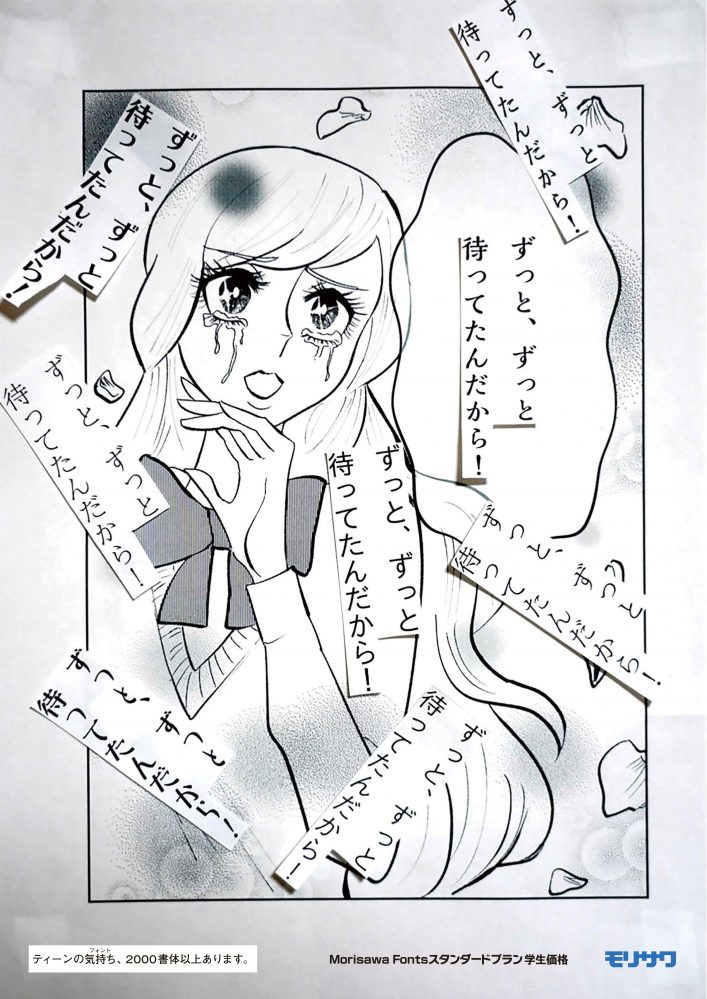
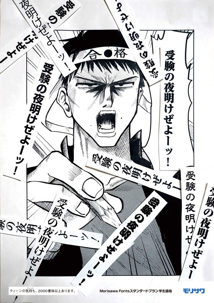
This is an attractive piece of manga illustration that evokes a youthful feeling, with various fonts used for the dialogue in the speech bubbles.
The copy "Teen Feelings (Fonts), Over 2000 Fonts Available" is also excellent.
Honorable Mention in the Video Category
Momoka Yamada, Nagoya Zokei University
I liked how they used fonts to express the anxiety and impatience students can easily relate to, with powerful words like "Any thought can be shaped" and "It will lead to your dreams." The use of handwritten fonts in the copy was also memorable.
Tatsuya Taniyama, Nagoya Zokei University
I liked the message that just as you choose a menu and buy a meal ticket at the school cafeteria, you can choose a font to achieve professional expression.
The winning works are:Japan Advertising Production Association websiteYou can also check it out here. Thank you to all the entrants for your wonderful submissions!
In the next article, we will present a report on the roundtable discussion we held with the award winners.
[Notice] Font service for students who created advertisements is here ↓