
Vantan Game Academy High School and Morisawa Inc. have collaborated on a project called "Turning on the Sensibility of Fonts."
The theme for this event was for high school students studying character design to choose one of the 20 Morisawa fonts, draw an anthropomorphized illustration of it, and place it alongside the font.
Works that are judged to convey the appeal of fonts to students will be turned into novelty items to be distributed to students, exhibited at Tokyo Game Show 2019, and distributed as novelty goods!
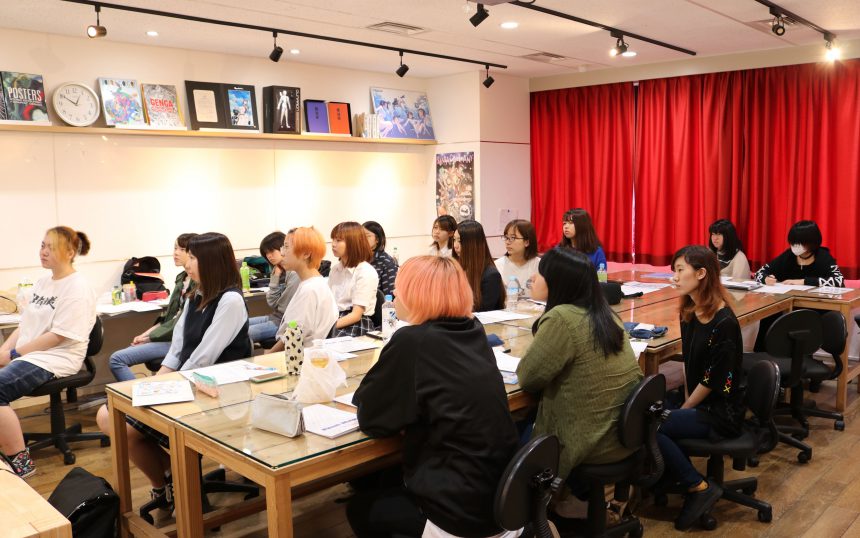
To create an attractive and compelling character, you first need to know about fonts. First, take a seminar to learn what to look for in a typeface and how to choose one.
When drawing character illustrations, you may not have paid much attention to fonts before. However, when you learned that the title logos of familiar manga and animations use fonts that match the worldview of the works, your perspective on fonts seems to have changed a little.
If you find a font that interests you among the 20 typefaces, we will first ask you to research its characteristics and history.
The real test is how you incorporate the characteristics of the font, including the impression you have of it, into your character design!
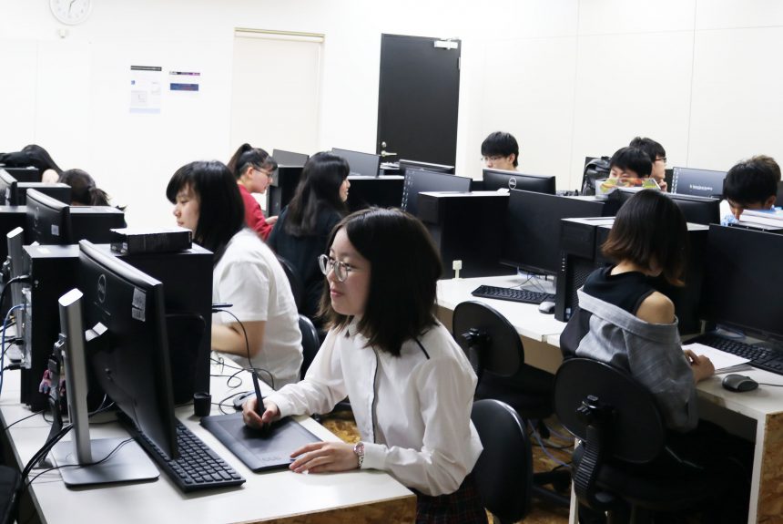
Once the image of the character is solidified, we proceed to actually draw the illustration.
Each person put their own unique touches into their characters, resulting in cute, cool, and unique characters.
Since the character illustrations will be turned into novelty items as they are, we will proceed carefully when placing the typeface name, taking into account the balance with the characters.
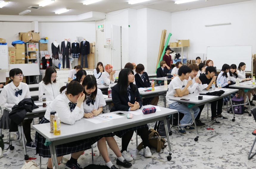
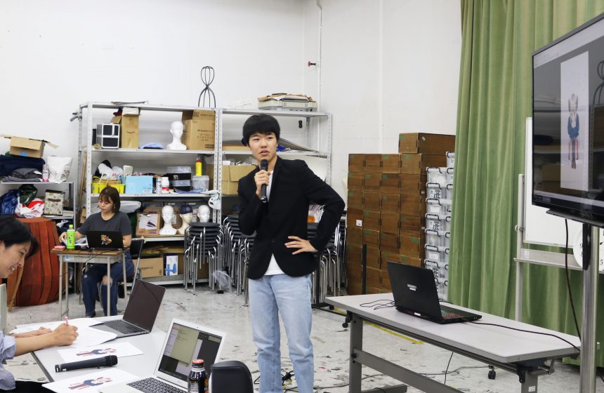
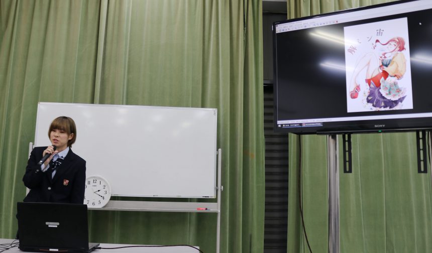
And then the final presentation day arrived.
Everyone looked nervous, but they shared their character designs and favorite fonts.
Which characters will be selected and distributed at Tokyo Game Show 2019?
In the next article, we will introduce the works that were selected as Excellence Award winners and comments from the winners!

Vantan Game Academy High School and Morisawa Inc. have collaborated on a project called "Turning on the Sensibility of Fonts."
The theme of this event was for high school students studying character design to choose one of the 20 Morisawa fonts, draw an anthropomorphized illustration of it, and place it alongside the font.
In the previous article, we introduced the events leading up to the final presentation.
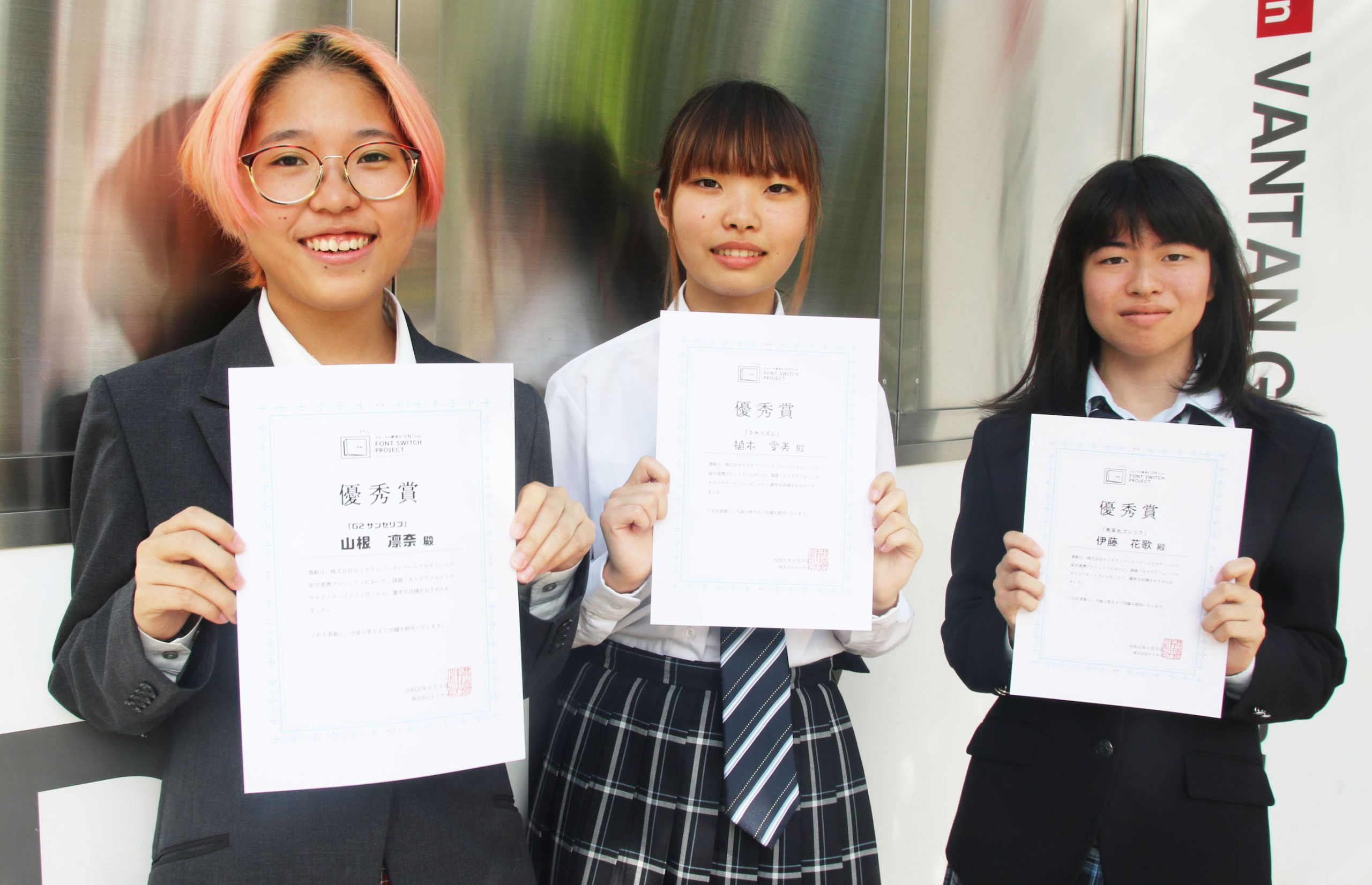
Three outstanding works have been selected to be turned into novelty items and exhibited at the Tokyo Game Show.
Here are comments from the winners and students, as well as a comment from Morisawa!
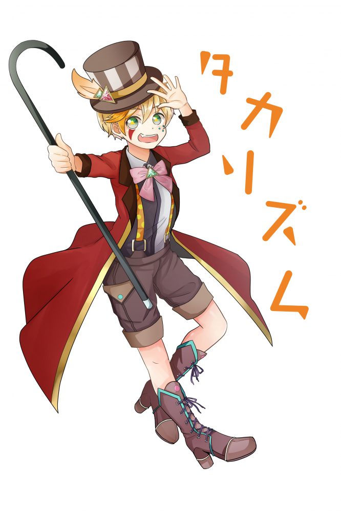
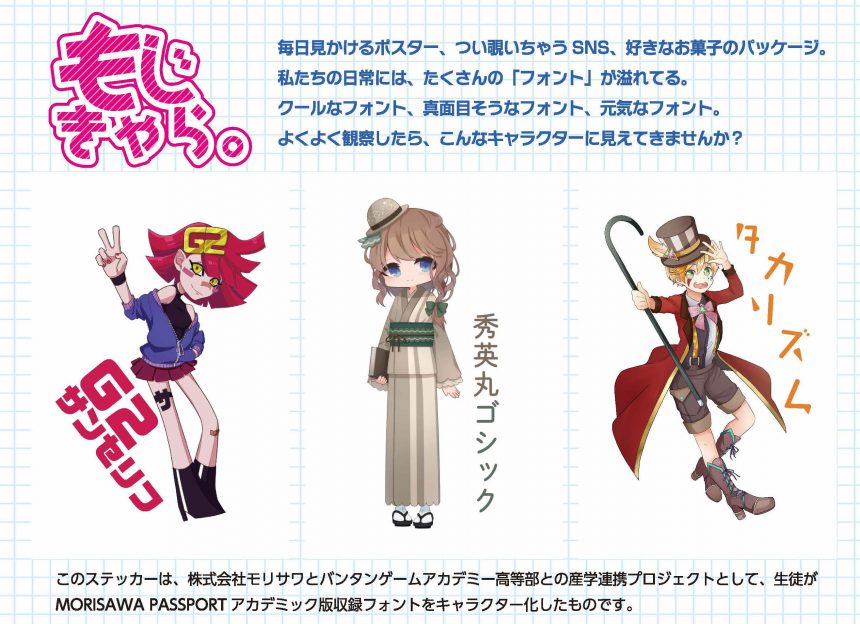
Manami Ueki:Takarism"
I chose this font because I really liked its cute and fun atmosphere.
Takarhythm is a font that is widely used in situations where you want to create a sense of fun, so we created a character based on the image of a circus, a place of entertainment.Since the lettering elements incorporate triangles and circles, we also added decorations with triangle and circle motifs to the character.We've also used it in the eyes and body paint to create a unique Takarhythm look, so I hope you'll take a good look.
It's wonderful that the typeface not only makes use of triangular and round elements in character design, but also evokes the circus, as it can be used to create a fun feel in headlines and logos!
The bright and fun font and the lively boy character are a perfect match, and the font placement is well balanced!
Yamane Rinna:G2 Sans Serif"
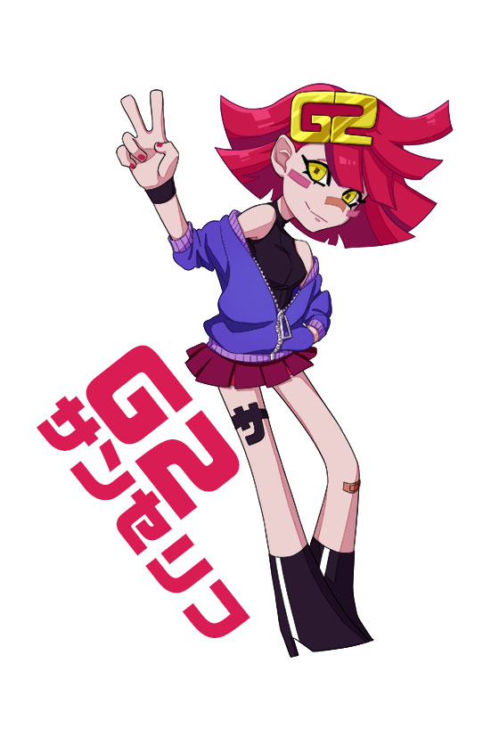
The reason I chose G2 sans serif this time is because I really like the bold, assertive feel it gives. I tried to make my own modifications so as not to destroy the impression I had at first.
The description of the typeface said that "the lines have been cut," so I kept that in mind when designing the hairstyle and the shape of the legs. Because it's a bold typeface, I used highly saturated colors and attached a large G2 hairpin to the character's head, so that even if there's no other typeface next to it, you can tell it's a G2 sans serif character.
The impactful typeface has been turned into a character while preserving its atmosphere. It is clear that the designer has analyzed the impression of a "design that makes a bold statement" and the explanation of "processing that cuts off the flow of the lines" in his own way and incorporated them into the design!
The characters' fashion and color schemes are well thought out!
Hana Ito: "Shuei Maru Gothic"
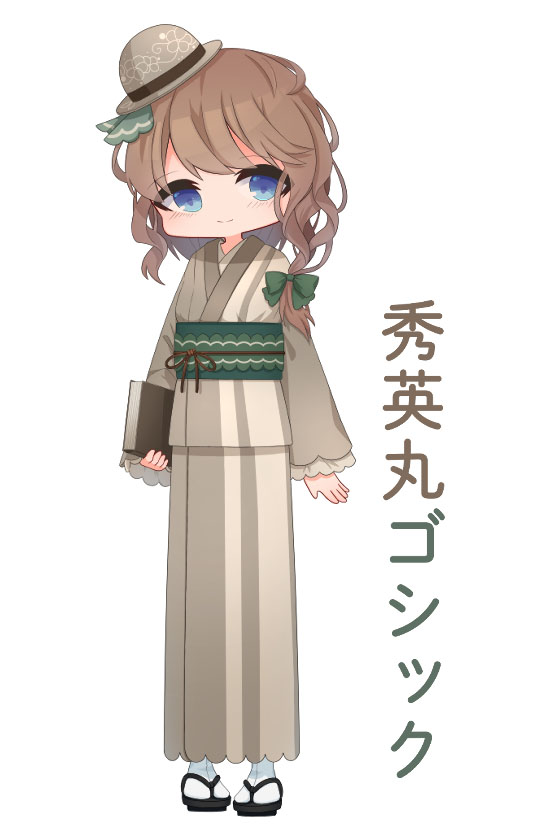
I chose Shuei Maru Gothic because I was attracted to its simple yet cute design with no sharp edges. I wanted to create a classic retro look, and because it has no sharp edges, I used rounded sleeves, obi, hat, etc.
In addition, I used the obi of the kimono to represent the tight pockets, and I used loose hair to represent the gaps between the letters.The special thing we did was make the eye color vivid so that you could see the facial expression.
The way they approached the "Shuei Maru Gothic" typeface, analyzed it, put it into words, and then created the design is fantastic! You can feel the design intent and care in even the smallest details of the character design, which is elegantly put together to match the image of the typeface.
Characters in action at Tokyo Game Show 2019!
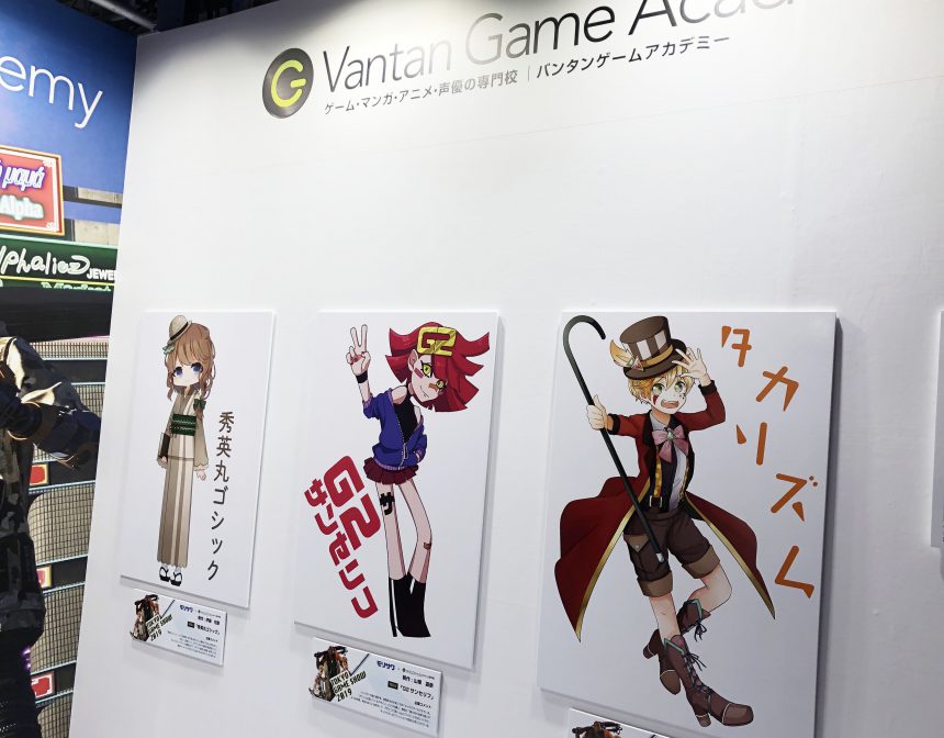
At the Vantan Game Academy booth at the Tokyo Game Show, held from September 2nd to 5th, 2019, the characters were introduced on an exhibition panel and stickers were distributed!
Vantan Game AcademySpecial siteBut we were introduced to the initiative.
I'm sure this was an opportunity for the participants of Tokyo Game Show 2019 to become interested in fonts. Thank you to everyone at the Vantan Game Academy High School Division!