
Morisawa Inc. sponsored the OAC Student Advertising Creative Awards 2022, hosted by the Japan Advertising Creations Association (OAC), a public interest incorporated association, and provided the theme of "an advertisement that makes people want to use the UD Digital Textbook Font."
We would like to introduce the works that have been awarded the Morisawa Award!
Education
I was allowed to judge the works.
The challenge of "font advertising" was likely difficult to find a good example for, but all the entries were so amazing that it was hard to choose!
Video Category Grand Prix
Ayaba Kamata, Kagawa Prefectural Zentsuji First High School
Education
It's a very atmospheric piece.
The first line of the narration states "What we are aiming for" from the perspective of a teacher, and the detailed print of the props and the lighting at night all give the impression of a solid worldview!
I think this is a piece that teachers will relate to and want to use the font.
Thank you, Kamata-san, for submitting your work! Next, we will introduce the winning works in the graphics category.
Graphics Category Grand Prix
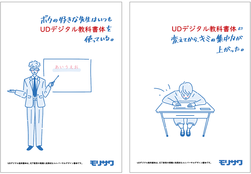
Bunka Gakuen University Kuiken Stella "Me and the Teacher"
Education
What caught my eye was the cute illustrations.
I was very impressed by how the story of the trust between teacher and student expressed how using the UD digital textbook font benefits both teachers and students, as it increases students' concentration and promotes learning, and also makes it easier for students to learn.
I also love how they combine fonts with hand-drawn letters!
Kuiken-san gave us a comment about the work.
Q: What are the key points of your work?
With a focus on making the design easy to see at a glance, we incorporated Morisawa Blue while limiting the number of colors to create a simple look.
Q: What did you do to promote fonts?
We wanted to create content that would resonate with people who actually use the font, not just in its beauty and readability, but also in the situations that arise from using it.
Q: What were the challenges you faced throughout the production?
I searched for the atmosphere of the illustration. I expressed the scene with simple lines so that the content would be conveyed, and made small adjustments such as adding distinctive features to the characters to add a bit of uniqueness.
Thank you, Kuiken!
Graphics Category Runner-up
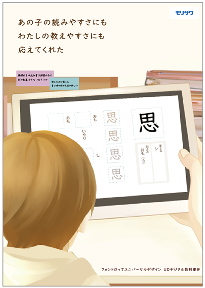
Aiki Ogawa, Nagoya Zokei University "Universal design that is easy to read and teach"
Education
Fonts exist for those who read them and those who create things using them. While many of the works focused on the theme of "easy to read" for the viewer, this artist constructed a work with the font user as the main character!
Since there is no main character depicted, I think viewers can put themselves in the ad's shoes. The warm colors also give it a nice feel.
Mr. Ogawa commented on the work.
Q: What are the key points of your work?
The UD Digital Textbook Font is not only a universally designed and easy-to-read font, but also an effective font for ICT education, so we made it clear who we wanted to use this font for in particular. To achieve this, we used the term "teachability" and set up a scenario in which a child is shown a printout displayed on a tablet.
Another thing we pay particular attention to is that the teachers write their thoughts on sticky notes attached to the bookshelf on their desks.
Q: What were some of the creative ideas you used to advertise fonts?
Rather than just saying, "This font is good for some reason!", we came up with copy that would convey to anyone what kind of typeface it is, so that they would think this font is good for a certain reason. We also devised the overall color scheme so that the visuals don't stand out too much.
Q: What were some of the difficulties you faced throughout the production?
I had a hard time creating the illustration. I wanted to use an illustration that looked somewhat realistic, so I used a tablet I had and photos of my own hands, and drew it through trial and error.
I also spent a lot of time adjusting the colors to match the atmosphere of the illustration with the atmosphere of the font.
Thank you, Ogawa-san!
The works that won the awards were selected from the Japan Advertising Production Association (OAC)siteYou can check it out here.
Thank you to all the participants!
[Notice] Click here for the font pack for students that can be used for four years↓
