The school project started in August. In this article, we will provide a short report on the second school, which was held on Wednesday, September 21, 2022, highlighting some of the participants' works.
If you would like to watch the entire video, you can watch the archive by registering the form.
→ Archive here
Report
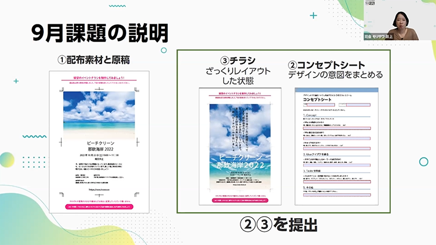
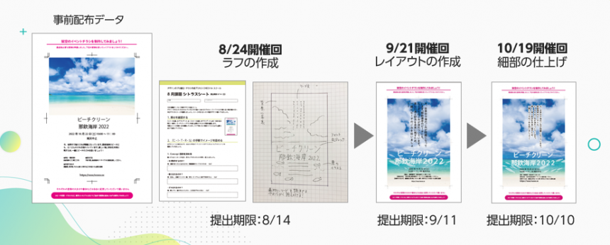
Students will be asked to create and submit a flyer for a fictional beach clean-up event as homework beforehand. On the day of the event, Shibuya will provide comments on the selected assignments.
The second assignment, in September, involves using an application to layout the handwritten rough sketches created in the school last month.
Thank you to everyone who submitted challenges!
Your submissions
Nakanaka-san
We asked them to use a lot of shell material. They were concerned about the fragmented feel and lack of sharpness in the composition.
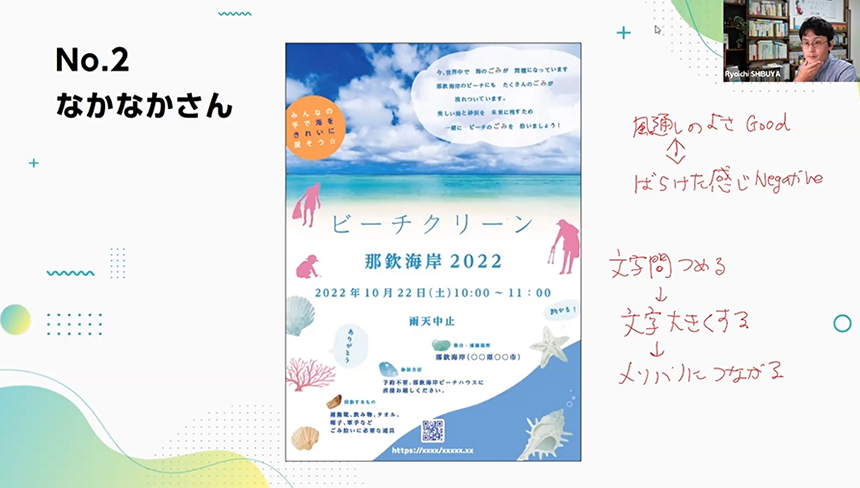
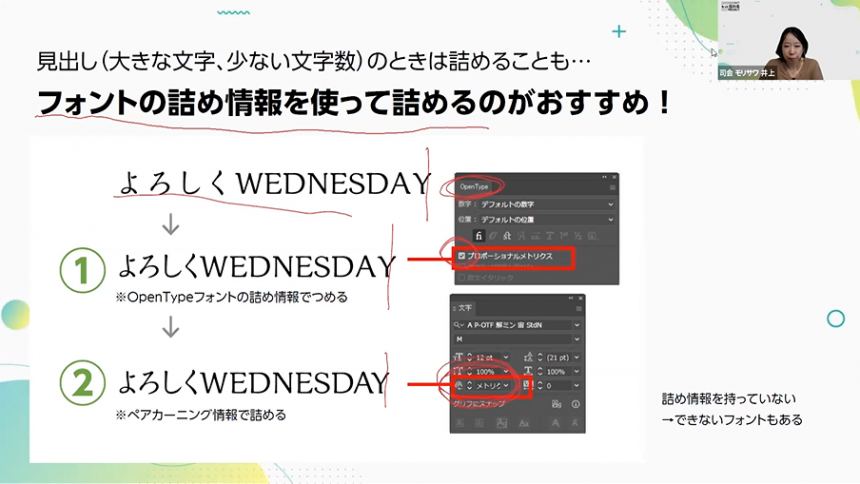
This really captures the airy atmosphere. If you narrow the spacing between the letters and increase their size, the overall look will be more vibrant.
As was mentioned during the stream, there is a preconceived notion that leaving more space between characters makes something look more stylish, and this was an opportunity to rethink that idea.
I discovered many interesting things, such as the fact that the number of fonts to use on one flyer is less than I expected. Thank you very much!!!
Morisawa has also provided additional information on recommended character spacing settings from font manufacturers, including Illustrator's OpenType function and methods for reducing spacing using pair kerning information!
Akiko Taniguchi
The blue is striking. It seems you are having trouble choosing and using materials for decoration.
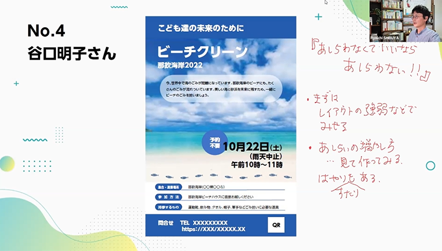
It's easy to expand your repertoire of design ideas, so I think it's better to start by learning how to create a good look using layout, margins, and emphasis.
If you add decorations to everything, it will lose its cohesion, so if you add decorations to this flyer, it's best to put them around the title and catchphrase, or wherever you want to draw attention.
We learned about how to use garnishes and the habits that Shibuya practices to increase the number of garnishes he uses!
I'm thrilled that you took up my issue. I asked a question about ashirai, and I'm grateful for the detailed response. I thought it was important to use ashirai effectively, and I was struggling, so I was relieved to hear your advice that "you don't have to force yourself to use it."
I also learned a lot from the tips I received from the program, such as bringing back printed materials when I went out to learn about the latest trends. I would like to increase my knowledge of design in the city in my daily life. Thank you very much.
Koreito-san
This was submitted as a free assignment. The client seemed to be struggling with how to present a design with a lot of text.
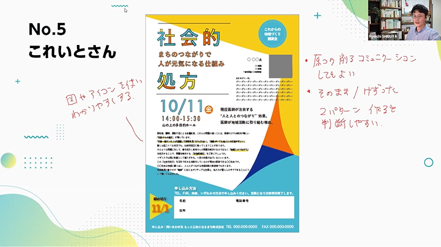
You don't necessarily have to layout the manuscript you're provided, so it might be a good idea to negotiate with the client by saying, "It will be this small."
If there are elements that can be converted into figures, you can also replace text with icons or figures.
Shibuya gave us some practical advice, including things to keep in mind when proposing manuscript cuts!
I was worried about whether it was okay to complete a flyer for work as it was, but by having it reviewed before the deadline, I was able to correct any areas for improvement and complete it.
There are many things I want to convey, and I often end up writing a lot of text, but I learned the simple fact that I can communicate without reading. If I were to be greedy, I would have been happy if I had received praise lol
For those who want to see the whole story
The school will also feature works that were not included in the report. If you would like to see all of the submitted works, please register using the form below to watch the archived video.
Next time, we will report on the final layout creation session, which was held on October 19th.
Instructor introduction
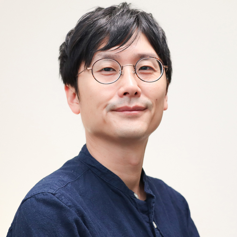
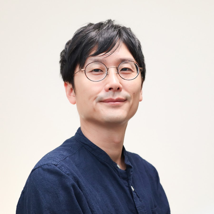
Shibuya RyoichiMr.
Art director and designer. YouTube428: Pachi Pachi Design ChannelHe is currently broadcasting about the work of graphic designers and the designer mindset. He has a reputation for being "easy to understand" even for people who have never studied design professionally.
His second book,The basic design theory' (Shoeisha) will be released on December 7, 2022.
All three sessions of the school have already concluded, but Shibuya's YouTube channel "428: Pachi Pachi Design Channel" is currently broadcasting about the work of a graphic designer and the designer mindset.
If you want to learn about design, be sure to check it out!
The report of the first school held on August 24th is here:
The report of the seminar held on July 20th is here.
If you want to use fonts in your designs, click here ↓