

For teachers and staff of Tamatsukuri Junior High School in Namegata City, Ibaraki PrefectureDesign improvement training that "communicates" with UD fonts(August 23, 2022) In Namegata City, Ibaraki Prefecture, the teachers' and staff's PCs and GIGA School Project terminals (student PCs) were equipped with theUD font plan for public organizationsWe have introduced this system to develop our personnel so that each individual can disseminate information that is easy to understand. This training was planned as part of that effort.
Report on group training days
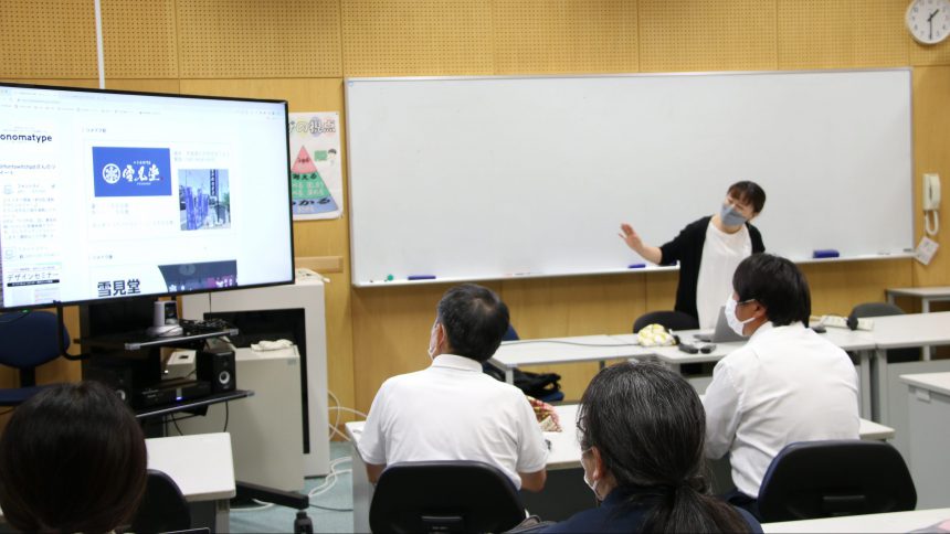
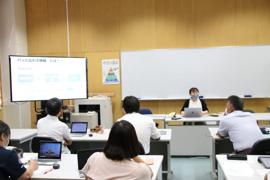
This time, we will report on a group training session in which participants took a video training course on the basics of creating information that can be communicated, and then provided advice and follow-up on the assignments that teachers and staff submitted in advance.
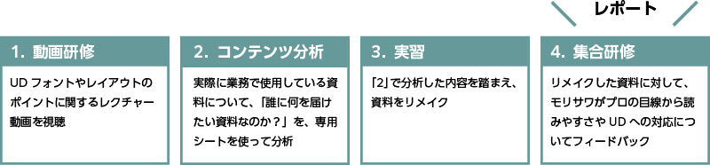
Picking out the issues faced by participants
We will pick out multiple challenges and share the problems we face when creating them, learning the know-how to solve them together.
There is a lot of text in teaching materials and class newsletters.Tips for making your text easier to readIs there any?
People tend to make the text larger, but in fact, it is more important to consider the size of the text than the font size.Line spacing has a big impact on readability!
By spacing the lines properly, your text will be easier to read without having to increase the font size, so give it a try.
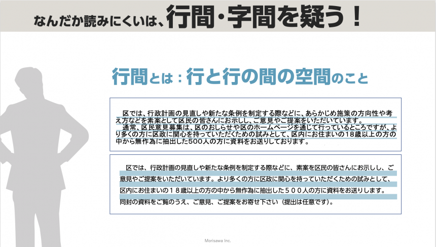
We gained a deeper understanding of why line spacing is necessary to improve readability. We also practiced convenient line spacing settings during work time.
I would like to use it as teaching material for my English classes, so I would like to know more about the UD Digital Textbook Font Roman Series!
The UD Digital Textbook Font is a font that comes standard with Windows 10.
They are different, so let's check them out together!
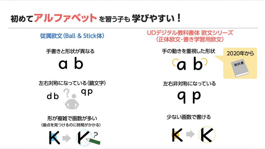
We followed up by giving lectures on how to use the included fonts in different situations so that the students can start putting them into practice in creating teaching materials today.
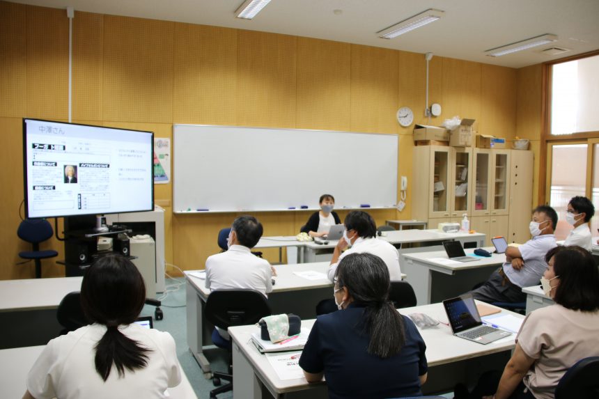
Advice to all participants based on the materials submitted by the participants
The instructor reviewed the materials that the faculty and staff normally create and gave a lecture on points that everyone should learn in common.
- The difference between "to convey" and "to convey"
- How to prioritize information
- About Color
- Tips for organizing information neatly
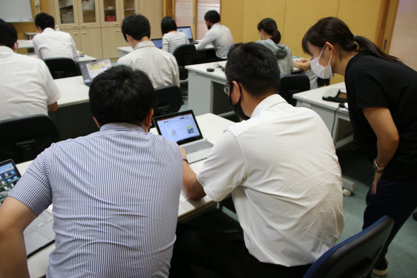
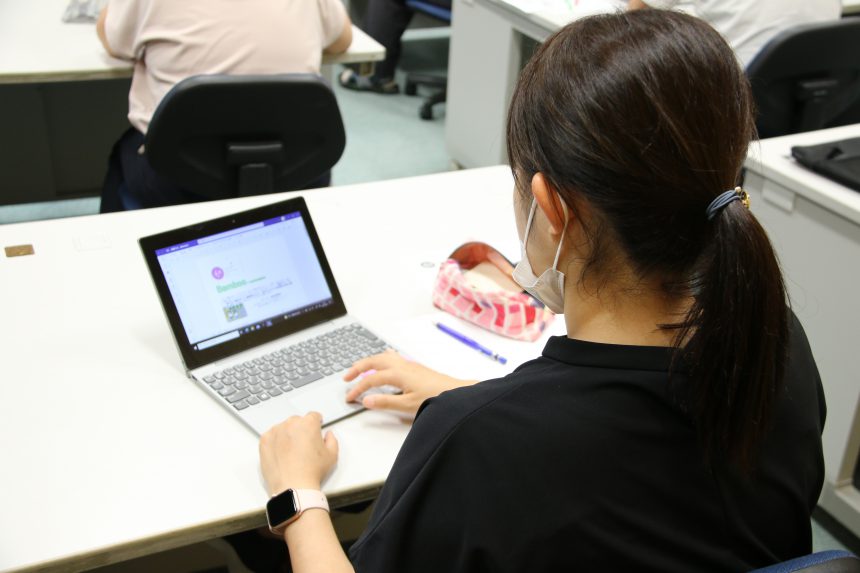
Remaking materials (work)
Based on the know-how learned in the first half, you have once again remade your own materials.
With individual instruction from the instructor and the teachers sharing their know-how, each participant was able to remake the materials into something that was "easy to see" and "easy to read."
Introducing the remade materials of participants
Mr. Kurihara
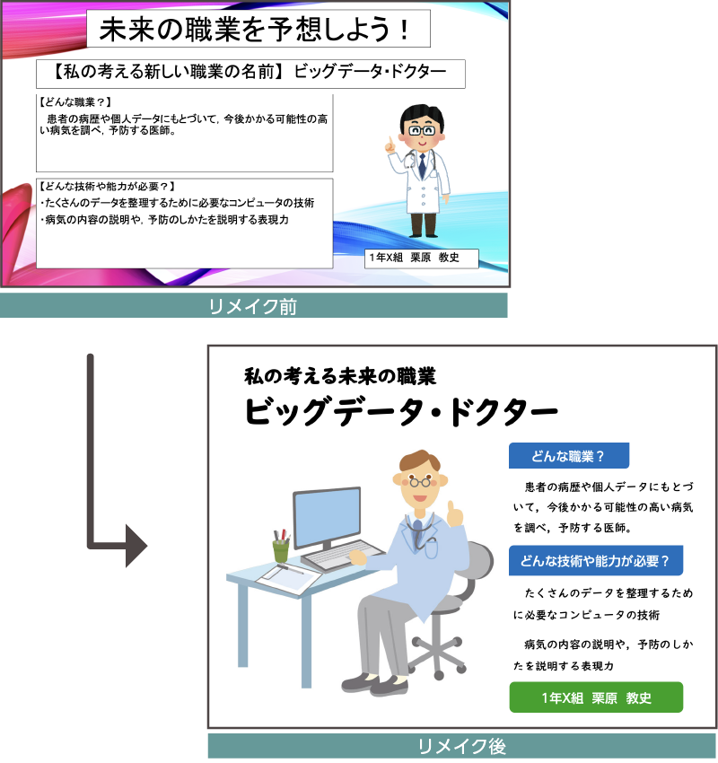
Point! Document design that "communicates"
- The layout (balance of visuals and text) makes you want to read it quickly.
- By prioritizing information and removing background colors that have lower priority, it became easier to read.
- The lines are spaced well, making it easier to read
Professor Ito
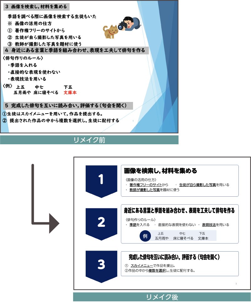
Point! Document design that "communicates"
- It is now visually clear that the document is a procedural document.
- The lines are well spaced, making it easier to read
- The information is organized and easy to read
In both teachers' materials, by understanding the priority of the information, they were able to remove background visuals and add contrast to the text to draw the eye to the elements.
Comments from participants
In this training, I used it somehow.Just by changing the font a little, the ease with which your message is conveyed to others can change dramatically.I learned a lot from this.
thank you very much!
By watching the video, I was able to understand the key points when creating it.
In the final training,Key points for creating materials that don't give readers unnecessary informationI learned a lot from your guidance.
All the teachers who attendedI would like to use UD fonts in my work in the future.The answer given was:
A wide range of materials were given as examples of situations in which the know-how gained in this training could be put to use.
- Learning Worksheets
- Study materials
- Handouts to students and parents
- Research presentation materials
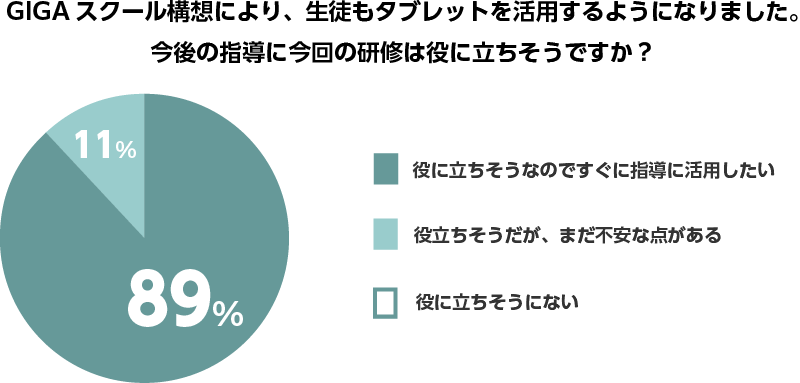
In the survey, students as well as teachers have begun to use tablets to create presentation materials, etc., and the content was highly praised as being immediately applicable to these teaching methods.
We also plan to continue to follow up with teachers who still have concerns through our seminars and other means.
Presentation materials and class reports created by students of Tamazukuri Junior High SchoolHereYou can view it from here.
I felt that the teachers had a very strong desire to communicate.
We hope that you will use our know-how to create documents that convey your thoughts effectively.
For local governments like Namegata City that have signed up for the UD Font Plan for Public Organizations, we will not only provide the fonts at a special price, but also make suggestions to help them use the fonts in a way that is more in line with their intended use.
Utilizing UD fontsTraining in document design that "communicates"If you are a school interested in this or if you are interested in our UD font plan for public organizations, please feel free to contact us.
To use UD fonts in Office applications on personal computers, MORISAWA BIZ+ is available. For details,Here
Free membership registration allows you to download free fonts and purchase paid fonts.Here