

Yamagata City Hall in Yamagata Prefecture implemented a document design program for its staff to "communicate."
In this article, we will introduce the changes in materials after the training session, as told to participants, and the effects of the materials becoming easier to read.
Participants
Public Relations Division
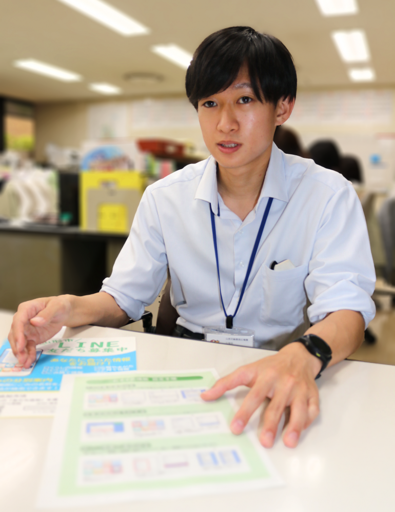
Junpei Nishiyama Mr. Miss.
Changes in materials after participating in the training session
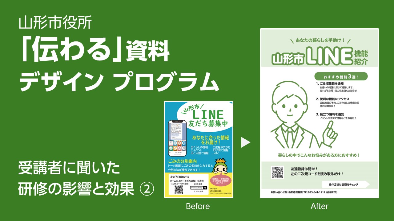
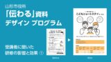
Nishiyama-san used the know-how he gained from our training to remake the "Yamagata City Official Line Registration Flyer." First, let's take a look at the before and after of the remake.
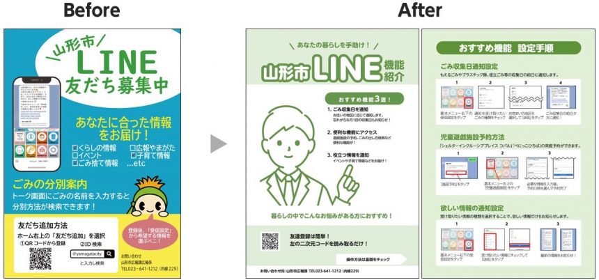
- By utilizing jump rates and weights (character thickness), it is now easier to recognize the roles of headings and body text, and the priority of information can be visually understood.
- The before design also used some UD fonts, but by standardizing the font used to "BIZUD Shinmaru Gothic," the materials have a unified look.
Morisawa:
Initially, the layout was intended to convey the local government's desire for people to add the app as friends on LINE, but the After design has been revised to convey that the information is useful to citizens (features that are useful in daily life, and information can be easily obtained on LINE), and that it is a tool that is useful in citizens' daily lives.
Also, by splitting the flyer into a double-sided version instead of a single-sided one, the amount of information per page is narrowed down, making it easier to see what the important content is.By utilizing jump rates and weights, the information was organized, making the material easy to grasp even in a short amount of time, and creating material that is interesting and makes people want to read it.
What do you think?! Comparing the before and after, you can see that there was a big change. Next, Nishiyama-san talked about what he felt when he remade his own materials and the changes he experienced after acquiring the skills.
Attracting the interest of citizensFlyer
The flyers were placed on racks in the city hall so that residents could take them freely. Over the course of about two weeks, residents took about 40 copies.Compared to other flyers, the materials were sold out at a faster pace.So,Interesting flyersI feel that this could have been achieved.
Cut your work time in half! Experience the increased work efficiency
By being conscious of the "jump rate" and "aligning elements" that I learned in the training session, I was able to create easy-to-read materials.By learning the key points for making documents easy to read, I was able to create them faster and my work efficiency improved..
Furthermore, when requesting materials or booklets from external companies, I was able to make more specific requests because I now have the knowledge to create materials that "communicate."This reduced the number of exchanges and cut the production time in half.
The readability of materials also affects the impression of the city.
After the training, I planned a feature article for the newsletter. I wanted to draw attention to what I needed to convey in the feature.The paper was planned with the intention of creating a layout that would guide readers.
A special feature planned by Nishiyama (public relations paper "Yamagata Public Relations May 1, 2024 issue"twist)
As a public relations officer, I hope that by making materials easier to read, citizens will see that our local government is a progressive, forward-thinking organization.The readability of the materials affects the impression of the city and also leads to an improvement in Yamagata City's image.I believe this is the case, so I would like to spread the word about how to create information that is easy to understand so that this skill can be spread throughout the entire agency.
Morisawa:
Now that the materials are easier to read, we can create materials that will catch the attention of residents and pique their interest.
and,As employees acquire these skills, they are beginning to have a variety of effects both inside and outside of city hall, such as increased work efficiency, improved ability to communicate information to citizens, and an improved image of the local government.
We have also published interviews with staff who participated in the training session, along with Mr. Nishiyama, who we spoke to this time. Please take a look!
Materials introducing details of the document creation training (costs, process, participant feedback, etc.) can be downloaded for free here.
If you are interested in the document creation training session or the UD fonts used in the training session, or if you are considering introducing or utilizing them, please feel free to ask us any questions below.
● If you want to use UD fonts as an organization, we recommend the "MORISAWA BIZ+ UD Font Plan for Public Organizations." For details of the plan,Here