Have you ever had trouble getting your point across in a presentation or project materials? In this series of columns, Toyomane, known as the "PowerPoint comedian" who shares know-how on Twitter for quickly getting your point across and has amassed over 90,000 followers, will share tips on creating PowerPoint materials and the relationship between fonts.
We don't know much about fonts
When creating materials, it is unavoidableFont selectionAs we have seen so far, fonts are an important factor that greatly influences the clarity and impression of documents.
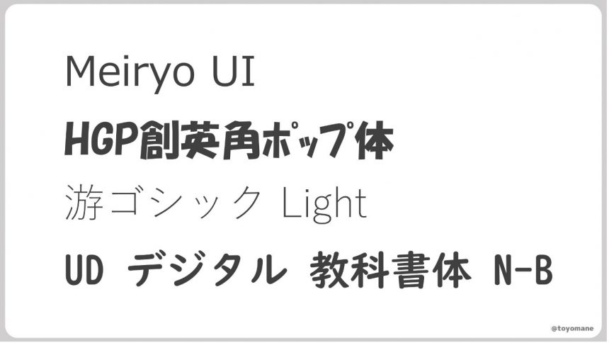
However, we don't know much about fonts. We just choose fonts based on their appearance, such as "Meiryo UI," "HGP Soei Kaku Pop," or "Yu Gothic Light."The name contains mysterious alphabets, and there is a font with a slightly similar name.I'm just going to ignore that. How much do you understand about the meaning of these font names?
Well, to be honest, you can get by without knowing the name, but knowing it might make creating documents a little more fun, so today let's take a look at the name of this font.
What are P and K?
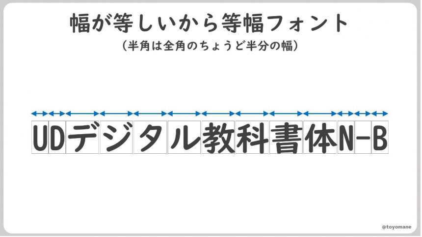
Now, let's take a closer look at the font name.UD Digital Textbook FontLet's try using ". It's a round and cute font. It seems like it would be a good fit for writing folk tales. As it is a textbook font, it would be perfect for writing Gon the Fox.
Now, this "UD Digital Textbook Font." If you look closely, you will see that there are three types with slightly different names. The difference isN" followed by "K"or"P" is present or absent. They look almost the same font, but what is the difference?
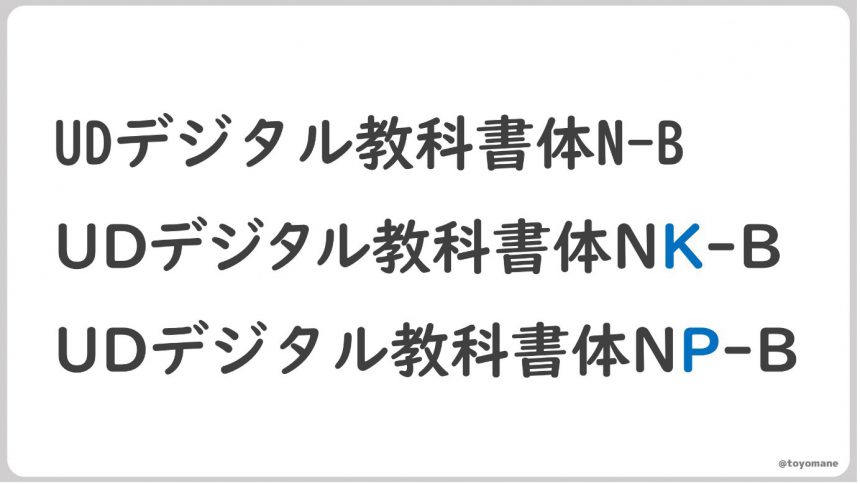
First, let's look at a blank font.monospaced fontThis is a type of font called a "square font," in which all the characters are the same width. It's like writing letters on graph paper.
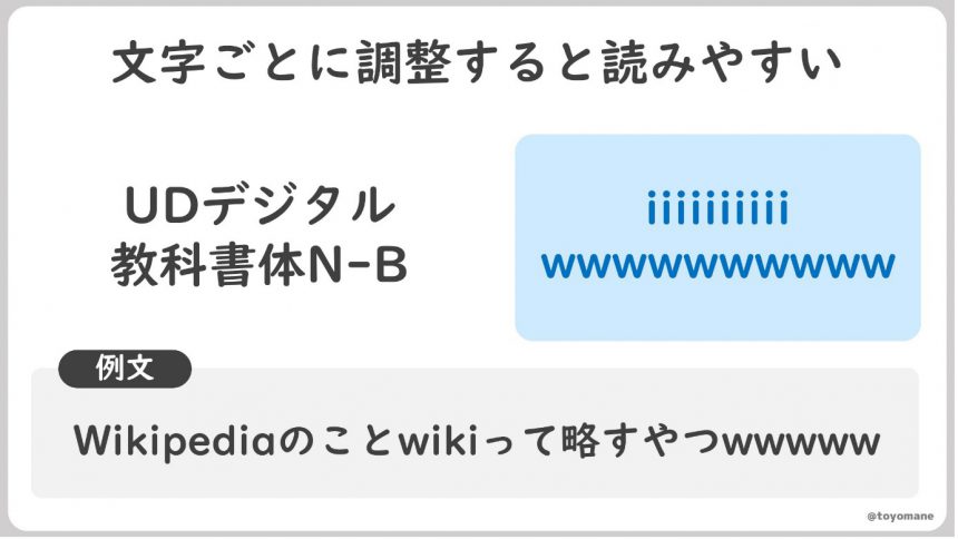
On the other hand, fonts that contain the letter "P"Proportional fontThe "P" stands for "Proportional," which means "balanced" or "well-balanced." Unlike monospaced fonts, this font has different widths for each character.
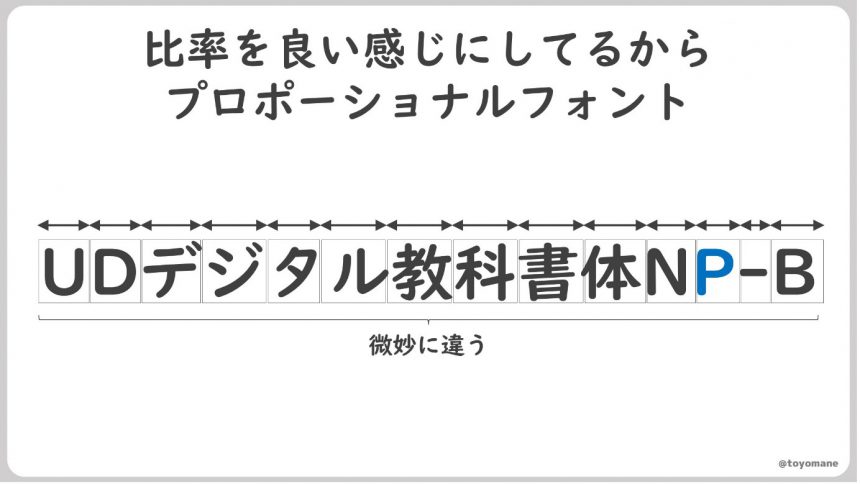
The reason why we do such a tedious job of subtly changing the width according to the type of character is that it is better to do so.Because it's incredibly easy to readis.
For example, between the letters "i" and "w," the letter "w" is clearly wider. If they were displayed with the same width, the "i" would appear stretched out, and the "w" would appear cramped.
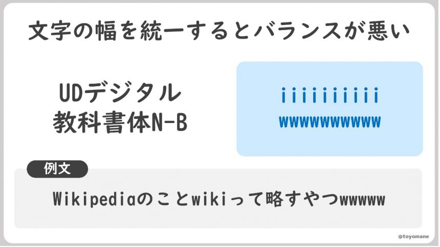
On the other hand, narrowing the width of the "i" and widening the width of the "w" will improve the overall balance and make it easier to read.
By the way"K"teethKana and alphanumeric characters are proportional, and full-width characters are monospaced.This is a type of font also known as a subproportional font.
Generally, proportional fonts are recommended when creating documents. However, monospaced fonts have neatly aligned vertical lines, so they are useful when it is important to have a consistent number of characters, such as in programming. It is a good idea to use them depending on the time and situation.
."UD Digital Textbook Font" is a font installed on Windows 10 and later.It is at the bottom of the font menu, so please look for "Monospace", "P", and "K" and try using them.Click here.
What are Light and Medium?
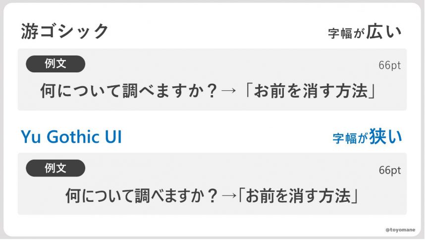
Next, we will introduce the standard Windows font, "Yu GothicLet's take a look at "Yu Gothic." There are actually a surprising number of different types of fonts.
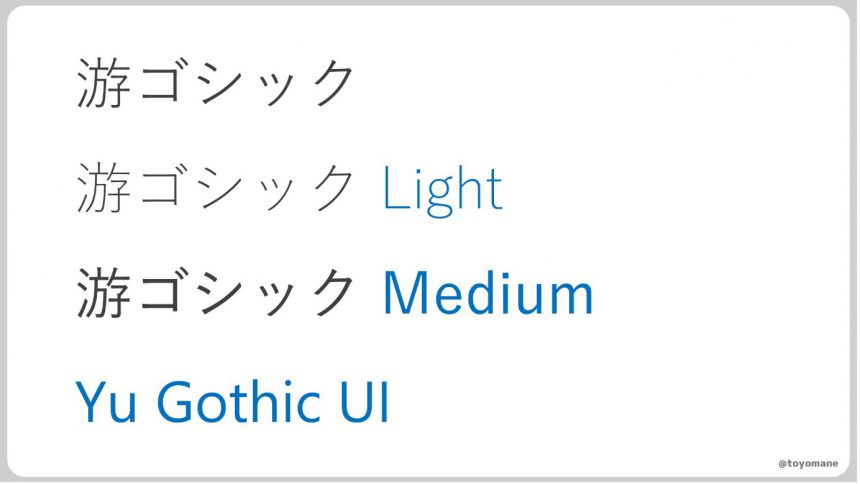
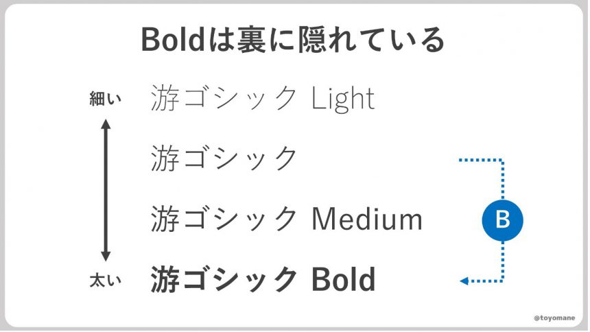
First, let's look at the Japanese "Yu Gothic" series. As you can see from the subtle differences in appearance, these are a series of fonts of the same type but with slightly different weights (thickness). By using different fonts depending on the purpose, you can create a variety of expressions. Incidentally, the thicker version of Yu Gothic, "Bold," can be called up by selecting the plain Yu Gothic and pressing the B (bold) button. Note that it cannot be selected from the font list.
Also, Light and Medium cannot be used to make text bold because pressing the B button does not call up a bold font. If you want to add contrast to the text, use the original Yu Gothic font in addition.
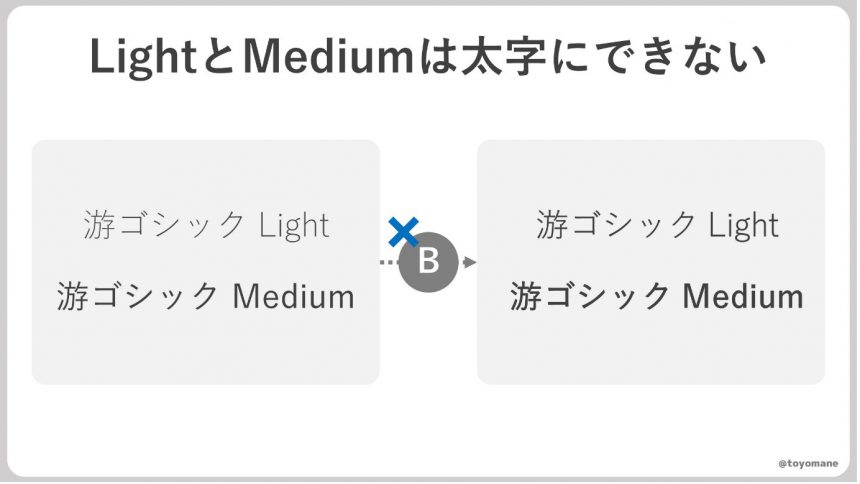
Morisawa'sBIZ UDP ShingoSeries such asYu GothicSimilarly, some text can be made bold with the B button, while others cannot. Please be careful when using them.
So, in EnglishYu Gothic UIWhat does that mean?
This is a font that is only available on Windows.UI (User Interface)As the name suggests, this font was originally developed for displaying on system menu screens, etc. It is designed with narrow character widths in order to fit many characters on a small screen.
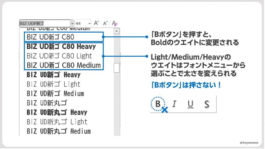
As shown in the figure aboveBIZ UD new C80is thisA narrow font similar to Yu Gothic UI(C stands for Condens) It is a paid service, but it comes in 80% and 60% widths, so it may be a good choice for those who use a lot of tables.
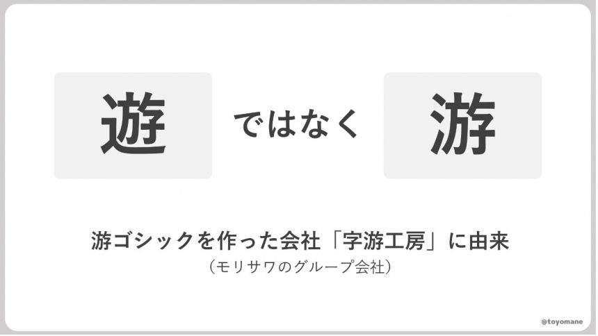
As an aside, the "yu" in Yu Gothic does not mean "play." I don't think you'll write Yu Gothic by hand very often, but please pay attention. By the way, although the kanji are different, the meaning seems to have roughly the same nuance.
Learn fonts to create unique documents
The more you learn about fonts, the more profound they become. With the motto "60% of documents are text," try to gain a deeper understanding of fonts and create documents that are a little different and easy to understand. Have a wonderful PowerPoint life!

Toyomane (Toyomane, blue background)
Born in Tokyo in 1994. Graduated from the Faculty of Engineering at the University of Tokyo. While working at Suntory, where he is in charge of CRM and advertising for the mail-order business, he is also involved in the creation of PowerPoint slides as a hobby, which are used on Twitter (@toyomane) has been met with a great response. With the motto "It's silly, but useful," he shares useful know-how for creating slides, as well as less useful images. His latest book is "PowerPoint Techniques to Communicate in Seconds: Tips for Creating Slides that Get Likes at Work and on Social Media."
Event Announcement
The series of seminar events that began on June 29th and will run until November,More Communicative Switch Project planned by font manufacturer Morisawa" will feature a variety of guests discussing how to create materials that are more effective for presentations, PR, flyers, and other means. If you are having trouble creating presentation materials, we recommend the school featuring presentation professional Keiichiro Takahashi as a guest.

For those who want to focus on fonts
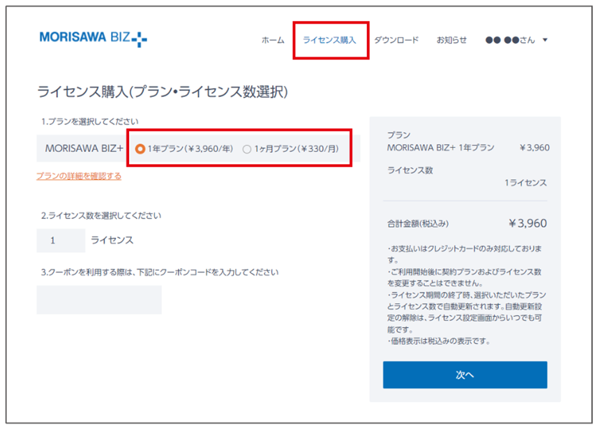
In the illustration in Toyomane's article, UD fonts for business use are"MORISAWA BIZ+"We are using the paid font "BIZ UDP Shin Go" included in the website. If you would like to use the same font, you can use it with the business UD font subscription "MORISAWA BIZ+" for 330 yen per month.

You can download free fonts or purchase paid fonts.Free Membership RegistrationClick the button below↓
Paid fonts can be purchased by selecting a plan from the "Purchase License" tab after registering as a member.