In this series, font manufacturer Morisawa will be giving a lecture on the basics of fonts. This time, they will be explaining the thickness of fonts, known as "weight."
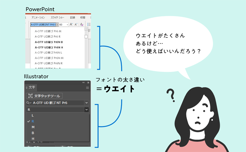
Fonts with the same name,Multiple fonts with different weightsThere may be differences in thickness.WeightIt is called.
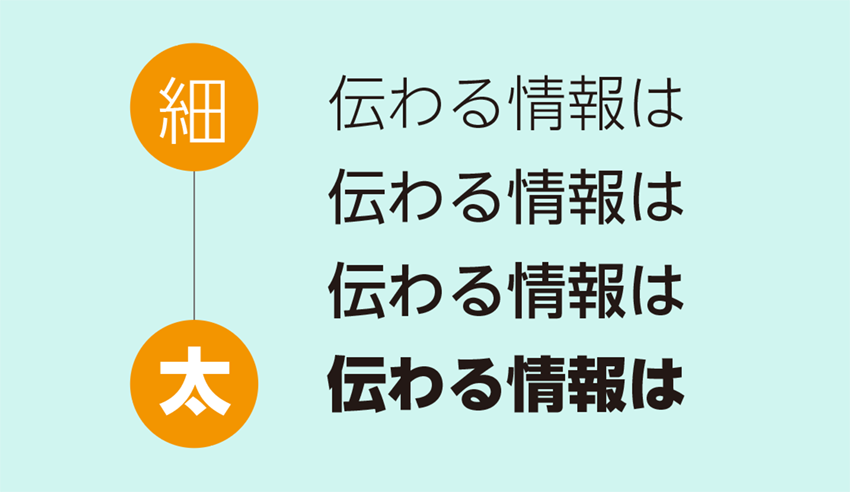
Depending on the software you use, some fonts and weights are displayed in the list of fonts, while others only show the weight of the selected font. If there are many fonts, the display becomes long and it can be a hassle to choose a font.
However, using weights effectively can have the following effects:
- The overall work becomes more distinct, making it easier to focus on the important parts.
- Graphically represent headings and key words
Let's look at an example.
1. Add variety to your work
By using multiple weights, you can add contrast to the page.
Slides created with one weight
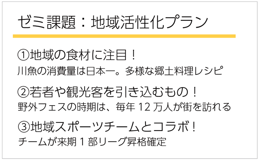

- Overall flatness
- Although the number of characters is not large, it gives the impression of being cluttered with a lot of text.
Created with multiple weights
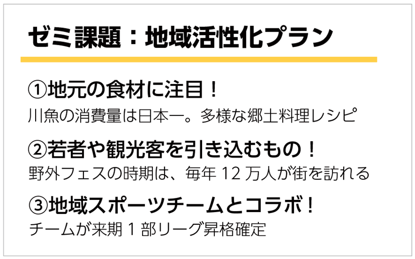

- The entire page is now more vibrant!
- The difference between the headings and the main text (bold and non-bold text) has been made, giving the page a more organized impression!
By the way, the slide above uses three weights of UD Shin Go: B, M, and L. It is not enough to just use thick and thin fonts.Choose different weights of the same fontSo,A sense of unity on the pageAdding contrast while still bringing out theYou can.
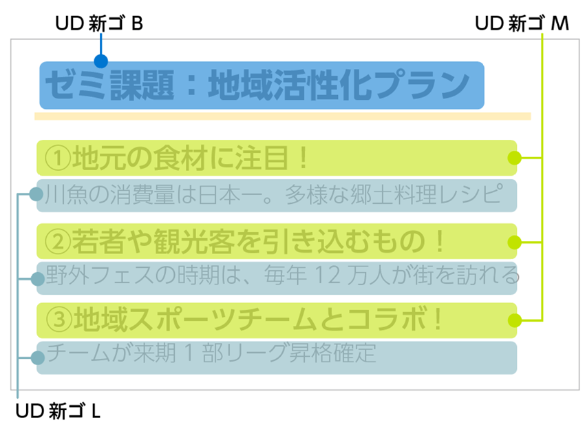
In this way, by using multiple weights, the information appears clear and organized.It makes it easier for the reader's eyes to be drawn to the part you want to draw their attention to.This time we used slides as an example, but the same thing can be said for any type of production, such as flyers, posters, reports, etc.
2. Graphically represent headings and key words
The previous section was an example of adding contrast to the entire page. In addition, by changing the weight of some of the words in the text, you can express the text graphically and use it as an accent in the design. It is even more effective if you also vary the font size.
Flyer example
Flyer created with 1 weight


- There is nothing eye-catching, giving a monotonous impression
- Although it's an event flyer, it lacks impact and has a dull atmosphere.
A flyer using multiple weights and adjusting the font size
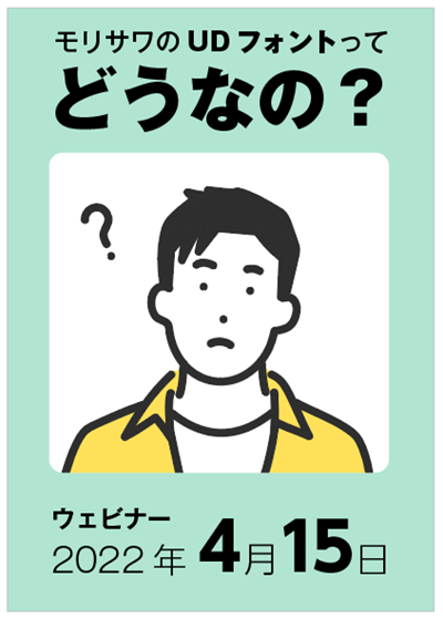

- The flyer now has a three-dimensional feel and impact!
- The title "What do you think of Morisawa's UD font?" has been revised to look a bit like a title logo!
- The date was a bit monotonous, but now it's easier for viewers to focus on the "4" and "15" so they don't misread them!
Example slides
A slide created with one weight inside the speech bubble


- The illustrations are beautiful and impressive, but the text is less noticeable, creating an overall unbalanced look.
- The inside of the speech bubble feels flat, making it difficult to absorb the information.
A slide with multiple weights and adjusted font size
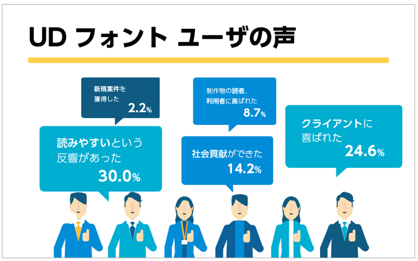

- The text has a stronger impact, making it easier for readers to focus on the letters and numbers you want them to read!
- The letters and numbers in the speech bubbles are now displayed graphically, making them easier to understand!
3. Summary
By using weights, you can achieve the following benefits:
- The overall work becomes more distinct, making it easier to focus on the important parts.
- Graphically represent headings and key words
When you're designing and feel like your design lacks contrast or the text is monotonous, try changing the weight!
Follow the Morisawa FONT SWITCH PROJECT on social media to turn on everyone's font sensibilities and have even more fun with fonts!
All fonts are available! The student font product "MORISAWA PASSPORT Academic Edition"Here
UD fonts for business use available from 330 yen per monthHere
