
In this series, font manufacturer Morisawa will be giving lectures on the basics of fonts. This time, they will be explaining the "face" and the size of fonts.
When choosing a font, you look at the shape of each individual character, but when you try to lay it out as text, have you ever found that the overall impression isn't what you expected?
The problem with these two people is that both of them chose the font "fontThe size of the lettering is related to the size of the text.Pressure on the vieweraffects.
Knowing the characters has the following benefits:
- You can control the apparent pressure when typing.
- You can identify fonts suitable for each purpose, such as body text and headings.
Before we go into detail about these two, let's first take a quick look at the "character appearance."
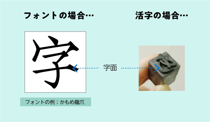
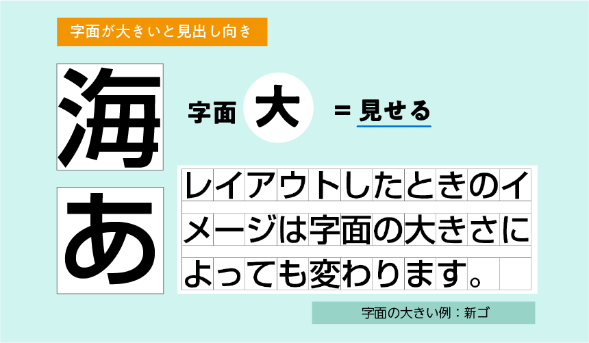
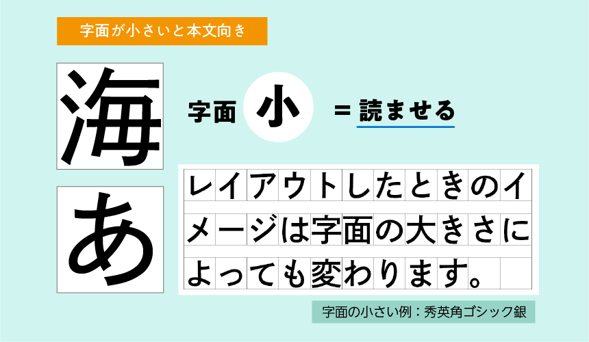
1. What is character design?
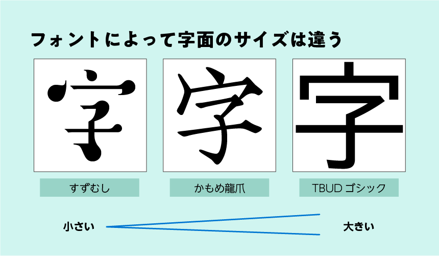
When Japanese fonts are designed, each character is designed within a square frame. The part of the font that forms the shape of the character relative to the frame is called the "character face." This term comes from the term typography, and refers to the protruding part of the type that forms the shape of the character.
The size of the characters varies depending on the font. Even if you type characters in the same size, the actual size of the characters will differ depending on the font.
When using large fonts in a sentence, the space between adjacent letters is narrow, creating a feeling of oppression. Conversely, when using small fonts, the letters are small and the spaces are wide, creating a more reserved impression.
Characteristic features
- The face of a font is the "letter-shaped part"
- If the font size is large, the letters will be large and will feel oppressive.
- If the font size is small, the letters will be small and give a more subdued impression.
With this in mind, let's look at the problem we discussed earlier again.
2. Use the size of the letterform to help you choose your font
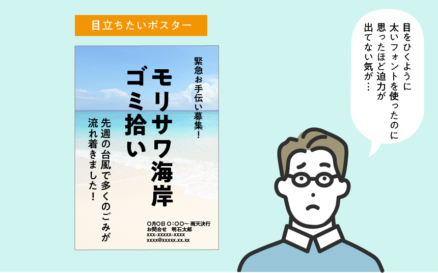
Posters that make a statement
When created with a small font
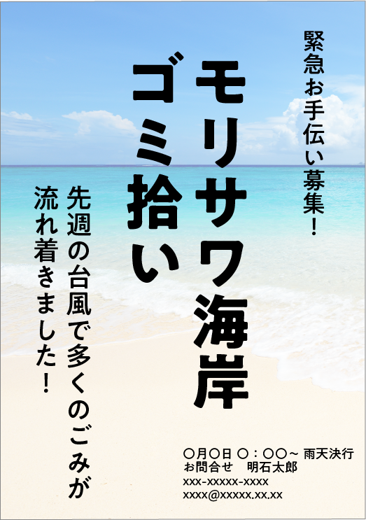
I want to shout out loud, "I want everyone to cooperate," but somehow it seems modest and weak... Is it because there seems to be space between the letters?
"Unobtrusive" and "The spacing between letters seems too wide." These concerns are caused by the small size of the font you are using.
When changing to a larger font
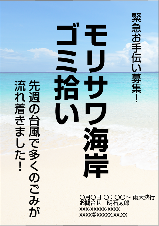
The large letters make a big impact at first glance and create a sense of pressure. It may also convey a greater sense of urgency!
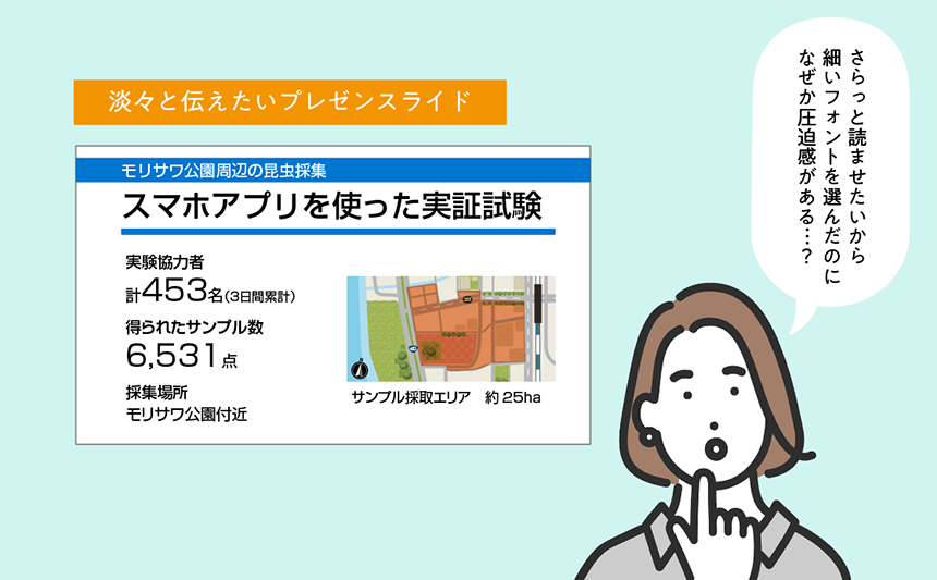
Slides that you want to give a clean impression
When using large fonts
In this announcement, I wanted to convey the facts in a simple manner, but the text is large and oppressive...
"The letters are too large" or "It feels oppressive." These concerns are caused by the large size of the font being used.
When changing to a smaller font
The smaller font size reduces the sense of pressure, giving it a more streamlined feel! It's not overbearing, so it seems to give the viewer a more rational and neutral impression...!
In this way, by choosing a font with the size of the letters in mind, you can control the pressure it exerts on the viewer. By using this to your advantage and choosing a font, you can create a design that better suits your purpose.
Font size and impression
- Small → Weak pressure → Modest, rational, speaks calmly
- Large → Strong pressure → Impact, pressure, impression of shouting loudly
3. Font size and whether it is suitable for body text or headings
In the previous chapter, we discussed how the size of type affects the viewer's impression.
In addition, the size of the characters can help you determine whether a font is suitable for body text or headings, and the appropriate situation.
Large font = suitable for headings
Large fonts have a strong impact, so they are suitable for short texts such as headlines. On the other hand, when used for long texts, they tend to be too crowded and oppressive, making them less suitable for the main text of a book.
Small font size = suitable for main text
Small fonts put less pressure on the viewer, so they allow you to read long texts without getting tired. In other words, they are typefaces that are suitable for body text. For headlines where you want to make an impact, they will have a slightly weaker impression.
Font size and impression
- Small font size → Weak pressure → Suitable for main text. Less pressure makes it easier to read long texts without getting tired.
- Large font size → strong pressure → suitable for headings. Suitable for making short sentences stand out.
You don't need to pay too much attention to this when it comes to flyers and the like, as the overall amount of text is small, but when laying out long pieces of text such as newsletters, reports, and papers, keeping this relationship in mind when designing the page is a shortcut to creating an easy-to-read page.
4. Summary
Knowing the characters has the following benefits:
- You can control the apparent pressure when typing.
- You can identify fonts suitable for each purpose, such as body text and headings.
When choosing a font, we tend to focus on the shape, but the size of the characters also affects the impression they give to the viewer.
Even if you choose a font by looking at the shape of the characters using the knowledge of "weight," "Mincho/Gothic," and "elements" explained in previous articles, if the size of the characters does not match the concept of the font selection, the impression of the design will be disjointed.
Also, when writing long texts, the font size can affect the overall readability, so be sure to choose it carefully!
If you're just starting out in design, check out this article to learn about the design process!

Follow the Morisawa FONT SWITCH PROJECT on social media to turn on everyone's font sensibilities and have even more fun with fonts!
All fonts are available! The student font product "MORISAWA PASSPORT Academic Edition"Here
UD fonts for business use available from 330 yen per monthHere