
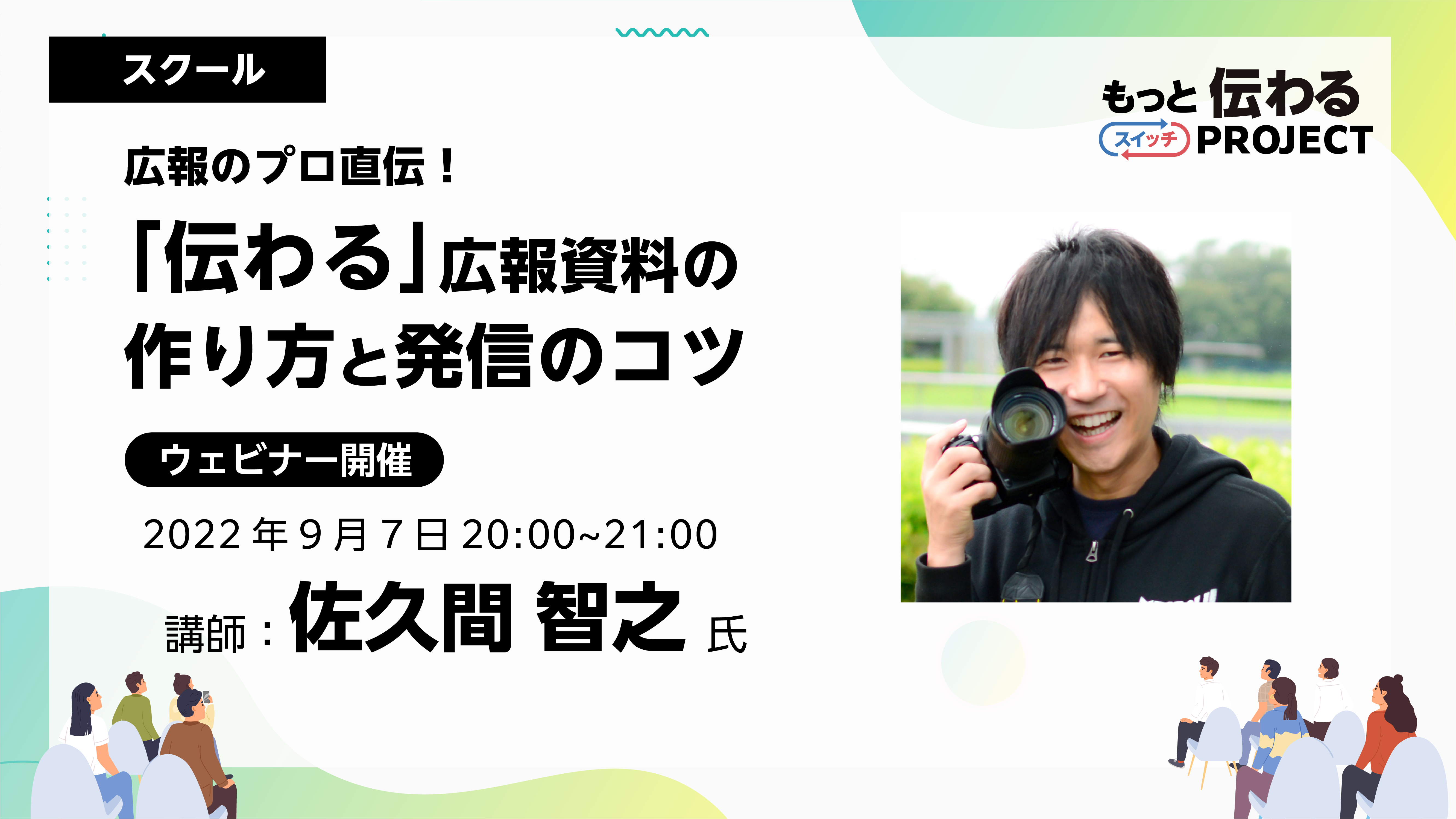
As a program aimed at improving skills in creating "communicative" PR materials, the school has been hosting a program with Tomoyuki Sakuma as a guest since August. This time, we will be introducing the "Direct from a PR professional! Tips for creating and disseminating PR materials for School (1st session)" will be reported.
Held on Wednesday, August 3rdSeminar ReportPlease also see:
If you would like to watch the archived video from the seminar, you can do so below.
*Registration is required to watch videos.
*In addition to watching the archived video, you can also download the materials and workshop materials from the day.
School Report

Guest Lecturer |Tomoyuki SakumaTomoyuki Sakuma
Representative Director of PRDESIGN JAPAN Co., Ltd. PR TIMES Evangelist Regional Strength Creation Advisor to the Ministry of Internal Affairs and Communications A former civil servant, he won the Prime Minister's Award at the National Public Relations Competition while still employed. He currently works as a public relations advisor for local governments and as a training instructor for public relations, PR, and design. He has written many books, including "Easy with Office! How to Create a 'One-Page Design' for Civil Servants" (Gakuyo Shobo).
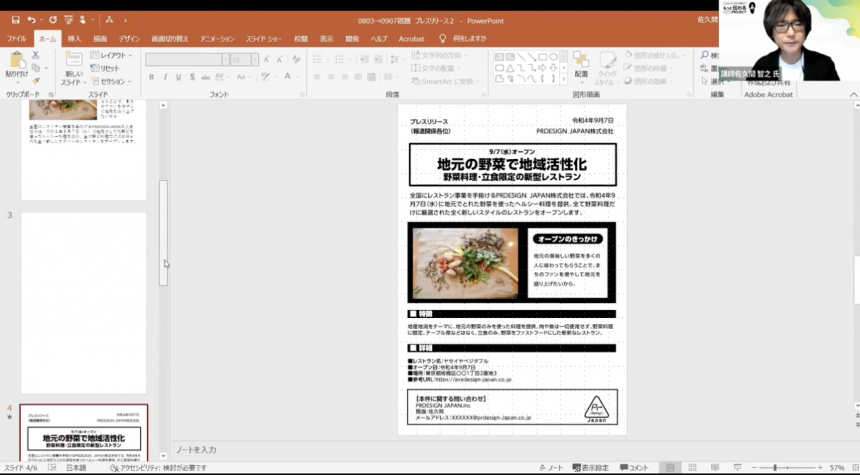
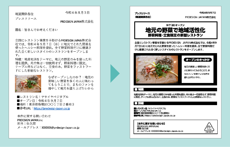
The first school had the theme of "press releases," which was also covered in the previous seminar. Participants were asked to remake their homework texts with the aim of creating press releases that "communicate."
From the many applications received, Sakuma will select some and provide comments and advice. At the end, Sakuma will edit the homework data and share a model.
Participant comments
I use PR Times quite frequently for work, but the company's existing templates have zero design quality, so I would like to propose a new template right away.
It was an eye-opener for me to learn that the width of the line spacing that is easy to read changes depending on the length of each line.
Sakuma's approach is very logical and he focuses on the key points, so even an hour is very satisfying. I would like to learn more in depth someday.
I've never written a press release before, but I learned a lot about being mindful of what reporters think. I learned a lot about how to catch the attention of busy reporters and make them want to cover your story. I've learned a lot about the key points. I'd like to try creating materials that are not limited to press releases, but that also take into consideration the jump rate of text.
We'll teach you the key points of press releases!
We received many questions about press releases from those who submitted their homework this time, so in the first half of the session we were given an explanation of what a press release is.
If you're interested, please take a look at the archives.
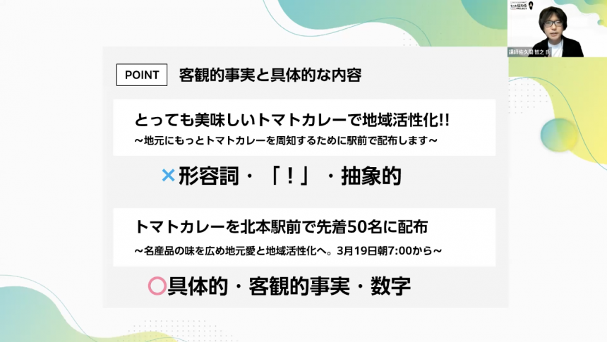
Key points to keep in mind when creating a press release
- Imagine yourself as a reporter
- Tips for getting featured in the media
- How to create a compelling title
- Be sure to post a photo
- Make the content relevant to the social context (socially meaningful content)
- Complete on a single A4 sheet
- Delivery times are generally Tuesday to Thursday
- Press release design and layout
- Jump Rate
- Leave some space
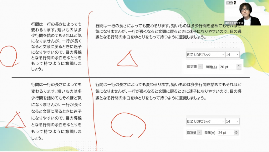
- Line spacing varies depending on line length
- There are three colors
Pick up
How to create a compelling title
The method of creating headlines was a concept that can be used in a variety of situations, not just press releases, but also flyers, presentations, etc., and it seemed to be a point that resonated with many viewers.
Line spacing varies depending on line length
Line spacing is very important for readability! Here, we learned how to think about how much line spacing is appropriate. The amount of line spacing that is easy to read changes depending on the length of the line.
If the lines are short, a fixed spacing of 20 points is easier to read than 14 points, but if the lines are long, a spacing of 24 points is easier to read.
Picking up issues and giving advice
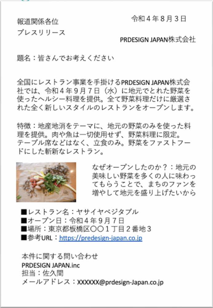
This week's homework | Press release
- Read the content and come up with the title yourself
- Using the know-how introduced in the previous seminar, we will remake the press release into one that "communicates" effectively.
Many of you have done your homework and posted your comments. Thank you!
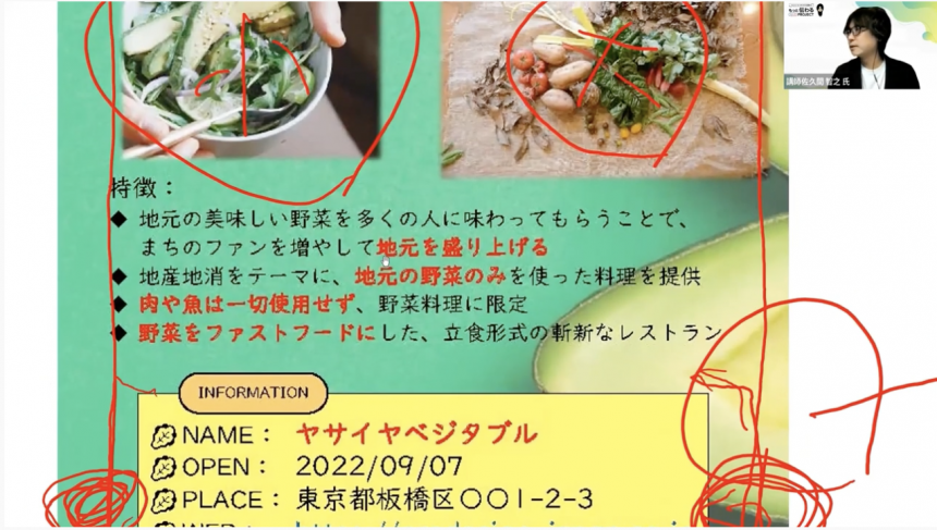
I can't introduce all of them, but in general, everyone aimed to write a press release that would be easy to understand by adding subheadings and adjusting the jump rate. In this report, I will be highlighting two points that you should pay particular attention to.
Jump rate is important
Rather than simply pouring in text information, he used a jump rate to create contrast and make the information flow cohesively. He also gave detailed advice on the color scheme of the text.
"The red text has a strong emphasis color image, but some people with color vision deficiencies see it as a color close to black. If the background is green, the text you want to emphasize will sink into the black and become difficult to read, so it's best to be careful," says Sakuma.
White space is important
It's nicely put together, but if you feel like something's a little off, it's probably best to suspect the "margins."
"Without any margins, the page will feel oppressive. By leaving equal amounts of margins on the top, bottom, left, and right, it becomes much easier to read!" says Sakuma.
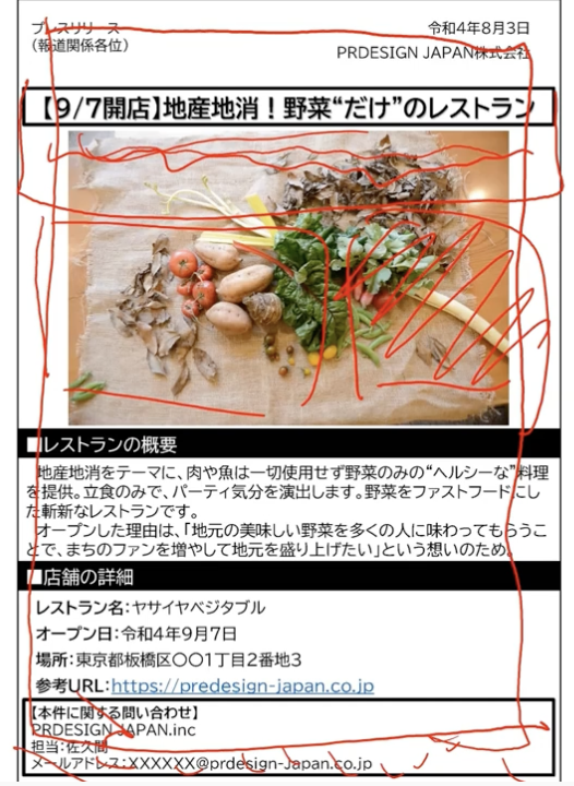
Sakuma demonstrates the remake
Finally, Sakuma will remake the homework data and show us an example.
We will quickly implement the points discussed in the first half!
The broken down text is then fitted onto the page. The font size, weight and decoration will eventually be adjusted, but the first step is to roughly decide where the information will go.
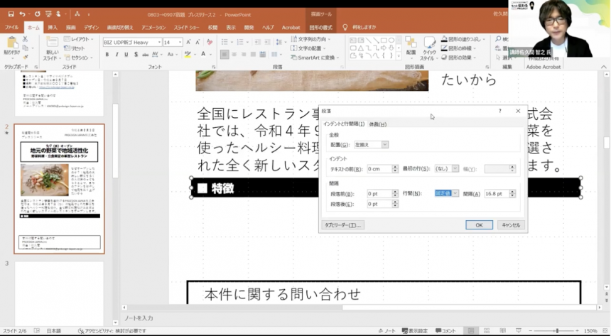
One of the decorative elements that was also discussed in the seminar is the rectangular "band" that can be used as a subheading. We were given hands-on tips on how to adjust the position of text, which are difficult to understand through words alone.
If the text position is too low, you can adjust it by increasing the line time setting.
Now you have a press release that the media will want to pick up!
Along with jump rate, I had a specific question about "margin," which I learned is very important.
How many centimetres of margin do I need?
It's 1.5 centimeters!
The reason for this is to prevent your thumb from covering too much of the information when you hold the press paper in your hand. Therefore, it is best to leave a minimum of 1.5 cm.
The hour flew by, but participants commented that they learned a lot.
School Announcements
Next time, Word dataNotice (information document)is.
It's a rather stiff sentence, but we'll use the jump rate to remake it into an easy-to-read notification. The key is to make it clear who you want to read it and who you want to deliver the content to!
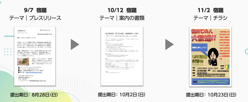
All three sessions of the school have prepared content that is often used in public relations activities! By challenging yourself with the homework, you will be able to learn more practically!
The school is open to both first-time attendees and those who have attended a seminar. If you have the same concerns, please apply.
If you want to use UD fonts, which Sakuma recommended in the seminar, easily in Office applications,We recommend MORISAWA BIZ+. For details,Here
Also,As a company, local government, organization, or school organizationIf you are considering using UD fonts, please feel free to ask us any questions below.
Sakuma's social media accounts are packed with information that only a public relations professional can provide. Please take a look at them along with his books and website.
PRDESIGN JAPAN Co., Ltd.– Changing Japan through public relations and design.