
Introducing our wonderful members one by one [Moripass Club Member Introduction]
This time, Moripass Club advisor Hashizume will be reporting.
This time,
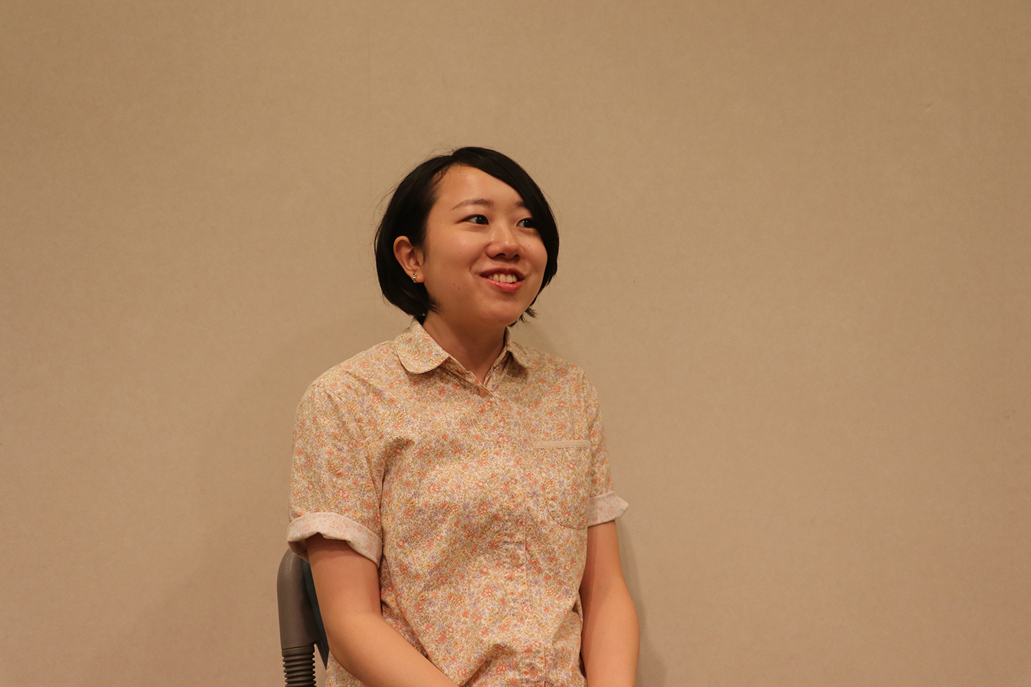
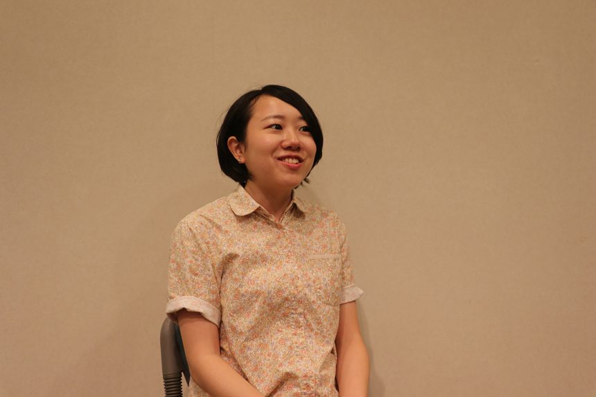
Sahoko Yoshino
Musashino Art University, Faculty of Art and Design, Department of Visual Communication Design, 3rd year
My favorite typeface is "Toppan Bunkyu Gothic"
Yoshino-san,
Tokyo × Typography
They created a short animation based on the theme:
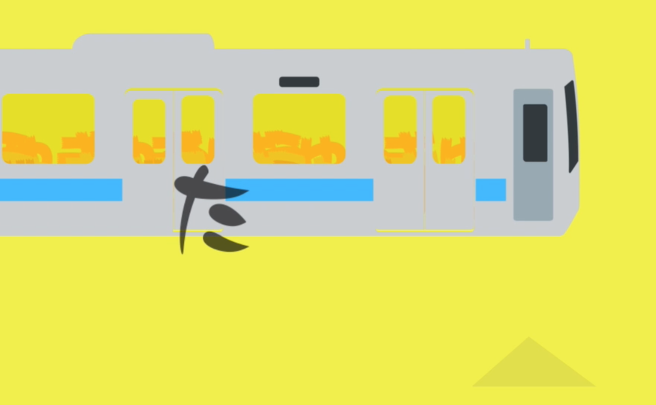
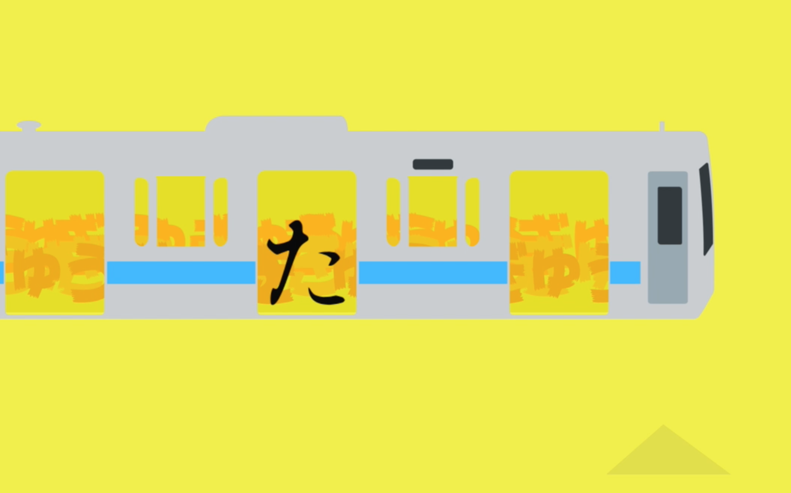
The main character is "ta"!
concept
Yoshino says he believes Tokyo has many excellent places in terms of art and performing arts culture, but he wanted to express Tokyo from the perspective of lifestyle and culture.
So Yoshino decided to use the crowds during the morning rush hour as the theme, something he had always thought about. The main character, "Ta," represents a woman running onto a train, and even if a woman dresses up to go to work, if she gets caught in the train doors, her true, unadorned self will come out... The change in a woman's feelings at that moment is expressed using multiple typefaces.
Creating your first animation
Yoshino usually studies two-dimensional design.
This time, he saw the Moripass Club as a place for challenges, so he decided to try his hand at creating an animation piece, something he had never done before.
Since this was their first attempt, the whole thing was a trial and error process, and they managed to complete it with the help of a university assistant who taught them the basics of animation production.
Expressing the protagonist's changing feelings through typeface
The scene of the female protagonist running onto a rush hour train is expressed through changes in typeface.
I was careful to make the typeface look human, such as how to make the main character "Ta" appear to be running.
The "ta" makes you chuckle and warms your heart. Let's take a look now!
The change in the protagonist "Ta's" feelings is nicely expressed through the change in the typeface!
Now, let me explain along with the font name.
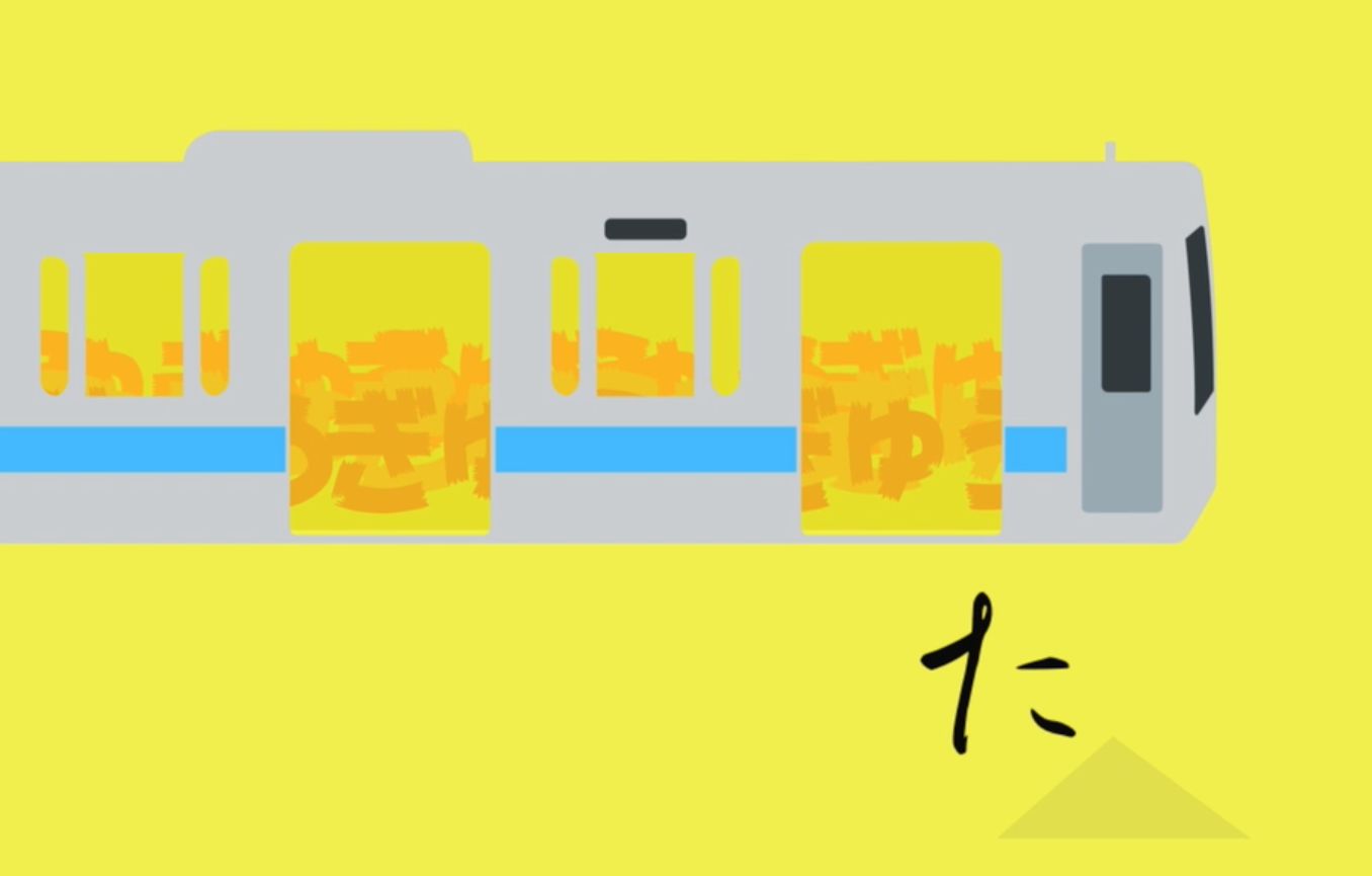 Font name:Kinreigyosho (elegant running calligraphy)
The main character is running... (It's written in elegant calligraphy, so it must look very beautiful.)
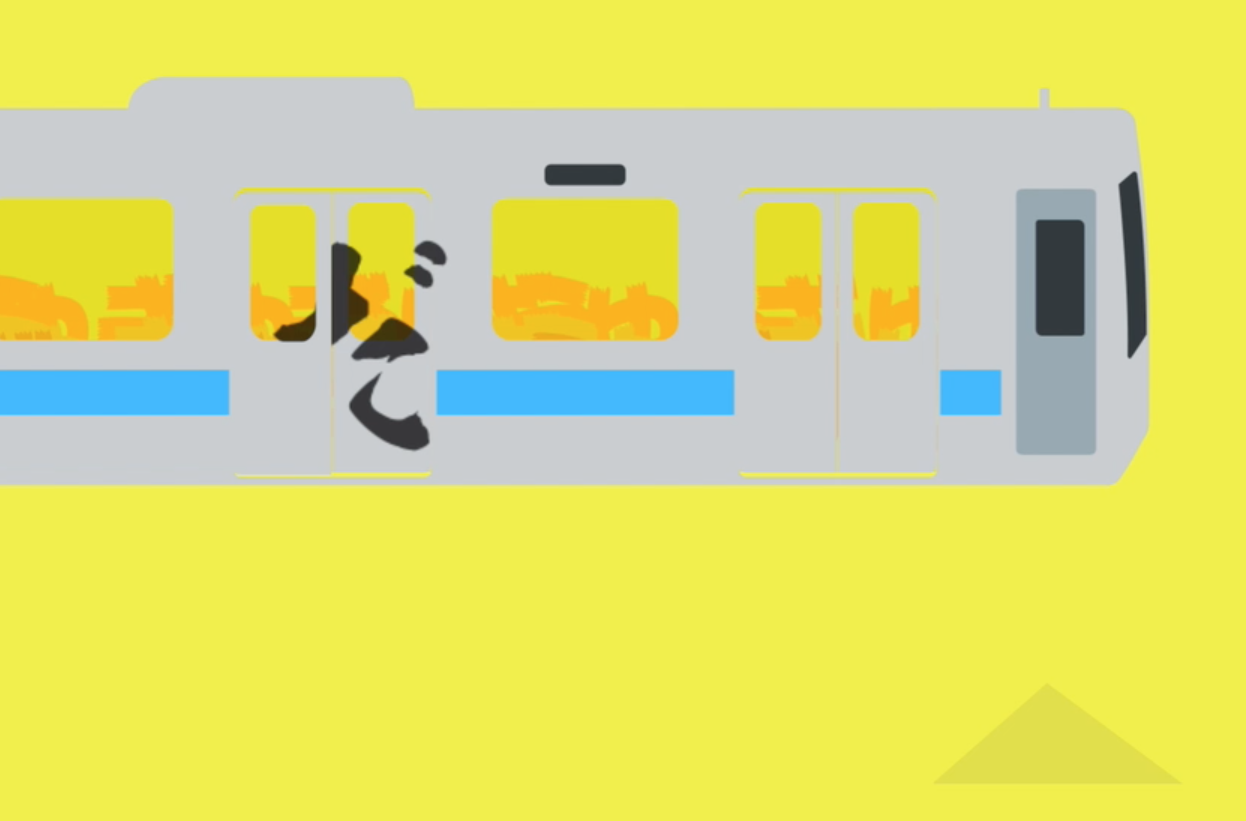
Oh no, I'm stuck in the door! (written in rough calligraphy)
She's worried about what others think and is anxious about it... (But even her anxious expression on Pretty Peach is funny and cute.)
He tries to hide his desperation to catch the train so that others won't notice. Shino's beautiful calligraphy expresses the slight loss of pretense as he rushes onto the train.
That was the explanation. What did you think?
Yoshino took on the challenge of expressing people's feelings through typeface.
Expressing different personalities through typefaces
In this assignment,Font sensitivity is now "ON"When asked if he felt it was real, Yoshino replied,
If you look closely at typefaces, you will notice that the roundness of the tips and corners varies depending on the typeface.
When you pay that much attention, you discover that even fonts that look similar at first glance can have different personalities.
As expected, Yoshino-san has been able to express his feelings through calligraphy. He's really turned on!!
from now on
Presentation of the assignmentHe said that having Shimohama Rintaro and the other members look at his assignments and receive their feedback and comments made him more aware of the public's view. He also said that he found it a valuable experience to learn how students from other schools presented the same assignments.
Yoshino is mindful of this issue and is enthusiastic about creating works that focus on typefaces.
In the second half of the year, he will be working on the event team, and hopes to hear from designers on the ground through the project and apply what he learns to his own work!
I look forward to seeing more of Yoshino's work in the future!