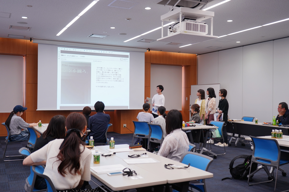
This was the second time the committee met, and it was another eventful day.
- "FONT SWITCH MAGAZINE Vol.3" Cover Design Competition
- Cover design selection
- The teams split up and discussed their ideas (the Morisawa Type Design Competition team even invited a typeface designer to participate in the discussion!)
It seems that they have started moving towards producing the paper all at once, and we will be reporting from the Kansai side on the members who have now turned on that mindset.
Click here to see what's happening in the Kanto region at the same time.
Kanto side is here
Cover design competition! A wide variety of unique designs
The first event today is a cover design competition for students in charge of the Moripass Club's visuals.
From here, participants were divided into Kansai and Kanto and each had 3 minutes to present the ideas they had come up with!
Before we began, Moripass Club advisor Nitano explained the important points for the Kansai cover design, saying, "Kansai will be in charge of horizontal typesetting for this paper, so I would like you to come up with a design that makes the most of that." The four members of the visual team then immediately began their presentations.
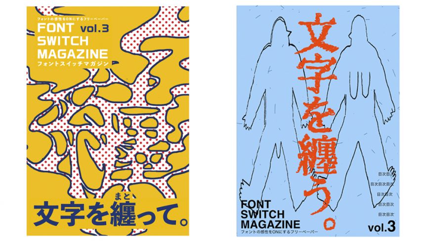
The first speaker was Kanako Taizan (pictured left).
The word "wear" brings to mind keywords such as "to cling" and "to stick together," and the design depicts these as an aura, depicted as smoke. The word itself gives off a delicate and gentle impression, so the visual expresses the inner strength hidden within.
The second person is Otomo Tomonori (right).
He gave extensive thought to the concept of "wearing" and came up with three proposals. In one, he considered the concept of "wearing" as something that is put on the human body, and proposed an illustration that associated the initial state with a naked human. The remaining two proposals, both related to fashion, were visualizations inspired by a book by philosopher Washida Seiichi. All of the designs were eye-catching and impactful, but the concepts behind them were delicately designed, allowing his individuality to shine through.
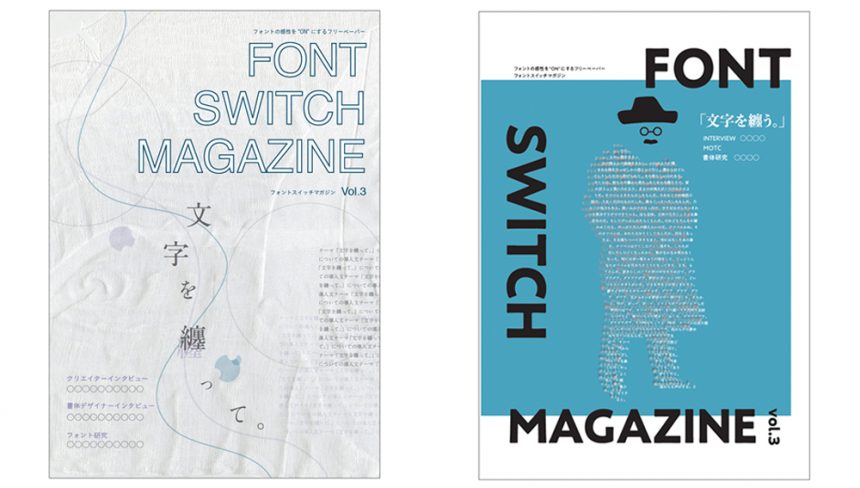
The third person is Yuka Nakamura (left).
Inspired by the soft fabrics and threads we wear every day, we proposed a specific cover design using scanned images of actual fabrics. We paid particular attention to the details of the design, including the placement of the text and the font to be used, all of which were chosen to fit the theme.
Lastly, Nanami Horiguchi (right).
Aiming for a cool cover reminiscent of fashion magazines, she proposed using icons of people and animals, with some of them made up of text. She incorporated Kansai nuances into the color choices and pattern creation. Each proposal turned out to be a pop design that is characteristic of her.
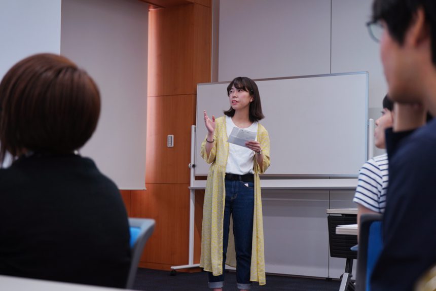
Now that all the cover designs are ready, it's time for the selection!
It seemed that some people were even more confused as they compared the products in person, making for a thrilling vote.
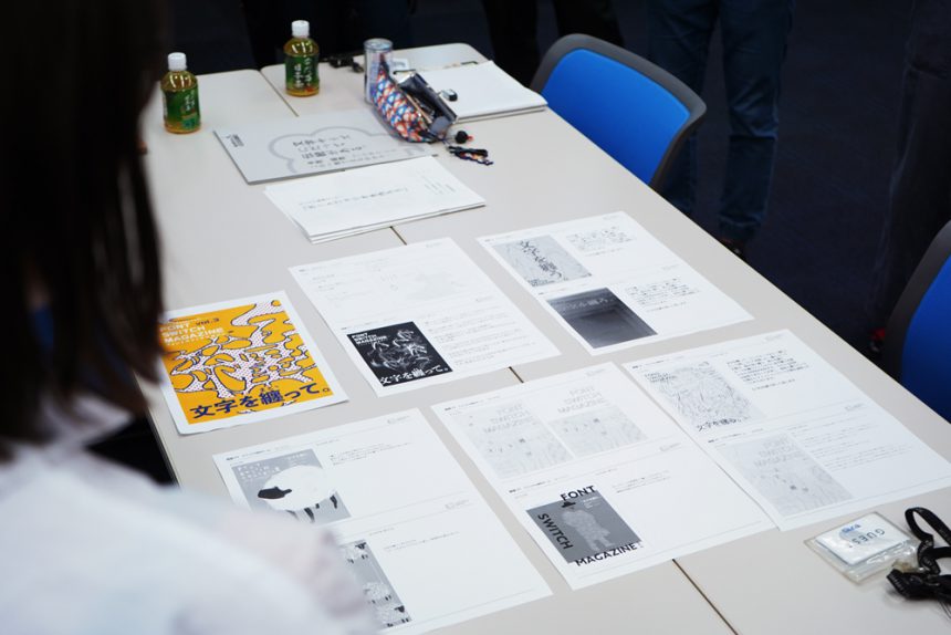
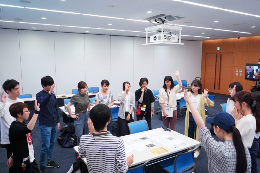
As a result of the voting, the designs by Taizan and Horiguchi received the most votes. A selection meeting was then held, and the votes of the advisors and managers were added to make the decision. The final announcement will be made after an input seminar. Which design will be chosen?
Input seminar & exciting cover announcement!
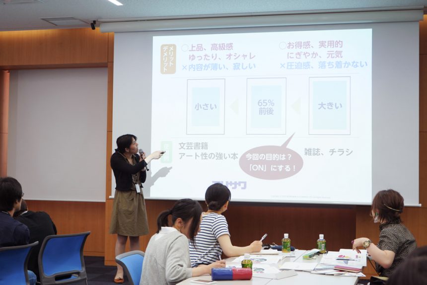
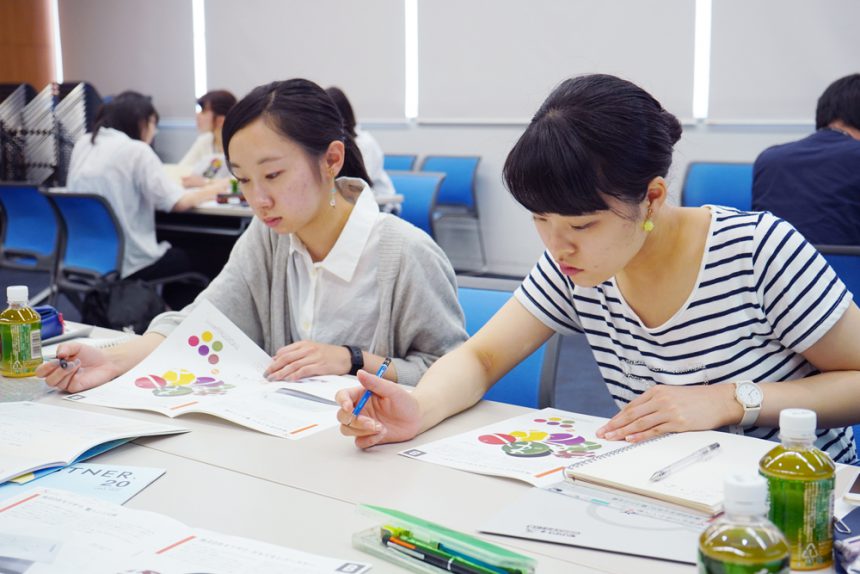
For this input seminar, advisor Suda gave a lecture on typesetting, which is important when creating a booklet. We learned about the different impressions that change when composing text and images, and the rules for doing so by comparing actual layouts.
When checking the sizes of various texts using a font size chart produced by Sobue Shin, which was prepared as a gift for all Moripass members, the students seemed very interested in this convenient item that can be distinguished at a glance just by stacking them.
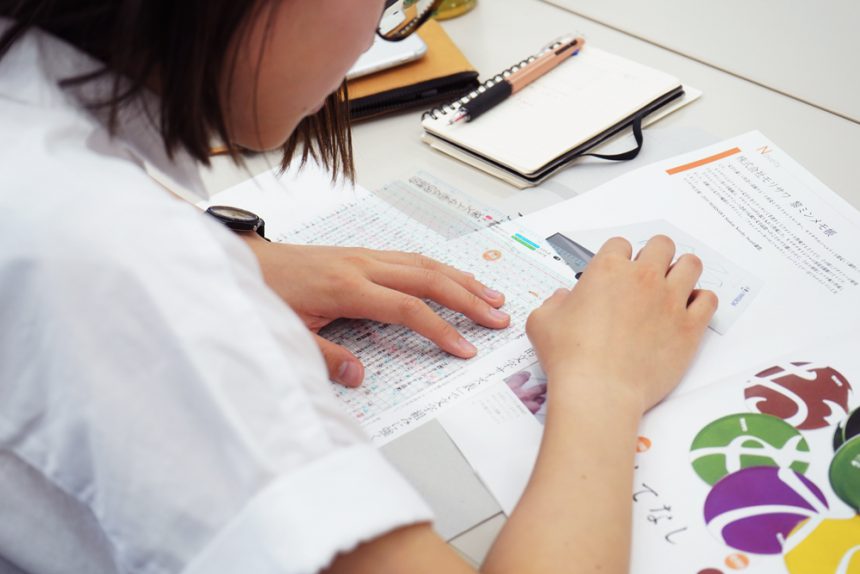
The members listened intently and took notes, as the content was packed with all the necessary knowledge for the booklet they would be creating. They will no doubt take in a lot of information and use it to create an even better booklet.
The results of the competition are finally announced!
As a result of the selection meeting, Taizan's design proposal was selected!
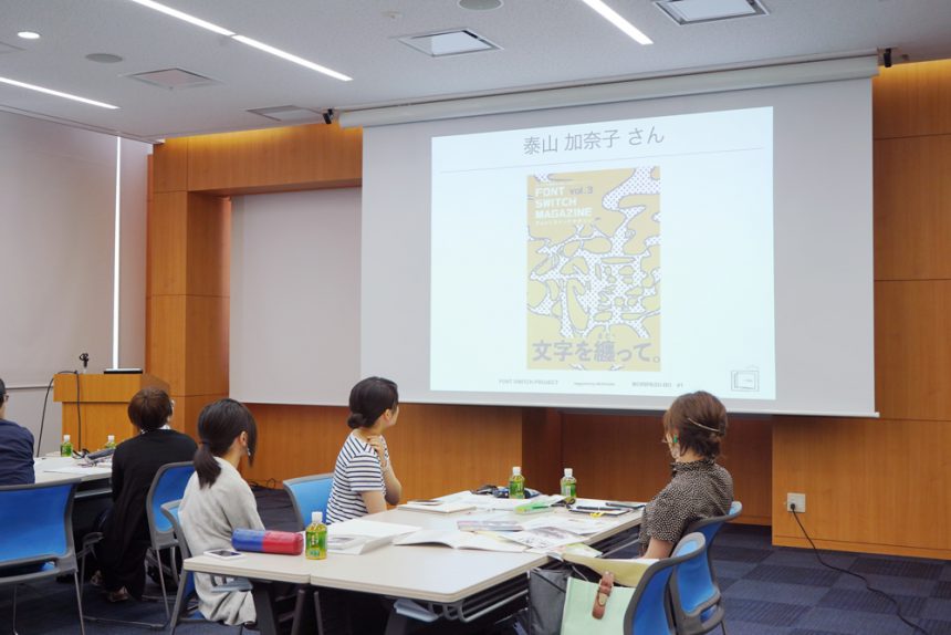
Advisor Nitano, who participated in the final selection, commented with great expectations, "This time, Moripass Club will be comparing Kansai and Kanto, and the special theme for Kansai is an abstract one, 'Wearing Letters.' Therefore, I chose this because I thought it would be able to express this difficult theme well. Since this is an idea that we all chose and decided on together, let's brush it up and make it into a good one." With the cover image decided, each team will now move straight into creating the pages.
After the morning's climax, the students split into teams to discuss the progress of their assignments, then moved on to a lunch meeting. It was time to press on with the presentations in the afternoon!
Set a goal and keep going! Invite guests to speed things up!
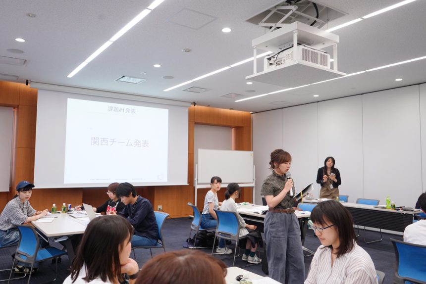
From here, we will connect the Kanto and Kansai regions and start with each team presenting their progress. Since there is limited time for face-to-face information sharing, this is an important time to learn about the progress of other teams.
Each team proposed specific ideas for the layout of their paper. They checked each other's progress while listening to the other teams on the other side of the screen.
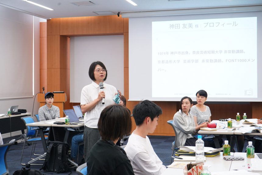
At this point, Ms. Tomomi Kanda, a typeface designer and winner of the Morisawa Type Design Competition (MOTC), appeared as a guest. The MOTC team immediately began asking questions they had been thinking of in preparation for the publication.
They asked simple questions such as "How do you make fonts?" and "How long does it take to complete?", and together they came up with ideas for a workshop based on the Kansai theme, "Wearing Letters."
Kanda gave us some advice from the perspective of a typeface designer: "Letters can be replaced by a skeleton and the design elements applied to it. If you want to make the letters plump, you can lower the center of gravity and add design elements to it. The skeleton x elements create the atmosphere of the letters. If you do this, I think you can get closer to the nuance of 'wearing the letters.'"
What will happen at the MOTC team's workshop, where ideas are expanding?
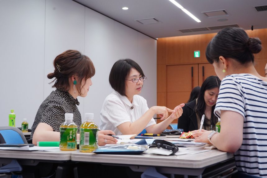
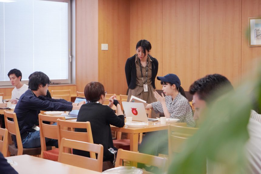
The other teams also finished brainstorming and shifted to concrete action, such as dividing up roles within the team, managing the overall schedule, and making appointments with guests, in order to realize the ideas they had brought with them.
The feature team, which was considering interviewing designers who are adept at using typefaces, heard voices such as, "What kind of questions should we prepare for the interview?" and "It wouldn't be interesting if the conversation turned to technical topics."
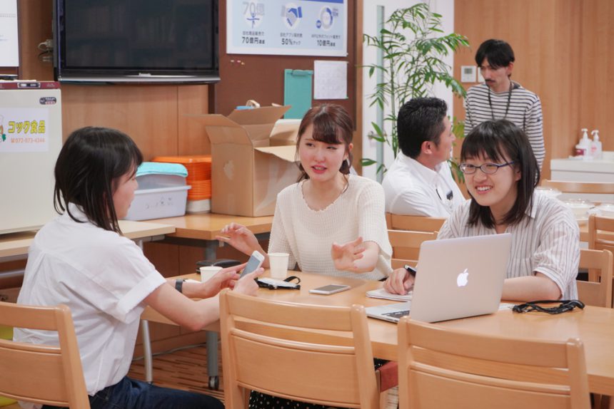
Now that the cover design has been decided, the visual team is moving forward at a rapid pace, with teams in the Kanto and Kansai regions reaching out to each other to come up with interesting designs.
We decided to focus on Michikusa, a typeface released in 2017, and discussed how to organize interviews with designers and developers.
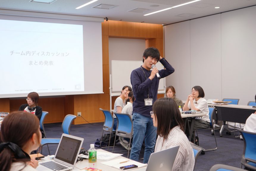
Finally, we connected Kanto and Kansai again and reported on the results of the day. The cover design was decided, and team roles and future directions were also decided, and the path to the goal was finally in sight. At the same time, the mindset of "we are the ones who create the pages!" was flipped on.
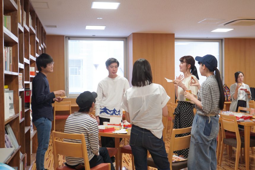
At the end of the day, a social gathering was held, where everyone deepened their relationships as colleagues who will work together in the future.
Each team has decided on many things in just one day! There is still much discussion to be done, but from here on, it's time for teamwork to come into play. Roles must be divided well and the leader must bring everyone together. The next subcommittee meeting will be the presentation of the first draft. I hope that everyone will make the most of the time until then!

