
Introducing our wonderful members one by one [Moripass Club Member Introduction]
This time, Moripass Club advisor Hashizume will be sharing his thoughts.
This time,
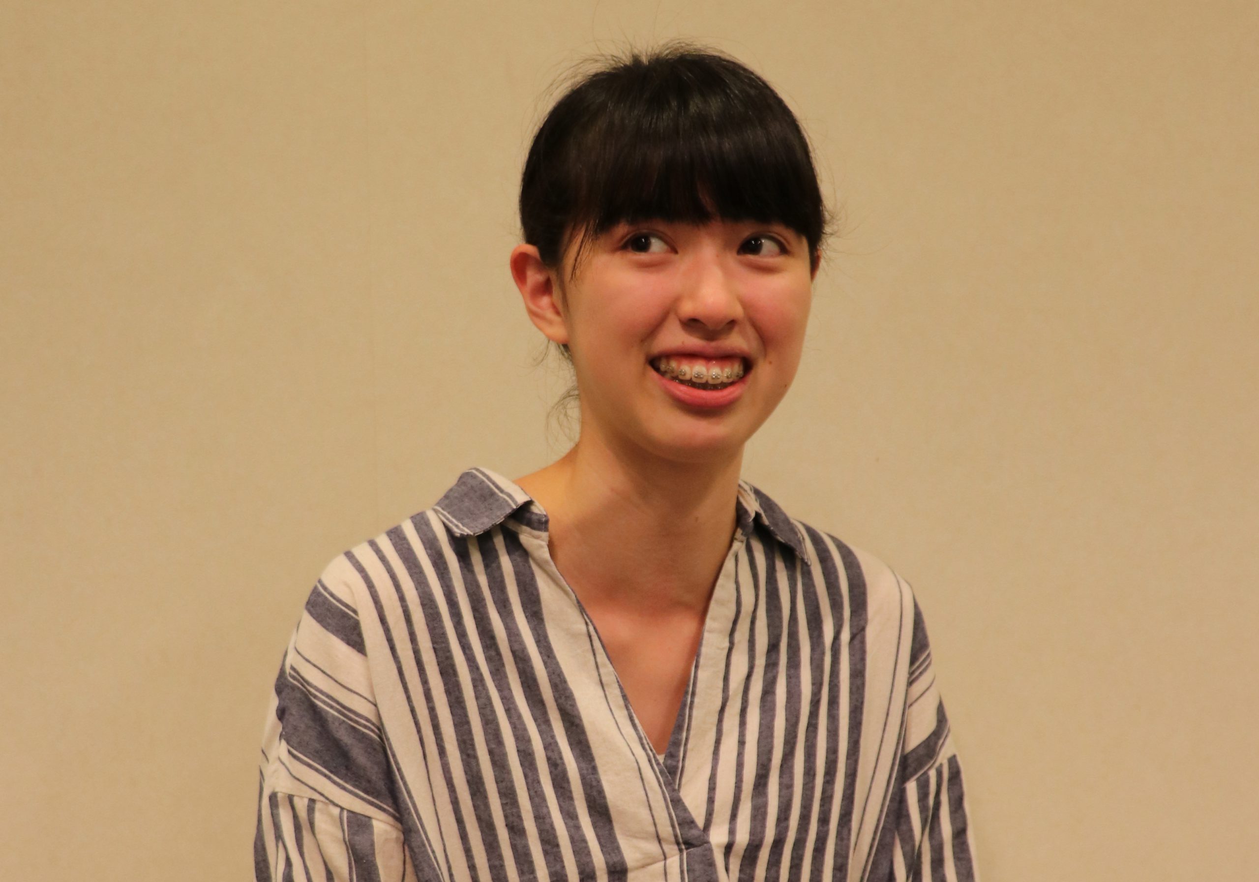
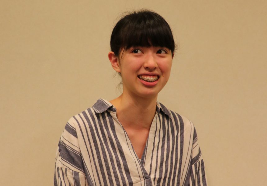
Hana Hirata
Tama Art University
Faculty of Fine Arts, Department of Information Design, 3rd year
My favorite typeface is "Gakusan Regularly Revised Textbook ICA"
 Mr. Hirata,
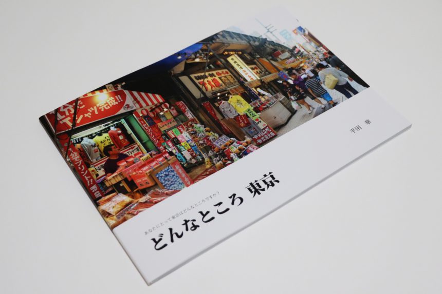
Tokyo × Typography
In response to this theme, they expressed the various impressions of Tokyo that Tokyoites have of the city using a wide variety of Morisawa fonts, and created a "photo book" to help people who have no connection to Tokyo learn about the city.
The left page features a beautiful shot of Tokyo, proving the photographer's impressive photography skills, while the right page features comments from Tokyoites asking them what Tokyo is like, written in Morisawa font.
I was careful to balance the photos and text.
said Hirata.
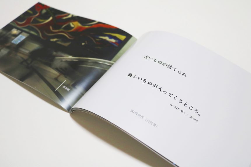
For example, a comment from a little girl might have a cute image like "Suzumuri"of.
For people who give a serious impression, such as company employees,Mainichi Shimbun Gothic"of.
For high school girls and fashion-conscious people, the stylish thin font "Hiragino Square Gothic"of.
The size and font of the letters are changed significantly to match the image and occupation of each respondent.
Although the respondents are not in the photograph, their personalities seem to be revealed through the typeface. Usually, magazines and photo books have a consistent typeface throughout the book, but this is a wonderful attempt that is only possible because the typeface is the main focus.
Typefaces take center stage
Because typefaces are the main focus, he was able to learn about the characteristics of each typeface.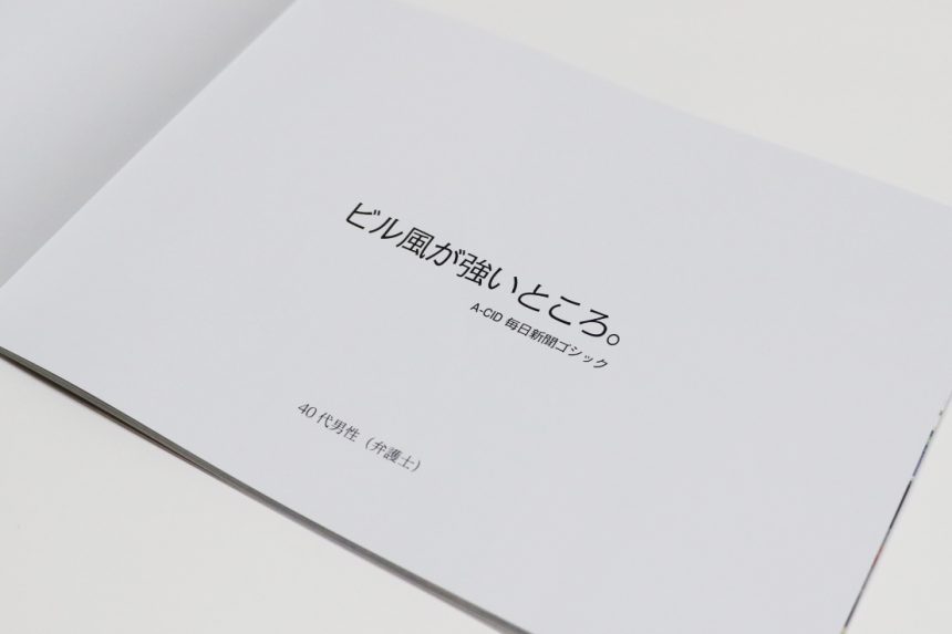
I paid more attention than usual to the typeface when designing.
I was surprised to see how much the atmosphere of a piece can change just by changing the font!
Hirata also said that this was the first time he had used a camera properly while making this film.
Although he was confused by the unfamiliarity of photography, he walked around Tokyo from morning until night and took over 500 photos!
It was a difficult project, but once he got used to the camera and the typeface, he began to enjoy creating it.
from now on
Presentation of the assignmentSo, were you nervous about giving your presentation in front of Shimohama Rintaro, the Morisawa staff, and students from other universities?
It was a very stimulating experience.
In the future, I would like to create more works that focus on typefaces and experience the joy of choosing fonts and the importance of fonts!
That's what they say.
In the latter half of the project, he has been active in the free magazine team!
I'm looking forward to a good article