
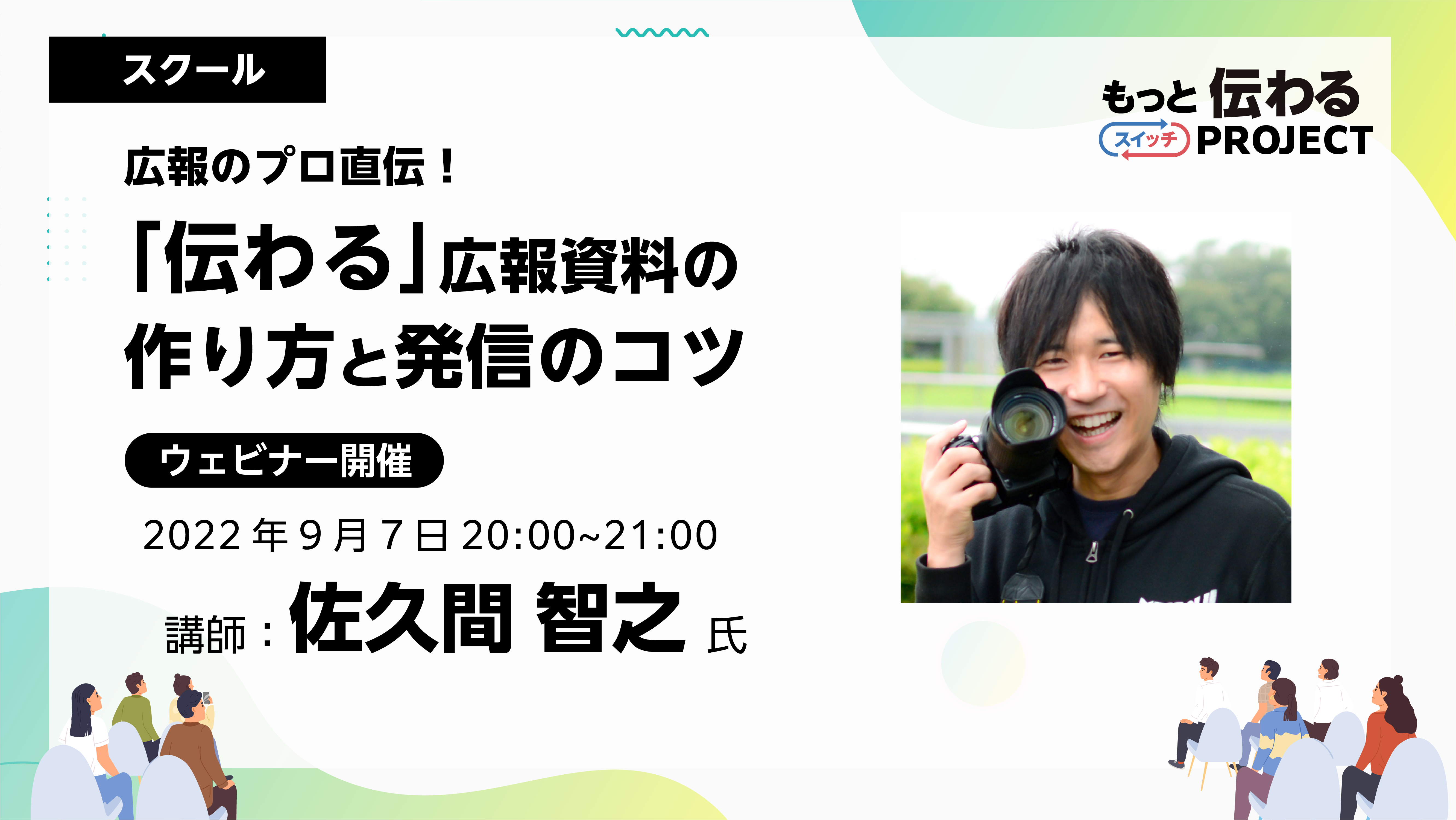
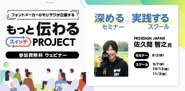
As a program aimed at improving skills in creating "communicative" PR materials, the school has been hosting a program with Tomoyuki Sakuma as a guest since August. This time, we will be introducing the "Direct from a PR professional! Tips for creating and disseminating PR materials for schools (3rd session)" will be reported.
If you would like to watch the archived video from the seminar, you can do so below.
*Registration is required to watch videos.
*In addition to watching the archived video, you can also download the materials and workshop materials from the day.
School Report

Guest Lecturer |Tomoyuki SakumaTomoyuki Sakuma
Representative Director of PRDESIGN JAPAN Co., Ltd. PR TIMES Evangelist Regional Strength Creation Advisor to the Ministry of Internal Affairs and Communications A former civil servant, he won the Prime Minister's Award at the National Public Relations Competition while still employed. He currently works as a public relations advisor for local governments and as a training instructor for public relations, PR, and design. He has written many books, including "Easy with Office! How to Create a 'One-Page Design' for Civil Servants" (Gakuyo Shobo).
Participant comments
Thank you for teaching me various tips for making content easy to read and understand, such as the 7:3 rule, font size and line spacing for titles and main text, etc.
It was very helpful to be able to see the work of other students and receive specific comments, including my own. I'm still a beginner, but I'd like to remember what I learned this time and improve my level little by little. Thank you very much.
I make flyers and other things at work, and I'm gradually getting better at making them! Thank you so much!
This time too, there will be a lot of content, from homework clinics to demonstrations and teachings on design points.
If you're interested, please take a look at the archives.
Picking up issues and giving advice
In the second school, the homework was to write an information document (to be written in Word) for residents. Participants were asked to rework the data in the homework into an information document that would be easier to understand and submit it.
From the many applications received, Sakuma will select some and provide comments and advice. At the end, Sakuma will edit the homework data and share a model.
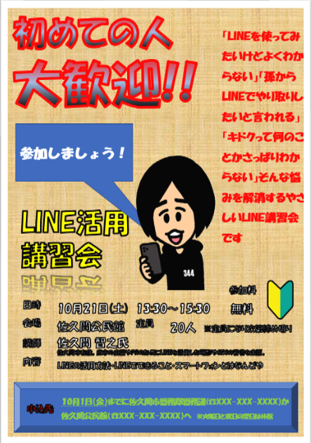
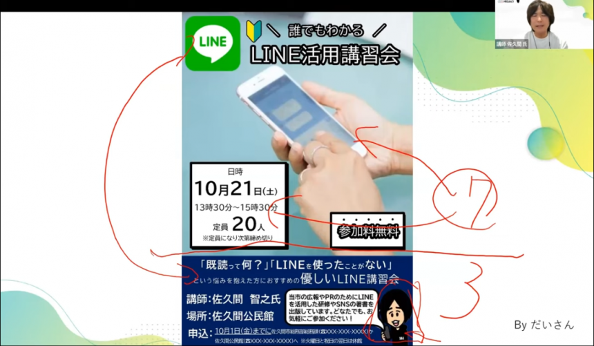
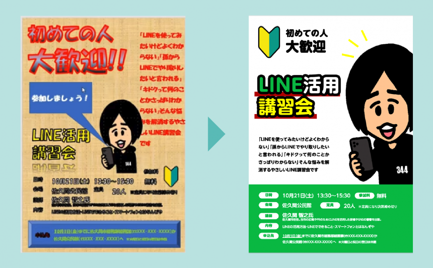
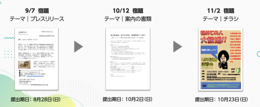
This week's homework | Flyer
The flyer's gaudy color scheme makes it hard to read, but our homework is to make it easy to read at a glance.
Pick-up and lecture
Many of you have done your homework and posted your comments. Thank you!
There are two points to pay particular attention to in this report.
Contrast in both text and illustrations
For students who find themselves constantly tempted to use gradients, the advice is to split the screen into two parts, top and bottom, without boxing the text to be read.
Furthermore, if you make the visuals as large as possible, such as using large illustrations, the flyer will attract attention at first glance.
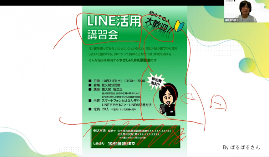
We also created outlined title letters by adding thick borders, and we were given a demonstration on how to create easy-to-read outlined letters.
Now that you have mastered the jump rate, use weights to further improve your level!
Many people used "jump rate" to vary the speed. BIZ UD Gothic has two weights. BIZ UD Shin Go has five weights, so we were told that if you want to make your font stand out more, it's a good idea to use the BIZ UD Shin Go lineup.
To create a LINE feel, the background of the information you read can be made the same green as LINE to create a sense of unity. This was also demonstrated.
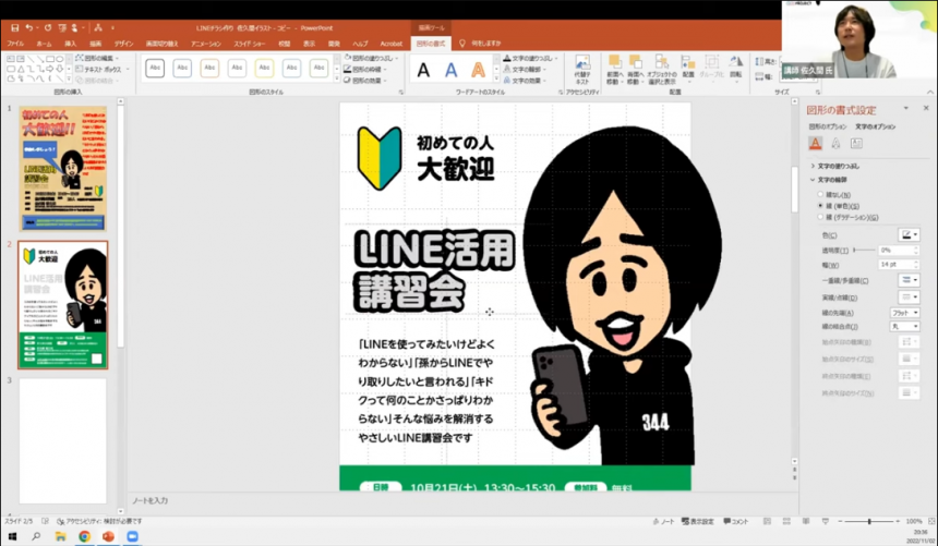
Sakuma demonstrates the remake
Remake Steps
- Make space for information to read
- Arrange information in a Z-shaped eye flow
- Make the eye-catching design large
- The text remains the same
- Adjust the color
- Set any color with the eyedropper
- Reduce the number of colors
- Arrange the letters and add definition to them
- Create a subheading object and adjust the text position
- Adjust whiteout etc. to match the color
- Create bold text for the heading to emphasize it
Instead of using a thick border for the outlined headline, overlapping two pieces of text will improve visibility and make the flyer more comprehensible! Please see the demonstration to see how.
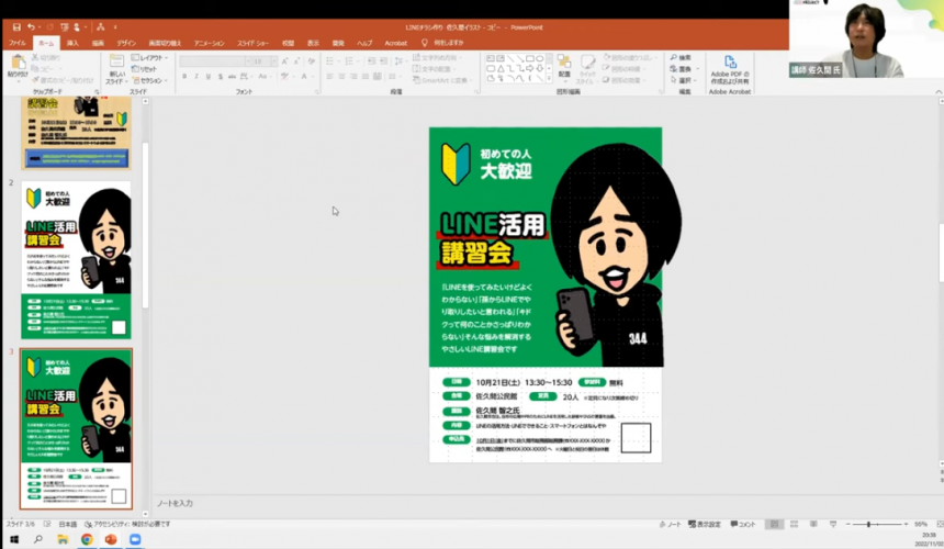
After completing all the steps, he even demonstrated how to change the impression by changing the background color. His fine adjustment techniques were well received by the participants.
How long does it take someone to decide whether they are interested in you or not?
After learning this information, we were given a video explanation of how to think in a way that attracts people, and we also had questions posed during the class, which were answered flexibly, making it a very fulfilling hour.
I'd like some advice on how many characters a headline should be!
A good headline is around 15 characters long. (There is a slight difference in the impression between vertical and horizontal typesetting.) Also, if it exceeds three lines, it will lose contrast with the main text and lead text, so we recommend adjusting it by deleting text or replacing words!
lastly
This marks the end of the three school sessions. What did you think?
The online seminar and school featuring public relations professional Sakuma received a great response. Please try to improve your own "communication skills" by looking at past reports and archives.
All three sessions of the school have prepared content that is often used in public relations activities! By challenging yourself with the homework, you will be able to learn more practically!
*Registration is required to watch videos.
*In addition to watching the archived video, you can also download the materials and workshop materials from the day.
Please also see the series of seminar reports.
If you want to use UD fonts, which Sakuma recommended in the seminar, easily in Office applications,We recommend MORISAWA BIZ+. For details,Here
Also,As a company, local government, organization, or school organizationIf you are considering using UD fonts, please feel free to ask us any questions below.
Sakuma's social media accounts are packed with information that only a public relations professional can provide. Please take a look at them along with his books and website.
PRDESIGN JAPAN Co., Ltd.– Changing Japan through public relations and design.