
Who exactly is a presentation for? What is its purpose?
Many participants in this seminar were able to understand very important points that are often overlooked when your mind is filled with creating presentation materials! This is the second installment of the "Effective Presentation Materials Design Seminar" held last year, which was very well received and was taught by Keiichiro Takahashi of The Presentation University!
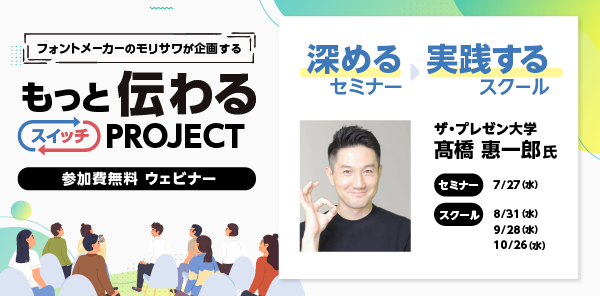
Morisawa holds various seminars on the theme of "communicating." Starting in July, we will be hosting seminars with three professional guests on the theme of deepening communication. Our second guest is Keiichiro Takahashi, who runs "The Presentation University," a channel with 100,000 subscribers. He will discuss various aspects of presentations that take the audience into consideration.
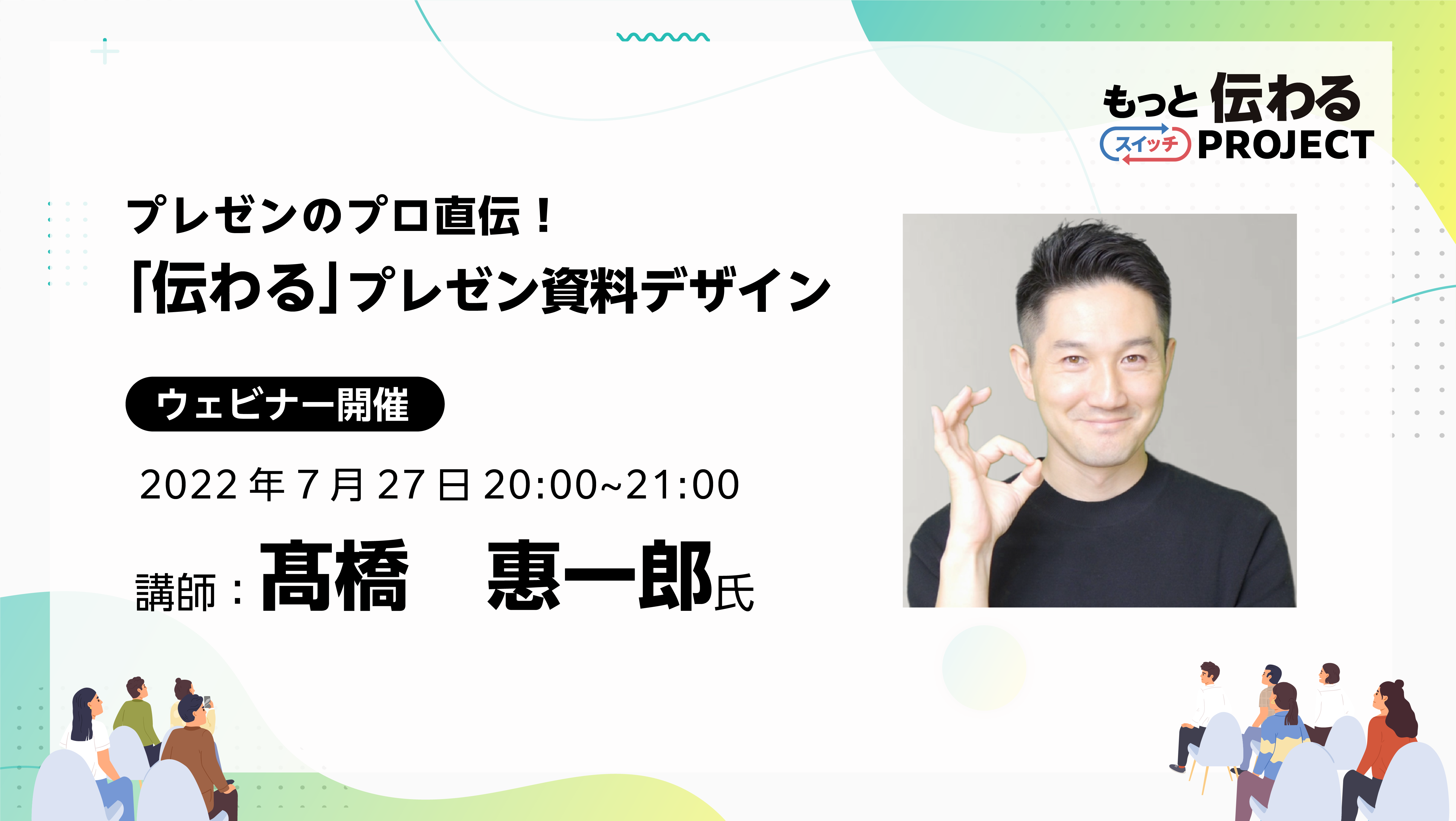
This time, we will report on the seminar "Learn from a presentation professional! Seminar on designing effective presentation materials using UD fonts," held on Wednesday, July 27th.
If you would like to watch the archived video from the seminar, you can do so below.
*Registration is required to watch videos.
*In addition to watching the archived video, you can also download the materials and workshop materials from the day.
Seminar Report
Reasons for attending the seminar and satisfaction
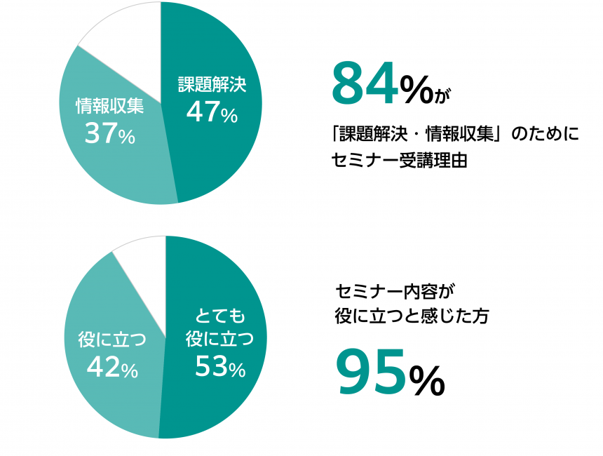
Many people attended this seminar to solve problems or gather information on issues, and 94% rated the content as useful for future activities.
Participant comments
I plan to use the font size adjustment and alignment method used in the final practical part when creating materials. Also, I will try to be conscious of how to speak using the Super Whole Part method from tomorrow.
I didn't know about the concepts of weight and condensation, so I feel like my perspective on fonts has broadened. I didn't think it was very easy to tell the difference between Meiryo and BIZ UDP Shin Go, so I was able to see the difference very clearly.
I was able to change my mindset and realize that giving a gift is not just about "communicating" something, but about "moving" the other person!
This was my first time learning about presentation formats, so I think I will be able to brush up on the content of my own presentations and use it when teaching children.
I think I understand why presentations don't go well now that you've explained the pattern!
From Morisawa
The course was attended by a wide range of people, from those who regularly create presentation materials in business situations to those involved in education and in-house human resource development, and the content provided a clue to solving their problems.
Here is a report on the seminar that day.
USeminar on designing effective presentation materials using D fonts

Keiichiro Takahashi(Takahashi Keiichiro)
He runs "The Presentation University," a channel with 100,000 subscribers. He provides comprehensive consulting on presentations, from creating content and designing materials to communication techniques. His latest book, "The World's Easiest PowerPoint Tips for Business Use: Just Look at Them" (Takarajimasha), is now on sale.
The format of a presentation that gets the message acrossteethThe listener is the main character
How do you define a presentation? I define it as "the act of conveying your ideas and asking the audience to change." So, to me, presentations include not only speaking in front of a large group of people, but also company meetings and discussions when traveling with friends. If you want to go to Europe, you want to present better than your friend who is recommending Asia.
When giving a presentation, it is important to keep your audience in mind.
Presentation 3.0 is the ideal
I call the early stage of a presentation Presentation 1.0, which means a presentation where the speaker "talks." For example, a presentation with a lot of information written on the slides is Presentation 1.0. It's easy for the speaker because they just read the text, but the audience is confused about whether they should read the slides or listen to the presenter.
What I recommend is Presentation 3.0, which is designed with the audience in mind, and places emphasis on the following points:
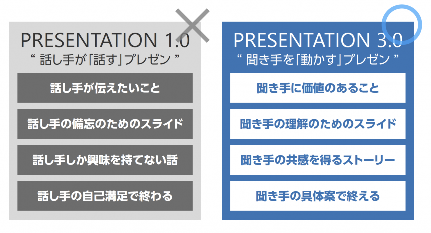
The presenter is not the main character, but ratherThe listener is the main character"
Super Whole Part Method
The essence of a presentation is to convey to the audienceProviding value"is.
The Super Whole Part Method is a presentation format that I devised, and if you master this format, you will be able to create very easy-to-understand presentations.
It starts with providing a topic, then goes into detail, conveying the main points, and is structured so that the listener feels that they have gained value. (Tips for creating each item can be found in the archive.)
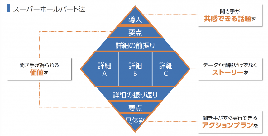
If you want to give a presentation that will encourage your audience to recognize the value of your content and take action, try structuring your content and creating your manuscript using this format.
The "form" of presentation materials
The material should not overwhelm the listener.
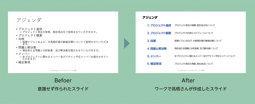
Now let's get into how to create presentation materials. As I mentioned earlier, "listing information on slides" and "having a cluttered design" are not good because they prevent the presenter from understanding what is being said.Presentation materials should be "clean" so as not to burden the audience.Please keep the following two points in mind: "organized information" and "well-organized design."
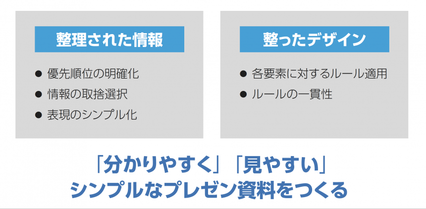
The "basic rules" of design that communicates
Presentation materials are made up of six elements: text, shapes, graphs, images, layout, and color. Here, we will focus on text.
◯ Add emphasis
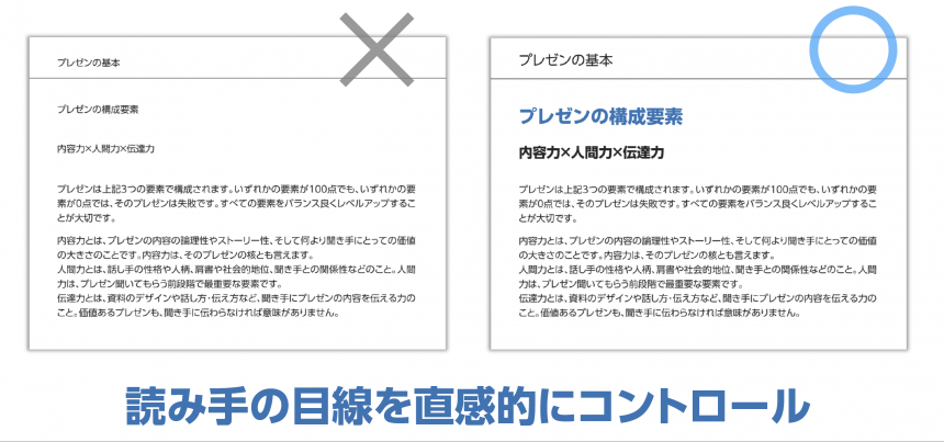
If all the text is the same size, it will be difficult to read, so you should vary the emphasis depending on the role. This emphasis is called "jump ratio," and headings should be 1.5 to 2 times larger than the main text. Adjust the thickness and color of parts you want to stand out in particular, and intuitively control the reader's line of sight. When it comes to design, we tend to think that it should be "stylish," but it's important to keep readability in mind.
The jump rate is explained here
◯ Adjusting line spacing
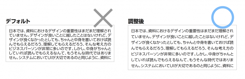
Adjust the line spacing to fit the length of the lines.
Format > Paragraph > Indents and Spacing > Line Spacing: Multiplier 1.3
It is recommended to keep it as such.
More details about the lines are explained here.
◯ Recommended fonts
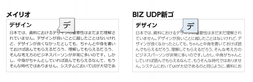
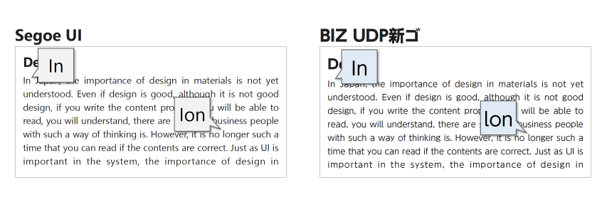
Do you know the difference between MS Gothic and MS P Gothic? The "P" stands for proportional. The width of the characters is adjusted, making them easy to read. For presentation materials, we recommend choosing a font with a "P" in it.
And we adopted universal design.BIZ UDP Shingo" is particularly easy to read and has a wide variety of options, making it a very useful tool. You can see that both Japanese and Western texts are easy to read and see.
Not only that
- A wide range of weights (thickness) = clearer control of strength and weakness, broadening the range of expression
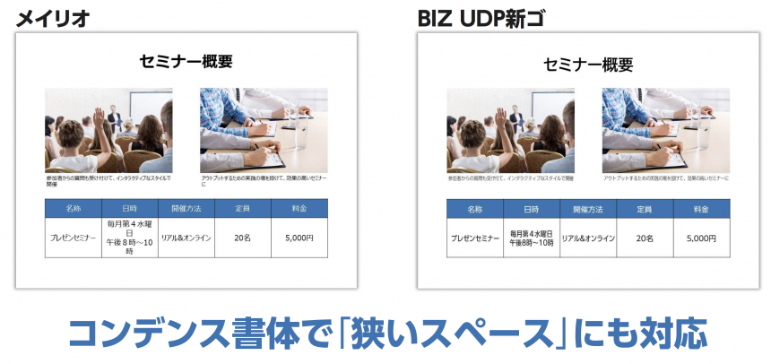
- There are "condensed typefaces" with tight spacing between characters, meaning that characters can often fit into tight spaces such as graphs and tables.
Demonstration at workshop
Takahashi gave a clear explanation of how to create easy-to-read presentation materials through practical workshops. If you want to know more, be sure to check out the video.
School Announcements
In this seminar, we learned about what to do before creating seminar slides and important points to keep in mind when actually creating them.
Starting from the next session, we will hold the workshop in a school format for three consecutive months. Please apply, taking into consideration the points that Mr. Takahashi shared with us during this workshop.
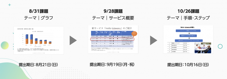
For all three sessions, we have prepared slides in the genres that you will most likely be dealing with! By completing the assignments and taking the course, you will be able to further improve your presentation slide creation skills, so please give it a try!
Participants in this seminar also expressed their expectations for the next school.
Slides tend to be well-organized but difficult to understand what is important, so I would like to solve this problem.
I would like to be told objectively whether the presentation materials I have created are practical.
I'm concerned about the time it takes to create the files, so I'd like to know how to do it efficiently.
The school is open to both first-time attendees and those who have attended seminars.Applications will be available.
*The application period has now ended, so please see the report and archive. If you have the same concerns, please take a look.
Direct advice from a presentation professional! How to design presentation materials that "get the message"Report List
If you want to use UD fonts, which Takahashi recommended in the seminar, easily in Office applications,We recommend MORISAWA BIZ+. For details,Here
Also,As a company, local government, organization, or school organizationIf you are considering using UD fonts, please feel free to ask us any questions below.
Takahashi's YouTube channel, "The Presentation University," shares presentation know-how. If you're looking to improve your presentation skills, be sure to check it out.