
Inabe City signed up for the UD Font Plan for Public Organizations, and in October 2019, UD fonts were installed on all PCs within Inabe City Hall, and employees are now using them in their daily work.
(For details on the introduction,Interview with Mr. Yutaka Sato, Policy Division, Planning Department, Inabe CityIt is also featured in the article.)
Morisawa Inc. has previously provided training to Inabe City employees on the functions of UD fonts and how to use them effectively.
This time, as an applied version based on the content that had been taught so far, we conducted an online training session titled "Training to improve public relations skills using UD fonts."
The steps below will show you how to renew documents that you are actually using.
- Watch lecture videos on UD fonts and layouts
- Prepare "documents for citizens used by each department"
- Analyze documents using the "Concern Design Questionnaire"
- Remake the materials based on the contents of the training and medical questionnaires
- Comparing documents and providing feedback during group training
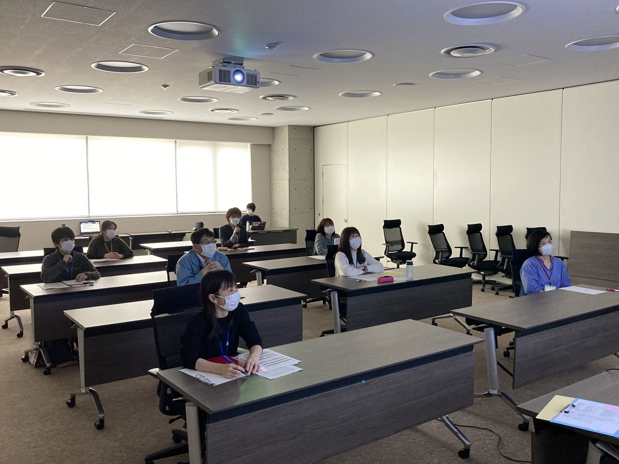
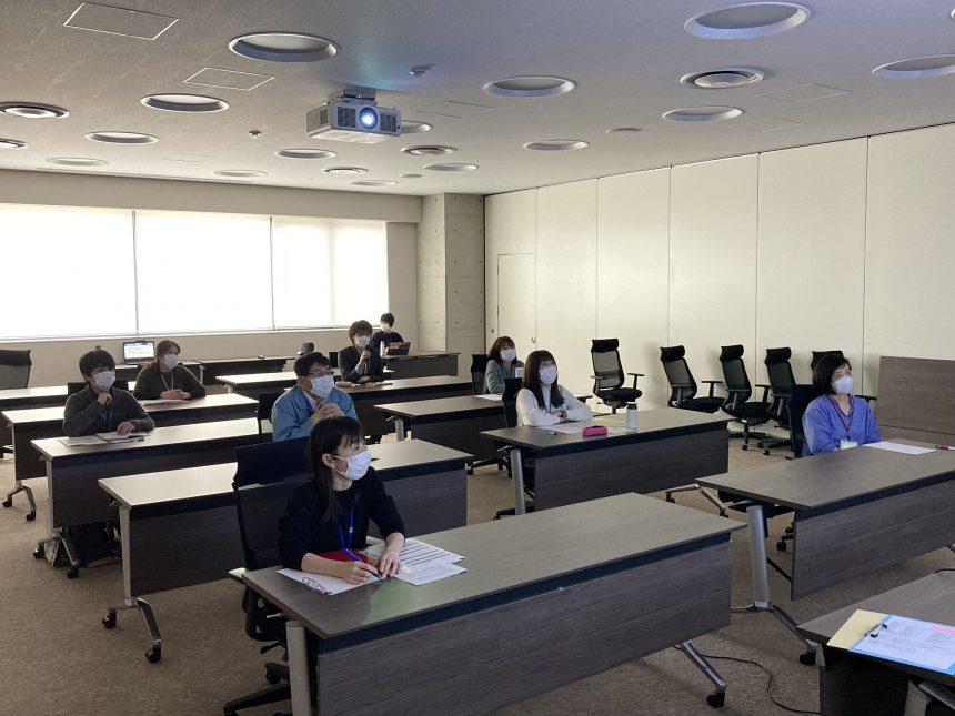
All staff members were asked to watch a lecture video on UD fonts and layouts in advance.
We had them remake their documents after sorting out any problems with their current documents using the "Design Concerns Questionnaire." During the group training, we compared the documents before and after the remake and provided lectures on how to improve them further.
Here we will introduce some actual examples that were covered in the training.
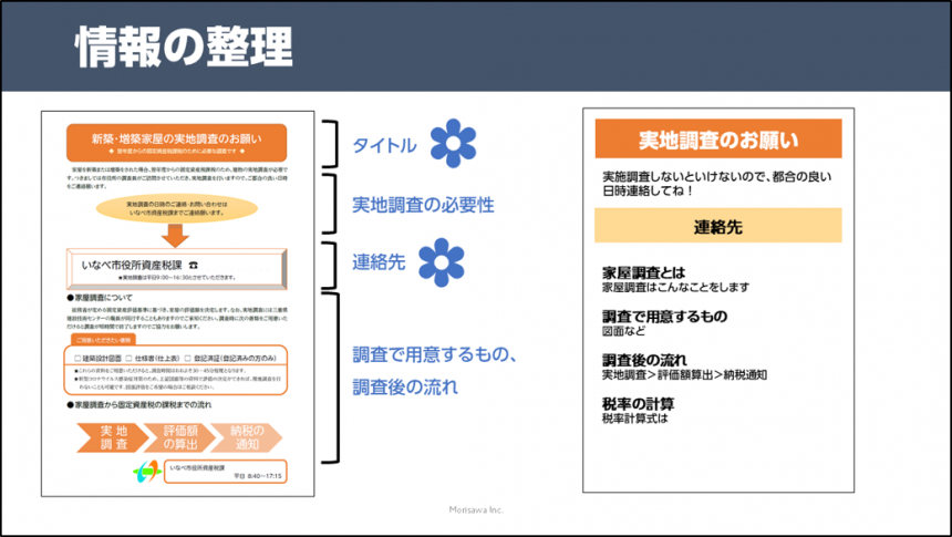
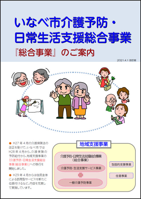
Example 1: Home inspection information
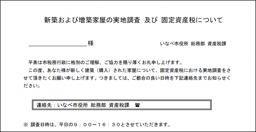
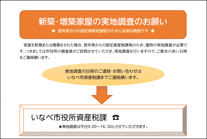
Guides that contain technical terms tend to be stiff documents.
The document before the remake "was bothered by its stiffness," but after the remake, the jump ratio (the ratio of the font size between the heading and the main text) was increased, giving it a more casual impression.
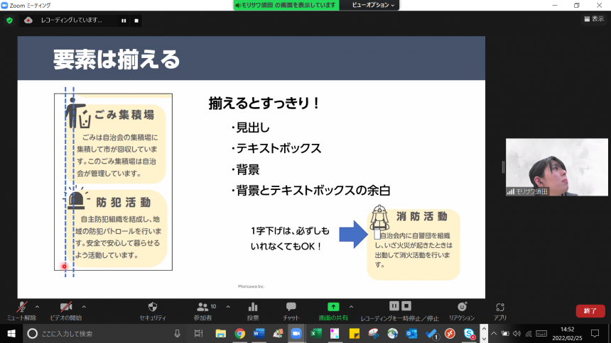
In addition, during the group training, we introduced methods for organizing information, using weights, and decorating to highlight points that you want to highlight.
Example 2: Flyer promoting neighborhood association membership
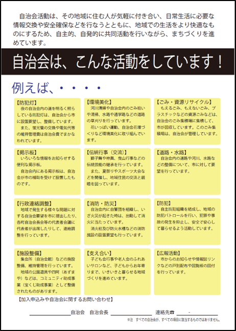
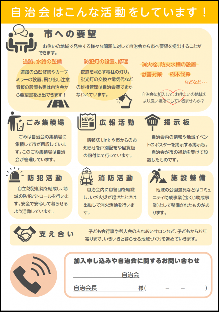
This flyer explains the activities of the neighborhood association and the benefits of joining.
The layout of the paper before and after the remake makes you want to read it.
The font is now a rounded gothic style, and the thickness and size of the letters are different between the headings and the main text, making it easier to understand and more approachable.
Additionally, using pictograms makes it easier to visualize what the activities involve.
During the group training, we introduced how to gather information when the line length is short.
Example 3: Nursing care prevention awareness leaflet
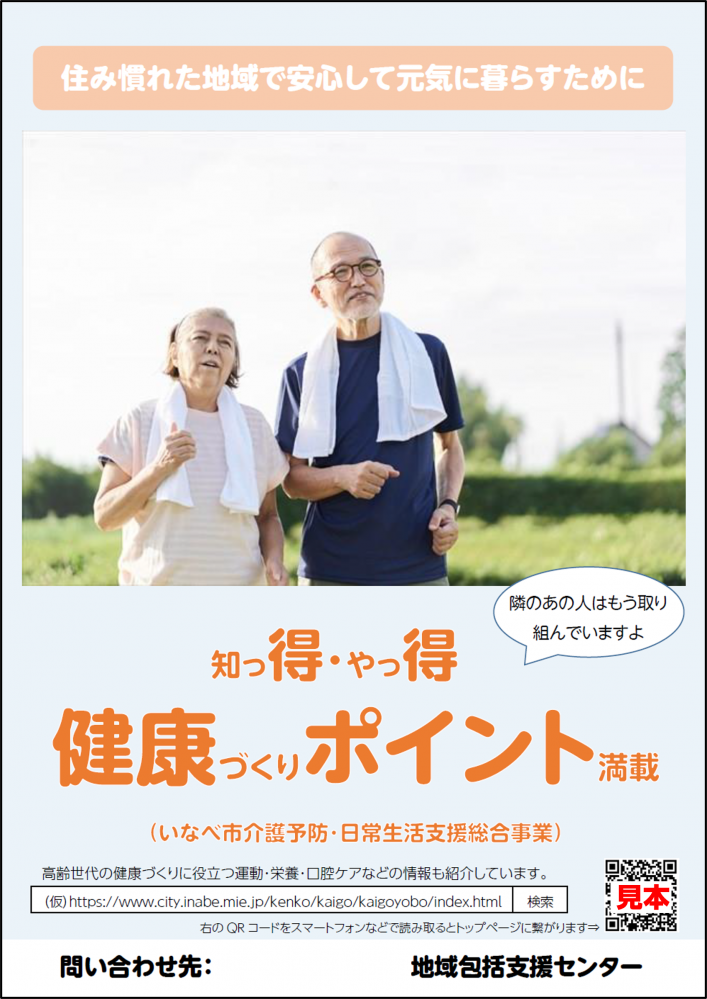
It was originally a pamphlet-like leaflet intended as a self-development flyer for those who are generally eligible for nursing care prevention, but we had it turned into a poster using photographs.
The flyer uses graphic elements and includes a catchy slogan to make it eye-catching. For poster-like flyers, the ratio of visible elements to readable elements is 7:3 to make a strong impression.
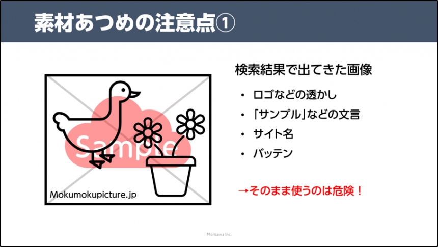
During the group training, we introduced things to be careful about when using free materials.
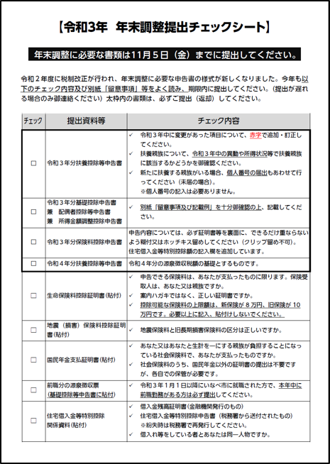
Example 4: Year-end tax adjustment document checklist
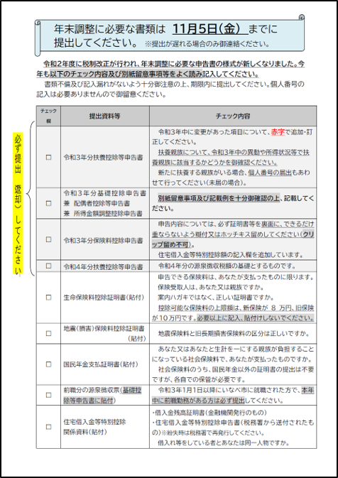
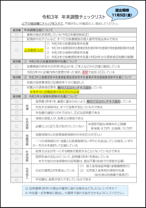
This is a checklist of documents required for year-end tax adjustments, and contains a very large amount of information.
After the remake, the text has been made clearer and easier to read by reducing redundant text and restructuring tables for easier understanding. The number of highlighting tools has also been reduced, making the text clearer.
During the training, we introduced examples created by Morisawa for reference.
Post-training survey
In a survey conducted after the training, 90% of participants said that the training was helpful.
When asked about useful methods and scenarios in which the service could be used, we received the following comments:
I would like to use this experience when creating publications for the public. The most important thing is to create something that people want to see and are interested in reading, so I will make sure to review the points I learned in the training every time I create something.
I would like to make use of condensed typefaces in the future.
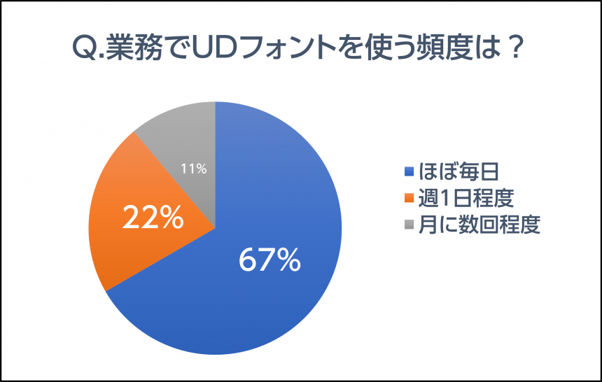
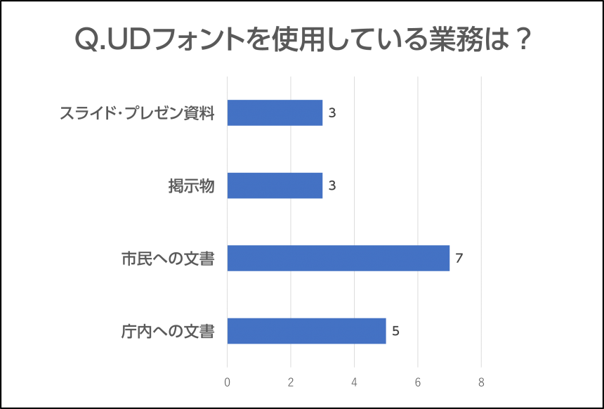
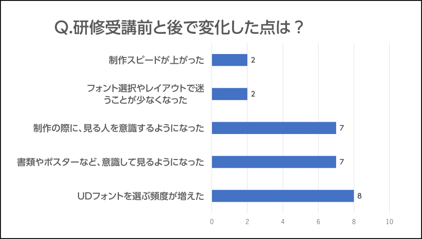
In addition, in the survey on the frequency of use of UD fonts, 90% of employees use UD fonts almost every day in their work, and the most common task for which they use UD fonts is "documents to citizens."
Furthermore, many participants commented that, compared before and after the training, they "have started choosing UD fonts more frequently," "have started to pay more attention to documents and posters," and "have started to be more conscious of the people who will be viewing them when creating something."
Morisawa continues to provide practical and ongoing support to users who are already using the service.
If you are interested in UD plans for public organizations, please contact us using the form below.
UD Font Plan for Public Organizations Inquiry Formhttps://www.morisawa.co.jp/support/contact/forms/ud-public