

The "FONT SWITCH PROJECT" brings together volunteer students from the Kanto and Kansai regions who are interested in fonts to "ON" their font sensibilities through the production of the free paper "FONT SWITCH MAGAZINE." A report session and graduation ceremony was held by the volunteer students and Morisawa on the results of six months of production work. What discoveries and growth did the participating students make after six months of magazine production? Here is a report on the graduation ceremony!
Click here to see the graduation ceremonies in Kansai.
What is the message they really want to convey? Two teams created the visuals while exploring this question, followed by the editorial team.
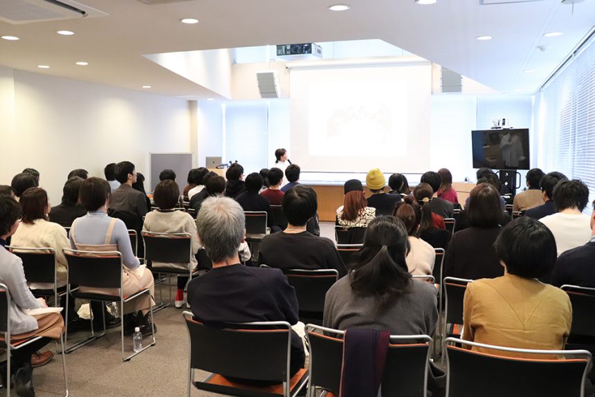
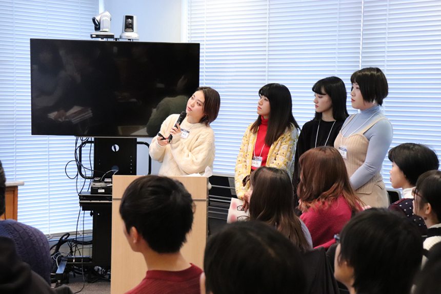
Two months after the Moripass Kansai graduation ceremony, the Kanto team's fourth meeting and graduation ceremony was held after being postponed due to a typhoon. With the Kanto team receiving harsh feedback from their advisor and manager at the previous meeting and the deadline fast approaching, how did they go about polishing their magazine? First, each team looked back on the process they went through to complete it, and then explained their output.
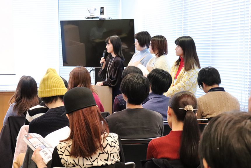
The first to take the stage was the visual page team, who said they had tried and tested many different things to express the concept of falling in love at first sight with text.
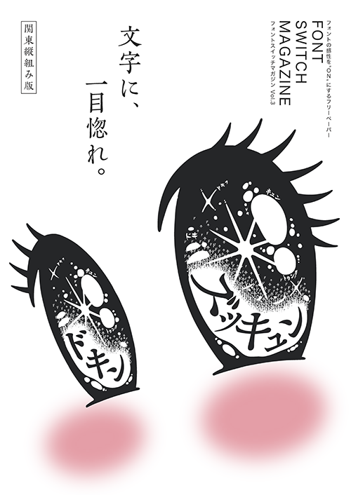
"When the concept was decided, the image of sparkling eyes came to mind, like the moment when the main character in a shojo manga falls in love. I sketched the shape of the eyes, but I struggled because it didn't come out very well. If it's too descriptive, it won't capture the reader's interest. But at the same time, if the concept doesn't get across, it's pointless, so it was difficult to strike that balance," she said, talking about the difficulties she faced during production.
In the end, they reconsidered the details and words, and decided on the idea of placing onomatopoeia in the eyes. They also adjusted the visuals by adding highlights to express the excitement of a shojo manga.
Apparently the next page, the table of contents, was the most difficult part.
"We had been thinking about the design with a focus on visuals, but we received feedback that it didn't serve as an introduction that would make people want to read the book. So we decided to place the body copy in the magazine, thinking of it as the entry point to the magazine."
The final page is captioned with the words "I'll love you even more," creating a very emotional expression.
The visual page is a page that expresses information in a single photograph among the textual information in the magazine. The goal of creating the visuals was to make the reader intuitively recognize the concept again.
"With the concept of love at first sight, I wanted to create an expression that would firmly carry that flow. At the same time, I was conscious of creating an expression that would fit the Kansai concept of 'wearing letters.'"
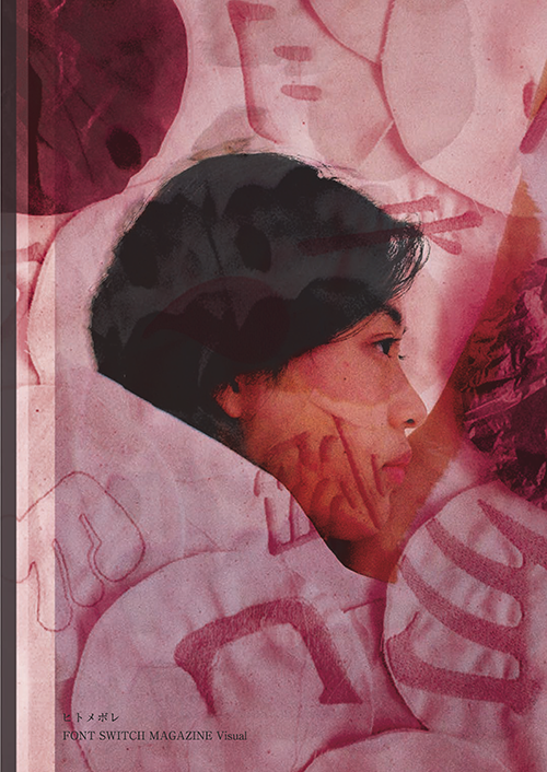
When people fall in love at first sight, their field of vision narrows to the point that "that's all they can see," so they decided to create something that resembles that image as a telescope, with close-up elements of typefaces in a round frame. The word "wear" (to wear), which is the theme of Kansai, led to the idea of using fabric as a medium.
However, the prototype they created didn't quite capture the image of being worn, so they decided to have models wear the fabric and take photos, and that was how they completed the project.
The following announcement is in the editor's notes.
FONT SWITCH MAGAZEN is a double-sided booklet. While the Kanto and Kansai teams are working on the front and back of the pages, respectively, what kind of ingenuity did the editorial team, who are at the center of it all, add?
"As a page that stands at the center of Kansai and Kanto, we were conscious of creating a structure that would convey the intermingling and cooperation between the two regions. We expressed this interplay by changing the layout from vertical to horizontal. We also used different fonts to highlight the individuality of each region."
It was a difficult role that required balancing many teams, but he received praise from his advisor for successfully organizing the information and compiling it onto one page.
Can the appeal really be conveyed? Three teams struggled with interview pages
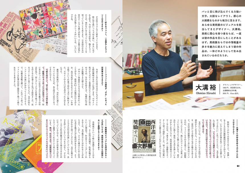
Then, under the watchful eye of today's guest, designer Omizo-san, the special feature page team made their announcement.
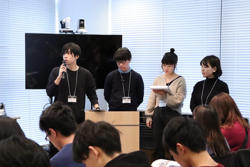
"Mr. Omizo's impressive use of letters and typeface creation have an overwhelming impact, so I requested an interview to find out the secret behind it."
As these words suggest, the special feature team sought ways to convey the appeal of Omizo's work. However, after writing the interview, they realized that the appeal could not be fully conveyed through words. After receiving feedback from their advisors and mentors, such as "Where is the hook in this interview?", they restructured the content.
Once again, I thought that the core of the interview was the "physical sensation of powerful graphics." I felt that Omizo's designs contained an emotional element that could not be explained logically, so I decided to re-edit the page to convey that physical element.
When asked about his favorite font, he got the unexpected answer, "It changes from time to time." Looking back, he recalls that the moment the special feature team's font switch was flipped was a pleasant surprise compared to the image he had of designers beforehand. Please read on.
The MOTC team interviewed Chikao Ito, the typeface designer behind the Inei Mincho font.
"When I learned that In'ei Mincho was a typeface created to sympathize with people who find life difficult, I felt the profound depth of the font. I was impressed by the fact that characters are not just chosen by people, but that they exist to sympathize with people," he says, looking back on the time when the project was being conceived.
The MOTC team's appeal lies in their elaborate plans, which combine the team members' areas of expertise. Nakamura, the only participant from a general university, wrote a novel inspired by fonts. He ordered resin relief printing plates from a printing company and printed them using a method similar to letterpress printing.
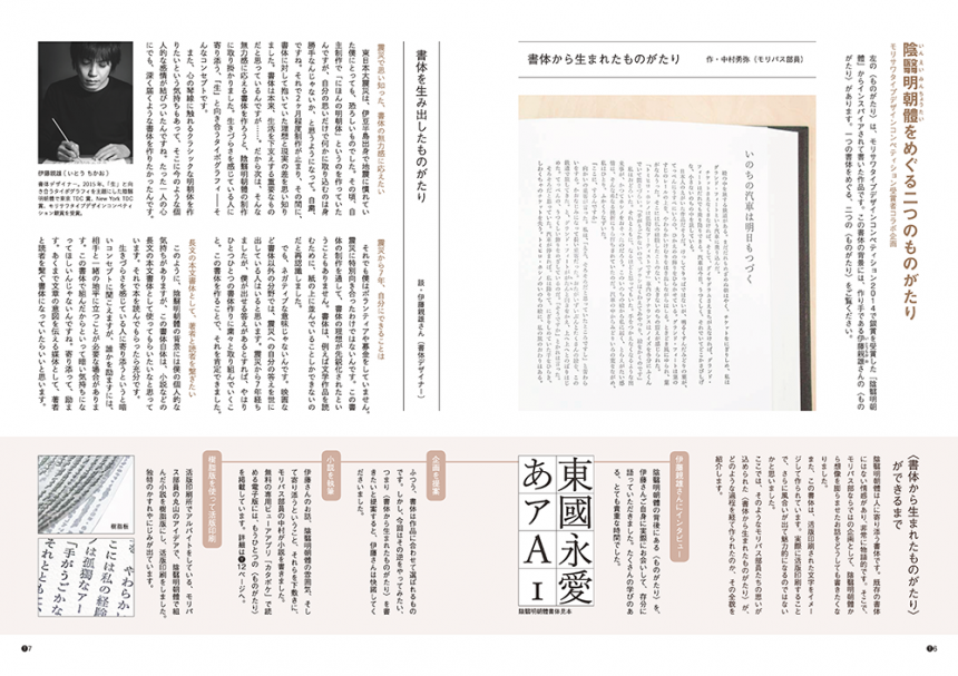
Despite the complexity of the project, it was not easy to convey the story behind it within the limited number of pages. The completed design proposal was extensively restructured, and the production process was explained in detail. The finished page has a multi-layered expression that amplifies the appeal of the work.
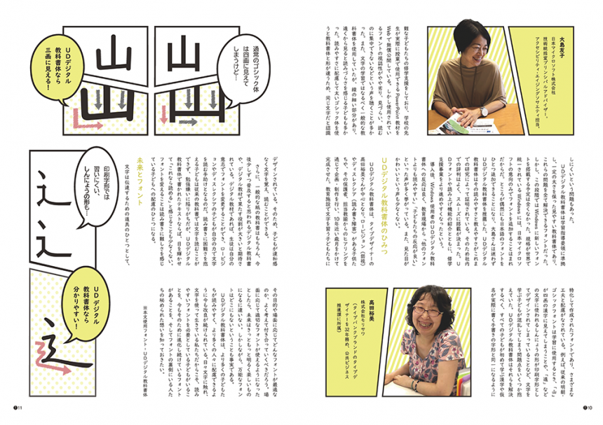
The typeface research team, which explores typefaces themselves, is in charge of a project called "UD Digital Textbook Font that Microsoft Fell in Love With."
Although it is not well known among students, we were interested in UD digital textbook formats that meet the needs of the times, and we came up with a plan to do so.
We didn't have enough understanding to convey its appeal, so we did some more research and discovered that it is a typeface whose details allow you to read the number of strokes and the origins of the characters.
"I'm sure the person in charge at Microsoft fell in love with this font at first sight!" we interviewed Oshima from the company to ask him about his feelings at the time.
Guest talk by Mr. Omizo, who helped us with the special feature
This concludes each team's review. After the presentations, a talk event was held with guest graphic designer Omizo Yutaka, who was featured in a special feature in FONT SWITCH MAGAZINE. Omizo, who works on art exhibition posters and web design, spoke about his work philosophy.
The excitement in the venue rose as he spoke candidly about how he acquires work, even projecting competition materials onto a projector, and even talking about the behind-the-scenes aspects of his actual work.
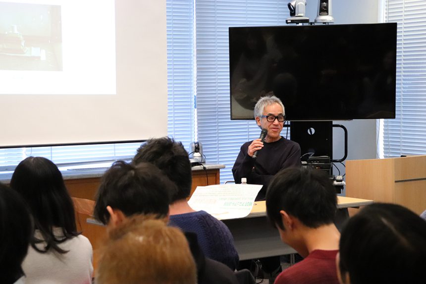
Finally, Omizo's unexpected words, "Have fun!", captivated even the teachers who attended.
Of course, Omizo was very popular at the social gathering.
"I could have done better" - A sense of accomplishment and regret at the review meeting and graduation ceremony
After the talk, the project participants had a party and a debriefing session. Manager Sakai gave some harsh feedback: "The completion of the booklet is not the end of the project. Getting it into people's hands is important to turn the font into a complete product. The reaction we get from there will lead us to the next step." However, surveys of those who picked up the 90% showed that the reaction was favorable.
With a sigh of relief, the students begin discussing things like, "We could have done it this way," or "How could we have made it more interesting?" Isn't it the accumulation of these unfulfilled feelings that is most important in improving the quality of production?
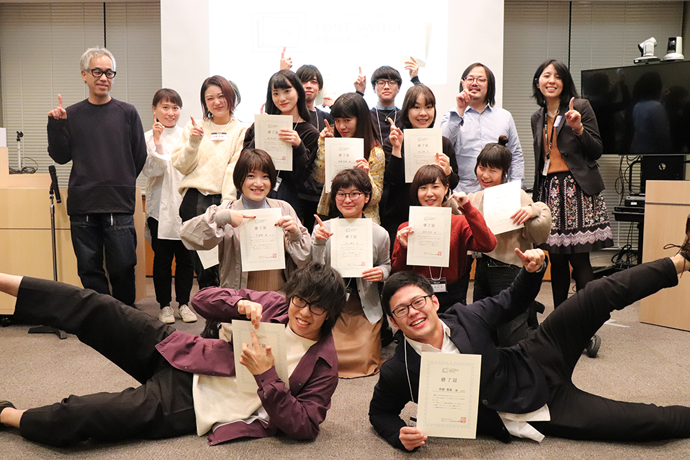
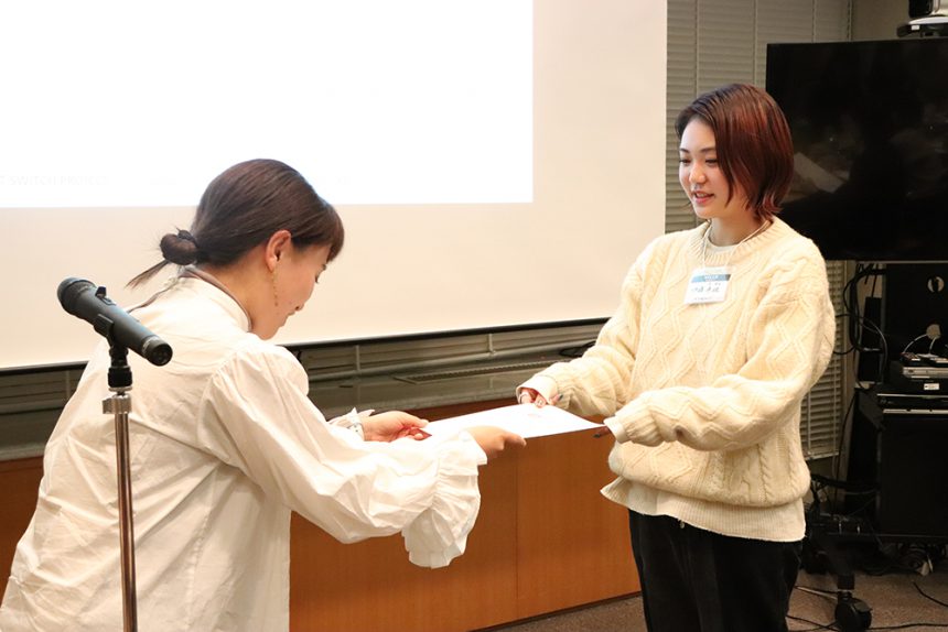
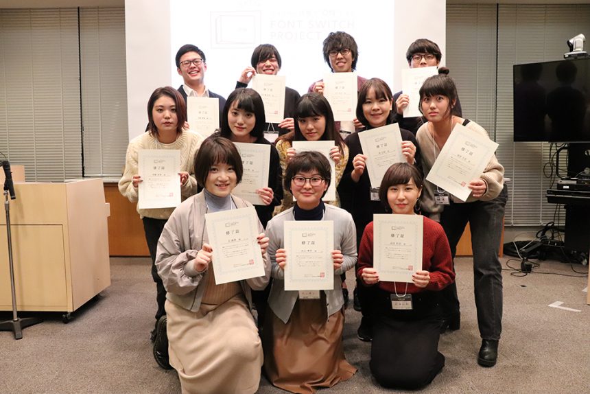
Then, finally, the graduation ceremony began. Advisor Hashizume personally handed each participating student a handmade diploma written in their favorite font.
"There must be a way for art students to communicate with each other, and only they can. The students should take the initiative in creating the work, and we should follow up on it," said advisor Hashizume, and the FONT SWITCH PROJECT has been run with this idea in mind. More than anything else, the way the students gradually become more independent is perhaps the greatest growth they have gained through this project, even more than their skills.
"It was fun to create something together with people from other universities."
"I'd like to work with fonts in the future, so this was a great opportunity."
These were the words of the students after the graduation ceremony. They will surely be able to make use of the experiences they have gained here in the future. We look forward to seeing their success!
You can read FONT SWITCH MAGAZINE Vol.3 here!