
We are pleased to introduce a collaborative project between HAL Nagoya College, Hokaze Co., Ltd., and Morisawa Inc. We wanted to turn on the sensitivity of fonts even for students who are not very familiar with fonts! Based on this idea, we asked them to come up with the theme of "Proposing a promotional tool for the Academic Edition of MORISAWA PASSPORT that personifies (characterizes) Morisawa fonts."
This time, the team consisted of a mix of students who could draw illustrations and those who could not.
Despite facing the unprecedented challenge of "understanding the characteristics of a typeface and creating an illustration that matches the image of that typeface," the students made the most of their teamwork to tackle the challenge.
At the mid-term presentation, we checked the direction of what typefaces to use, what characters to design, and what tools to create.
And then the final announcement came.
Each team had a completely different style, making for a fresh presentation.
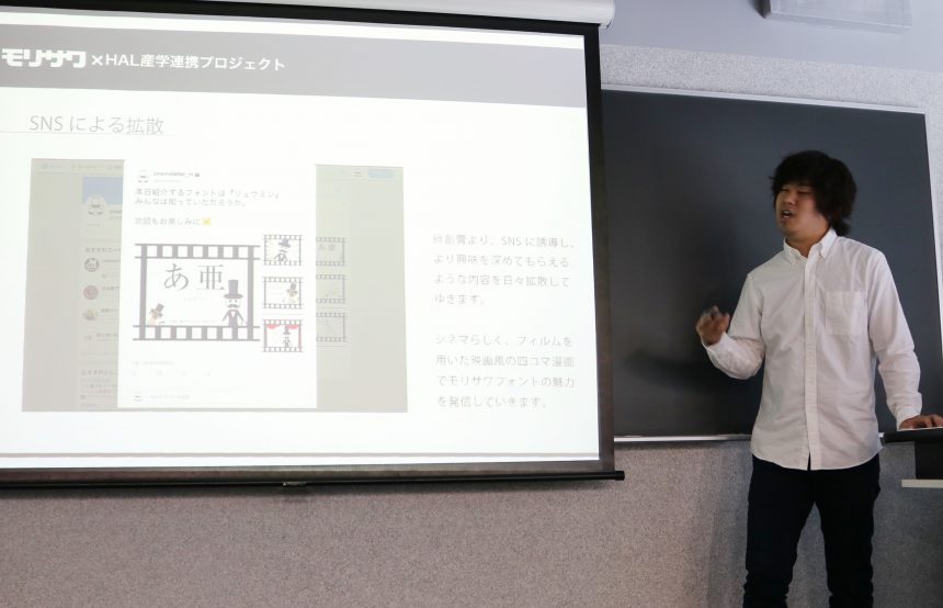
He noticed that bandages could also be used as a communication tool between students.Cinema LetterThe team chose " and came up with a unique proposal in which the characters invite you into the world of fonts.
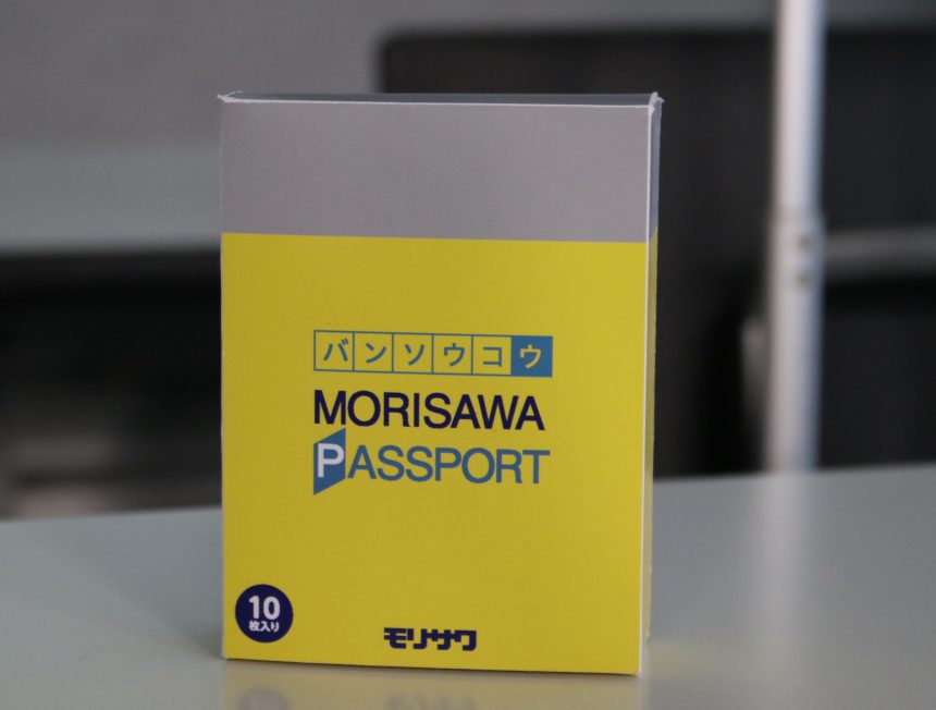
*The bandage box in the eye-catching photo is a mockup created to resemble the packaging of the MORISAWA PASSPORT academic edition (!).
Characterized by continuous characters,RoadsideThe team came up with a plan involving an illustration social networking site, where people could "connect" with their own power by choosing "Illustration," using fonts, and trying out various designs.
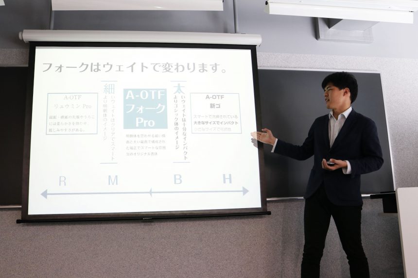
."forkThe team realized that the impression and usage of the four different weights (thickness of the letters) changed, and expressed this through the characters of four charming sisters with different personalities.
We investigated the use of typefaces and found that they are used in posters around town, cute package designs, and videos popular among young people.Suzumuri" The team came up with a proposal that made the product more approachable.
For students who tend to be biased in their choice of fonts,Song readingThe team used cute characters to demonstrate how using "" can broaden the scope of designs.
It was clear that each team had given careful thought to how they could convey the appeal of typefaces to fellow students.
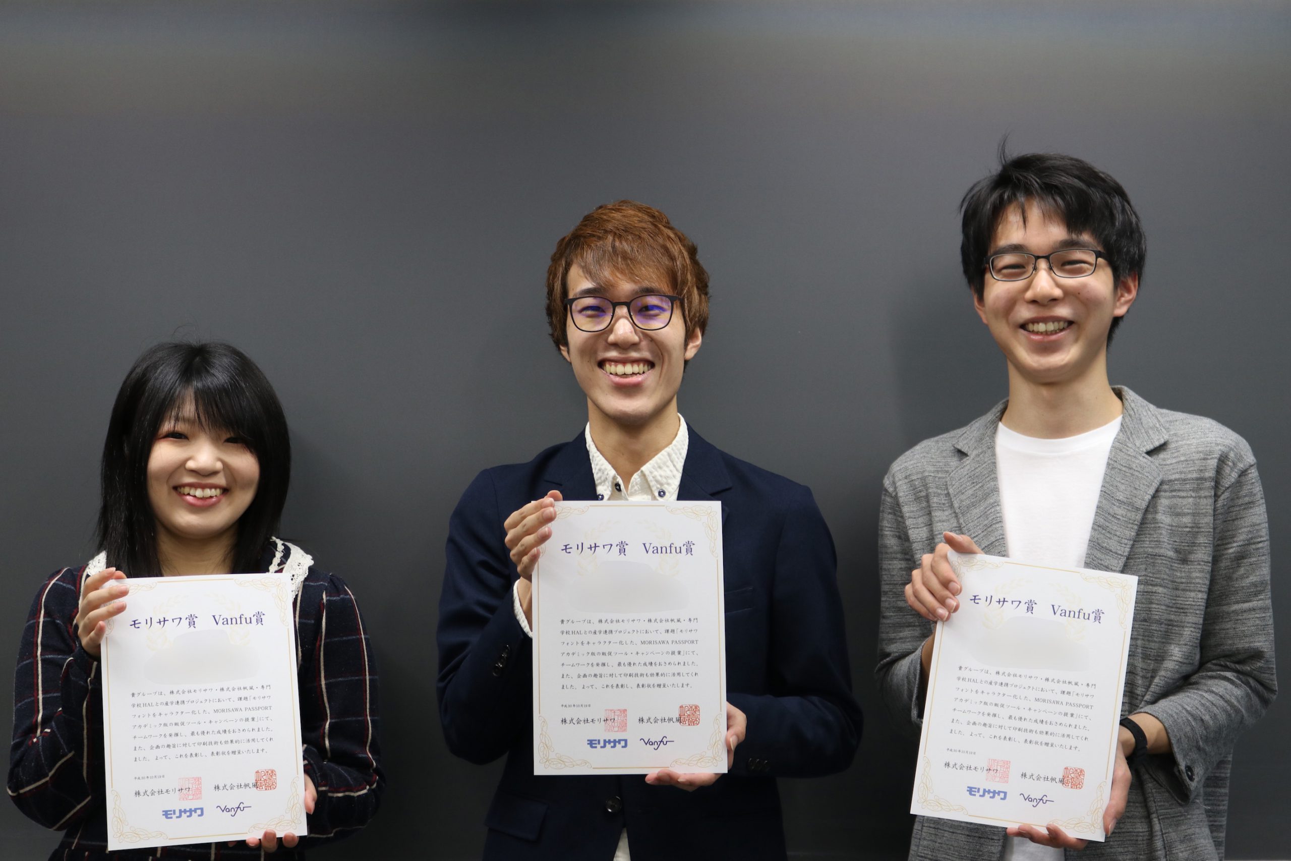
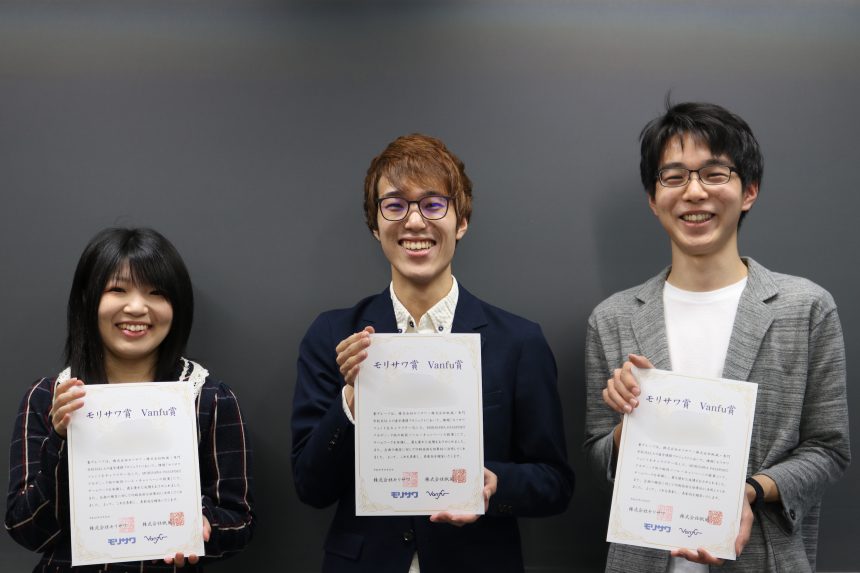
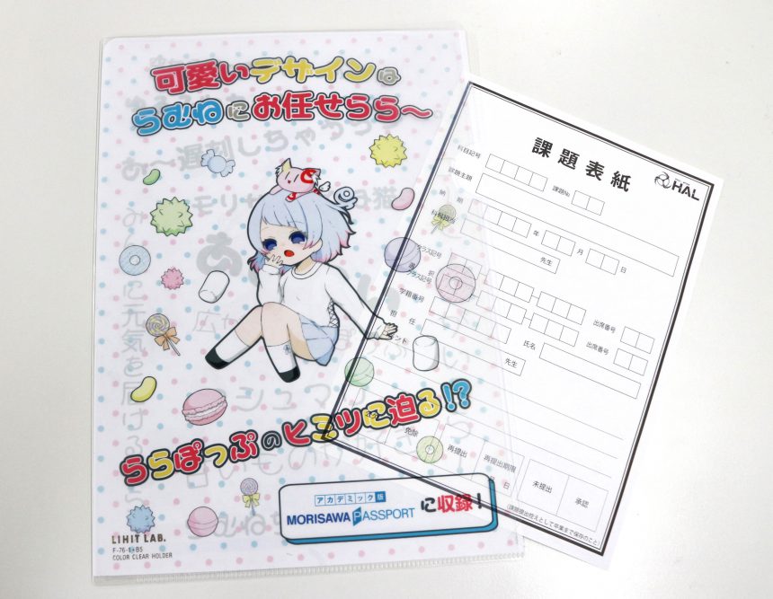
And the one selected was "Lalapop"Brabo Team" proposed a clear file with the theme "I want to make a difference." Their thorough analysis of the problem and convincing approach to the goal were the deciding factors.
We will be interviewing the team in an upcoming article, so stay tuned!
In the previous article, we reported on the final presentations by the HAL Nagoya students.
This time, we will focus on the Brabo team, who were awarded the Morisawa Award and the Hokaze Award, and present an interview with the three team leaders, Miyaji Takahiro, Odagiri Mayu, and Deguchi Itsuki.
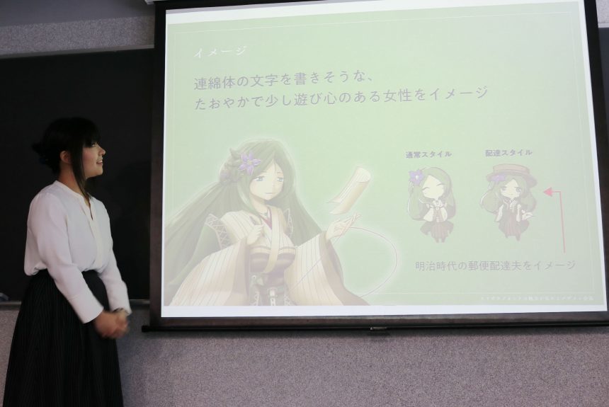
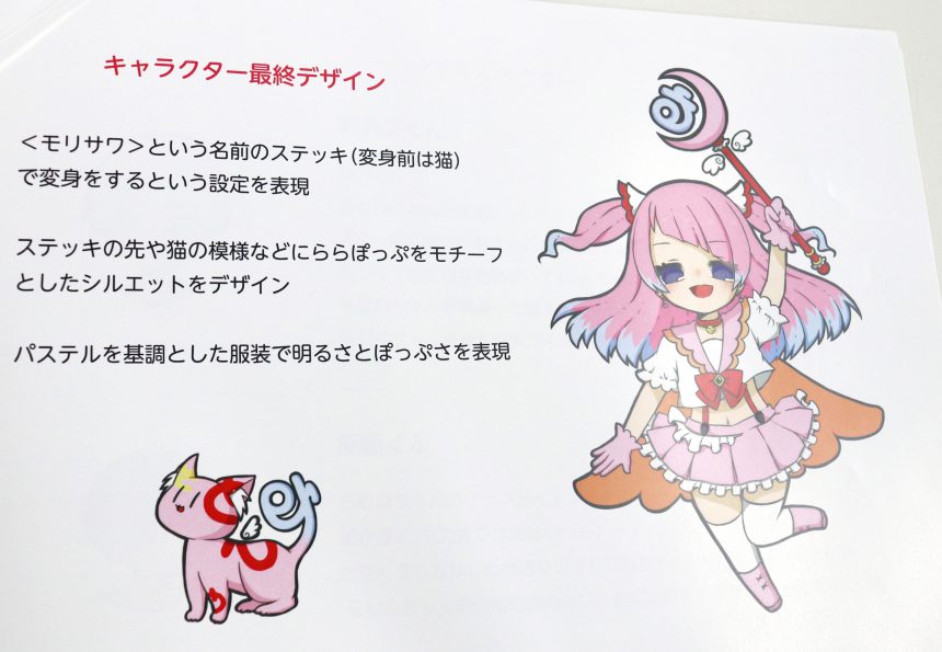
This team is creating a pop and fancy kana font called "Lalapop" was turned into a character called "Ramune-chan," a cute girl who transforms into a magical girl. They thought that by choosing a font with a unique design from Morisawa's fonts, they could create a memorable character.
The character design began with analyzing the impression of "LaLapop" and then putting together ideas. One brilliant idea was to use the unique shape of "LaLapop" not as a character, but as a motif for the walking stick and mascot.
As a tool to promote the MORISAWA PASSPORT Academic Edition, they suggested a file to store assignment covers (papers to be used as covers when submitting assignments) used by students in the HAL Group.
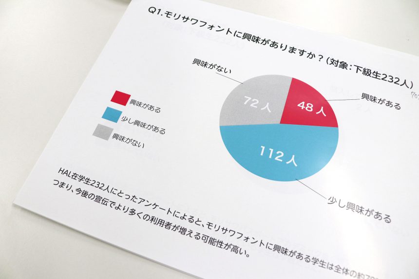
In addition, the target audience was set at "female students studying graphic design who have just enrolled at HAL Nagoya," and a survey was conducted of younger students currently enrolled at HAL Nagoya to ask questions such as, "How can we make our products more known?" and "When do we need fonts?", which also led to high praise.
By working on the assignment, the "face" of the font became clear
Miyaji, who was originally interested in the relationship between design and lettering, Odagiri, who excels at illustration, and Deguchi, who compiled the data. We asked each of these three individuals if they experienced any changes as a result of working on the assignment.
Miyaji:
I had always thought of fonts as part of the design elements, but by taking on the challenge of personifying them, I was able to see the characters...it felt like they really had personalities, and I felt more familiar with them.Odagiri:
When I see fonts other than "LaLapop," I also start to imagine what the character looks like and what their personality might be like.Exit:
I don't have much preference for fonts, so I've been using "Ryumin" I used to only use fonts that I liked. But while researching fonts this time, I realized that there are many different types and that fonts can broaden the scope of designs.
I think the enthusiasm of the whole team made for a compelling and wonderful presentation!
The Brabo team will now begin preparations to distribute the products to the students at HAL Nagoya. Please stay tuned!