

To commemorate the 20th anniversary of the establishment of the city, Namegata City in Ibaraki Prefecture is collaborating with Morisawa to select a new font for its city. Candidates were selected through workshops held between Namegata City officials and elementary school students in July and August 2025, and the new font was selected in September 2025 through a vote by junior high school students.
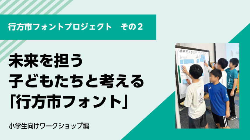
The "established font" will be used in government communications such as public relations materials and business cards, and will be one of the brand elements that will demonstrate the uniqueness of Namegata City both domestically and internationally. In this article, we will introduce the second "Workshop for Elementary School Students."
[Namegata City Font Project Decision Process]
- Workshop for city officials (July): City officials consider what makes Namegata City unique and consider candidate typefaces.
- Workshop for elementary school students (August): Elementary school students in Namegata City learn about character design and hold a mock vote from candidate typefaces.
- Voting by junior high school students (September): The official font was decided by voting among junior high school students in the city.
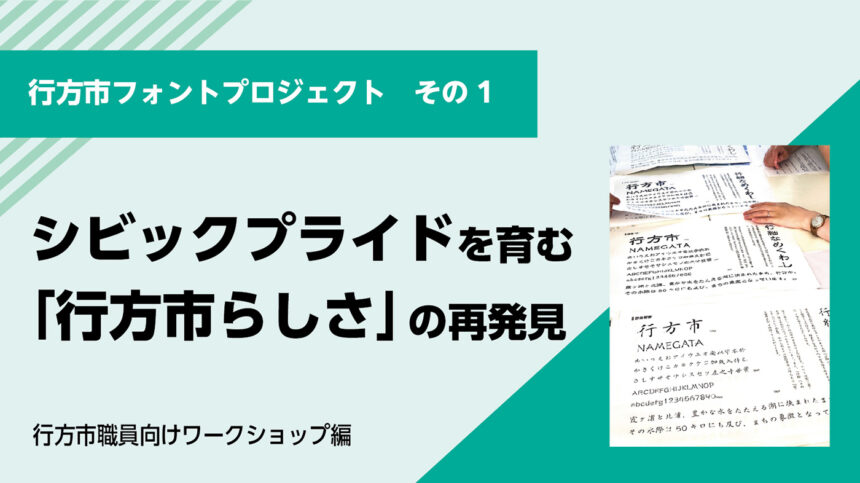
Namegata City Font Project (Part 1) - Workshop for Namegata City Employees -
Thinking about the "Namegata City Font" together with citizens
A "designated font" is a powerful tool for unifying an organization's identity and conveying a consistent image to the outside world. Namegata City's efforts were not simply about selecting a font. The use of unified fonts is also attracting attention in cities around the world (such as Chicago and Dubai) as an effort to foster civic pride.The true purpose of this project was to put into words what makes Namegata City unique and to build a foundation for sustainable brand management that would be acceptable to every single Namegata resident.
In this Namegata City Font Project,To emphasize that the selection process should be done together with the citizens, rather than being decided unilaterally by the government, children, who will be responsible for the future of the city, were also asked to participate. Through workshops where they could learn about the fun of fonts, they came up with a font that would evoke the essence of Namegata City.
[Elementary school studentforEstablished Font Workshop】
Make a postcard of your whereabouts using letters
- Part 1: Find the same font
- Part 2: Making postcards introducing Namegata City
- Part 3: Let's think about the letters of Namegata City together
Part 1: Finding the same font
In my opening remarks, I introduced Morisawa as a company and its relationship with Namegata City. During that time, I asked how many people knew the word "font," and nearly half raised their hands.
Here, the children were reminded that different types of character shapes are called "typefaces" or "fonts," and that there are tens of thousands of different fonts in the world. Many were surprised when they learned that Morisawa fonts are used in school textbooks, manga titles, game consoles, and more.
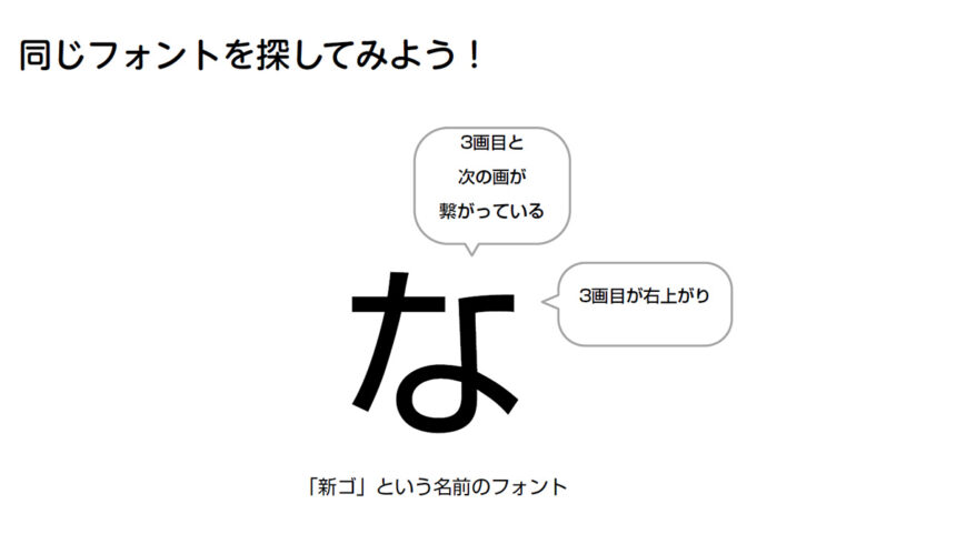
To help people become more familiar with fonts, we held a workshop where participants searched for the same font. We asked them to find the "na" character in the font "Shin Go." This character has a distinctive feature in that the third and fourth strokes are connected.
The children immediately picked up the stationery and handouts that had been prepared on the work table, poring over the small print. When asked if they had found the new Go character "na," many raised their hands enthusiastically.
What's the difference in fonts?
Next, we had the participants experience how different types of letter shapes affect the impression they get.
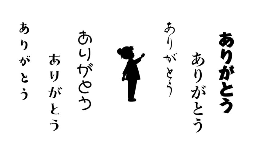
The example given was the word "Thank you" written in six different fonts alongside the silhouette of a kindergarten-aged girl. When asked which font would go best with the picture, many raised their hands for one that gave a feeling of cuteness and innocence. Next, the font type was left the same, but the picture was changed to that of an 80-year-old grandfather. This resulted in an elegant font that looked like it had been written with a brush being chosen.
There is no right or wrong when it comes to choosing a font, but the same words can be conveyed very differently depending on the font used. For this reason, fonts are also said to have a "voice."
Thinking about the voice of "Namegata City"
If Namegata City were a person, what kind of voice would it have?
Here, we have considered assigning characters to each of the four font candidates selected by Morisawa based on the content of the "Staff Workshop."
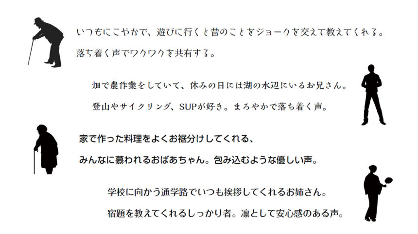
- The first one is "Hasemin": A grandfather who is always smiling and who tells jokes about the past when you visit him. He shares his excitement with you in his calming voice.
- The second person is Kaimin Sora: A farmer who works in the fields and spends his days off by the lake. He likes mountain climbing, cycling, and SUP. He has a mellow, calming voice.
- 3rd "Soft Gothic": A beloved grandmother who often shares her home-cooked meals with everyone. She has a gentle, enveloping voice.
- 4th person "Folk": An older sister who always greets me on the way to school. A reliable person who helps me with my homework. A dignified and reassuring voice.
The elementary school students imagined the "voice of Namegata City" by thinking of their family and neighbors, and consulting with people sitting nearby. When asked which font suited them best, each student raised their hand, revealing the diversity of Namegata City.
Part 2: Making postcards introducing Namegata City
In this part, the elementary school students created postcards introducing Namegata City using the font they chose in the first part, "Voice of Namegata City."
First, they selected a postcard as the base. Then they cut and pasted letters from a font sheet and photos onto it to create a collage. It was impressive to see the students approach the work with such free-spirited ideas as making numbers look like fireworks and using the entire piece in blue.
The postcards, each filled with individuality, were all wonderfully done. The elementary school students seemed very satisfied as they showed their postcards to the people around them and shared their impressions. When asked who they would like to send them to, many responded with comments like "Mom" and "Friends."
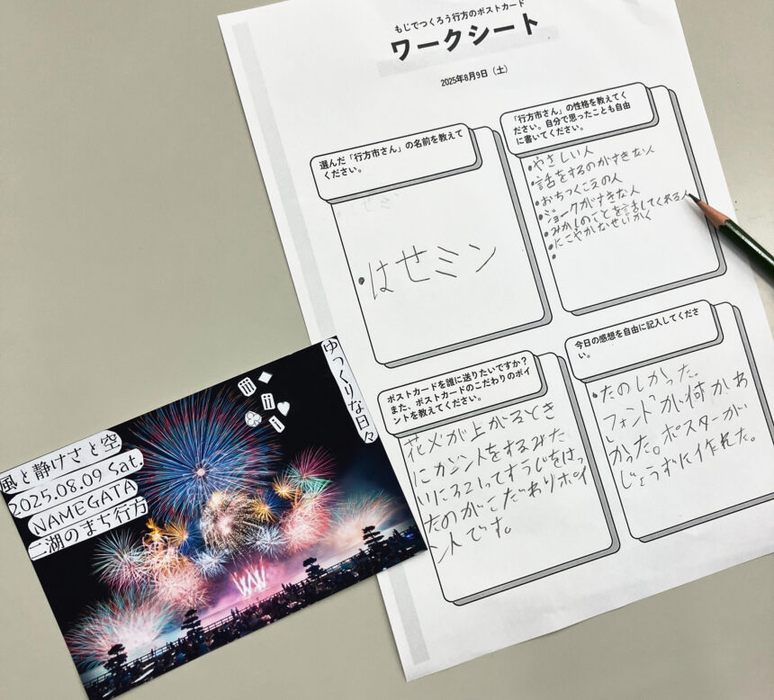
Each child wrote down their image of "Namegata City"
Part 3: Let's think about the letters of Namegata City together
In the third part, we held a mock vote to select the official font. Which font best represents the "voice" of Namegata City? Participants were asked to choose from four candidates.
As a result, the most votes went to "Kaimin Sora" and "Hasemin."
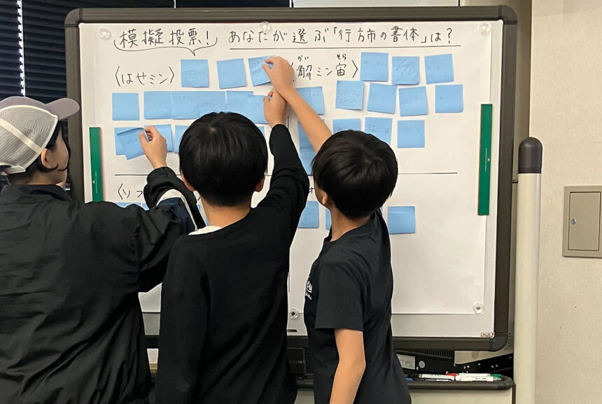
Of course, everyone has a different perception of fonts, so it was interesting to see that each person received a vote. In fact, there were a wide variety of opinions from the elementary school students.
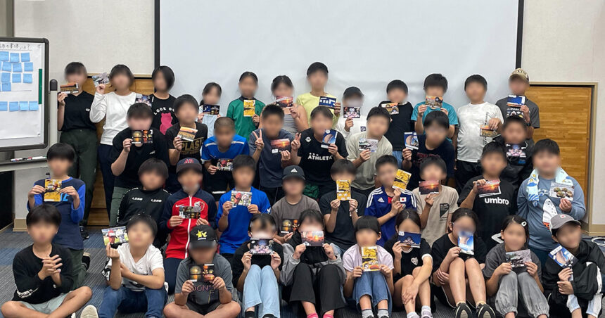
At the end of the workshop, everyone took a group photo holding the postcards they had made, bringing the event to a close with smiles and applause.
A font that embodies the essence of Namegata City
The four fonts nominated through workshops for city employees and elementary school students were ultimately selected by a vote of the city's junior high school students and announced at the ceremony marking the 20th anniversary of the city's incorporation.
[Namegata City Font]
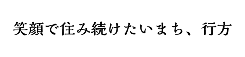
●Selected official font:"Kaimin Sora"
●The "Namegata City-ness" embodied in the established font:A city in harmony with nature / A city that coexists with the richness of nature
The established typeface will be used in Namegata City's public relations materials, business cards, and other government communications, and will play a role in demonstrating the "Namegata City identity" both internally and externally. By infusing the typeface with the local government's DNA and familiarizing employees and residents with a common typeface, it will foster a sense of unity throughout the city and promote branding.
We hope that the "Namegata City Font" will become popular among the citizens of Namegata and be used in a variety of places.

⇒Part 1: Workshop for Namegata City officials is here
The first part of the staff workshop, "Training on document creation," is a "Document Design Program that Communicates," and is also conducted in a face-to-face format for local governments, schools, and general companies.
Further details (including costs, schedule, and participant testimonials) can be downloaded for free here.
If you are interested in the "Communicative Material Design Program," the UD fonts used in the training sessions, or the "Established Fonts," or if you are considering introducing or utilizing them, please feel free to contact us using the form below.
● If you want to use UD fonts as an organization, we recommend the "MORISAWA BIZ+ UD Font Plan for Public Organizations." For details of the plan,Here