2month18In five parts, we will be presenting the stories of the teachers who cooperated with the pre-interviews for the event "Design Work from the Perspective of Typefaces" held on the 1st! There will also be stories that we were unable to share within the limited time of the event! Please check it out if you attended the event on the day or if you were unfortunately unable to attend this time.
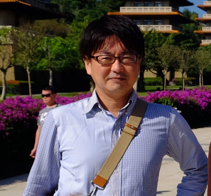
This time, we have Professor Eto from Osaka Kyoiku University, where I, Tanaka from the Kansai Moripass Club, belong.
Osaka Kyoiku University
Professor Ryo Eto
Q.What kind of work or production do you do?
Originally, I specialized in photographic expression, but recently I have been interested inGraphic Composer"iOSGraphical notation forAppI am in charge of planning and designing the following. I am in charge of visual design in classes.
Q.What is the role of typefaces in your work?
When I find a typeface that matches the design I want to express, I feel like a piece of the puzzle has been filled in. It is a "very reliable presence" that gives power to the design.
From the perspective of someone who simply loves letters, they are objects of love. I also like slightly pathetic, ugly characters.
Q. What was the moment when your font senses were turned on?
Ever since I was in elementary school, I've loved drawing car meters, air conditioners, and other instrument panels. I remember thinking the neatly arranged buttons and dials, and the lettering placed around them, looked really cool.
I also clearly remember developing letters using phototypesetting for the first time when I was in elementary school. My father had a phototypesetter in his workplace, and I was allowed to type.
Q.What is your favorite font?
."Small Gothic"ofW6It is a smallW6teeth,1character1I like this style because it gives the letters a strong presence, yet leaves a comfortable gap between them, creating a light and airy layout. I use it especially often when I want to emphasize the texture of the paper.
Among the new fonts:Shuei Nijimi Mincho" is my favorite. It has heart-wrenching details, but is not overbearing and has an elegant finish, making it easy to use.
I have other favorite typefaces, but I think I generally like typefaces that are simple and have a certain "moistness" to them. I feel a sense of humanity in them compared to dry, symbolic typefaces, and I find myself gazing at them with deep appreciation.

