
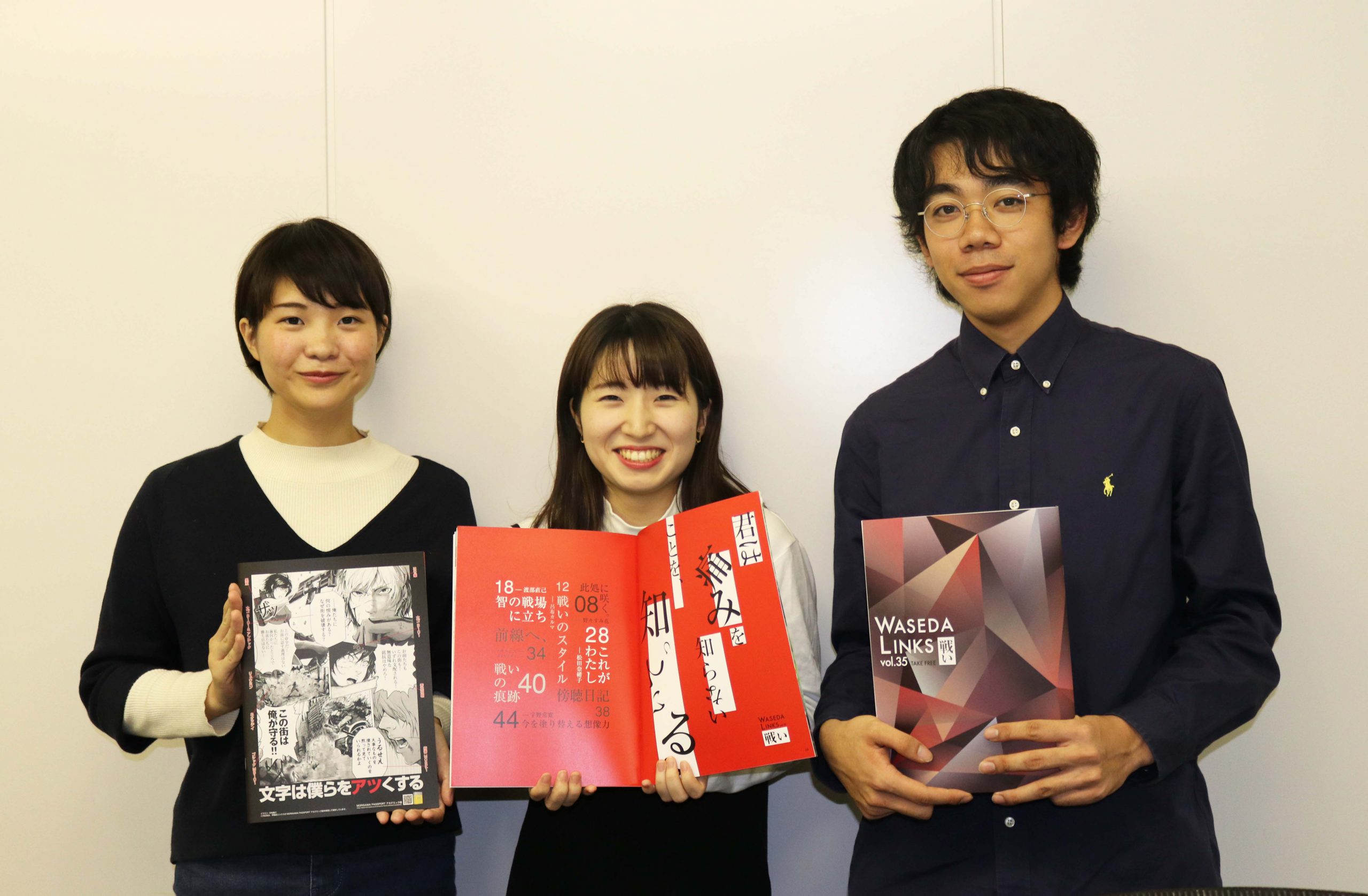

Mr. Imamura (left), Mr. Nakagawa (center), and Mr. Yoshida (right) from Waseda Links came to deliver "WASEDA LINKS vol.35"!
The theme of this issue is "battle." It is a powerful volume that looks at "battle" from various angles. We spoke to Imamura, who was in charge of editing the magazine, about his feelings towards this issue and the production of Morisawa's advertising pages.
From the stage when this project was decided, I wanted to use Gothic font rather than Mincho font for the main text. I tried various Gothic fonts, but they gave off too much of a flat impression that is characteristic of Gothic fonts, and I just couldn't find a good fit.Shuei Square Gothic Gold" has a certain weight to it, which I thought was a perfect fit for the theme of "battle," so I decided on it as the font for the main text. Now that it's complete, I feel that this typeface is one that Japanese people will be familiar with.
For the headings of each feature, each designer chooses their favorite font and processes it to match the image of the feature.
For the advertisement in Table 4, we considered how to best convey the concept of Morisawa Font and the theme of this issue, "battle," directly to readers, and chose a manga-style presentation.
The person in charge of the illustrations on this advertising page is not a member of Waseda Links, but Yosuke Nakamura, a third-year student at Waseda University (a friend of Yoshida). He adjusted the illustrations many times to meet our request to "make the typeface stand out more," and I don't think we could have made it into a reality without Nakamura.
Imamura-san's font switch is completely "ON." Nakamura-san's drawing skills are also amazing! We at Morisawa are very happy to see people who don't usually study design as their main focus choosing typefaces with such care.
Imamura, a third-year student, will be retiring with this issue. From now on, second-year students Nakagawa and Yoshida will be leading the magazine as core members. Please keep an eye on the ever-evolving Waseda Links★
And what's more, starting with this issue, you can now read the articles as e-books! Be sure to check it out!
Read "WASEDA LINKS vol.35" on Katapoke
KatapokeWhat is it?
Waseda Links official Twitter ▶︎@wasedalinks