The Kuwasawa Grand Prix is an in-school competition held at the Kuwasawa Festival, a cultural festival held at Kuwasawa Design School. Every year, students submit works based on a theme, and designers and artists critique and judge the entries. This year, Morisawa also participated as a sponsor!
The theme for 2022 is "Kokoro-ma".
A coined word that combines heart and space.
From the "Kuwasawa Grand Prix 2022 Poster"
First, face yourself, and then try to give your heart space to others.
Words that mean you don't have to worry about it too much.
What is your heart?
Following the theme that allowed for personal interpretation, the venue was lined with masterpieces from a variety of genres, including two-dimensional and three-dimensional works, product designs, and fashion designs.
Education
Morisawa wants to promote written communication through fonts, so in addition to evaluating the work itself, one of the judging criteria is "Does the work convey the intention and thoughts behind it, including explanatory tools such as panels?" category and selected the sponsorship award.
We'd like to introduce you to the works that won the Morisawa Sponsorship Award, as well as an interview with the students!
Morisawa Sponsored Grand Prize
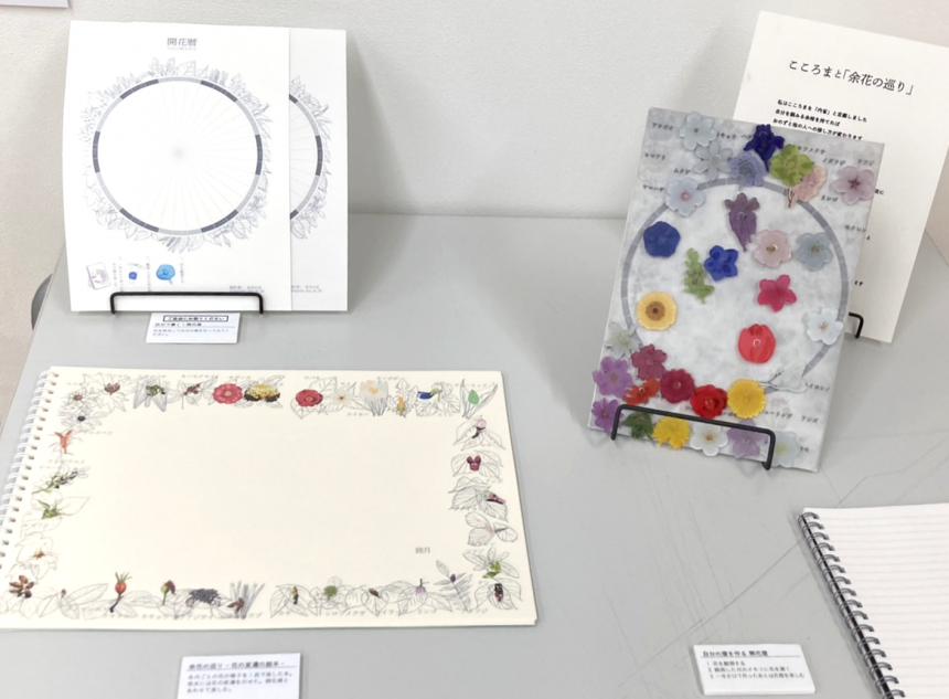
Ayano Matsuda's "A Tour of Other Flowers"
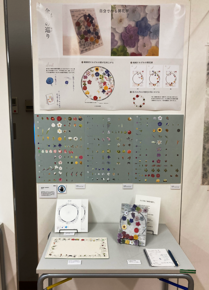
Matsuda provided us with comments on the work and the work explanation tool.
Q. Please tell us what you focused on in your work and what difficulties you faced in creating it.
We paid particular attention to the printing of the magnets.
I used UV printing on clear acrylic, and used clear ink to raise the line drawings and express their delicacy. I used a lot of flowers, so I struggled with arranging them. I searched for a layout that would look beautiful.
Q. What were some of the challenges you faced in conveying the merits and concept of your work through panels and posters?
I created a product that records flowering and allows you to create a personal flower calendar. I struggled with explaining how to use it. To emphasize how easy it is to use, I summarized how to use it in three points, each with an illustration to make it intuitive.
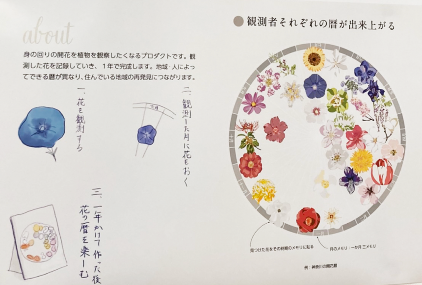
Q. What are your preferences when choosing fonts?
I chose a font that matches the delicate theme of flowers. I wanted to create a soft atmosphere, so I chose "Shuei Nijimi Mincho" was used to create the title.
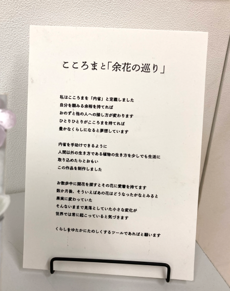
The poster features large, eye-catching photographs. There is a margin around the title, creating a gentle atmosphere. Because the flowers are colorful, a neutral gray band is used to summarize the explanations. We also created captions for each piece, aiming to make the exhibit easy to understand.
Education
This gorgeous piece allows you to create your own personal flower calendar using flowers you find around you. Using tools such as flower magnets and sheets, you can observe the changes in flowers with the seasons. What caught my eye was the attention to detail, including the posters and panels explaining the concept.
The font selection is also careful and effective.The old-style Mincho font brings out the elegant atmosphere of the work, while the small text in the captions and other small characters is written in a simple, easy-to-read new-style Gothic font.The handwritten letters are also a nice accent.
Morisawa Sponsored Excellence Award
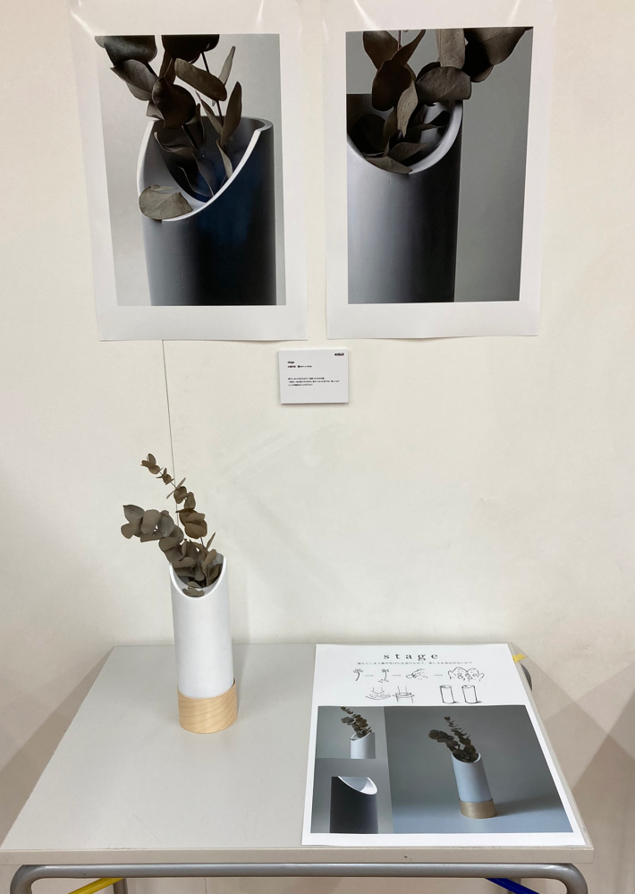
Kato Zen'ei "stage"
Kato provided us with comments on the work and the work explanation tool.
Q. Please tell us what you focused on in your work and what difficulties you faced in creating it.
The concept is expressed through minimal design, with a focus on creating a soft yet sharp form.
We struggled to find the perfect balance between the width and height of the vase, taking into consideration many factors such as the size of the cut flowers and the stability of the vase.
Q. What were some of the challenges you faced in conveying the merits and concept of your work through panels and posters?
We struggled with how to maximize the information that could be conveyed while minimizing the amount of "textual information" so that the image could be conveyed intuitively.
Q. What are your preferences when choosing fonts?
I chose a font that would suit the image of the work. I was conscious of not only choosing the font type but also kerning it to create the best possible image.
Q. What ideas did you have for arranging the work explanation tools?
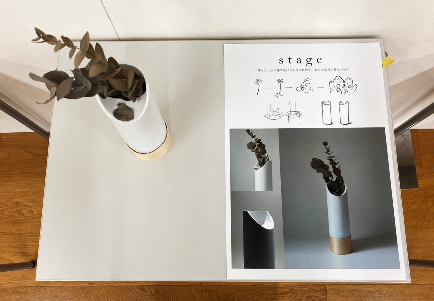
We used photographs and sketches to allow the viewer to intuitively grasp the intention, and we devised a way to communicate everything from the concept to the details in a clear and intuitive manner.

Education
This is an appealing piece with a unique perspective: "A vase that catches falling leaves and petals." I felt a sense of worldview and attention to detail not only in the design of the vase, but also in the layout of the sheet explaining the concept and the way the poster photograph was taken.
There isn't much text on the sheet, but you can see that it has been carefully set up.The space between the letters in the title "stage" creates a breezy and effective effect.That's right. It helps create a delicate worldview, like falling petals and leaves.
The lead sentences have no spaces between the letters, which creates contrast and makes the page appear more lively and not flat..
Miu Yamada and Marina Yui "Here and There, Our Hearts"
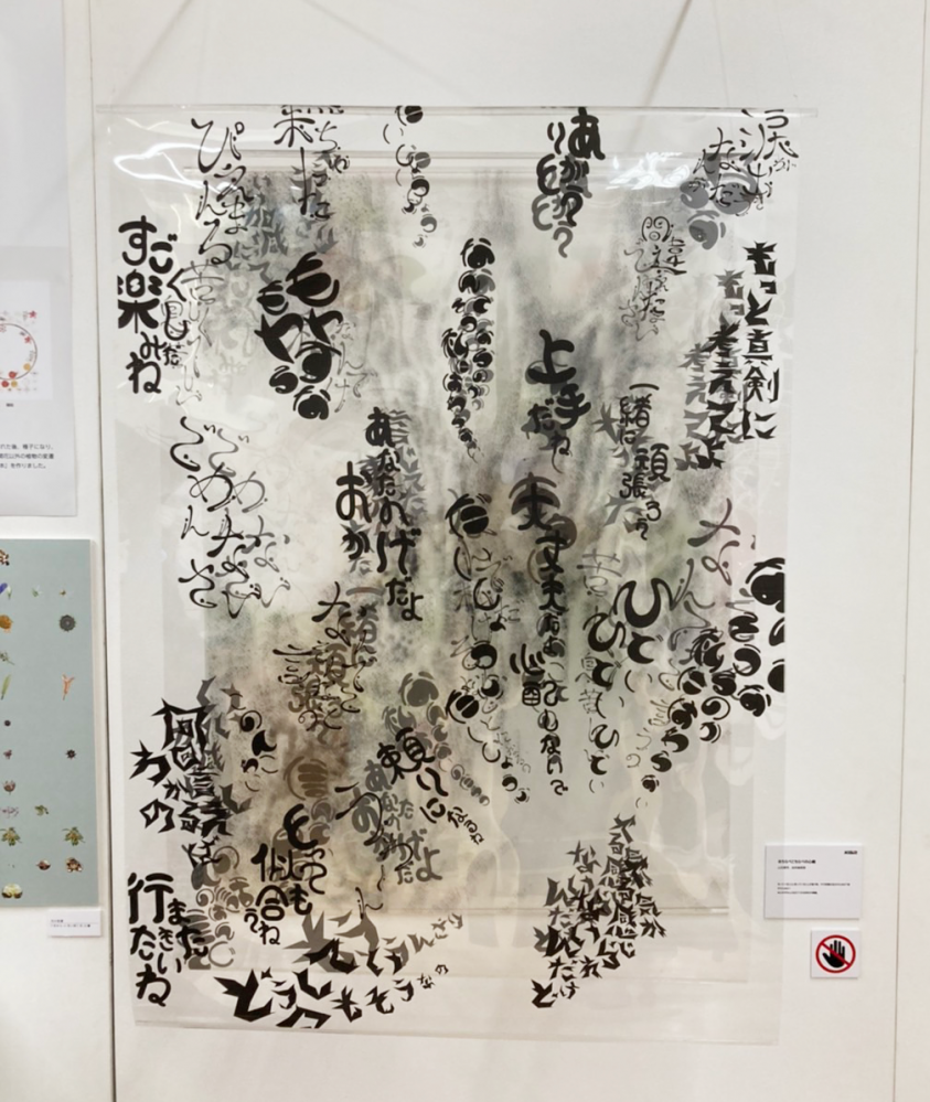
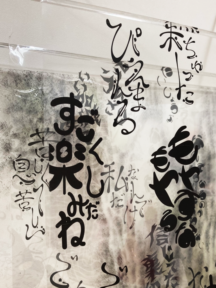
Yamada and Yui gave us some comments about the work.
Q. Please tell us what you focused on in your work and what difficulties you faced in creating it.
We divided a transparent film into three pieces to express the difference between what we think and what we say.
This work asks what it means to you when the words you think and the words you say are the same (your true feelings).
I struggled with aligning the two characters' images and expressing their emotions in words.

Education
The words on the transparent film separate the "true feelings" from the "superficial feelings"I liked the way it was expressed so that it was easy for viewers to understand.is.The handwritten characters are well designedI felt that it was a work that could be enjoyed by imagining the situation and replacing it with your own experiences.
The works that won the Grand Prix and Designer Awards are from the Kuwasawa Grand PrixTwitterYou can check it out here.
Thank you to all the participants!

