

Introducing our wonderful members one by one [Moripass Club Member Introduction]
This time, Moripass Club advisor Hashizume will be reporting.
This time,
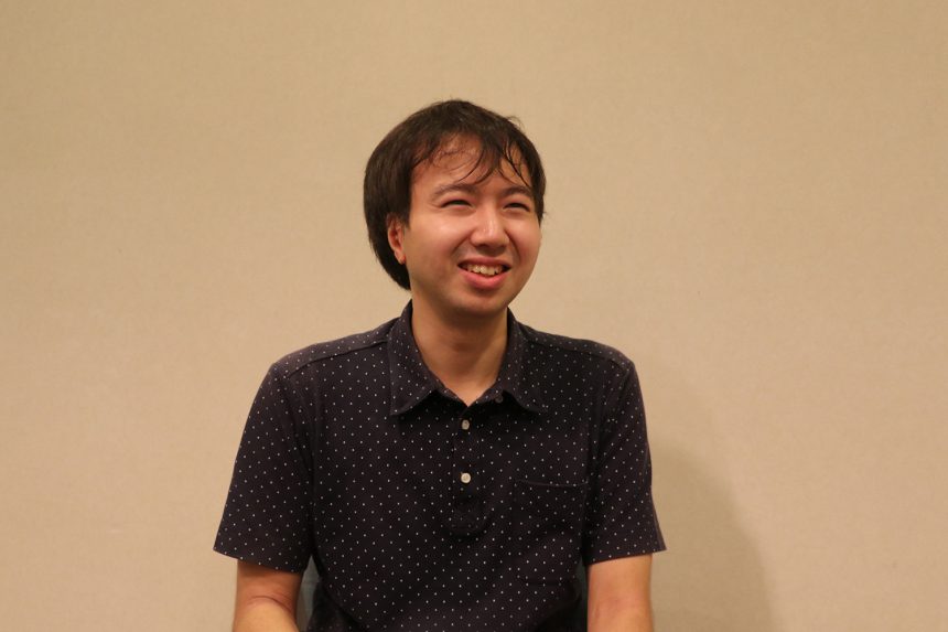
Keisuke Yoshida
Musashino Art University, Faculty of Art and Design, Department of Fundamental Design, 3rd year
My favorite typeface is "Lalapop"
Mr. Yoshida,
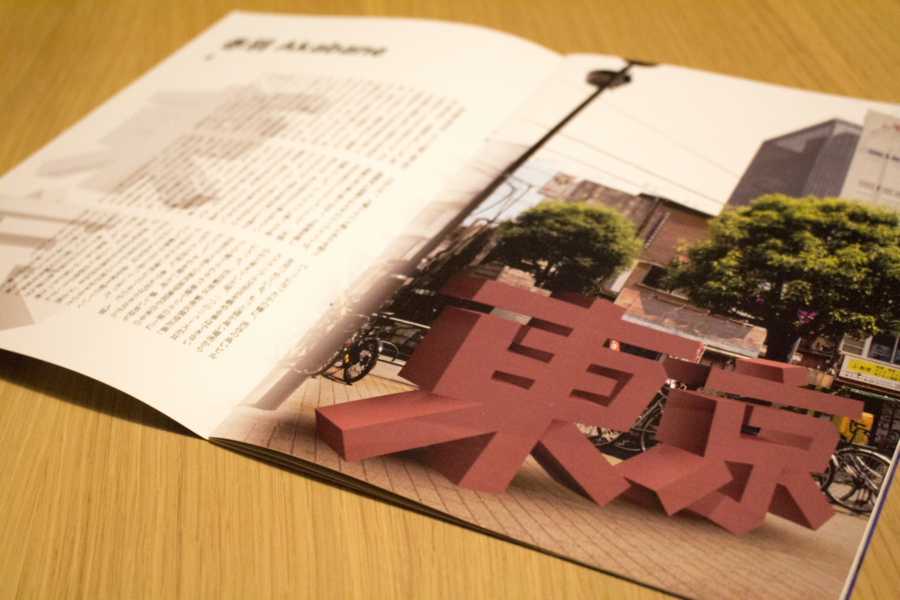
Tokyo × Typography
They created a photo book with the theme,
What's more, it's a photo book of the word "Tokyo" changing shape as it walks through various cities!
concept
"The aim is to express the diverse personalities of Tokyo's cityscape by using Morisawa fonts with various impressions to match the cityscape!"
They also had a solid reason for choosing the typeface.
Here are a few of my passionate thoughts!
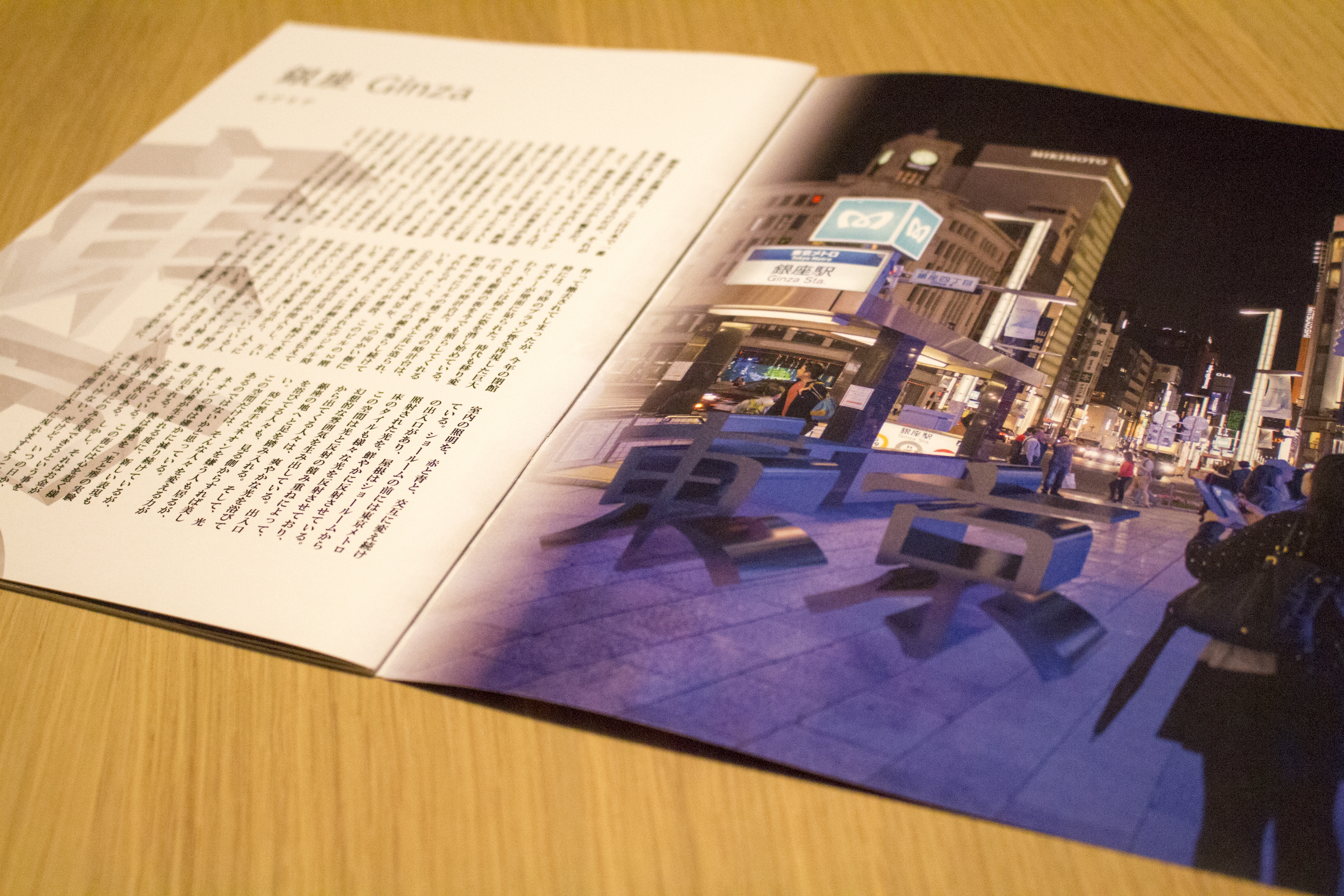
"Moaria" in Ginza
Ginza has long been a thriving urban area, and is a city that is constantly pursuing new things, so we chose Moaria, which has elements of the Mincho font but also has a free element.
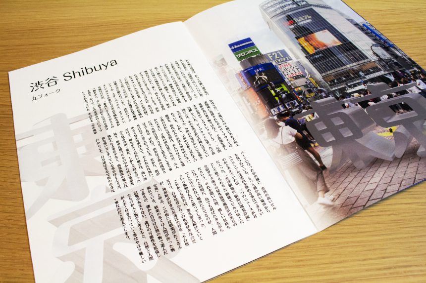
"Round fork" in Shibuya
Shibuya is lined with many buildings and is home to a variety of cultures with their own unique personalities, yet everything is in harmony and fits together nicely, hence the name Maru Fork.
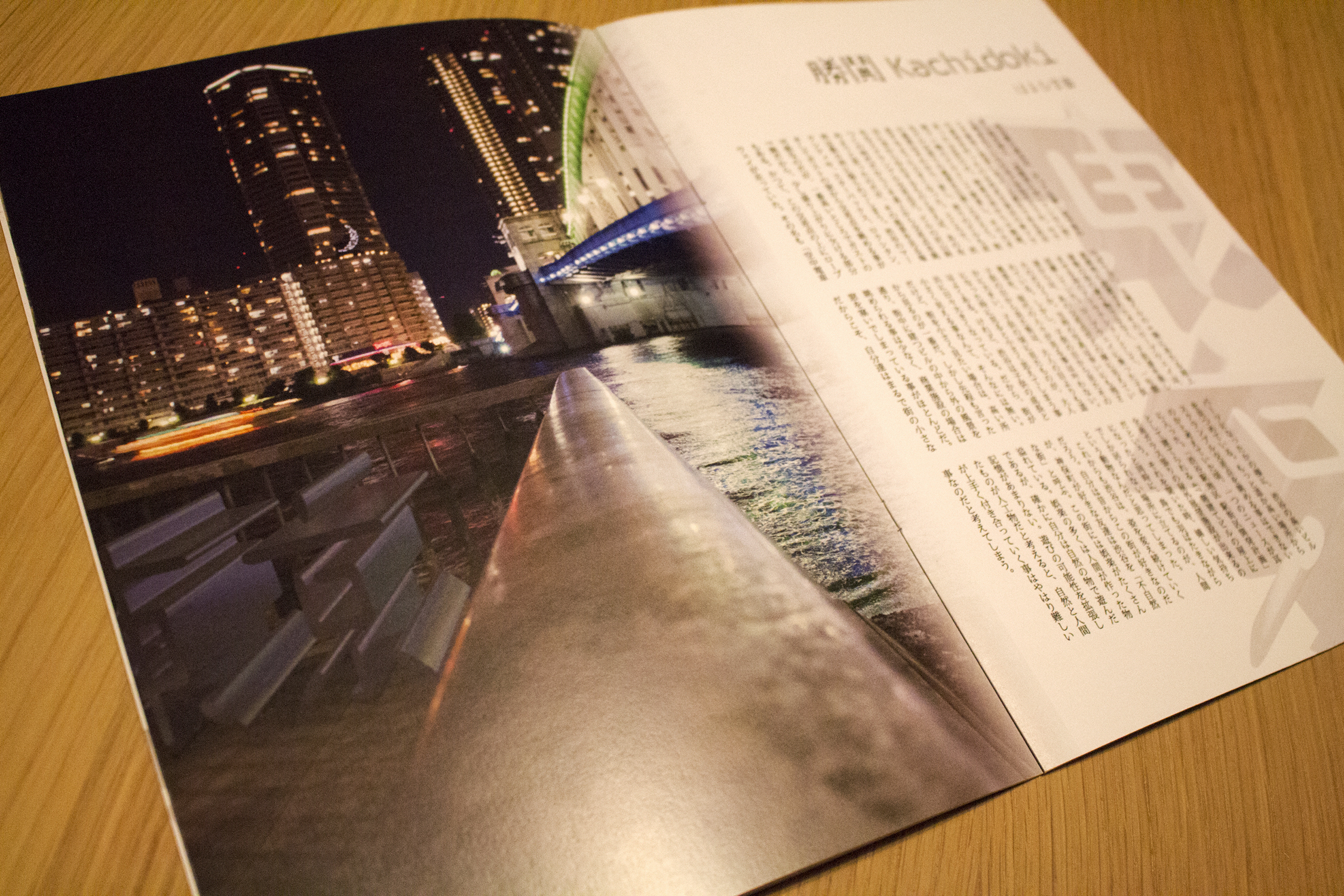
In Kachidoki there is "Haruhi Gakuen"
Despite its name, Haruhi Gakuen has a free-form shape and exudes the same youthfulness as a couple gazing at Kachidoki Bridge at night.
Akabane has "bamboo"
Akabane holds the Baka Festival every April, and is known as a town full of unique people, so we chose "bamboo," which is thick and unique, yet has a solid shape.
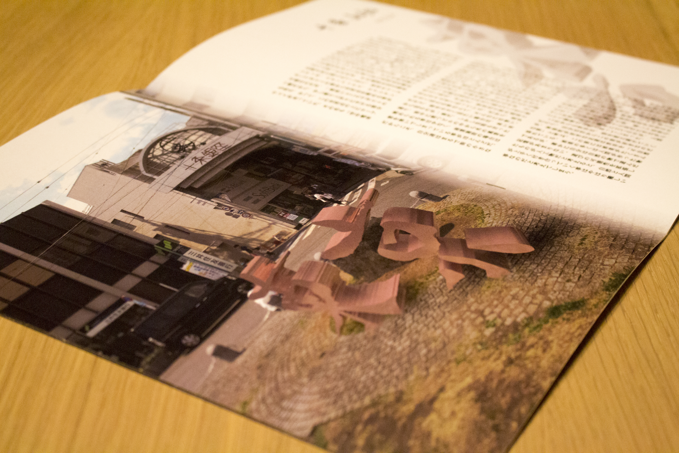
Jujo has "Utayomi"
I sometimes feel nostalgic when I walk around Jujo Station and the shopping district. When I first saw Utayomi, I felt a sense of nostalgia and warmth, and thought it would suit this town.
In a few years, a large building will be constructed in front of this shopping street as part of redevelopment. If you were to walk through this street again at that time, it may no longer feel like a "storytelling" street...
The most difficult part was making the letters exist within the city.
However, simply creating 3D letters in 3D CG and combining them with the cityscape doesn't seem to blend in well, resulting in an unnatural scene.
- Match the direction of the shadows at the base of the letters to the surrounding scenery
- The landscape reflected in the letters is photographed with a 360° camera, and after mapping, it is reflected on the letters.
He added, "Because 3DCG is created in a computer world, it is completely clean and not even covered in dust, but it is too beautiful to exist in this world!"
"Since all things are born into this world and are gradually affected by their surroundings, they gradually deteriorate, so the text in this photo book should also deteriorate!" So he took the extra step of adding noise to the text itself, which resulted in a more natural-looking landscape.
from now on
There seems to have been a lot of learning from this production.
My goal was not just to depict the word "Tokyo" walking through the city, but also to create a story in which the word "Tokyo" plays a central role, so all of the text on the page was written by me.
It was a powerful statement,CommentaryAt that time, Shimohama Rintaro
"You should decide whether you want the sentences in the book to reflect the feelings of the person looking at them, or the feelings of the walking letters."
It seems he gave me some advice.
"This incident made me realize once again that it is important to have both subjective and objective perspectives. In the future, when I create works, I would like to continue to value the fact that words are also characters!"
Yoshida-san has both a knowledge of design work and a keen sense for fonts.
He is scheduled to be active on the free magazine team in the second half of his career, so we look forward to seeing more of Yoshida's future success!