
Have you ever had trouble getting your point across in a presentation or project materials? In this series of columns, Toyomane, known as the "PowerPoint comedian" who shares know-how on Twitter for quickly getting your point across and has amassed over 90,000 followers, will share tips on creating PowerPoint materials and the relationship between fonts.
What is contrast in letters?
This may be a sudden question, but are you conscious of the "contrast of text"? Many people are conscious of the contrast of their work, but don't really understand the meaning of contrast in text... There may be many people like that. However, this "contrast of text" is a very important factor in making documents easy to read.
It may be hard to imagine what it means if you are suddenly told this, so let's think a little about the contrast in letters using two examples that you often see around you.
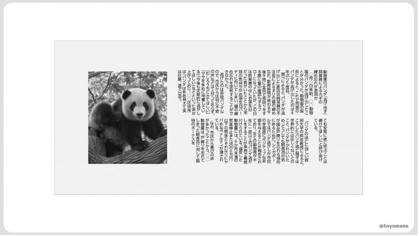
Example 1: "Newspaper"
Have you been reading a paper newspaper lately? Paper newspapers have been somewhat pushed aside by the spread of smartphones, but newspapers still provide us with very important insights into the readability of materials.
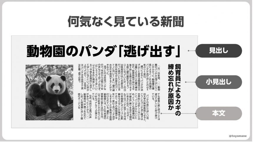
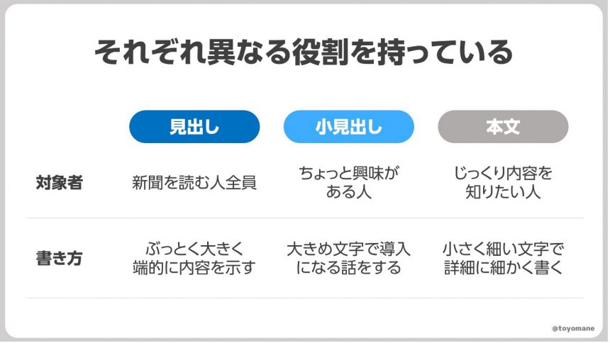
When we read a paper newspaper, we unconsciously read the headline first. A headline is like the title of an article written in large, bold letters.
If you read a headline and become interested, you will read the subheadings nearby. Reading these will give you a rough idea of the gist of the article.
Once you have read the subheadings and become interested in the content of the article, you will then read the main text, which conveys a lot of information in small, densely packed letters.
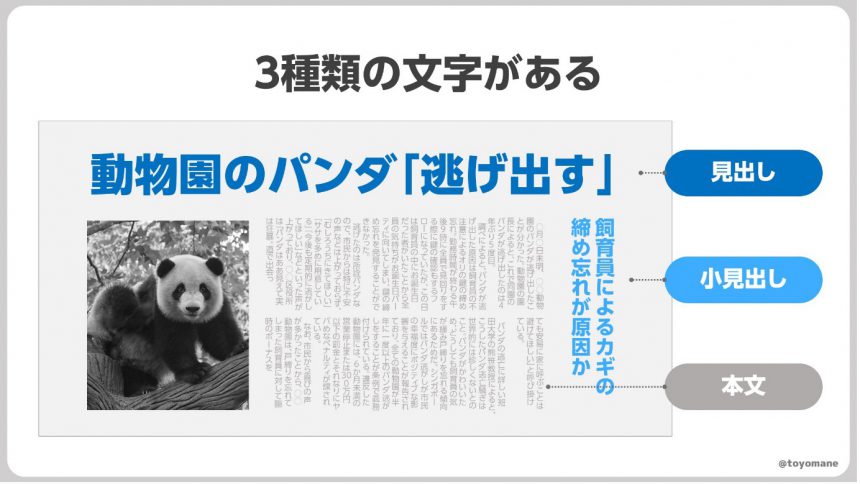
We don't often realize it, but newspapers are actually made up of three main types of characters. (Sports newspapers are more complicated, though.) These characters are each intentionally designed with different sizes and thicknesses.
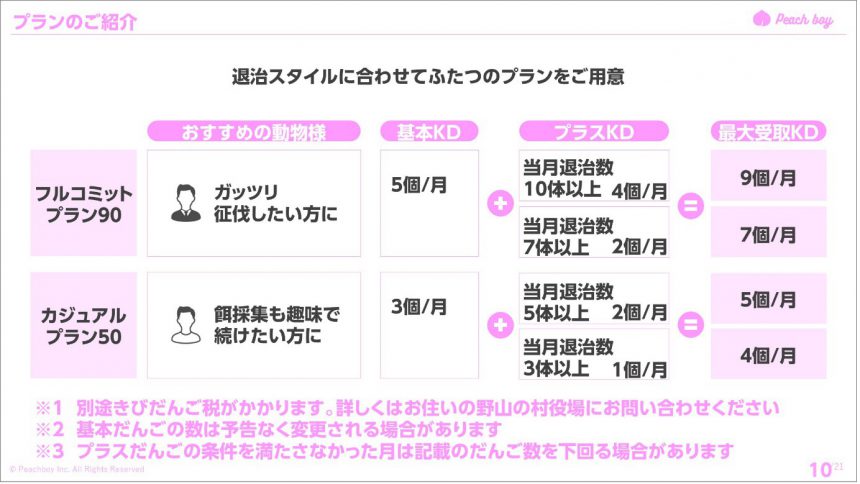
Example 2: "Plan Table"
The next example we will use is a plan table. This is the plan table for the "Kibi Dango Regular Payment Service DonbraCo" that everyone is familiar with (?), but if you look closely, you will see a slightly dangerous note written in the bottom left.
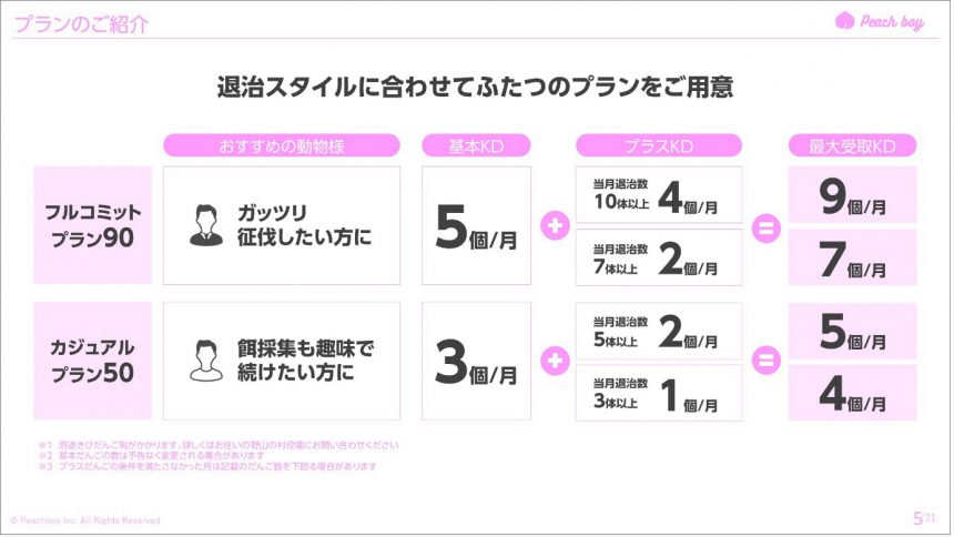
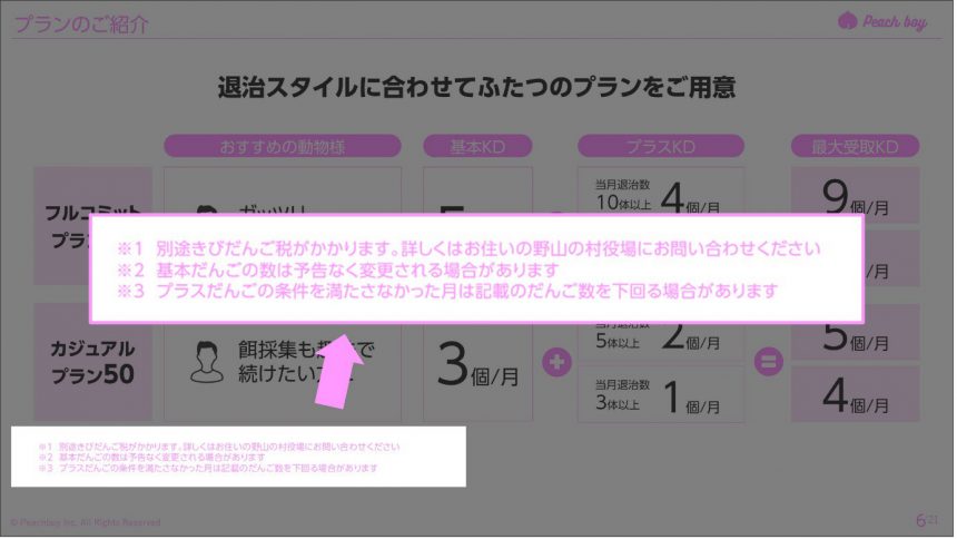
Although it's quite unethical, you can make text that you don't want people to look at less likely to notice by making it smaller. Here too, the text with different content attributes was intentionally designed with different sizes and thicknesses.
If the letters aren't well-balanced...
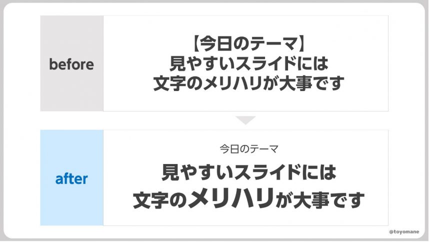
So, how would these examples change if the characters did not have this kind of contrast? For example,
The newspaper ended up looking like this, and I didn't feel like reading it at all.
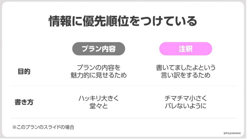
The plan ends up looking like this, with not a single animal showing up to join.Contrast of the charactersI hope you understand the importance of this.
Tips for adding contrast to text
So, what should you pay attention to in order to make your text more distinct? There are two main points to keep in mind.
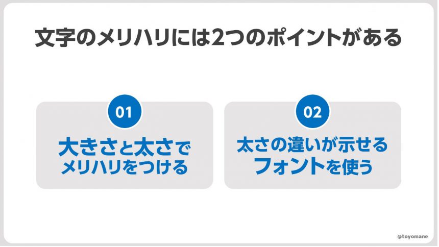
❶Add contrast with size and thickness
The first thing to remember is to use size and thickness to create emphasis. When you want to emphasize text, you might be tempted to write it in red, surround it with a red frame, or highlight it.
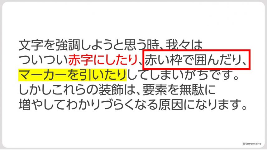
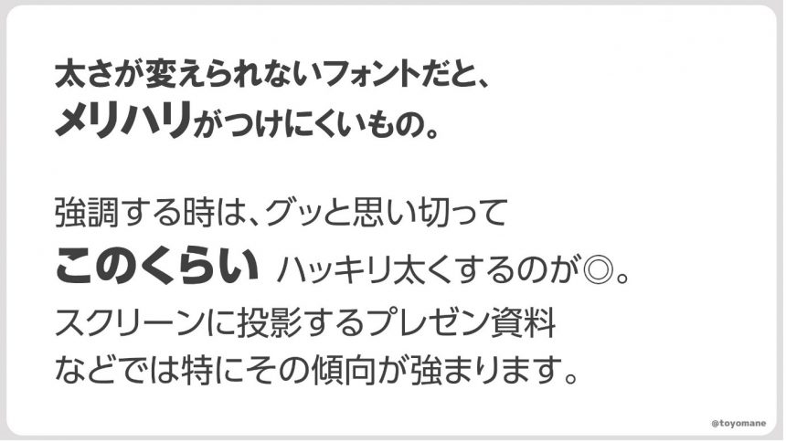
However, these decorations can increase the number of elements unnecessarily, making it difficult to understand. So, first consider whether you can emphasize the text using its size and thickness.
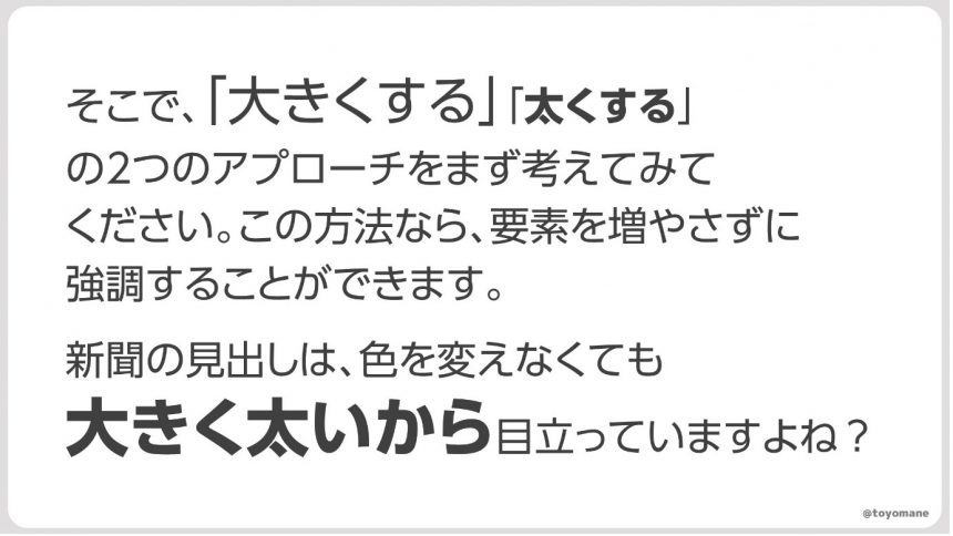
As newspapers do, it is possible to emphasize something by using size and thickness without using color or lines. First, think about how to emphasize something using these two methods.
2. Use fonts that show differences in thickness
As newspapers do, it is possible to emphasize something by using size and thickness without using color or lines. First, think about how to emphasize something using these two methods.
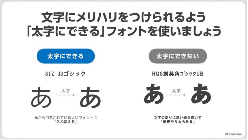
To emphasize with "weight," you need to use a font that has a variety of weights.
In addition, fonts such as BIZUD Shin Go have a variety of weights in addition to the thickness that can be selected with the B button, so it is a good idea to go for bold and varied thicknesses.
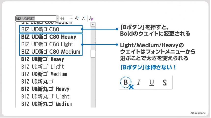
"MORISAWA BIZ+" contains 4 to 5 weights for each font. The lineup of weights and their uses are as follows:HereBe sure to check it out.
Easy-to-read materials with emphasis on contrast
I hope you now understand that variation in text is important for creating easy-to-read documents. However, variation isn't just important for documents. Variation is important in presentations and work, too. Take a long pause to draw attention, or take a relaxing vacation from time to time. Nothing wonderful comes from monotonous repetition. So, start using variation today!

Toyomane (Toyomane, blue background)
Born in Tokyo in 1994. Graduated from the Faculty of Engineering at the University of Tokyo. While working at Suntory, where he is in charge of CRM and advertising for the mail-order business, he is also involved in the creation of PowerPoint slides as a hobby, which are used on Twitter (@toyomane) has been met with a great response. With the motto "It's silly, but useful," he shares useful know-how for creating slides, as well as less useful images. His latest book is "PowerPoint Techniques to Communicate in Seconds: Tips for Creating Slides that Get Likes at Work and on Social Media."
Event Announcement
The series of seminar events that began on June 29th and will run until November,More Communicative Switch Project planned by font manufacturer Morisawa" will feature a variety of guests discussing how to create materials that are more effective for presentations, PR, flyers, and other means. If you are having trouble creating presentation materials, we recommend the school featuring presentation professional Keiichiro Takahashi as a guest.

For those who want to focus on fonts
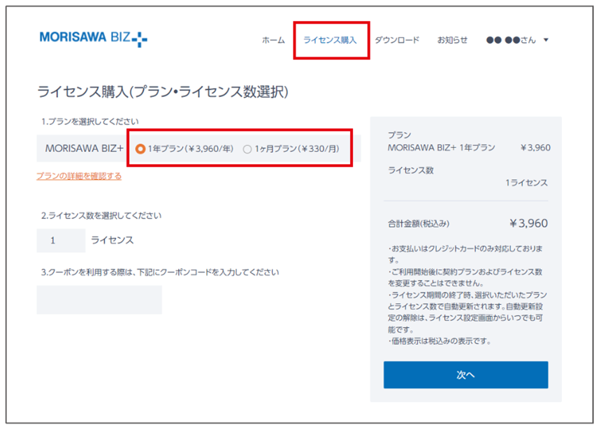
In the illustration in Toyomane's article, UD fonts for business use are"MORISAWA BIZ+"We are using the paid font "BIZ UDP Shin Go" included in the website. If you would like to use the same font, you can use it with the business UD font subscription "MORISAWA BIZ+" for 330 yen per month.

You can download free fonts or purchase paid fonts.Free Membership RegistrationClick the button below↓
Paid fonts can be purchased by selecting a plan from the "Purchase License" tab after registering as a member.