Introduction
I'm starting a blog called "Easy to Understand! Embedded Fonts" that will explain the basics and terminology of embedded fonts. This time, I'll explain typefaces and summarize the points to consider when choosing a typeface.
What is a typeface?
It is a collection of characters with a common look. Japanese fonts are those created based on a common concept, such as "Ryumin" and "Shin Go," and can be broadly categorized into "Mincho" and "Gothic."
Fonts and glyphs
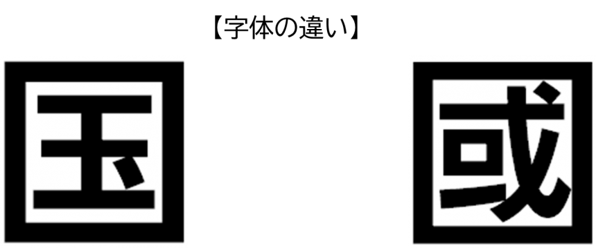
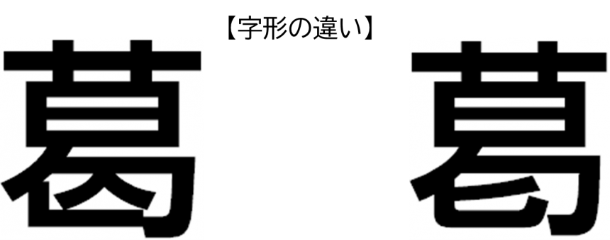
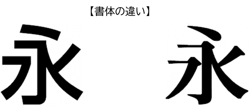
When considering typefaces, the words you often hear are "font style" and "character shape."
JIS X 0208:1997, "7-bit and 8-bit 2-byte coded kanji set for information interchange," defines a typeface as "an abstract concept of the shape of a graphic character as a graphical representation," and a character shape as "the actual graphical representation of a typeface, whether by handwriting, printing, or displaying on a screen." Specifically, a "typeface" is the skeleton of a character made up of the dots and strokes, and the shape of the character written in this form is the "character shape."
Japanese fonts
Gothic font
Gothic typefaces are designed so that all strokes appear to be of roughly the same thickness. They were originally created with the establishment of letterpress printing as a way to emphasize headings and other areas. They are said to have been designed after European sans serif typefaces.
■It has high visibility and is suitable for UI such as operation screens and various guidance displays.

Mincho font
The origins of Ming typeface lie in the typeface used in woodblock printing, which became popular during the Song dynasty in China (10th century), and which imitated regular calligraphy. For example, traces of this can be seen in the accents called "uroko" on the right edge of horizontal strokes, and the subtle variations in thickness within a single stroke.
The current Ming typeface is a product of continuous improvements based on the metal typefaces that were brought to Japan at the beginning of the Meiji era, and various Ming typefaces with different expressions have been produced.
■It is highly readable and is suitable for displaying or printing long texts such as e-books and explanatory texts.

Brush writing
In China, the homeland of Chinese characters, a wide variety of calligraphy styles have emerged from a long tradition of calligraphy. Representative styles include seal script, clerical script, running script, cursive script, and regular script. In order to express these calligraphy styles in print, various brush calligraphy styles have been created.
There are also traditional calligraphy styles such as "Kanteiryu," "Yose Moji," and "Hige Moji," which emerged from townspeople's culture in Japan during the Edo period, as well as calligraphy styles that emerged from cultural and social trends, such as "Kyōkasho-tai," which began to be used at the beginning of the Meiji period.
■It has a traditional handwritten style and is suitable for printing applications such as New Year's cards and products with a Japanese image.

Design typeface
Since the 1970s, when phototypesetting reached its peak, typefaces have undergone a graphical evolution in line with changes in printing technology and media. Around the same time, many "kana typefaces" were created that allowed for easy changes to the typesetting image.
A variety of typefaces have been designed, including typefaces that have characteristics of both Mincho and Gothic fonts, typefaces that project a clear image, typefaces that are designed with ingenious design, and typefaces that express subtle nuances.
■There are a variety of designs available, making it suitable for apps and games that need to match the image of their target audience or worldview.
Universal Design Fonts
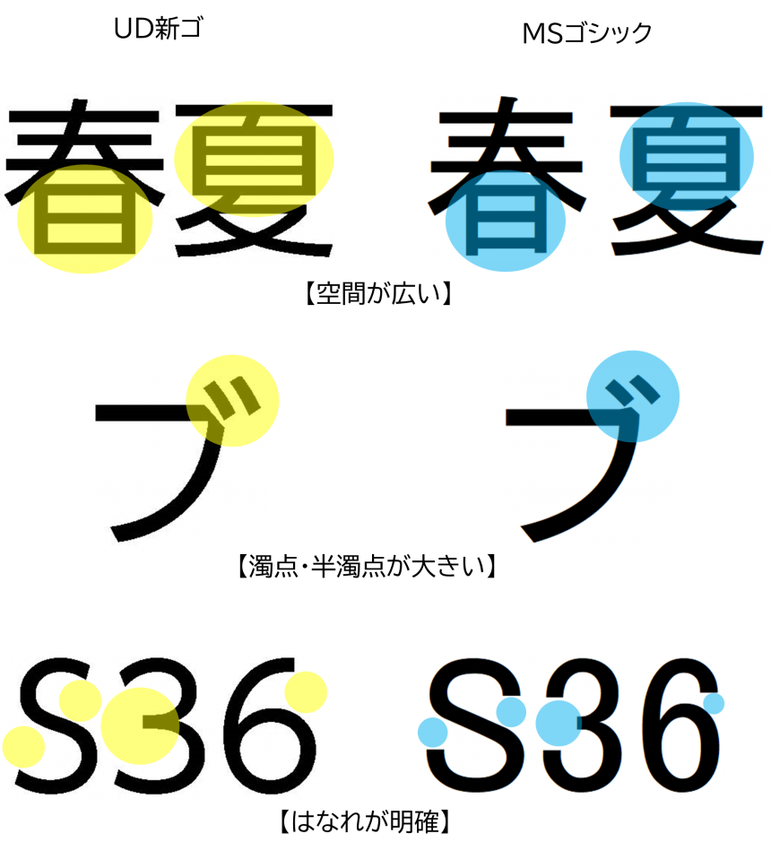
Universal design is a concept advocated by Ronald Mace, director of the Universal Design Center at North Carolina State University, USA, and others, which states that "design should be easy for all people to use," and universal design typefaces were created based on this concept.
Universal Design Typeface (UD Typeface)
Morisawa's UD typefaces were created based on the concept of universal design, making them "easy to read and understand for everyone." UD typefaces were born from the following three concepts, and have been verified by a third-party organization for visibility and readability, proving their clear superiority over standard typefaces.
■It is suitable for various information display products, especially public guidance display products and UI displays for various products.

Three concepts of UD typefaces
・The shape of the letters is easy to understand
・The text is easy to read
・Difficult to misread
Characteristics of UD fonts
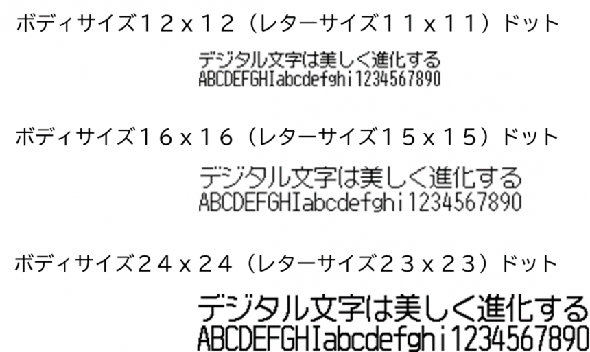
Uni-Type
This is a bitmap font created based on the concept of universal design.
Like UD fonts, this bitmap font has been verified by a third party for visibility and readability, and its superiority has been recognized.
■It is suitable for displaying the UI of products with low specifications and resolution, such as operation panels and mobile devices.
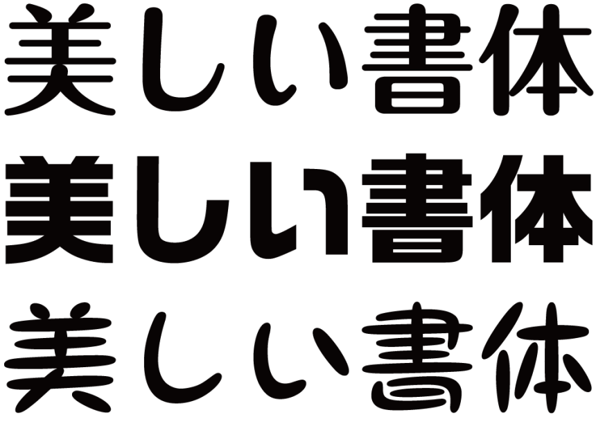
UD Digital Textbook Font
This is a universally designed textbook font that is effective in ICT education settings, including digital textbooks.
Rather than using regular brush writing, we focused on hard pen and felt-tip pens, and placed emphasis on hand movements. We created a structure that is close to the handwriting found in textbooks.
The design maintains the direction of writing and the shape of the dots and strokes, but reduces the variation in thickness, making it suitable for people with low vision and dyslexia (reading and writing disabilities).
It conforms to the character shapes used in the English language teaching materials published by the Ministry of Education, Culture, Sports, Science and Technology in line with the curriculum guidelines for the 2020 academic year.
■It is suitable for digital textbooks, educational apps and distribution services, and other educational products.

Condensed typeface
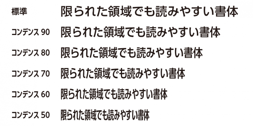
This is a elongated typeface that is designed to be narrower in width than the standard typeface.
If you want to display or print as much text as possible in a limited space, the only options are to reduce the text size, narrow the character or line spacing, or use software to transform the text, but these methods significantly reduce visibility and readability.Condensed typefaces are typefaces that are designed to be narrow in width so as not to impair visibility or readability.
■Suitable for displaying and printing ingredient labels and warnings on smartphones, tablets, and other mobile devices.
Global Typefaces
It is a unified typeface designed for each language using the same universal design concept.
Even if you change the display language using the settings function, the image of the user interface screen will not change.
■It is suitable for products and services for inbound and global markets that require multiple language displays.
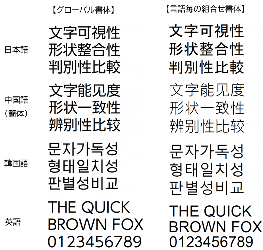
If fonts are collected for each language, there will be no consistency in weight or shape, but global fonts have a consistent look and are ideal for embedded products that support multiple languages.
When selecting a font, please consider the following:
| Products used | [Example] Digital signage |
| Purpose of use | [Example] Guidance display |
| User | [Example] Unspecified number of people |
| Age group | [Example] All ages |
| Target Language | [Example] Japanese, English, Chinese, Korean |
| Usage environment | [Example] OS, panel size, resolution, number of gradations, display size, etc. |
*For details on the usage environment, see "Easy to understand! Embedded fonts Part 1"First, know your fonts.Please refer to ".
This concludes the explanation of the typeface for this article.
If you have any questions, please contact us directly by email.

Contact
株式会社モリサワ セールスイノベーション課 salesinnovation@morisawa.co.jp