

Introducing our wonderful members one by one [Moripass Club Member Introduction]
This time, Moripass Club advisor Hashizume will be reporting.
This time,
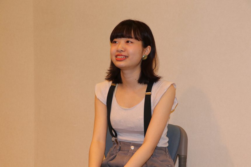
Tomokiyo Miyu
Musashino Art University, Faculty of Art and Design, Department of Fundamental Design, 3rd year
My favorite typeface is "Released Min Moon"
Tomokiyo-san said,
Tokyo × Typography
They created a poster on the theme of
concept
Tomoki created a poster titled "Tokyo is a vessel."
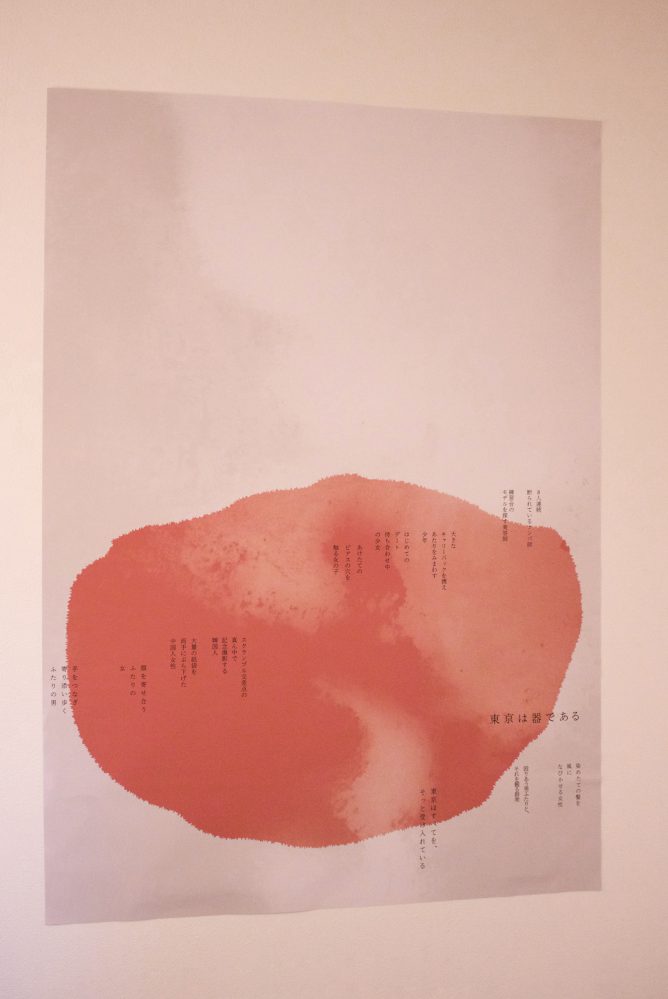
Tokyo is a place like a vessel that accepts a wide variety of people without hesitation.
Tourists, young people who have come to Tokyo,LGBTA couple of...
In the early morning in Shibuya, a diverse range of people from different nationalities and places of birth gather, from university students coming off a night shift to part-time workers coming off a night shift, which is something that is unique to Tokyo.
And completely indifferent to others
Being indifferent to others is often seen as a bad thing, but Tomokiyo says he finds a certain comfort in it.
I put these thoughts into the form of a poster.
The hardest part was coming up with the concept.
"I think Tokyo's tourist attractions and packed morning trains are also distinctive features of the city. However, for this assignment, I wanted to convey the charms of Tokyo that are usually overlooked.
So I thought carefully about the image and feelings I had about Tokyo, and decided on the concept (Tokyo is a vessel)."
When choosing a typeface, after much deliberation, I chose "Toppan Bunkyu Mincho."
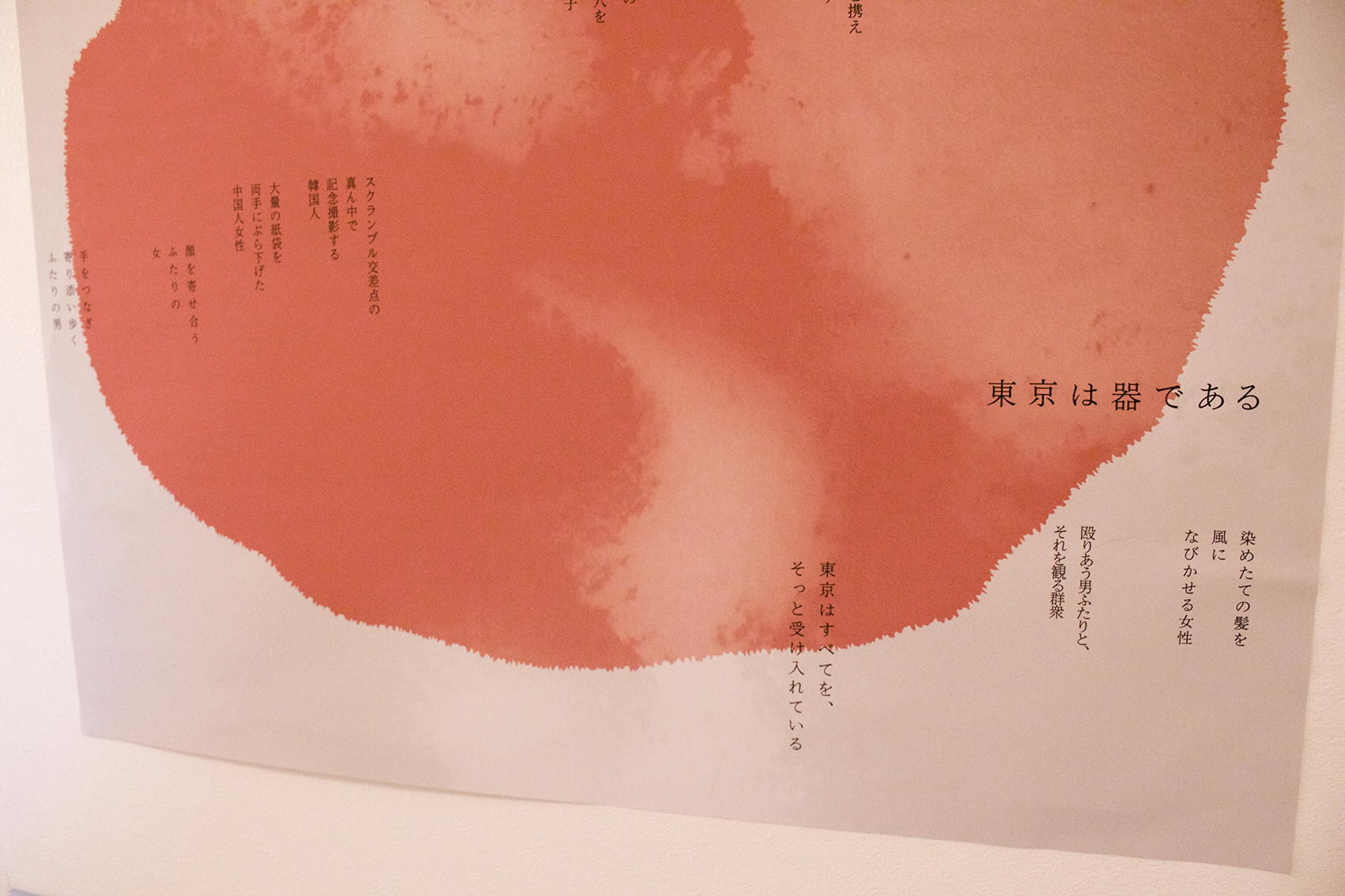
Tokyo has an image of being at the cutting edge of everything, so to match that, we used Toppan Bunkyu Mincho, a new style that also has a nostalgic feel to it.
That's what they say.Toppan Bunkyu Minchois a reproduction of the house font used by Toppan Printing since the days of letterpress printing, and is adapted for modern expression such as display.
Nice typeface choice!
In this assignment,Font sensitivity is now "ON"When asked if he felt it was real, Tomokiyo replied,
"Yes! I realized that the font I use can influence the reader's emotions. I personally like typefaces that have a remnant of letterpress printing."
And. You're growing up! Tomokiyo-san!
For regular assignments, he first thinks about the visuals and then arranges the text and typeface to match, but for this assignment, the typeface also played a central role. He struggled to create the visuals without destroying the atmosphere of the typeface and text.
from now on
Presentation of the assignmentIt seems that Shimohama Rintaro and the other members have given various feedback, and they are considering further improvements in the future.
"We weren't able to decide on where to place it or who to target, so after thinking about those things, we're digging a little deeper and considering a different output, such as a free paper, rather than a poster."
Once it's completed, I'd love to share it on this blog.
After completing this presentation,
"I learned a lot by hearing directly from the other members about their thoughts and methods when they made their works. I think it was a valuable opportunity to talk with people from different schools and departments while looking at their works."
It seems that they are also inspired by the unique initiatives of the Moripass Club.
In the second half of the year, he will be working on the free magazine team. We look forward to seeing more of Tomokiyo's work in the future!