


MORISAWA BIZ+ offers a lineup of UD fonts (Universal Design Fonts) at reasonable prices for users of business applications such as Word, PowerPoint, and Excel. (For details of this service, please seeHere)
Some of the fonts provided have a "P" in their names, while others do not. This time, we will explain the "P" in detail.
*The content explained here applies to the following fonts included in MORISAWA BIZ+.
BIZ UD Shin Go, BIZ UD Reimin, BIZ UD Shinmaru Go, BIZ UD Gothic, BIZ UD Mincho
Please note that the specifications of the UD Digital Textbook font are different.
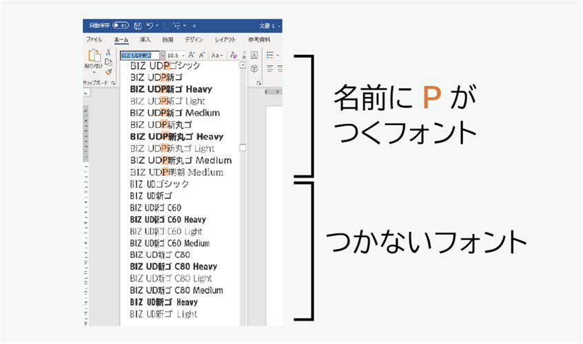
"P" is a symbol of proportional font
"P" isProportional fontThis is a mark. Also, fonts without P aremonospaced fontWhat is the difference between these two?
Let's look at the characteristics of each, starting with monospaced fonts and then proportional fonts.
monospaced font
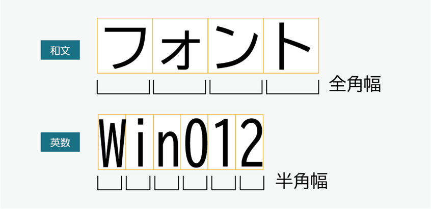
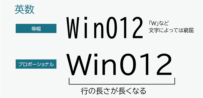
Japanese (Wabun) characters areFull-widthThe letters and numbers are designed in a square.Half-widthIt is designed to.
The advantage of a monospaced font is that the characters are all the same width.The number of digits is consistentIn addition, in the case of Japanese text, punctuation marks are all in full-width characters, and the arrangement of characters creates a uniform rhythm.It is comfortable to read when typing long texts.It is said that...
The disadvantage is that when you write a sentence, all letters and numbers are in half-width characters, so you can't write "W" etc.Wide letters are cramped and difficult to readIt's a point.
Advantages: Numbers are aligned. Japanese text is easy to read even when it is long.
Disadvantages: All letters and numbers are half-width, so some characters are difficult to read.
Proportional font
Character width varies depending on the shape of the characterThis is a proportional font.
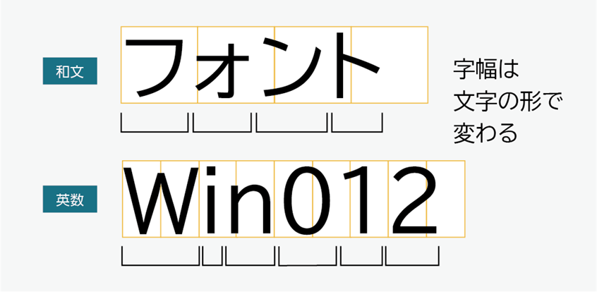
Let's take a look at the differences between Japanese and alphanumeric monospaced fonts.
Differences in Japanese
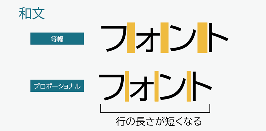
If we look at the katakana character "o," the character itself is small, but because a monospaced font is full-width, there is a large amount of white space before and after the character. On the other hand, a proportional font compresses the characters before and after the character "o" to fit the character width.
Also, all characters are packed according to the character width,Compact line lengthIt has become.
Differences between alphanumeric characters
In monospaced fonts, all characters are half-width, but in monospaced fonts, the character width is designed to match the shape of the characters.Line lengths are longer in proportional fonts, but they offer a more natural reading experience.It will be.
Advantages: Japanese text has compact line lengths, making it easy to use in presentation slides.
Disadvantages: Alphabet lines become longer.
Summary of what we've learned so far: The difference between monospaced and proportional fonts
- Monospaced font: A font in which characters are displayed in the same character width, either full-width or half-width.
- Proportional font: A font in which each character has a different width
↓Comparison of equal and proportional widths
Recommended usage
Now that you understand the difference between monospaced and proportional fonts, let's look at recommended ways to use them. To create documents that are easy to read and communicate, we recommend using them as follows:
For content such as presentations with short sentences…proportional font
When creating presentation materials in Japanese, the majority of characters used are Japanese, so using a proportional font allows you to include information more compactly.
Slides made with proportional fonts
The Japanese text is compact and the English numbers blend in well with the Japanese text. This is a recommended way to use it.
Slides made with monospaced font
There is a space after the punctuation mark. The alphanumeric characters are narrow and look unbalanced.
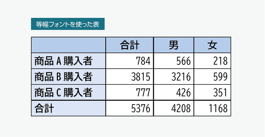
For presentation materials with a lot of Japanese text, a proportional font is recommended as it is compact, but for English text, the font will be longer.If you want to keep numbers compact, use a monospaced font or condensed font.It is effective to use a monospaced font. Also, if there are many numbers in the table, you can align the digits by using a monospaced font.
When it comes to presentation materials, don't just use proportional fonts; try combining different typefaces to suit the content of your slides.
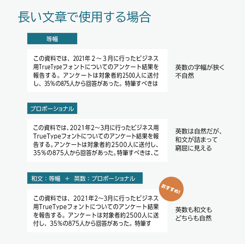
When creating text using Word
When typing long documents such as reports or proposals in Word,Proportional font for Japanese text, monospaced font for English and numbersIt's easier to read if you use
Proportional fonts are more suitable for short pieces of text, such as presentation materials, but for longer pieces of text, proportional fonts can look crowded and are less comfortable to read.
It's a pain to have to select and change the font for each Japanese section and each English section one by one. The article below explains how to change the font for multiple sections at once using Office software.

Summary of recommended usage of proportional fonts and monospaced fonts
For content such as presentations with short sentences
- Both Japanese and EnglishProportional font
For text content such as Word
- Japanese sentence…monospaced font
- Alphanumeric…Proportional font
Understand the difference between monospaced fonts and proportional fonts and use this knowledge to create documents that will "communicate" with your readers!
The product page for the business UD font, MORISAWA BIZ+, isHere
You can download free fonts or purchase paid fonts.Free Membership RegistrationClick the button below!