


With the cooperation of ABK Gakukan Japanese Language School, we held a seminar on "UD Fonts (UD Digital Textbook Font)" and "Communicative Layout" for Japanese language teachers and those aspiring to become Japanese language teachers on January 15, 2022.
For learners who have just started learning Japanese, it is difficult to determine whether the character shapes in printed fonts when learning characters are the same as the handwritten ones or whether they contain design elements. As a result, they end up simply reproducing the font's character shapes as they are, which seems to be an obstacle to learning.
What did Japanese language teachers who deal with learners with these industry-specific concerns every day think of the UD digital textbook font?
Participant impressions
After learning about the UD digital textbook font at this seminar,It seems that this will solve some of the problems that arise from the number of strokes, differences in character shape, stroke order, etc. that arise from each style of kanji.And most importantly, it's easy to read and understand. I wanted as many people as possible to know about UD Digital Textbook Font.
I was reminded once again of the profound depth of fonts.It's important to put effort and thought into creating materials that people will read. Line spacing, character spacing, jump rate... I want to study more. When UD Digital Textbook Font became a standard feature on Windows, it was truly revolutionary! I plan to continue studying Morisawa's YouTube and note posts.
The developer of UD Digital Textbook Font talks about the background and design of the UD Digital Textbook Font
We are currently introducing the UD digital textbook font lineup on Morisawa Note!

[Teaching materials now available!] Teaching materials that use UD fonts and are useful for Japanese language education can be downloaded from the link below.
Changes in participants' materials
Materials prepared before attending the seminar
After the seminarCreatedMaterials
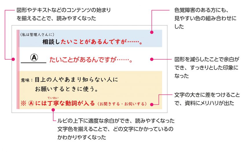
Improved points
● Uses UD digital textbook font, which is easy for international students to understand
● Line spacing has been increased, making it easier to read.
I received
teachingteacher
In class, students are asked to read aloud the text on the slides. Although there are differences in reading ability among students, in class using the materials created after the seminar, everyone was able to read aloud smoothly.
Furthermore, the students were also able to write neatly in their notebooks. I was a little surprised to see the students taking notes so actively.It was
Morisawa shares feedback with the teachers who provided the materials, as a way of thanking them.
Comment from Mr. Toshifumi Kameyama, teacher at ABK Gakukan Japanese Language School
In Japanese language education, learning kanji is one of the biggest hurdles for learners from non-kanji-using countries (those who do not use kanji in their native language). They may have trouble identifying and writing individual characters, or even if they can, it may take them longer than learners from kanji-using countries. This often has an impact on vocabulary acquisition and reading comprehension.
For example, in writing, it is common to see learners even reproducing the decorative parts of characters in the textbooks. They study the textbooks carefully, noting whether the strokes are connected or not, whether they appear or not, but depending on the shape of the font, they may cross out characters that they have carefully reproduced exactly as they saw them.
I think so many participants came because fonts that are easy to recognize and remember and serve as writing examples, and the layout of teaching materials that lead to smooth reading, are exactly what Japanese language teachers are looking for.
One participant said, "I was curious about how the teaching materials shown in online classes would look, so I'd like to try it out right away."
Thank you to all the teachers who participated in the seminar.
We hope that the font will be useful in realizing a multicultural society.