


We held a seminar called "Presentation Professionals' Direct Instructions! Effective Presentation Material Design Seminar - Font and Graph Design Rules You Can Use Starting Tomorrow," where we introduced design rules for presentation materials that can be put into practice immediately in business situations, tips for choosing fonts, and the effectiveness of UD fonts.
The seminar participants commented,It's practical and can be put to use immediately","I listened to him nodding repeatedly, saying "I see!"","I realized the importance of fonts again.We have received many happy comments such as:

Seminar lecturer profile:
Presentation Planning: Keiichiro Takahashi
Presentation producer. He provides comprehensive consulting on presentations, from creating presentation content and document design to communication techniques. He has experience in providing guidance to a wide range of people, from new employees to executives, at large and small companies with annual sales ranging from hundreds of millions to trillions of yen. His selling point is his essential, not superficial, presentation method, which he developed through his own experiences of success and failure.
Since 2019, he has been running the YouTube channel "The Presentation University" He has published books such as "The easiest document creation and presentation textbook” (Impress).
If you would like to watch the archived video of the seminar (excerpt), please click below.
The video introduces how to use fonts and UD fonts.
*Registration is required to watch videos.
Seminar Report
This report introduces the comments of those who actually attended the seminar and the materials created after the seminar.
Case 1
Ms. Yuko Nakabayashi, Business Division, Nanohana Chubu Co., Ltd.
I have opportunities to give presentations at training sessions and company introductions at work,Information must be conveyed in a limited timeI had been watching the instructor, Mr. Takahashi's, YouTube channel for some time, so the work in this seminar was very practical and helpful.
I knew about UD fonts before attending the seminar, but I was surprised by theIt affects reading speed and the rate at which errors are avoided.After learning about these specific benefits, I decided to use UD fonts in the materials I created, such as company introduction materials and pharmacy posters.
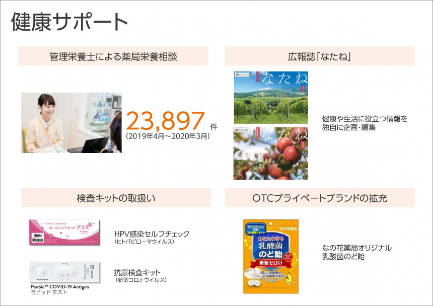
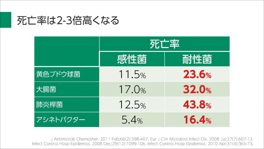
Pre-seminar materials

Areas for improvement
- The content is not all there, so it feels a bit disjointed.
- The text is difficult to read because it has a shadow.
- The colors are strong, and the attention is drawn to the colors before the content.
Post-seminar materials
What's improved
- By aligning each content, the site has a cohesive and clean look.
- The font used is a UD font, and the lack of processing makes it easier to read.
- By changing to a gentler color, it became easier to focus on the content.
Case 2
TohoShinji Ogihara, Department of Community-Based Infection Control, Faculty of Medicine, University of Tokyo
I had been struggling with how to create easy-to-understand materials for some time, and when I attended a paid presentation course, I found out that it was attended by university and high school students.
As a teacher and someone who is in a position to be their superiors and seniors, I felt a sense of crisis when I saw that the younger generation was learning about presentations on their own. I would like to create opportunities for those around me to learn how to create materials that can be conveyed to others.
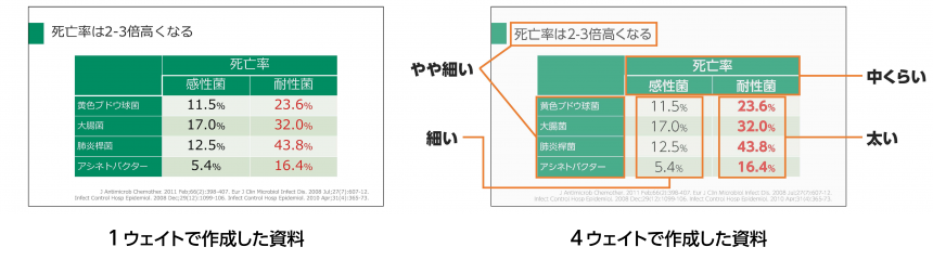
In this seminar,Use of weight (character thickness) and condensed typefacesI found the content on this topic particularly useful. I immediately started using it in the materials I created myself.
Post-seminar materials: Utilizing multiple weights
Slide Points
- Four different font weights were used
- This gives it more definition and makes it easier for the eye to focus on the thickest number.
Post-seminar materials using condensed fonts
Slide Points
- When enclosing text in a box, if there are many characters in a regular font, the text size must be reduced. However, if the size of the box is changed to match the number of characters, the overall layout will be disrupted.
- By using a condensed font, layout can be done at the same font size even when there are a large number of characters.

On the day of the seminar, we received many questions from the participants. The answers to the questions were answered on the lecturer, Mr. Takahashi's YouTube channel. Please also take a look at this Q&A video!
[Part 1] This will solve your problems! We'll answer all your questions about fonts! Live Font Seminar Q&A
[Part 2] We asked Morisawa about fonts! Font Seminar Q&A Live
This seminar focused on "text" and "graphs," but if you would like to learn more about the basic design rules for presentation materials, such as "shapes," "images," and "colors," please take a look at Takahashi's video course (fees apply).