

Morisawa Co., Ltd. has beenUD font plan for public organizationsWe conducted online training for teachers and staff in Ikoma City, Nara Prefecture, who have introduced UD fonts and are using them in the educational field.
In Ikoma City, teachers and staff created lesson videos based on a manual issued by the Board of Education, with the aim of "not stopping learning" even during the school closures caused by the COVID-19 pandemic.
(For more information on Ikoma City's UD initiatives and the use of UD fonts during the COVID-19 pandemic, please seeReport article on online seminar for local governmentsYou can also read it here.)
In addition, teachers and staff in Ikoma City create materials such as grade-level newsletters on school PCs that have the UD Digital Textbook Font set as the default setting.
It is said that documents are created using UD fonts, but after interviews with people on the ground, we found that many people said, "We only use certain typefaces," and "We would like to know more about how to choose fonts."
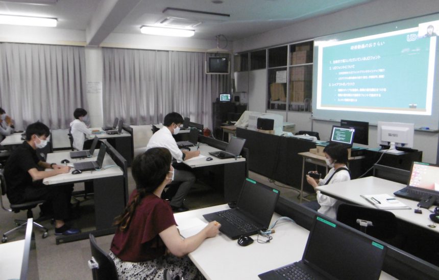
With the demand for better communication skills increasing, Morisawa conducted training on the theme of "Creating materials that communicate" using the following steps.
- Watch lecture videos on UD fonts and layouts
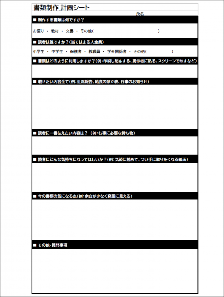
- Create a "planning sheet" to organize what you want to communicate
- Remake materials based on the contents of videos and planning sheets
- Comparing materials before and after remaking in online group training
The teachers and staff members were asked to individually watch a lecture video produced by Morisawa in advance about the history of Ikoma City's introduction of UD fonts, as well as UD fonts and layout. Using the materials they had produced up until then, they were asked to organize what they wanted to communicate on a "planning sheet" and then remake the materials.
During the online group training, we compared materials before and after the remake and gave lectures on points that could be improved further.
We would like to introduce some examples of actual improvements that have been made.
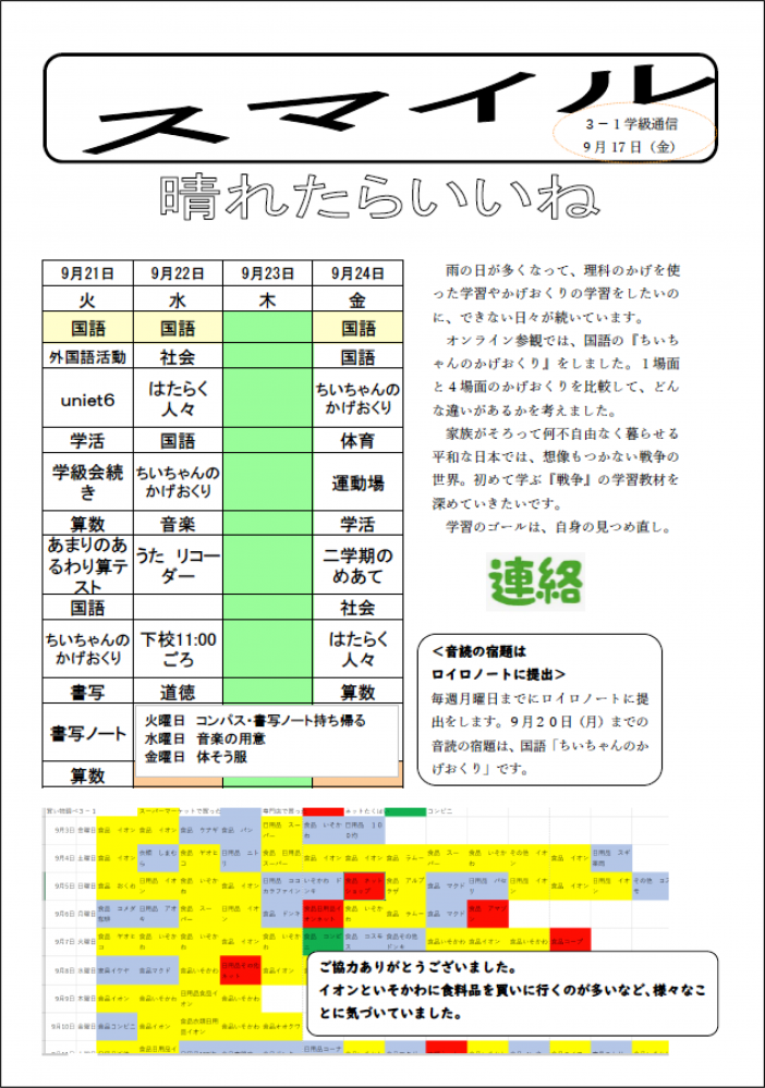
Example 1: Junior high school grade newsletter
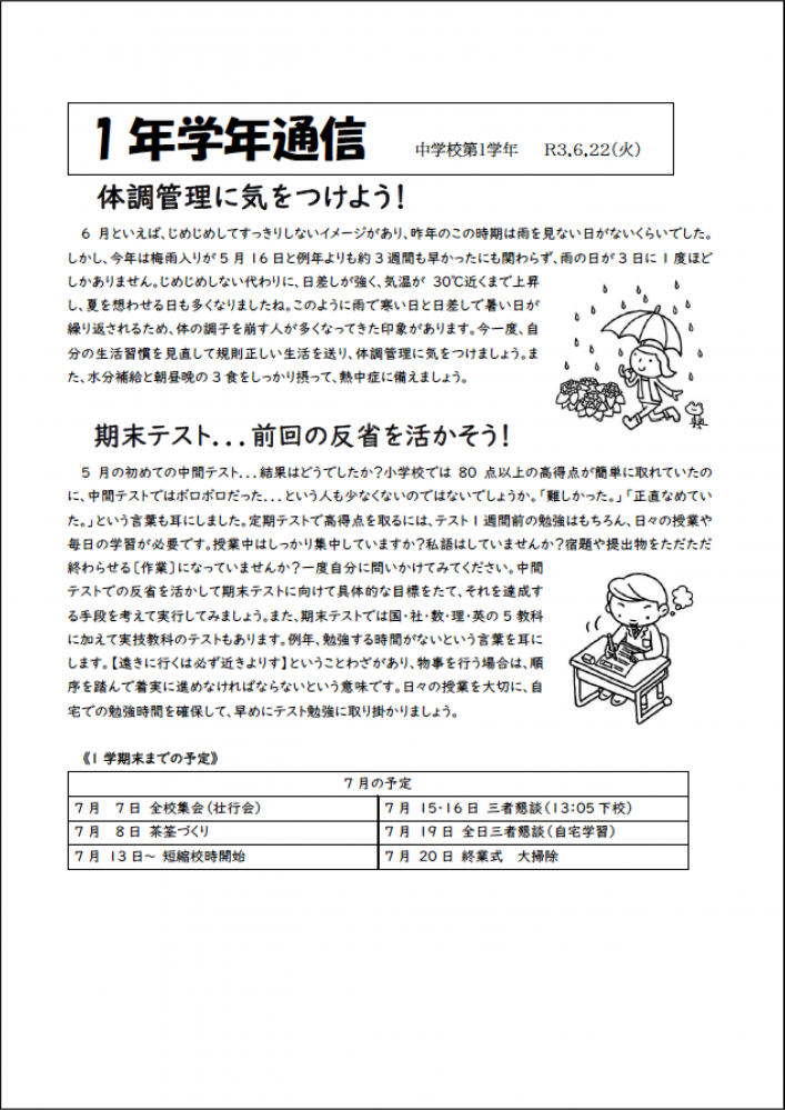
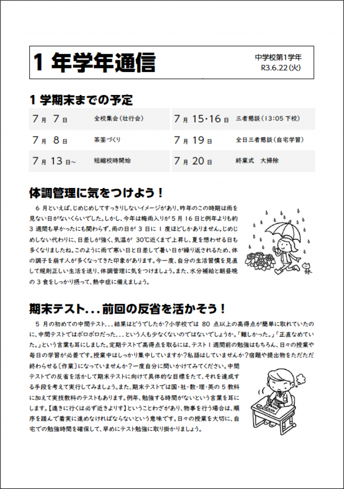
In the planning sheet, one of the concerns raised was that "all the information looks equal," but by changing the font of the headings, the grade newsletter has become more distinct. By aligning the position of the headings and the main text, it has become clearer and easier to read.
After the polishing, the first thing that catches your eye is the "plans until the end of the first semester," which was the information you answered as the thing you most wanted to convey to readers.
Example 2: Elementary school class newsletter
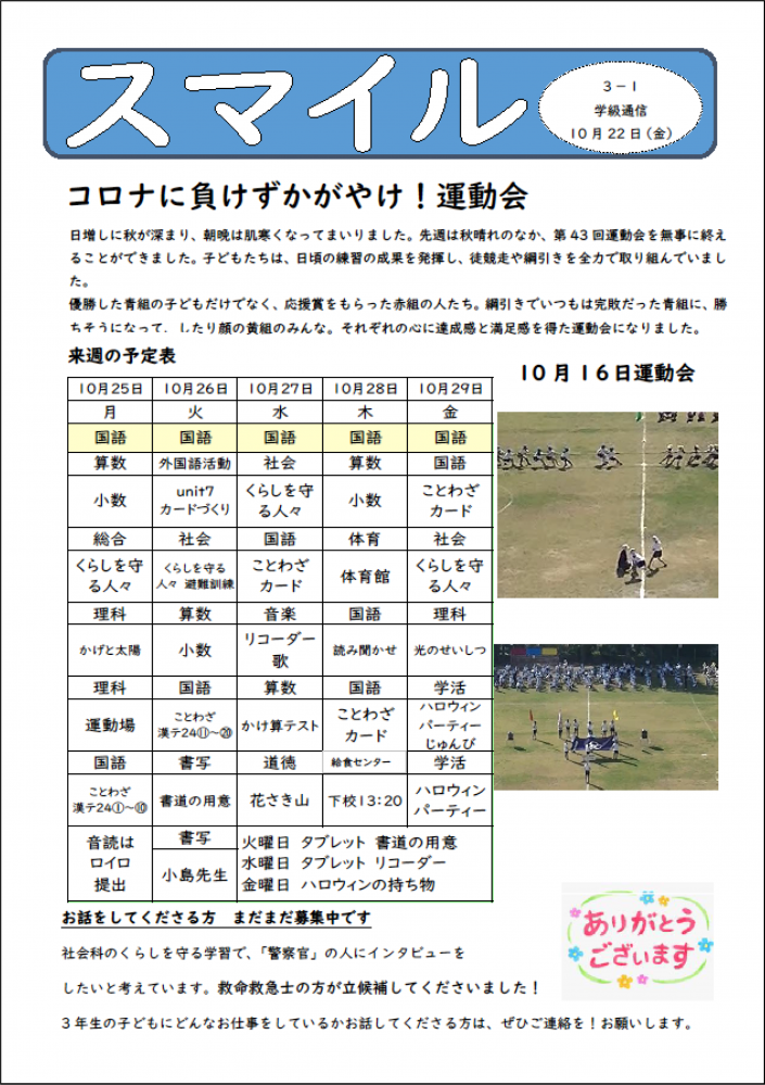
Elementary school class newsletters need to include a variety of information, such as timetables and what to bring. Organizing the information and thinking about the order in which you want readers to read it will help you create a layout that is easy to read.
In the class newsletter sent after the training, the students' eyes are guided to read in the order they want the contents to be read: "A message from the teacher, a schedule, photos from the sports day, and a request for recruitment."
In addition, by eliminating the distortion and processing of titles and headings, the site is now simpler and easier to read.
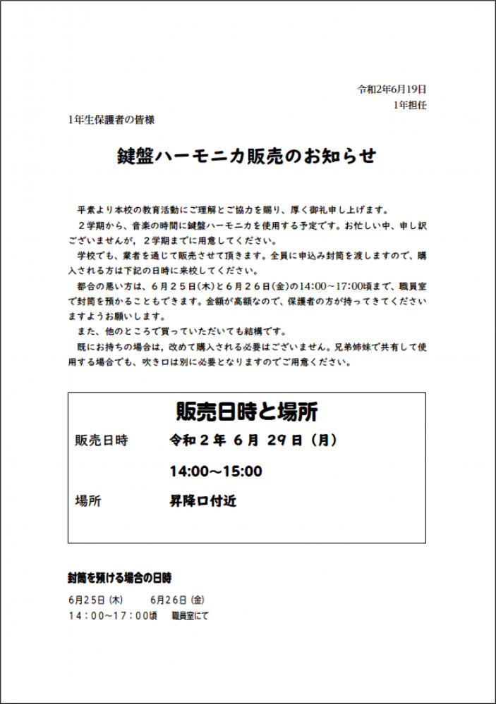
Example 3: Notification to parents
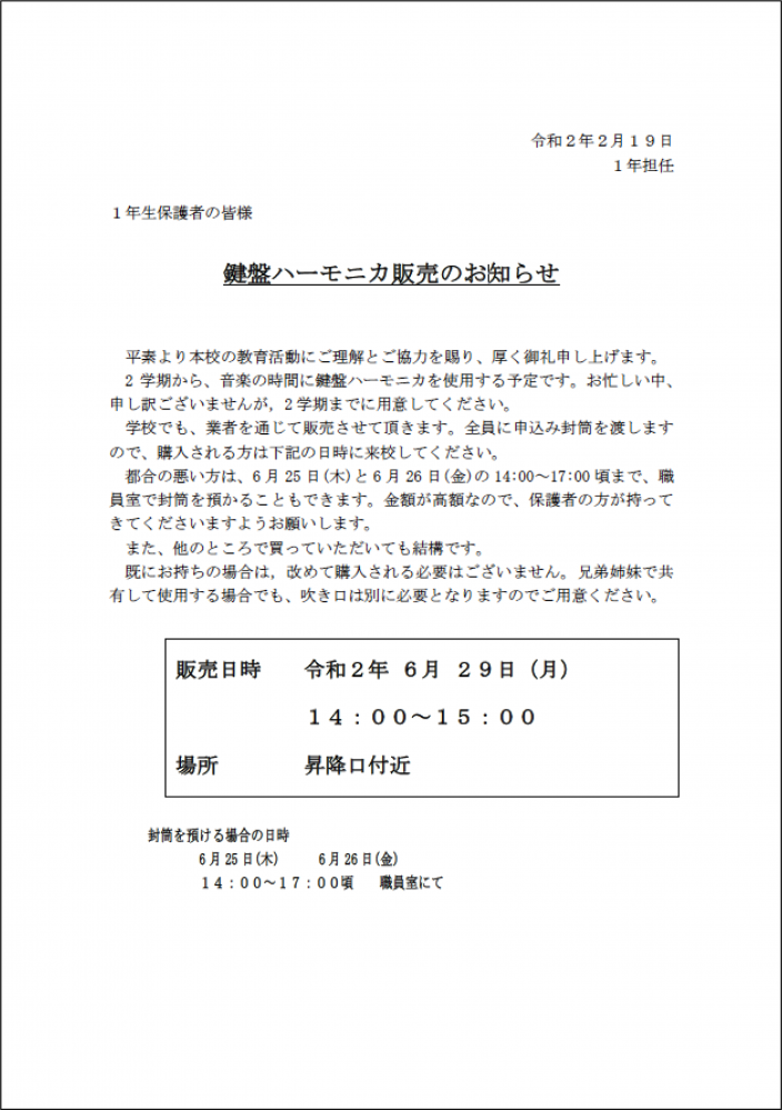
After the training, the title "Announcement of keyboard harmonica sales" and the most important information, "sale date, time and location," were included to create an eye-catching structure.
In addition, the line spacing of the main text has been adjusted and the size of the page (the area in which information is laid out) has been increased, resulting in a better overall balance.
Post-training survey
In a survey conducted after the training, all teachers and staff members rated the training as "very helpful" and "informative."
Specifically, the following comments were received as helpful:
especiallyFont monospaced, with P and KRegardingAbout the line of sight and layoutThis was something I had never heard before, and I felt that it could be very useful in layout.
I had received training on UD fonts in advance through a video. The explanations were easy to understand because they used school-related materials.is.
With UD in mind,What can you do specifically to improve the readability of your materials?I was able to learn a lot about fonts, line spacing, copyrights when using illustrations, and so on.
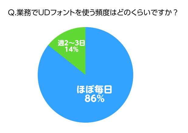
In addition, the survey asked about the frequency of use of UD fonts, and the results showed that 86% teachers and staff use UD fonts almost every day in their work, indicating that teachers in Ikoma City have an environment in place where they can create content using UD fonts.
When we switched to UD fonts, 4 out of 21 people responded positively.."Children's motivation to learn has increased", for 3 people."Children have become more proactive in their learning"I think this comment is only possible because teachers keep an eye on the daily lives of their students.
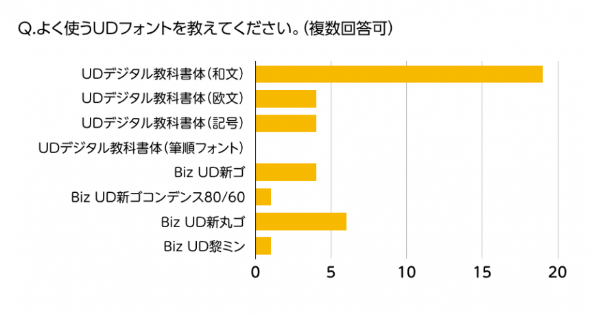
We also found that the most commonly used UD font is the "UD Digital Textbook Font."
In fact, "UD Digital Textbook Font" is not an all-purpose font, and there are various cases where "UD Shinmaru Gothic" is easier to read for some people. Therefore, we would like to continue to support you so that you can choose and use the font according to the situation and consideration.
For public organizations like Ikoma City that sign up for the UD Font Plan for Public Organizations, we will not only provide the fonts at a special price, but also make suggestions to help them use the fonts in a way that is more in line with their intended use.
If you are interested in UD plans for public organizations, please contact us using the form below.
UD Font Plan for Public Organizations Inquiry Formhttps://www.morisawa.co.jp/support/contact/forms/ud-public