

After roughly three months of creating font zines in eight teams of four to five people each, the Moripass Club members held an event to present their work. Here is a report on how they presented their zines to a group outside the club for the first time.
The last day of club activities where I learned three skills
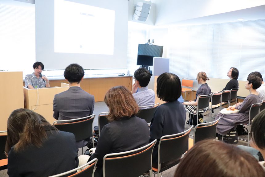
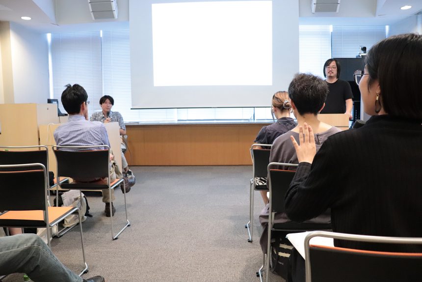
On September 29th, students sat quietly at the event venue, waiting for the Moripass Club members to give their presentations. Representatives from Hokaze, a printing company with cutting-edge technology, and Takeo, a specialized paper trading company, who supported the club's activities in 2019, were also in attendance, warmly watching the members' big day.
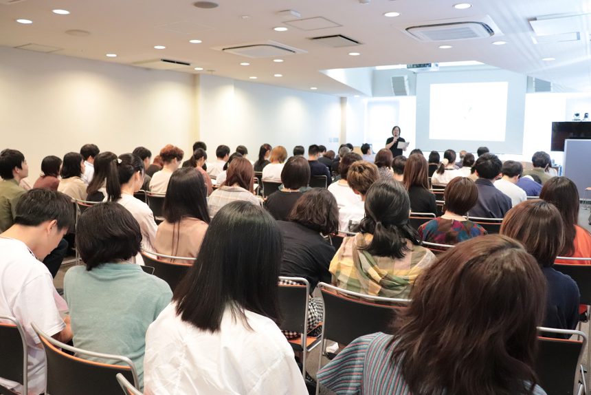
The members waited at the back of the auditorium, feeling a bit nervous before the presentations began. Then, the microphone was switched on and it was announced that the event would be divided into three parts: student presentations, guest talks, and a social gathering. The event was about to begin. Advisor Hashizume of the Moripass Club gave an opening address.
"The Moripass Club is made up of student members. We aimed to produce an output aimed at turning on the sensitivity of fonts for students who are interested in creativity. However, we also wanted the students who participated to gain something from it. So we promoted our activities in a way that would develop three skills: teamwork skills, practical design skills, and the ability to communicate."
Up until this day, the members had repeatedly worked as a team to shape and present what they were thinking and how they wanted to communicate, and the event to present their work was an opportunity to showcase these three strengths.
Presentation of works that convey the diverse appeal of fonts
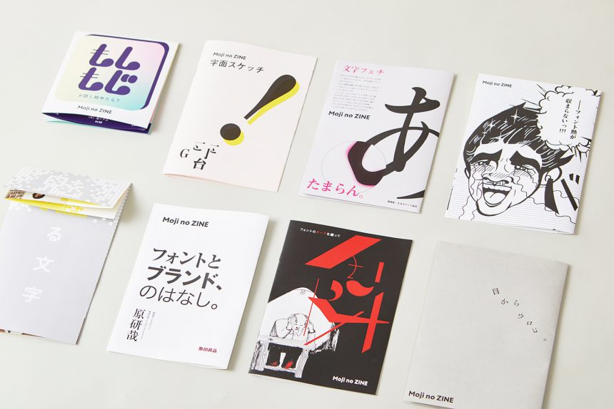
The presentations by the eight teams showed that even if they were dealing with the same subject matter, fonts, the appeal of the fonts expressed can be diverse depending on the members conveying their appeal. Each team drew attention to the zines they produced, limited to 100 copies, and conveyed their achievements and thoughts over the past three months to the audience in the stands listening to their presentations.
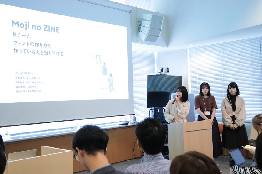
One team edited their zine by focusing on how fonts are made and the creators behind them. Believing in the saying "the soul is in the details," they created a zine that focused on the elements of fonts. They presented their ideas, such as making the opening feature a manga and creating a structure that connects the creators' thoughts with each page turn, so that even people who aren't familiar with fonts can easily access the zine, and the audience looked at the zine with satisfied expressions.
Another team edited a zine focusing on creators skilled in working with fonts. They delivered an in-depth interview with one designer, highlighting the fact that fonts, which are used to present information, have a unique quality that captivates the reader's sensibilities. Because fonts have different appeal depending on the person using them, this zine placed emphasis on valuing the individuality of the interviewee. It was striking to see people looking back at the zines they had in hand as members shared the parts they valued.
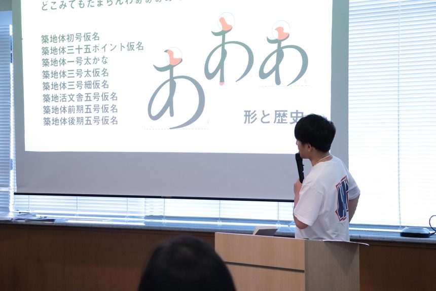
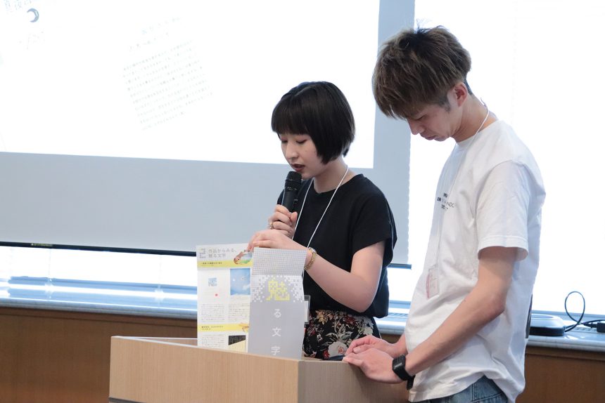
Other presentations included a zine that delved into what can be expressed through fonts and another that traced the history of font creation. The presentations began with a tense atmosphere, but laughter erupted from the audience at key points, gradually easing the tension and conveying the personalities of the team members. When each team returned to their seats after their presentation, their cheeks relaxed and a sense of satisfaction was apparent.
Creating new connections through font sensibilities
The second half of the presentation event featured a guest talk by art director Tomoya Kaishi, who gave advice to the members at the third club meeting. Kaishi, who teaches at a university, gave a lecture-style review of the appeal of each team's zine from his perspective, as well as a design lecture on fonts. Members of the Moripass Club joined in the audience, taking notes on Kaishi's teachings. Even on the final day, the members' senses were "ON" as they learned about font creativity.
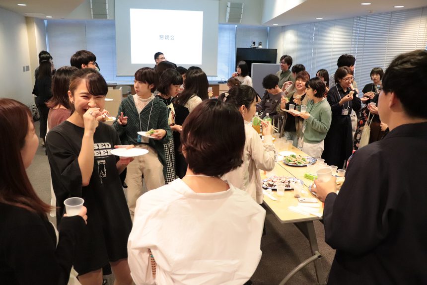
The Moripass Club, which began in 2016, has now completed its fourth term. This fourth term included time for members to interact with those who came to watch. Moripass members reflected on the day with people they had met for the first time, and used fonts as an opportunity to make new connections. Some members also invited acquaintances and friends to share what they had learned in the Moripass Club, with some even expressing interest in joining in.
This scene shows that the members, who have been able to transform their interest in fonts into a heightened sensitivity over the course of approximately three months of activities, have joined the ranks of creators who can connect with people they've just met through their sensitivity to fonts. From the next day, they will become former members of the Moripass Club. This means that the members' creativity, which allows them to bring out the charm of fonts, will continue, using their experience in this club as a source of nourishment in their creative lives.
With this group of people, the advisors were convinced, and the members left the nest.
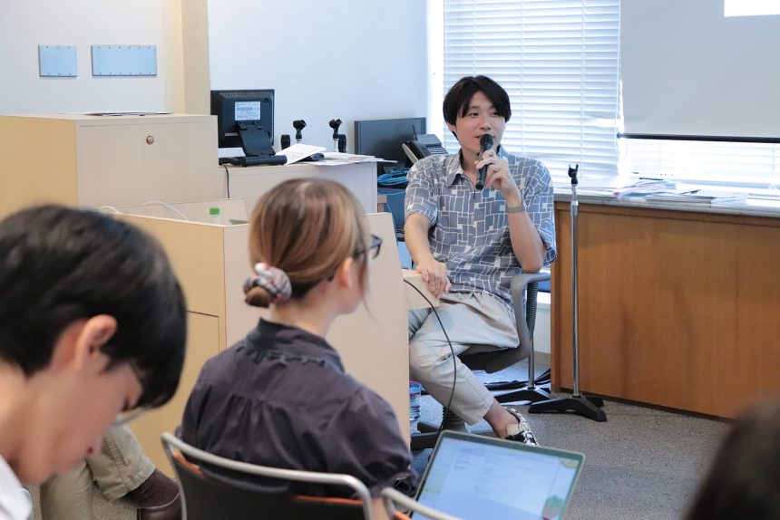
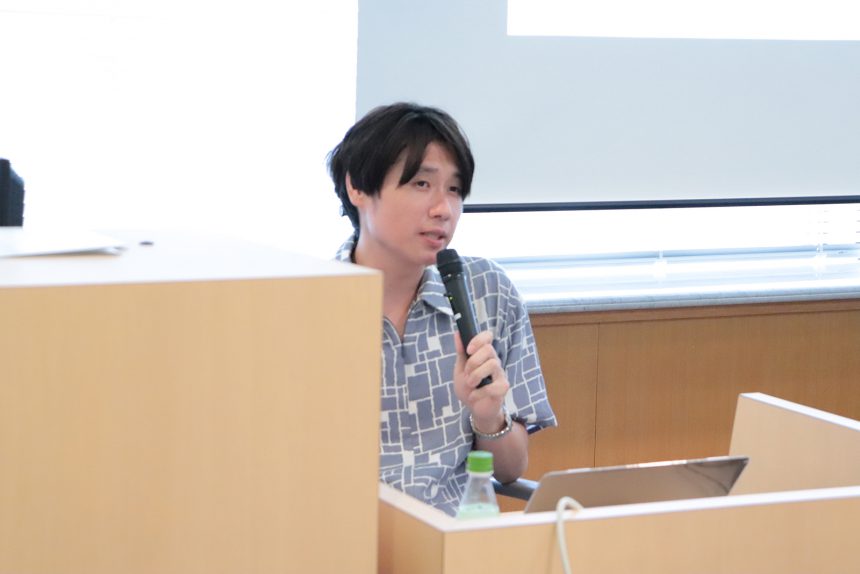
Art director Tomoya Kaishi participated in the third Moripass Club meeting and gave advice to the members. At the presentation event, he gave a guest talk about Moji no ZINE and designs that utilize fonts.
A well-designed process leads to great success
What if you were to grade the program Moji no ZINE? Kaishi, who normally teaches at a university, approached the guest talk in university mode and began speaking.
"I think it was a great success, I'd even say 10 times! I'm studying communication in the design process at university, and this program allowed me to experience the practical design process that I will experience after entering society, where my output is seen by many different people and completed.
Another factor in the program's success was the fact that Morisawa and the students worked together. Morisawa normally communicates about fonts with students like the group members. However, in this program, the student members took on the challenge of communicating directly with other students.
Because the perspectives of the members, who are usually information recipients, on fonts differed from team to team, there was a nice difference in the perspectives of Morisawa, the font creators, and the members, who are users, on fonts, which made the communication about fonts in this program even more interesting."
Eight things Kaishi noticed about the appeal of zines
When viewed through Kaishi's eyes, each team's zine also reveals the delicate charm of fonts.
"The first team to present (It was an eye-opener.) is interesting in the way they divided one zine into three pieces of content. From the idea of making a manga that is accessible to the average university student, to the idea of getting the cooperation of a font creator to explain how to use it, I was impressed by the way they structured it to stimulate communication.My font fever just won't subside!!!) also has a different appeal. The font creation process is expressed through a board game. This kind of output is something that could only be expressed by student members, and it seems likely to reach people who are newly interested in fonts.
The third team's ZINE (Fascinating characters) was probably the one I enjoyed reading the most. Kazunari Hattori has given interviews in various media outlets, but this was the most understandable of all the ones I've read so far. I think even the best interviewers and editors would have had trouble getting him to talk.
The fourth team's ZINE (A story about fonts and brands.) also featured an interview with Hara Kenya. It was a long zine, but it was beautifully done with designs that expressed the halftone dots and the whiteness of the paper, and it was a great read, with him even talking about the behind-the-scenes of font development.
Next team (Moshimoji) is a stark contrast to the original idea behind the project. I thought the idea of deliberately transferring content based on social media into a print medium was in keeping with the times, and I was impressed with the attention to detail, such as the battery gradually decreasing on the page that resembled a smartphone screen.
The words of praise for the zine continued without a hitch. It was clear that they had truly embraced the appeal of zines.
"The sixth team (Character sketch) deserves applause for designing such a great zine despite not having any art students in the team. They printed their innovative ideas on pale pink NT Lasha White Rose paper, creating a beautiful zine. The next team (AURA) But I was impressed with the design. The members created bindings for the four stories that made use of the font, and none of them detracted from the beauty of the font.
The last team (Letter fetish) It's amazing how he doesn't hide how his interest in fonts has turned into a fetish. The content is a micro-analysis of eight different angles, and the page design makes use of the jump rate, making it a very powerful zine.
All of them were really good. I think it was because we were able to establish a common perspective and not have so many overlaps that we were able to create a zine that fosters good communication between creators and users."
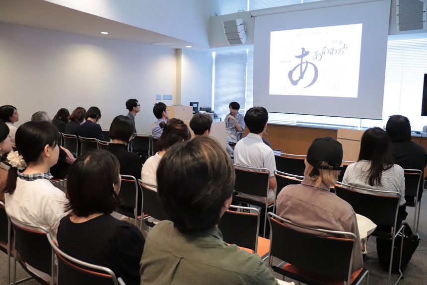
Tomoya Kaishi's Typography Basics
The second half of the guest talk was about design that makes use of fonts, using Kaishi's work as an example. Kaishi usually prefers to use simple fonts and often tries not to deviate too much from the font creator's design, and he seems to be conscious of dividing the essence of typography into two parts.
"The essence of typography is '① what kind of letters' and '② how to arrange them.' Like '①,' many people focus on choosing the font, but if you keep '②' in mind, the possibilities of typography expand infinitely. Even with a simple font, I think you can create a logo-like design by simply arranging it with an awareness of the gestalt (form)."
Even though Kaishi sometimes incorporates techniques to bring out the faded look of fonts into his designs, his fundamental approach to fonts remains the same. After sharing his basic ideas about how to make the most of fonts, he answered questions from the audience.
Q. The fifth team's zine had the goal of getting people interested in the font so much that after reading it, they would get excited when they saw it in town. Kaishi, do you ever find yourself wanting to fix a font when you see it in town?
"The truth is, I do find the spacing of letters bothering me. If I could have psychic powers, I would want the power to fix the spacing of letters on signs all over the world (laughs). While I sometimes feel this way even when it's designed by a professional, I'm also amazed by things made by other people. I find it fascinating how the letters written and created by ordinary people with passion, such as coffee shop signs, really move me."
Q. Recently, there has been a lot of talk about whether brand logos should be serif or sans serif. How do you distance yourself from design trends?
"Design is certainly something that is popular among people with a certain range of interests, so I do think about going against the trend and how much of a trend I'm willing to accept. It's not a question of which is better or worse: design for a highly sensitive audience or design for a less sensitive audience, but rather I'm conscious that their needs are different, and it's important for designers to constantly hone their sensitivity."
By the end of Kaishi's lecture, which began with a discussion of the zines the members had created and continued by building communication with the audience based on his own work, it seemed that everyone in the venue had become more aware of fonts. This was evidenced by the lively discussion about fonts that continued throughout the venue during the social gathering that followed.