
As part of a collaborative project between Tokyo Design College and Morisawa Inc. titled "Turning on the Sensibility of Fonts," students were asked to create a commercial for the Academic Edition of Morisawa Passport.
The theme this time was to have them create a "MORISAWA PASSPORT Academic Edition Commercial" targeted at students! Using "videos" that are familiar to many people on social media, we hope to convey our desire to make many people aware of the appeal of fonts.
The commercial that conveys the most appeal will be used as an actual advertising video!
First, I attended a seminar to learn about the appeal of fonts.
After that, you can post your own onomatopoeia in your favorite font on the website.onomatypeYou will be able to use this to observe and choose typefaces!
This should have been a good opportunity for them to practice explaining in their own words what typeface would be most suitable.
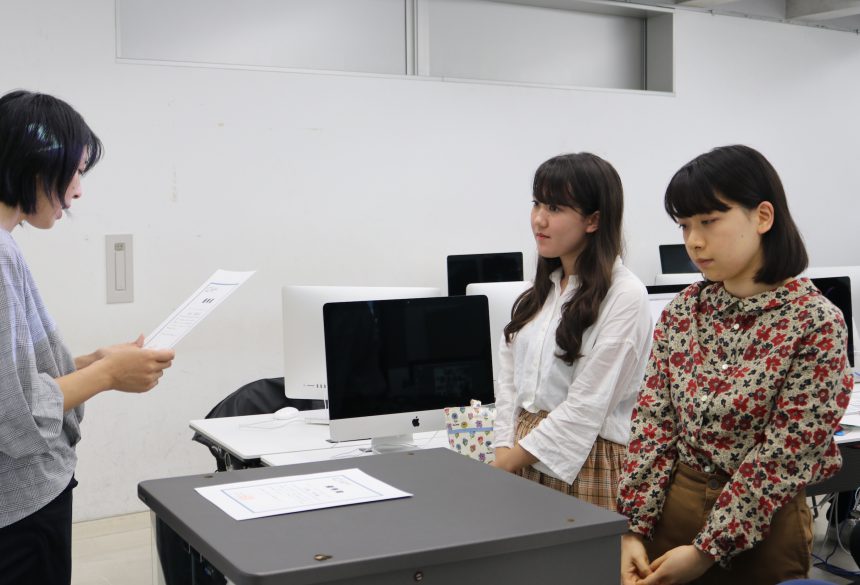
At the interim presentation, the participants explained the flow of the video based on storyboards and proposals.
Does your choice of typeface match the message you want to convey?
With advice such as these, you will be able to create a commercial that conveys your message better!
And then the final announcement came!
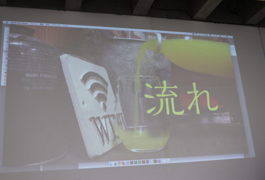
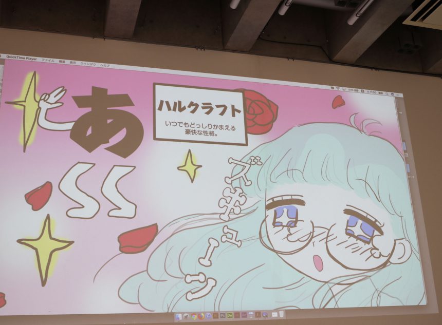
The videos were produced using a variety of unique ideas, including hand-drawn animation and live action.
Because so many wonderful works were submitted, Morisawa's internal review process later proved difficult.
This time, we have specially set up two awards, the "Grand Prize" and the "Excellent Prize," and both winning works will be used in advertisements!
The team that won the prestigious "Grand Prize" was Araki Kanami and Tamiya Yui.
The team that won the "Excellent Award" was the team of Kobayashi Shu and Takayama Yuki.
In the next article, we will be introducing interviews with the winning team and actual videos of the two teams, so stay tuned!
In the previous article, we introduced the progress of the project and the winning teams of the Grand Prize and Excellence Prize.
In this article, we will be interviewing the grand prize winning team and introducing their actual work!
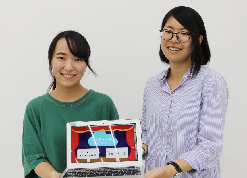
Grand Prize "SHOW TIME with Fonts!"
・Kanae Araki
・Yui Tamiya
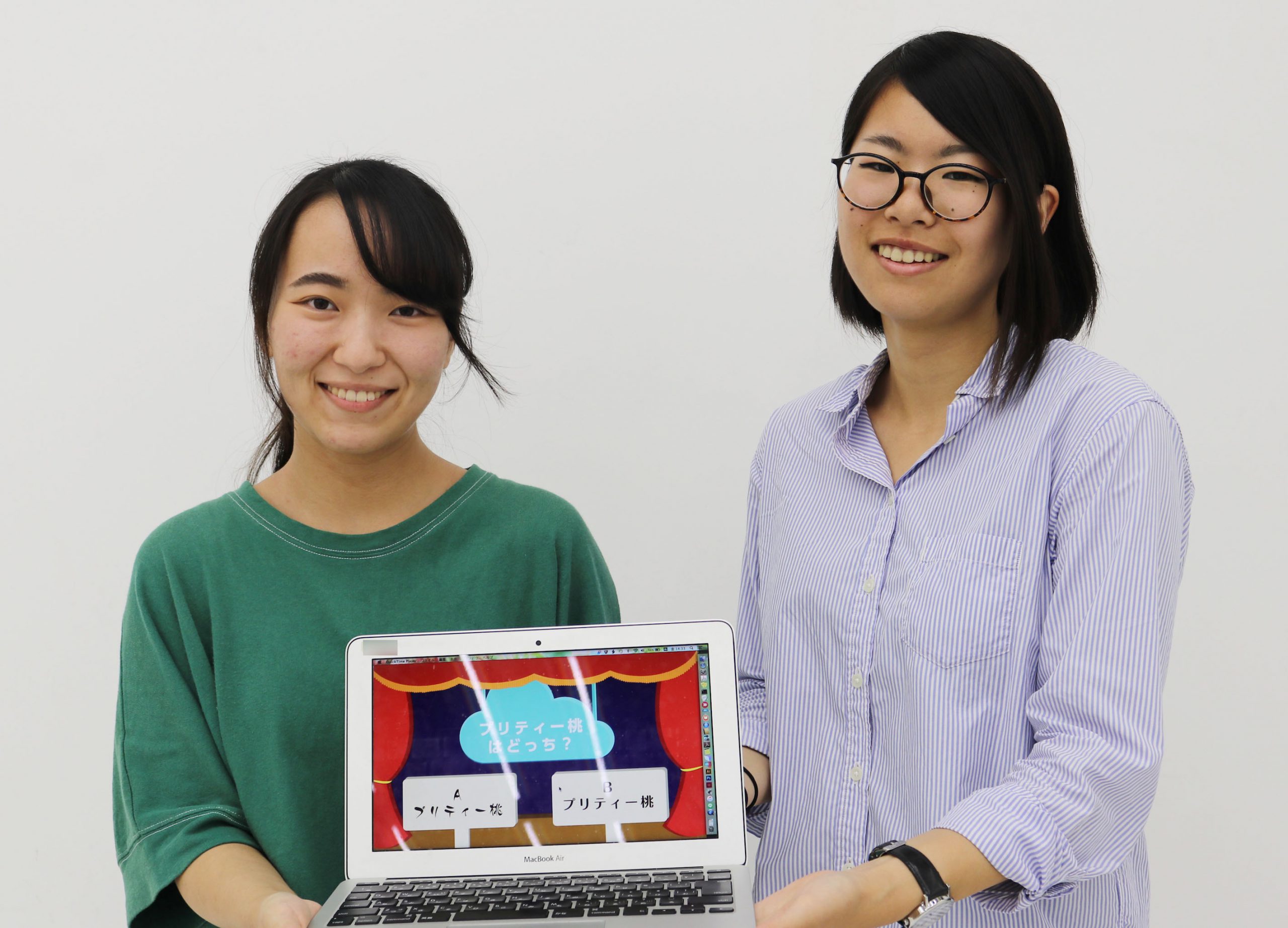
The Grand Prize went to a submission entitled "Font SHOW TIME! - Which one is it? Font Quiz!!" which highlighted the appeal of the typefaces included in the MORISAWA PASSPORT Academic Edition.
."Musashino","Pretty Peach","Takarism","Bellbug".
What kind of designs do you imagine when you look at the names of various fonts?
The quiz-style video allows participants to imagine the shape of a typeface from its name, and it allows both those with and without an interest in fonts to naturally interact with and enjoy fonts, which led to high praise!
This team created five different patterns, including the ones below!
Please try the font quiz.
Pretty Peach (video)
Takarhythm Edition (video)
Bellbug version (video)
Cinema Letter Edition (video)
Excellence Award "There are so many fonts"
・Kobayashi Shu
・Yuki Takayama
This team used cute animation to comically depict the story of a girl who is having trouble choosing a typeface for an assignment, but is invited into the world of Morisawa fonts and finds her destined font among the many fonts available (!?).
The film was awarded the Excellence Award for its impactful content and addictive nature that made people want to watch it again after they had finished watching it.
The works of both the Grand Prize and Excellence Prize winning teams will be used to advertise the MORISAWA PASSPORT Academic Edition on social media and other platforms!
The "typeface name" became the gateway to my interest in fonts
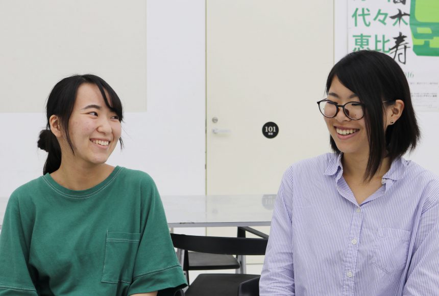
We interviewed Araki and Tamiya, who were awarded the grand prize.
Araki was mainly in charge of planning, and Tamiya was mainly in charge of creating the materials. The two worked together to get the project going!
Q.What impression did you have of Morisawa fonts?
When I looked at Morisawa's website, I got the impression that it was very formal overall. I was impressed by the attention to detail that goes into creating the fonts by hand.
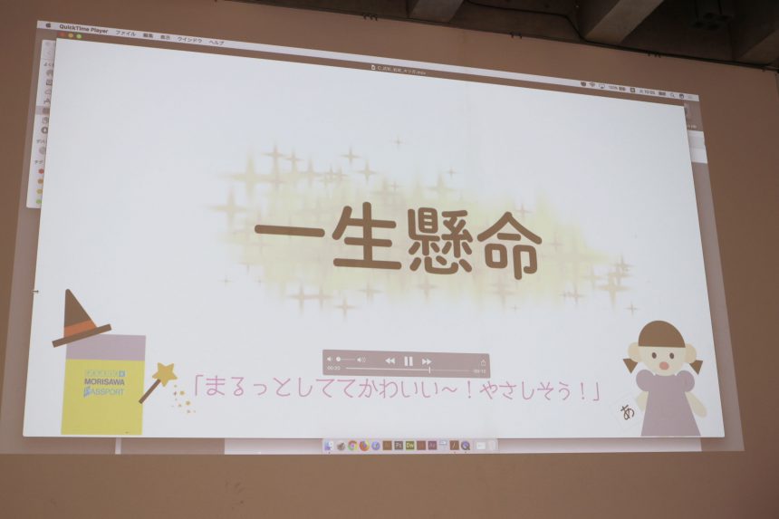
Look at the font sample page and say,TakapokkiI thought the font names such as " were interesting.
There are also otherPretty PeachThe idea for "SHOW TIME with Fonts!" was born from the gap between the image I had in mind when I heard the name of the font and the actual design.
In fact, the inspiration for this work came from my interest in fonts, sparked by the names of the typefaces.
The students said that working on this project has changed the way they view typefaces in their everyday lives. We hope that the commercial they produced will "turn on the sensitivity to fonts" in even more students!
Thank you to everyone at Tokyo Design College!