
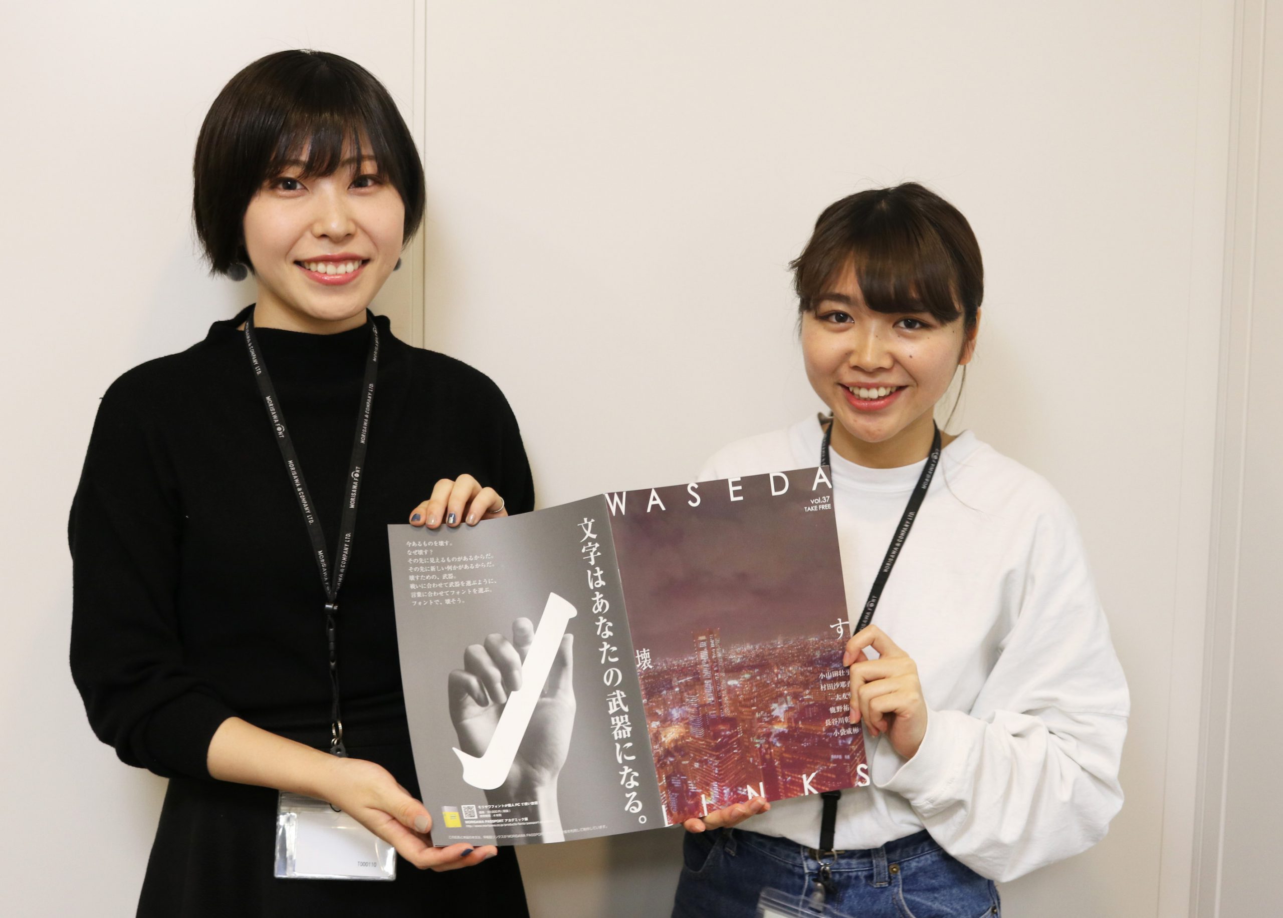

Mr. Iwashita (right) and Mr. Shigeoka (left) from Waseda LinksWASEDA LINKS vol.37" He came to deliver it to me.
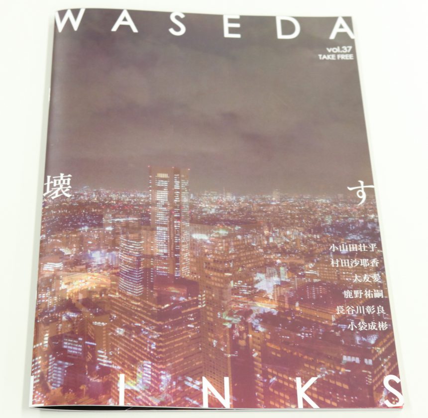
The theme of this issue is "breaking."
The theme was born from the realization that nothing new can be created without destruction, after seeing a development site in Shibuya, Editor-in-Chief Yoshida said. He wants people to destroy their perceptions and values, and have hope beyond the destruction. The content explores the concept of "destruction" in this positive sense.
We spoke with Mr. Iwashita, who was in charge of the layout design for this issue.
The cover and visual pages were created with red and black as the theme colors.
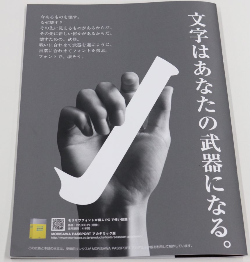
The content of the article is shocking and far removed from everyday life, so the design itself is neat and tidy.Also, because I wanted to let readers read the interview in detail, I used a basic, easy-to-read font for the text.Ryumin" I chose ".
Nakagawa was in charge of the advertising side, and we asked him to choose a scene that would use the "weapon" of fonts to destroy existing values.
Just as you would choose the right weapon for a battle, we asked the artist to use a photo of a hand and kanji radicals to illustrate how to choose a font that matches the words and message you want to convey.
The interviews in this issue have been well-received, and many of them have already been sold.GETPlease do!