
"Font Find" is a corner that introduces various typefaces based on a theme.
This time the theme is "Takikomi Gohan"!
Takikomi gohan can take on many different forms depending on the cooking method and ingredients used.
Maybe changing the font will give you a new perspective...?
This section is available on Twitter (@fontswitchpjtThis project is linked to
We will be updating this article with the typefaces introduced on our Twitter account, so don't miss it!
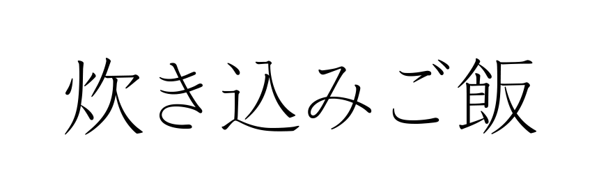
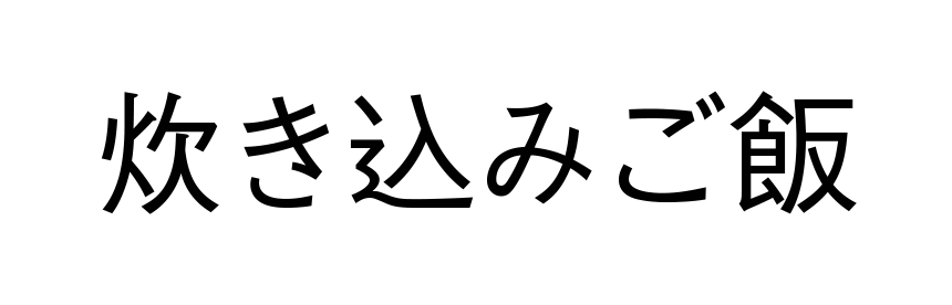
"Akashi" evokes the image of elegant, lightly seasoned rice. It's the perfect typeface for expressing a delicate and delicate image. It gives off a sense of transparency, while the intonation of the brushstrokes gives it a rich feel, so even when displayed large for headings, it stands out for its beauty and strength.
▲ Click on the font name to check out the font introduction page!
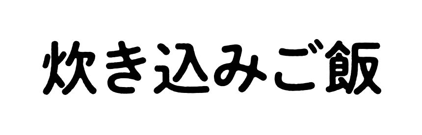
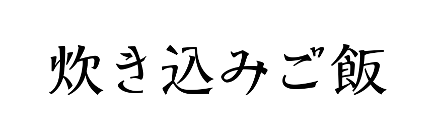
Shuei Nijimi Maru Gothic was released as a new typeface in 2018. It's just so cute! It's so cute!
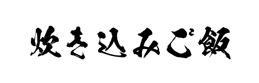
The texture of letterpress printing evokes a nostalgic image, so it would also look good with the green peas and corn rice served in school lunches. If you have trouble seeing the "bleeding," try enlarging the image and paying attention to the swaying of the lines and the bleed effect at the intersections!
▲ Click on the font name to check out the font introduction page!
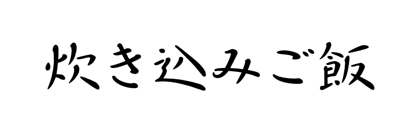
Are the flickering shapes of the letters due to the heat haze, or perhaps the steam from freshly cooked rice?
This dynamic yet easy-to-read typeface would be perfect for the fragrant and delicious matsutake rice served at a long-established Japanese restaurant.
▲ Click on the font name to check out the font introduction page!
When I see this word on the school lunch menu, my heart leaps!
The character shapes of the Gakusan font are designed to be suitable for learning kanji, so they are perfect for elementary school menus. Pay attention to the shape of the "shinnyo" (radical)!
▲ Click on the font name to check out the font introduction page!
Although it has a unique design, it somehow feels nostalgic because the thickness of the vertical and horizontal strokes creates a contrast similar to that of Mincho fonts. It's perfect for when you want a Japanese-style design with a bit of something different!
Is it a slightly flavorful rice dish?
▲ Click on the font name to check out the font introduction page!
If you see it on the menu at an obanzai restaurant, you can't help but order it, hoping to taste like your mother's cooking...that's Nachin.
If you look closely, you will see that the key point is the bold typeface design, which omits the spiral strokes and finishes them with rounded strokes.
▲ Click on the font name to check out the font introduction page!