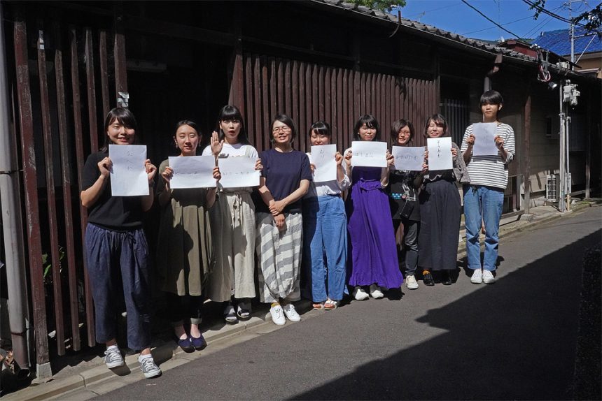
On July 1st, when the cicadas were just starting to sing, the Kansai Moripass Club invited typeface designer Tomomi Kanda to hold a workshop on the theme of "Catchphrases x Letters."
This time, the venue was outside the Moripass Department's Osaka headquarters, and was held at Tadahonya, run by Kansai Manager Yamada! We'll be reporting on the members' valuable experience of experiencing everything from how to create fonts to how they think about them, all while getting a feel for Kyoto throughout the day!
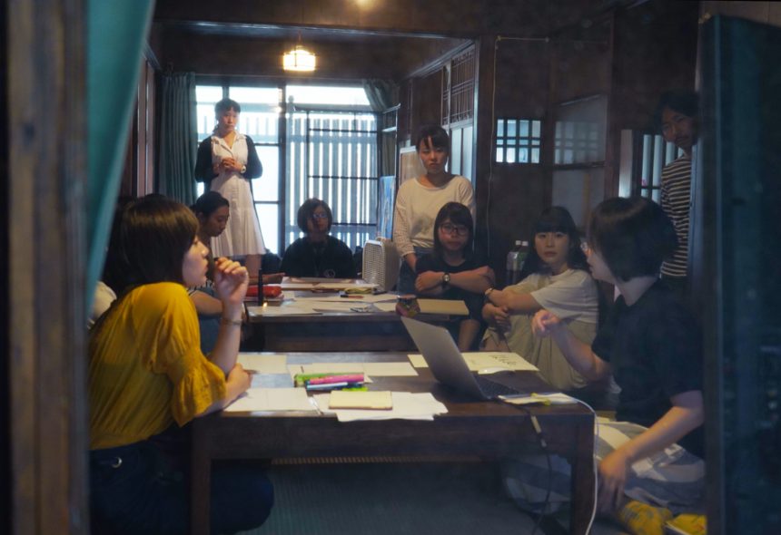
First, let's share the image and atmosphere that everyone's catchphrases convey!
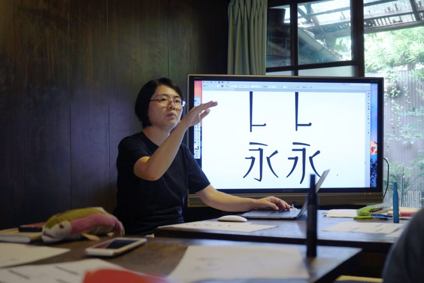
The theme of "FONT SWITCH MAGAZINE Vol.3" produced by the Kansai Moripass Club is "Wearing Letters," so this workshop was a chance to think together with Kanda about what it means to wear letters.
The idea was to find a phrase you use often and create a font that matches the atmosphere of that phrase. Kanda-san introduced us to the work he has done up until now and generously taught us things we could only hear here, such as how to create letters and how to come up with ideas!
Characters are made up of two elements: a "skeleton" that is the framework that forms the character's shape, and "elements" that add various nuances to the character.
In the morning session, we thought about the "skeleton" that captures the nuances of catchphrases from these two elements!
First, each member shared their favorite phrase with everyone. They spoke it out loud so that the nuances would be easy to understand, and explained in what situations they use it and what image they evoke.
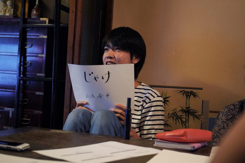
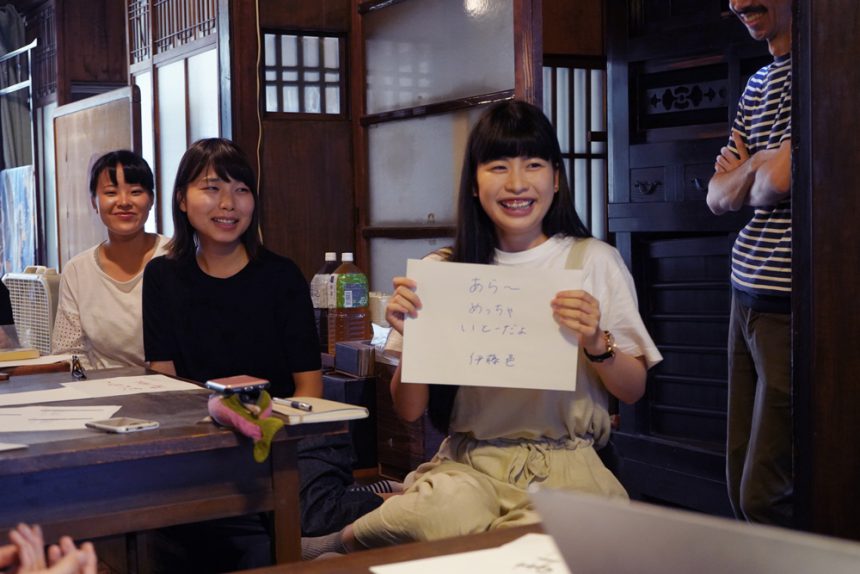
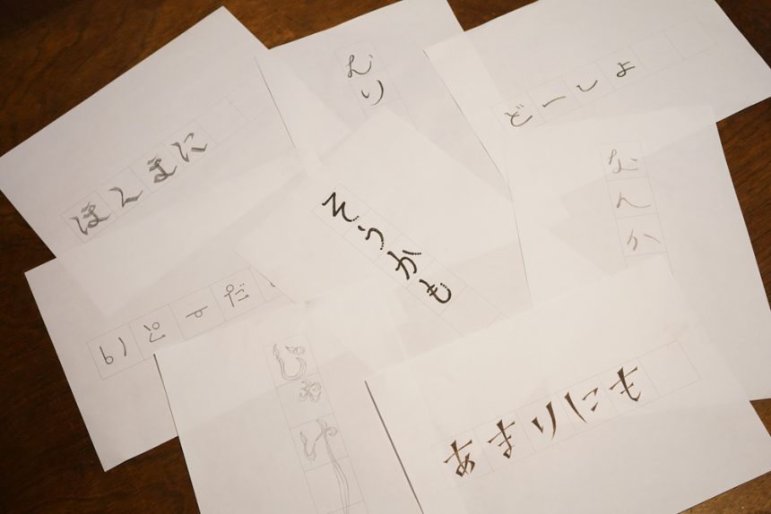
Takei's "jakke" is a Yamaguchi dialect word that is often used to mean "that's why." It's a word he uses when he wants to take a breather. He uses a drawn-out "jakke" at the beginning of a conversation, but apparently the rule is not to write it down. This is the catchphrase that has the biggest gap between the written and spoken word.
Ito's "Itou da yo" is what she responds to when someone calls her by name, and she apparently uses it as a greeting. It's a cute catchphrase that matches Ito's character, and I'm looking forward to seeing how the font will express her somewhat silly atmosphere.
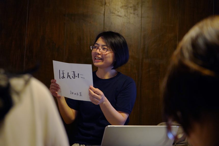
By the way, Kanda's catchphrase is "Honmani." The nuance is not "Honmani!!" but "Honmanii," and he uses it as a gentle interjection.
Struggling to grasp the exquisite nuances of his catchphrases!
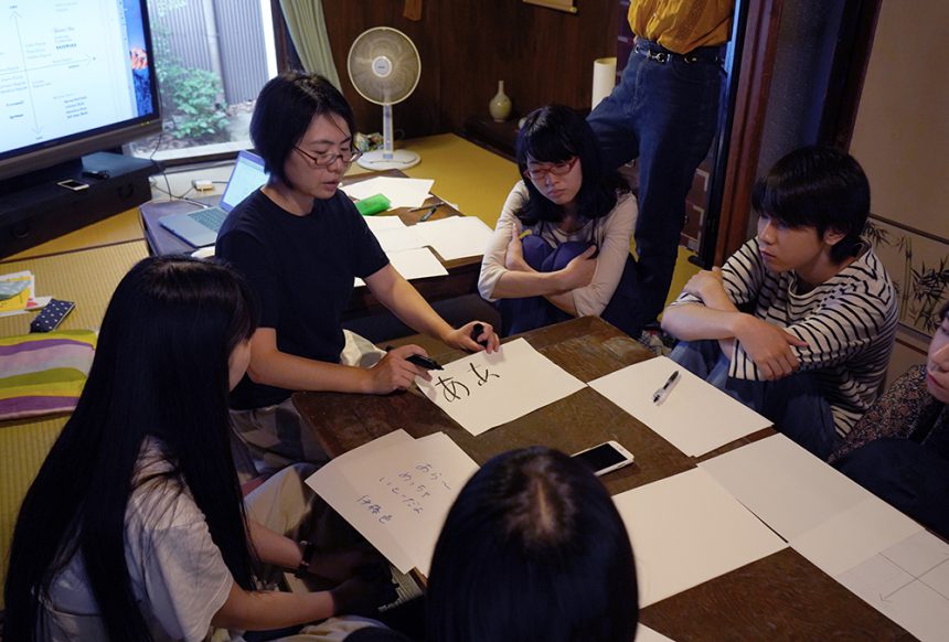
After everyone announced their catchphrases, we were given a lecture on how to visualize them in concrete terms.
When Kanda explained in front of everyone using the letter "a" as an example, he said, "A high center of gravity gives it an elegant and feminine feel. A version with a low center of gravity gives it a slightly funny feel." He actually used his hands to explain the different impressions that are created by differences in the center of gravity, as well as the patterns that are created by changing the depth of the character.
Using this as a reference, they write out many patterns and find the shape that feels right. When they start to lose track of the character they are aiming for, due to the impression that changes with subtle differences, they are often seen asking the people around them for advice as they go along.
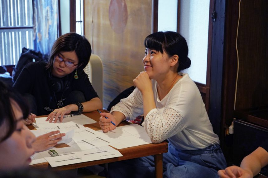
Perhaps it's easier to grasp the nuances when thinking out loud, as everyone's catchphrases were flying around the venue.
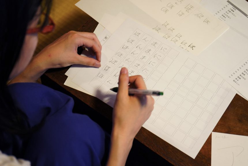
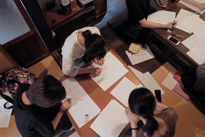
Seven changes in letters! The impression of letters determined by elements
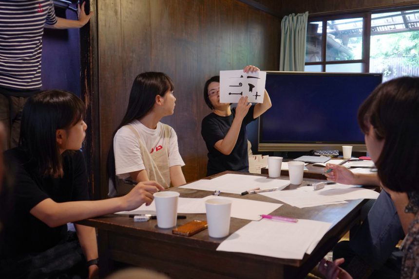
In the afternoon, we started adding elements to the skeleton we had in mind!
Occasionally, they would check with the other members and give each other advice, such as "Is it a little too stylish?" or "Maybe it should be a little more relaxed."
Taking advantage of this rare opportunity, Kanda gave the students some advice: "If you're unsure, try something with a wider range and you'll end up with something interesting," and with that, they were able to come up with a collection of highly original letters.
It's almost complete! What kind of catchphrase font will it end up being?
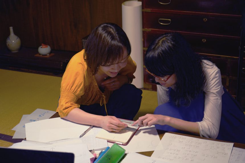
While checking the characters, I made sure they would function as a font, saying things like, "Imagine how they will look when they are smaller, so pay attention to the line width," and "Be careful not to make the characters too distorted, as there's no point in making them unreadable."
We received advice from a designer's perspective, such as: Everyone asked questions and brushed up their work! Finally, we finished the final draft and it was complete!
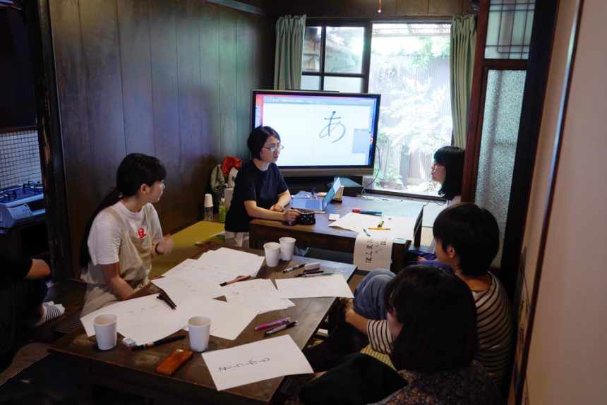
Before the presentation, we were given a lecture on how to digitize the fonts that we had created so that they could be used on a computer.
It was a valuable opportunity to learn how professional typeface designers work, and the talk was full of useful information that even students can use right away, including introductions to techniques and apps.
The members took careful notes as the fonts they created in the workshop would be digitized after the workshop was over.
Do fonts express your personality? We've created a font that reflects everyone's individuality!
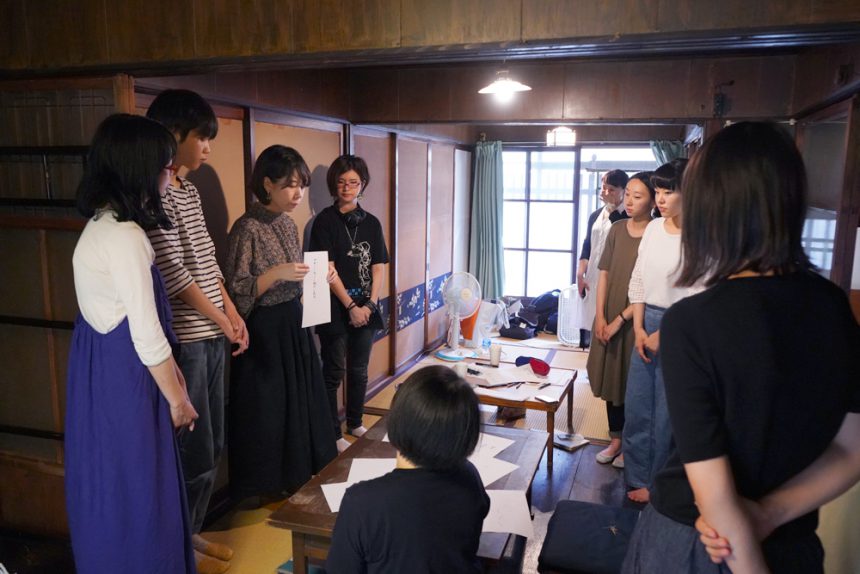
The workshop is coming to an end, and the final event will be a presentation of everyone's completed catchphrase fonts!
Each student explained the font they had created. Seeing everyone's catchphrases visually made it easier to convey the nuances. The impression heard and seen through the eyes matched well, and during the presentations, comments like "I understand, I understand" were heard all around.
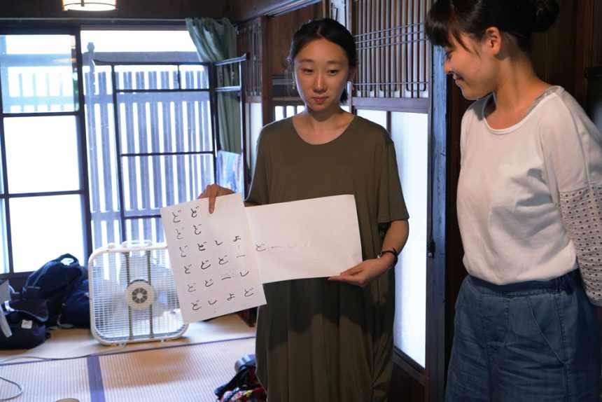
Ii says that her impression has changed considerably since she first started thinking about it. She thought about the catchphrase "Doushiyo." It seems she was influenced by the impression of the catchphrase she came up with in her head, but towards the end, the letters she wrote by hand seemed to fit perfectly, and she was able to create an original font that only she could create.
Horiguchi, who shares the same catchphrase as Kanda, used a calligraphy pen to create unique lines with varying strengths that cannot be achieved with a pencil. Since it is used like a stamp at the end of a conversation, the design was intended to emphasize the point.
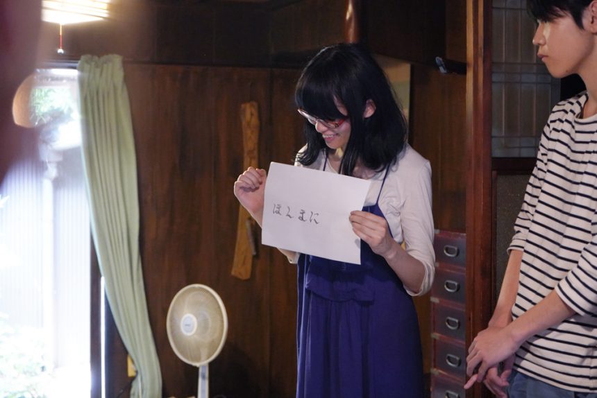
The fonts that were presented, along with their catchphrases, all made me think of the people who created them, and it was as if the ``name speaks for itself'' and the ``font speaks for itself.''
At the end of the workshop, Kanda said, "It was great to see everyone concentrating so much. I hope that through this experience of creating letters, you will use this as a way of thinking when you create something in the future." With these closing words, the workshop came to a successful conclusion.
At one point, Hashizume, who had rushed over from Tokyo, commented, "I can almost hear the voices," as he looked at everyone's lively writing. Kanda also commented, "The image is so clear that it's easy to understand."
The words we use casually in our daily lives contain various nuances, and when we put them into writing, we can use the power of fonts to ensure that these nuances are not lost.
This workshop, which allowed participants to think about the power of fonts through their own catchphrases, seemed to activate the members' senses for sensing the atmosphere that fonts evoke.
Based on the workshop, the MOTC team will compile their thoughts and experiences into a magazine! There were probably many things that only those who actually got involved could understand. "FONT SWITCH MAGAZINE Vol. 3," where you can learn more about their impressions and the fonts that everyone created, will be published this summer!

