Four students from the Hayami Momoko Laboratory at Waseda University's Faculty of Science and Engineering (Department of Applied Mathematics, School of Fundamental Science and Engineering) used Morisawa fonts (Morisawa FontsMorisawa fonts are loved by many in the creative industry, but how are they used in the field of research presentation materials?
You all recently finished presenting your graduation and master's theses. How did you use Morisawa fonts when creating your presentation slides?
In this graduation thesis presentation,UD ShingoI created the presentation slides using
It is designed to be easy to read for many people.UD fontAmong the fonts in the lineup, I started using it because it was a favorite font of Professor Hayami in my lab. When I started using it, I found that the line thickness of the letters was consistent, the shapes were clear and easy to understand, and I think it improved the readability of the text in my presentation slides.
I also used UD Shin Go for the Japanese text in the slides for my master's thesis presentation.
In addition, the English font isClarimo UD PEI was interested in finding a font combination that would work well with Japanese and English, and because Clarimo UD PE was developed to be used alongside UD Shin Go, I think it gives the slides a sense of unity.
Also, I would like to try using it in the future.Condensed typefaceIt allows you to fit a lot of information into a small space without sacrificing visibility or readability, so it's great if you want to include a lot of references.
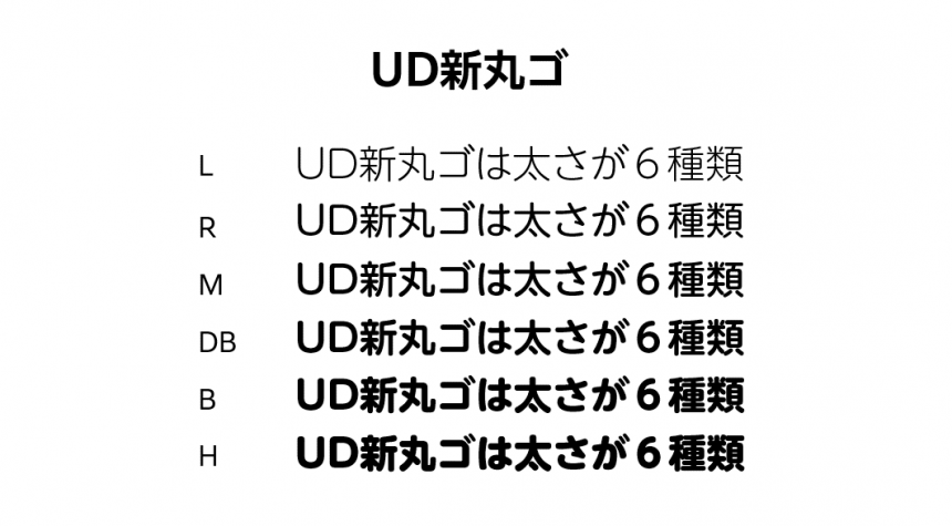
I want to use a font that is easy to read and stands out for my master's thesis slides.UD Shinmarugowas used.
I had previously used a blocky font, but I wanted something a little more rounded. Blocky fonts give off a stiff impression, so I wanted to create a gentler feel. Although the presentation will be formal, I will also be explaining to professors outside of the lab who I don't normally communicate with. I chose this font because I thought it would be approachable and easy for people who have no experience in the field to understand the information.
Also, up until now, the only options for font thickness were "bold" or "thin." If making the font thinner made it difficult to read, I would keep it thick and reduce the font size, which felt a bit cramped. UD Shinmaru Gothic has six different font thicknesses, which is amazing! I'm really impressed with how easy it is to use.
Now that I've experienced the convenience of being able to freely choose fonts from a wide selection, I don't think I'll ever go back.
Everyone has chosen fonts effectively to make the content of their presentations easier to understand. I had no idea fonts could be so useful! I'd love to hear from anyone struggling with their research presentation slides. How do you learn this kind of knowledge?
By joining Professor Hayami's lab, I gradually became aware of the existence of this world. He would look at my finished work and give me lots of advice, and it was a repetitive process.
I knew that there are people with disabilities that make it difficult to read and write, but at first I had no idea that the font and layout used can affect readability, or that changing the font can make it easier for people with such disabilities to read.
In the world of mathematics research, I feel that there is still a lack of awareness of things like easy-to-read slides and how information should be conveyed. However, this lab provides thorough guidance on how to make materials easy to read.
For example, up until high school, many textbooks were written in graphical, easy-to-understand formats, but as soon as I entered university, the highly difficult content began to be written in dense print, and I gradually became accustomed to this. However, it is still easier to learn when the layout is easy to read. My way of thinking has changed since joining this lab.
Nowadays, I try to create documents that are easy to read, so I created my class reports using a word processing tool called LaTeX, carefully adjusting the font. Compared to Word, LaTeX makes it easier to insert mathematical formulas and allows you to adjust the placement of figures with precision of even a few millimeters, so it has become the standard for writing papers, especially in science and engineering fields.
Being able to set the font as well as the layout made the report easier to read.
It seems that you have mastered a wide range of fonts because of the importance of fonts and layout you learned in the lab. Where else do you use them?
Personally, I felt that the best way to use it was to write the application form required for research.UD ReiminWhen I use
In the case of reports, you can make them easier to read between the lines, but application forms often have a set format and you need to fit everything you want to convey into a limited space, so even after organizing the information, the space often becomes too full.
Even when the spacing between lines is not appropriate, by switching from the font I had been using to UD Reimin, the contained space is larger, so the letters appear larger and are much easier to read.
Those who check applications have to look at many of them, so we think it's important to make them easier to read so that they will take as much time as possible to read your application.

I also set all my web browser fonts to UD Shin Go.
I've never liked reading printed text to begin with, and I haven't actively read books since I was a child. With UD Shin Go, the stress of reading has been greatly alleviated, and I feel like I can read faster.
I'm used to seeing it now, so I'm not particularly conscious of how easy it is to read, but compared to before, I feel like the information is coming in more naturally.
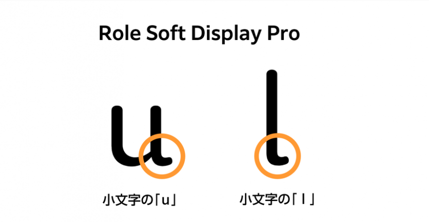
When writing an English paper, etc., I want to change the font of the editor's editing screen.Role Soft Display ProIt is set to.
I was looking for a font that would make English text easy to read, and this one seemed to suit me, so I chose it. It's easy to read overall, but my personal favorites are the lowercase "u" and "l." The way the letters stick out a little to the right at the end is really cute! It makes me feel more energized and helps me get work done.
It's still difficult to judge which fonts are good or bad, but the range of choices has expanded and it's fun just to try them out.
I belong to a musical club and am in charge of producing materials related to musical performances. I also use Morisawa fonts to create flyers and other materials.
Until now, when I made flyers, I'd only ever used the limited fonts available in free production tools, which left me feeling unsatisfied. Using Morisawa's fonts is great because I can choose easy-to-read fonts that match the worldview of my work, such as titles in Roman characters. I also feel that even small print is now easier to read in Japanese, such as venue information, addresses, and ticket prices.
Thank you everyone.Not only presentation slides, but also research-related applications andThe book was full of practical tips on how to use fonts in science and engineering research, such as for writing class reports and papers.Some students also use Morisawa fonts in extracurricular activities, and I was delighted to hear that they are also useful to science and engineering students.
We hope that you will continue to use Morisawa's diverse fonts from your own perspective. Morisawa would like to expand this circle even further.
Morisawa supports the use of characters!
Thank you to all the Waseda University students!
Letters are essential for communicating something to people and are the foundation of information transmission.
To help schools that have introduced Morisawa products use text more effectively, we provide various support, including in lessons.
If you are a school considering introducing fonts, please feel free to contact us!