

Introducing each of our wonderful members one by one [Moripass Club Member Introduction].
This time, Moripass Club advisor Suda will be sharing the story!
This time, we'll focus on the Moripass members!
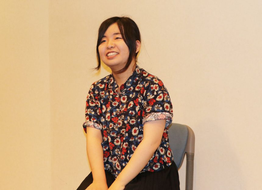
Goto Yume.
Tokyo Zokei University, Faculty of Art and Design, Department of Design, Media Design major, 3rd year
My favorite typeface is "Kaimin Sora".
We asked Goto to create a piece based on this theme!
Tokyo × Typography
concept
Mr. Goto created a website that gives the impression of peeking into the Tokyo landscape, as the character "Tokyo" looks like a window.
If you "peek" through the window called Tokyo...
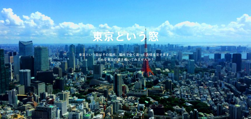
You'll see many different "Tokyos"...! (Let's take a look at different Tokyos too!)
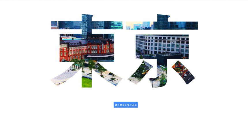
Which "Tokyo" should you capture?
When we asked Goto about the difficulties he faced, he said that he struggled to decide which scene to capture in Tokyo, a city with many different images.
He believes that the contrast between the old-fashioned atmosphere of Asakusa and Ueno and the modern atmosphere of Shibuya is what makes Tokyo so unique, and so he chose locations for the shoot that would allow people to experience that.
The character for "window"
Goto said, "The character 'Tokyo' is often used in advertisements and magazines, and is a font that you often see."Hidashigo MB31""I used this font. Tokyo is the capital of Japan, and it's a city where you see it often. I felt that there was a commonality between the two, so I decided to use this font as a window," he said, explaining why he chose the typeface.
In addition, the buttons and text on the site use cloud font services.TypeSquareUse "Medium Gothic BBBBy specifying ", I think the site has become simple, easy to read, and has a unified look!
from now on
Goto said that up until now, he had rarely worked on projects that focused on typefaces. However, through the Moripass Club's activities, he was able to broaden the scope of his work by turning his attention to typefaces, something he hadn't really paid much attention to before.
When creating text, I began to think carefully about whether the characters were actually easy to read and whether they would properly convey their message to the recipient.
With this new perspective, I'm sure the works I create from now on will be even more appealing, as I consider whether the message I want to convey can be conveyed through these letters.
In response to the advice given in the comments to "try changing the way you output your work," Goto thought carefully about what would be the best way to communicate with others and how to convey the concept of this work, and then he took on the challenge of outputting his work in the form of a website.
I think it's a wonderful piece that can be more easily conveyed!
Goto-san is currently working hard on the Free Magazine Team as part of the second half of Moripass Club's activities. The advisor has high hopes for him!