Toyo Art School and Morisawa Co., Ltd. collaborated on a project called "Turning on the Sensibility of Fonts." We asked students at Toyo Art School to take on a project that would help them feel closer to fonts.
This time the theme is postcards with a "spring" theme.
I chose the font that best suited the image of "spring" that I had in mind, and had a postcard visual that evoked spring created, with a Morisawa representative providing an explanation.
Here we will introduce the works that were awarded the Grand Prize and Excellence Prize, as well as comments from Morisawa representatives and interviews with the Grand Prize winners!
Grand Prize (1 person)
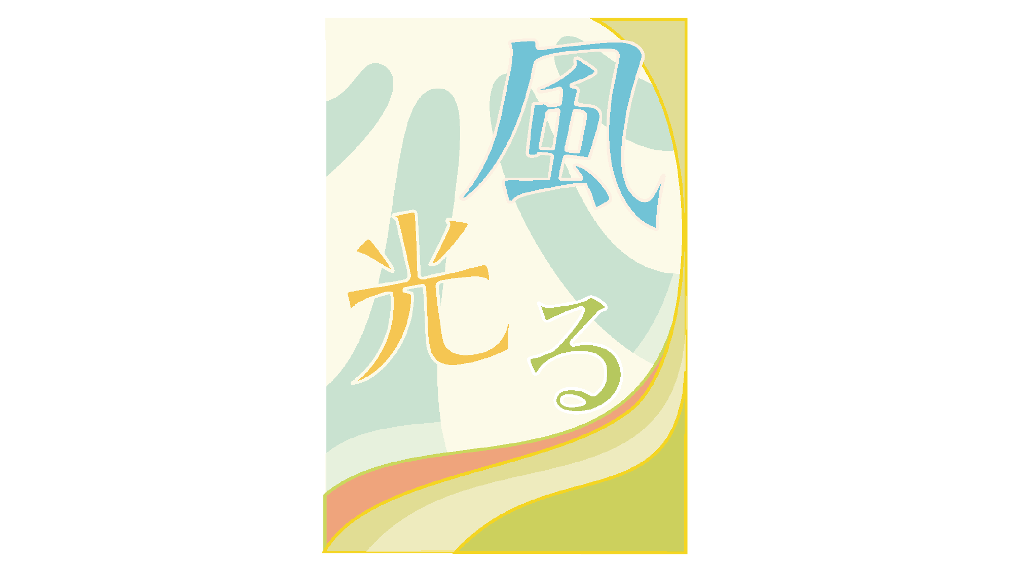
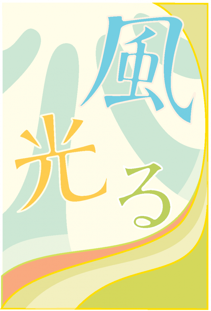
"Kaze Hikaru" (Takubo Yumeka) Font used:Moaria
Comment from Morisawa
The spring seasonal word "wind shining" was used to expand on the image of "the scent of freshly blooming spring buds," and the elements were then processed to bring the font closer to the ideal image.
The intention of what he wanted to express was clear, and the explanation was easy to understand and conveyed in his own words, which I thought was wonderful. The color choices are consistent and refreshing!
Excellence Award (5 people)
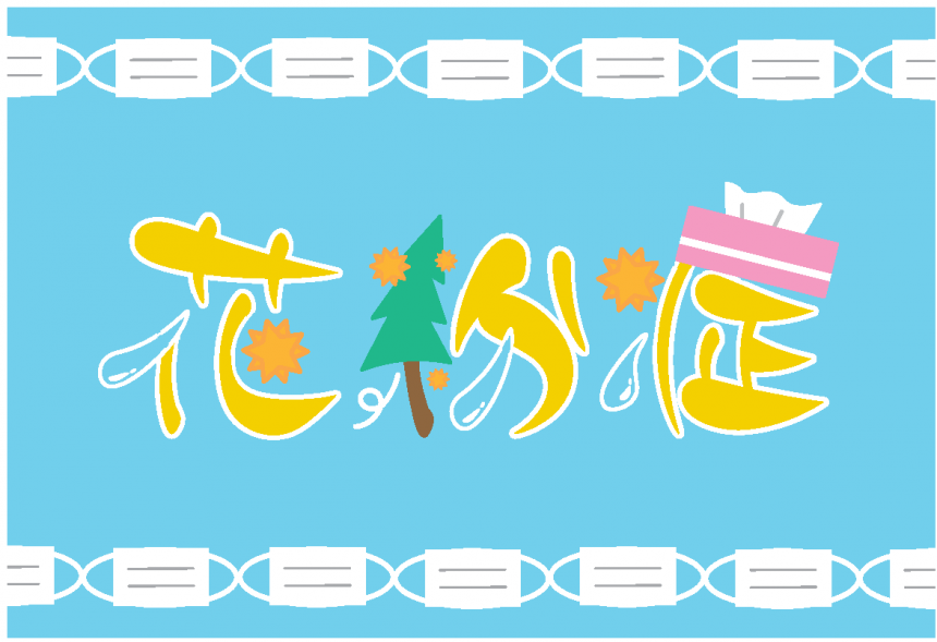
"Hay fever" (Miki Mikuni) Font used:Pretty Peach
Comment from Morisawa
I was impressed by the idea of linking the energetic elements of "Pretty Peach" to the pain of hay fever. Hay fever is a painful condition, but the pop and bright design also has a wonderful message that we can overcome it together!
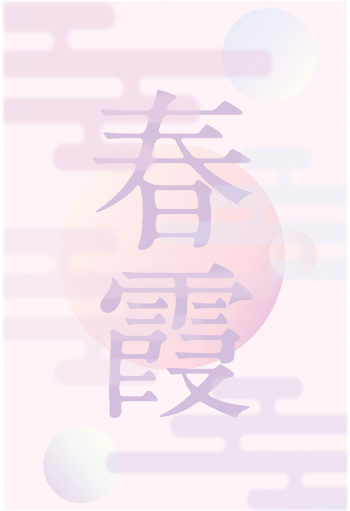
"Spring Haze" (Haruka Hamada) Font used:A1 Mincho
Comment from Morisawa
Rather than using the soft, ink-filled "A1 Mincho" font as is, he skillfully used deformations and gradations to make it blend in naturally. The image of "spring haze" is conveyed just from the visual alone.
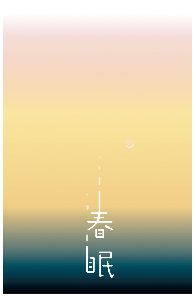
"Spring Sleep" (Ogawa Konoko) Font used:Haruhi Gakuen
Comment from Morisawa
Taking advantage of the discontinuous shape of "Haruhi Gakuen," the design expresses the feeling of falling into a comfortable sleep. The carefulness of the graphic design, including the adjustment of transparency and the soft use of colors, was highly praised.
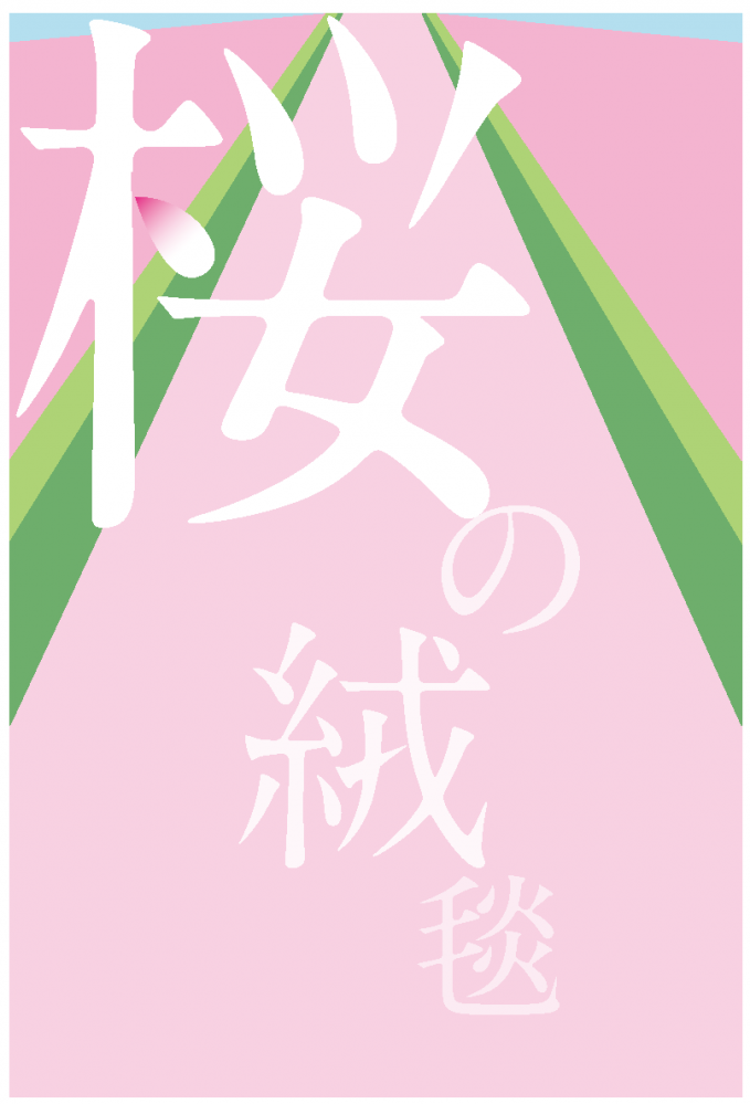
"Cherry Blossom Carpet" (Yasukawa Hina) Font used:A1 Mincho
Comment from Morisawa
I thought this was an interesting piece, with a bold composition and a subtle touch: "The letters are arranged to resemble dancing flower petals, and as they fall they become closer to the color of the carpet." By stripping away the details of the background, the design is interesting, with the movement of the letters and other ingenuity.
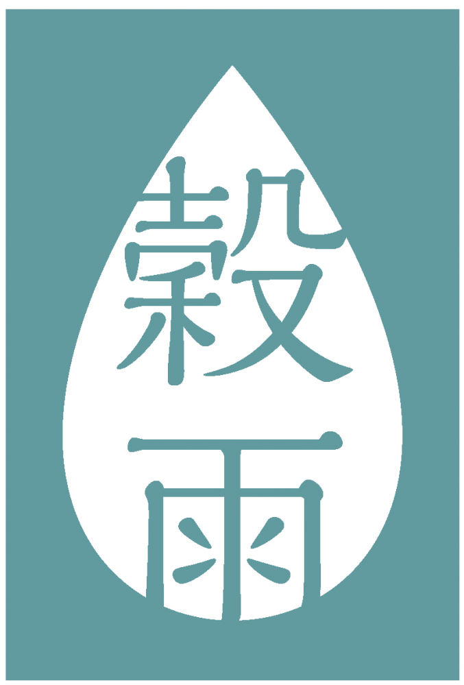
"Grain Rain" (Riki Miura) Font used:Kaimin Sora
Comment from Morisawa
Taking advantage of the drop-like elements of "Kaimin Sora," we were able to create a simple yet cohesive design. The weight and colors chosen also seem to fit perfectly with the image of "rain gently falling on plants."
Interview with the Grand Prize Winner

Q1. What was your impression when you first heard about this assignment?
I had no experience with processing letters, so I was a little nervous about whether I could design it in a way that would not offend the typeface creator.
However, it was fun to modify the typeface to fit the image I had in mind. When I heard the image of spring, the first thing that came to mind was the scent of new buds and sunlight, so I tried my best to somehow create that.
Q2. What did you focus on in this assignment?
Font processing and background design.
It was very difficult to process the typeface to come close to my image, while not destroying the image of "Moaria."
To match the soft scent of spring, the tip is rounded and slightly inflated, adding a gentler touch to the energetic "Moaria."
The background design was very difficult to create as it brought out the best in the processed text.
We worked by trial and error, adjusting the sunlight and the color of the sky in millimeter increments to find the best position to make the letters stand out.
We also paid particular attention to the curved lines that flow from the top right to the bottom left. We made the edges of the yellow-green and pink curved lines golden yellow and green to give them a sparkling, shining image. We also added translucent curved lines to express the refreshing, soft, veil-like breeze of spring.
Q3. Has anything changed between before and after you started working on this assignment?
Before starting the assignment, I didn't know to what extent it was okay to modify a typeface, but by working on the assignment, I learned that as long as I didn't make any unnecessary changes, it was okay to modify the typeface to express what I wanted while still making the most of its strengths. Modifying a typeface to express something was fun, as it felt like I was working together with the typeface to create a better design.
I decided to continue to understand typefaces better and become more familiar with them.
Although Takubo won the grand prize, it seems he faced difficulties in processing the font to get closer to the image he wanted to convey, while being careful not to lose its appeal.
I hope this assignment will inspire you to think more about design and fonts. I hope you continue to have fun and get to know fonts better!
Thank you to everyone at the Oriental Art School who participated!

