

In order to create a society of coexistence, it is important to provide high-quality education to diverse people and to ensure that they receive the information they need to live. At the online event held at the end of May 2022, Education Day focused on the acquisition of languages other than one's native language and universally accepted fonts, while Local Government Day focused on the public relations of local governments and a society of coexistence. Experts from various industries were invited as guests to give various lectures.
This time, we will report on the lecture "Exploring the Importance of Western Fonts in English Education for Elementary and Junior High School Students - Understanding and Issues with Western Fonts Based on Verification" held on Saturday, May 28th.
If you would like to watch the archived video from the seminar, you can do so below.
*Registration is required to watch videos.
*As this is an interim report on the verification, some parts of the archive have been edited.
Seminar Report
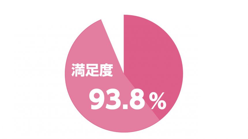
Satisfaction with the seminar
Participant comments
It was great to hear directly from someone who creates textbooks. Because I'm using textbooks that take the characters into consideration, I want to be more particular about the fonts in the teaching materials I create and present.
I was able to understand the current learning situation of children and the influence that fonts have.The live voice is memorable,There are some differences between the perspective I had and that of an elementary school student.It was extremely valuable information.
Title etc.By using both fonts that pique the interest of students and fonts that help students accumulate knowledge, the effectiveness of learning will increase.I was able to reaffirm this.
From Morisawa
In this seminar, we were able to hear the reactions of actual elementary school and university students through editors from publishing companies and teachers in the field.
During Professor Iijima's research presentation, participants exchanged valuable opinions through chat and networking sessions. This was just a progress report, so future developments are sure to be interesting.
Seminar Contents
"UD Digital Textbook Typeface's Subordinated Western Language and Western Language Series"
Haruka Nomura, Public Business Section, Sales Planning Department, Morisawa Inc.
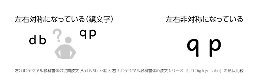
The UD Digital Textbook Font we offer is unique in that it is easy to learn even for children learning English for the first time. There are two designs, and the Ball & Stick font's "Dependent Roman Letters" combine circles and lines, making them symmetrical. This makes it difficult to distinguish between "a" and "o" or "d" and "b."
On the other hand, the "Roman Series" is asymmetrical like handwriting, making it easy to distinguish between letters such as "b" and "d" or "p" and "q." The Roman Series also has fewer strokes, making it easier to write. Until now, English textbooks have used the Ball & Stick font, but from the 2020 school year, the Roman Series format has been adopted.
"Blue Sky elementary font selection considerations"

Shinko Publishing Keirinkan English Editorial Department
Fumi Iwamoto(Fumi Iwamoto)
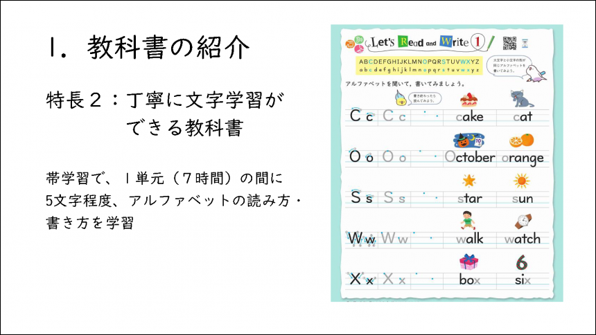
The elementary school English textbook "Blue Sky elementaryIn "English Words," English words are clearly displayed near illustrations and photos. The aim is to make children familiar with English words by pairing sounds with letters.
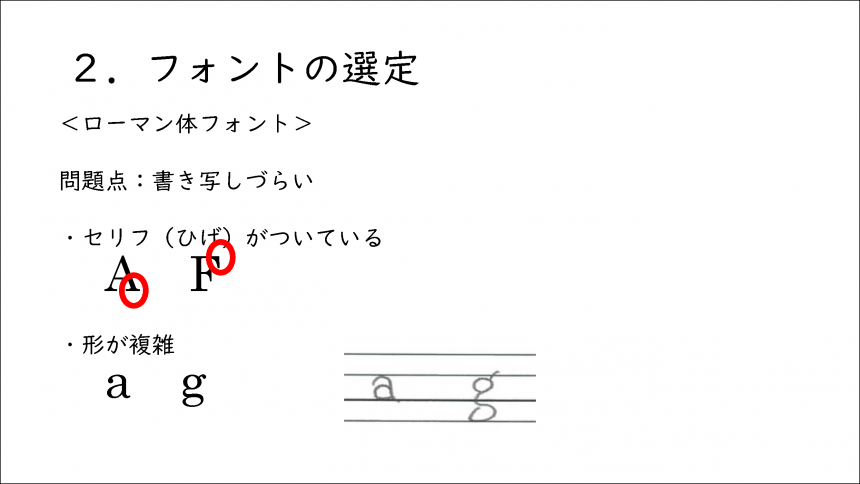
For elementary school students to learn to read and write the alphabet properly, it is important that the font is easy to transcribe. For example, Roman fonts have complex shapes, including serifs, which resemble whiskers, so they are not very suitable for elementary school textbooks.
On the other hand, sans serif fonts are alsoa" is difficult to write, and the capital letter "I" and lowercase L "l" are almost identical, so it can be said to be a high hurdle for elementary school students. In the past, a font called Comic Sans, which makes it easy to distinguish the alphabet, was adopted in schools, but it had a unique style and was difficult to read.
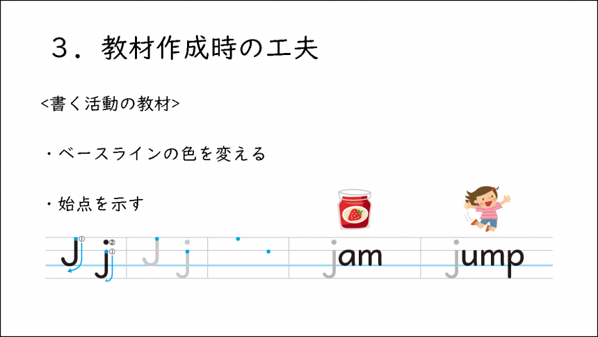
That's why we decided to use Morisawa's UD Digikyo font.This font was developed after consulting with people with low vision and reading and writing disabilities, and is close to handwriting, making it easy to transcribe.It is also easy to read as a digital textbook displayed on a tablet, and is convenient for children to learn writing.UD Digikyo WritingThere is also a font called ", which I find easy to use.
"The impact of letters and fonts on English learning"

Professor, University Education Center, Organization for Higher Education and Student Support, Gunma University
Mutsumi Iijima(Mutsumi Iijima)
I once showed two English stories partway through to two groups of students, and investigated whether the story would have a happy ending or a bad ending. The typefaces used for each story were significantly different, and the results showed that more students predicted a happy ending when the story was written in a softer font. This shows that fonts are a communication tool and have a significant impact on our emotions.
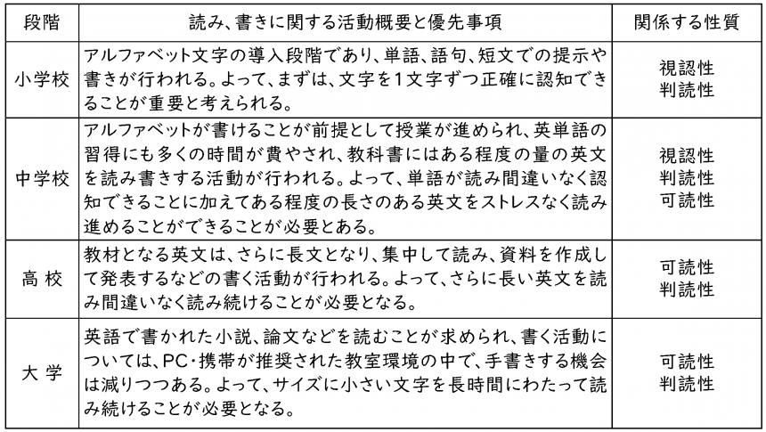
English learning also goes through stages according to development, and in the first year of junior high school, students move from sound-based learning to letter-based learning. In order to efficiently understand content that has previously been recognized through audio, it is important that the text is easy to read and write.
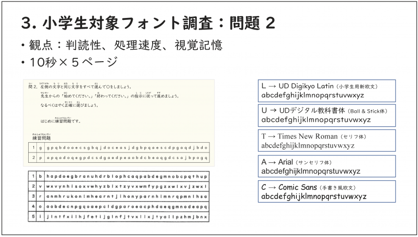
So I am conducting tests at elementary schools to see which fonts are best for visibility and readability. As the tests are still ongoing, clear results are not yet available, but it seems that fonts without serifs tend to be more visible and readable.
AlsoWhen asked how to memorize words, many students still say, "I memorize it by writing it down while pronouncing it." In that case, a font that is closer to handwriting is easier to remember.With this in mind, we would like to conduct demonstration experiments at junior high schools, high schools, and universities.
Morisawa has also launched a website called "FONT SWITCH PROJECT" that makes fonts more accessible.English learning materials for nine developmental stages' is available to use for free, so please check it out.
English fonts from a child's perspective

Vice Principal of Musashimurayama Municipal No. 9 Elementary School, Tokyo
Hidetomo HiyoshiMr. Hiyoshi Hidetomo
We once conducted a survey about fonts among a total of 87 fifth and sixth graders at our school. First, we asked students if there were any alphabets that bothered them, and many of them mentioned differences in the shapes of letters such as "a," "i," "g," "l," and "t." Of course, there are students who don't mind the differences in shape at all, but many of the students who answered that they are "concerned" often require special support.
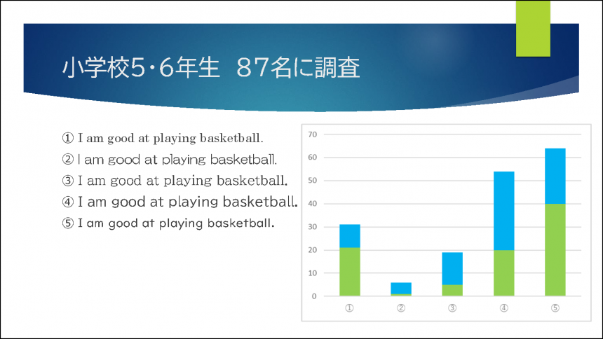
In this survey, participants were asked to compare five fonts: Century (1), Maru Gothic (1), and Universal Design (3).65 students answered that the universal design type was "easiest to see."In the free comment section, responses such as "Because it's the same as the characters we see in textbooks" and "Because it's the same as the romanization we learned in Japanese class" were seen.
Children first encounter romaji in Japanese language class in the third grade of elementary school. Although classes are short, at around five hours per year, what they learn here seems to have such a big impact that it forms the foundation for what comes next, so I hope to be able to ensure that even minor differences in characters do not affect children's learning.
This time, we conducted a comparative survey of typefaces stored on the teachers' computers, but it seems that there are also European typefaces that have been developed based on research, such as the UD Digikyo font, so we hope that you will make effective use of these as well.
Exchange meeting
At the end of the event, a networking session was held between the three speakers and the audience. Participants included people involved in various fields of education, such as cram school managers and elementary school English teachers."I was surprised because I never thought that different fonts would make such a big difference in how characters are recognized!"In addition to these comments, there was also an exchange of various opinions on educating children.
The Morisawa representative who acted as moderator concluded by saying, "As a font manufacturer, we hope to continue to provide many opportunities for people from various professions to discuss English education."
A plan that allows you to use 55 UD fonts that can be used in educational settings
For details on MORISAWA BIZ+Here
If you are interested in solving problems in your school organization or considering using UD fonts, please feel free to ask us any questions below.
I teach English at a university, and I was dissatisfied with the English characters that came with the UD Digital Textbook Font, so I combined it with a different font.
Western font "UD Digikyo LatinWhen I found out that there was another service called "MORISAWA BIZ+," I immediately decided to introduce it.